Purple Garden Blooms Anew: How Mother Design Conjured a Mystical Brand Identity
In the ethereal realm of spiritualism, where intuition reigns and definitions often elude concrete grasp, a significant rebrand has taken root. Purple Garden, a leading platform for psychic services, has undergone a profound transformation, shedding its former skin for a vibrant, mystical new identity. The ambitious undertaking, spearheaded by the innovative design agency Mother Design, was far from a conventional design process. Instead, it was a journey steeped in séances, chakra readings, and intuitive creativity, pushing the boundaries of traditional branding to capture the intangible essence of spiritual connection.
This is not merely a fresh coat of paint; it’s a holistic reimagining that seeks to resonate deeply with its audience of "seasoned seekers," as Jo Tulej, Creative Director at Mother Design, describes them. The goal was to solidify Purple Garden’s position as a leader in its category by crafting a visual and verbal language that felt both familiar and refreshingly elevated. The resulting brand identity is a testament to the power of unconventional approaches, proving that divine results can indeed spring from spontaneity and deep exploration.
The Genesis of a Mystical Rebrand
The challenge of translating something as abstract as psychic power into a tangible brand identity was a significant hurdle for the Mother Design team. Unlike conventional product branding, where tangible features and benefits often guide the design, spiritual services rely on intangible connections, intuition, and personal experience. This inherent nebulousness demanded an equally unconventional approach.
Mother Design, known for its "Wild Card" initiative that encourages experimentation with unfamiliar disciplines, embraced this challenge head-on. The agency understood that to authentically represent the spiritual realm, they needed to immerse themselves in it. This led to an unprecedented collaboration: the design team partnered with a holistic practitioner from Purple Garden, embarking on a journey that involved séances, chakra readings, and intuitive creative exercises.
"Transferring something as intangible as psychic power into a brand identity was a chunky challenge that we wanted to get right," explains Jo Tulej, Creative Director at Mother Design. "It had to begin with the audience. Purple Garden is aimed at people who have had spiritual readings and practices, and the business objective was to cement the brand’s place as the leader in the category. Therefore, we had to create something visual and verbal that would feel familiar and resonate with these ‘seasoned seekers,’ but in a fresh way, that would communicate Purple Garden’s elevated offering."
The team recognized that a superficial understanding wouldn’t suffice. To truly tap into the essence of psychic services, they needed to experience it firsthand. This led to an immersive workshop where members of the Mother Design team, some with prior spiritual experience and others without, participated in a guided chakra reading and automatic drawing and writing session. This unconventional "brand audit with a twist" served as the bedrock for the entire rebrand.
A Creative Process Rooted in the Unseen
The inspiration for Mother Design’s methodology drew parallels with historical movements that embraced channeling higher consciousness for creative output. The term "séance," meaning "sitting" or "session," itself points to a collaborative gathering. The designers looked to figures like Hilma af Klint, a pioneer of abstract art whose work predated many established male artists, and "The Five," a group of women who entered trance states to bypass conscious thought, believing they were receiving messages from a higher consciousness that translated into their art.
"We wanted to immerse ourselves in spirituality and see if that could be baked into a design process in order to create great work," Jo Tulej elaborates. "The chakra reading and automatic drawing/writing took place as a group workshop in which the whole team participated. We then came back a few days later and sat alongside the drawings and writing and discussed what we were seeing and noticing. To have had this experience with an advisor from Purple Garden was an invaluable way to gain insight as well as an invigorating creative process."
This process of instinctive creation, using paper and charcoal to bypass conscious thought, yielded raw forms, textures, and feelings that became the foundational elements for the new brand identity. The designers aimed to replicate the spontaneity and unfiltered expression that characterizes genuine spiritual insight.
The Unveiling of the New Identity: Visualizing the Unseen
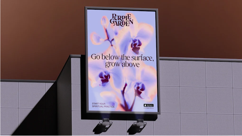
The visual manifestation of Purple Garden’s rebrand is a harmonious blend of the ethereal and the grounded, designed to evoke trust, intuition, and growth. The wordmark itself is a masterful creation, combining elegant serifs with fluid, curved junctures that appear to organically sprout outwards, symbolizing life and vitality. This is complemented by a digital-first, crystal-like glyph, exuding a modern, yet mystical aura. Together, they position Purple Garden as a beacon of "grounded guidance."
The typography plays a crucial role in balancing the brand’s essence. The use of Literatura Present and ABC Social typefaces strikes a delicate equilibrium between whimsical charm and practical legibility, ensuring that the brand’s messaging is both engaging and accessible.
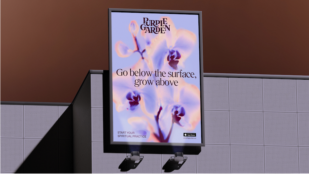
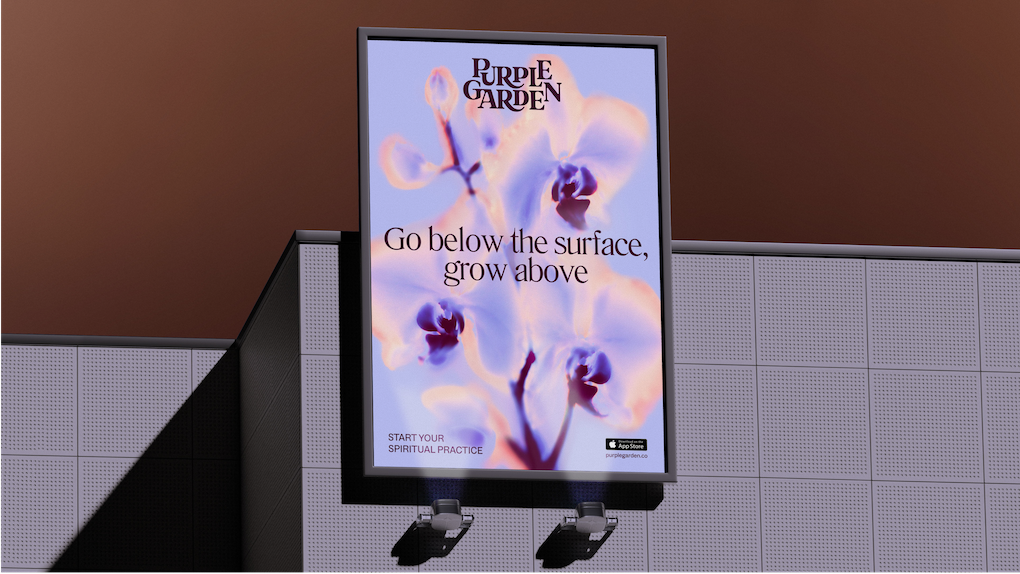
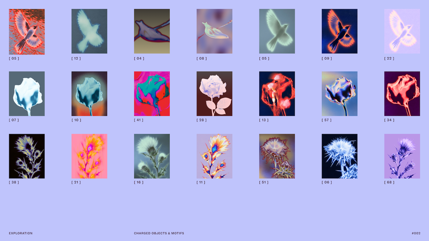
Beyond the core elements, the imagery is a significant carrier of the brand’s spiritual energy. The rebrand incorporates photographs of "charged objects," abstract representations designed to embody the essence of services like dream analysis and psychic readings. These images are further enhanced with "solarised glows and flame-like ripples," visual metaphors for the energetic exchange that occurs between a practitioner and a client. This technique imbues everyday objects with a magical, otherworldly quality, signifying the transformative power of spiritual connection.
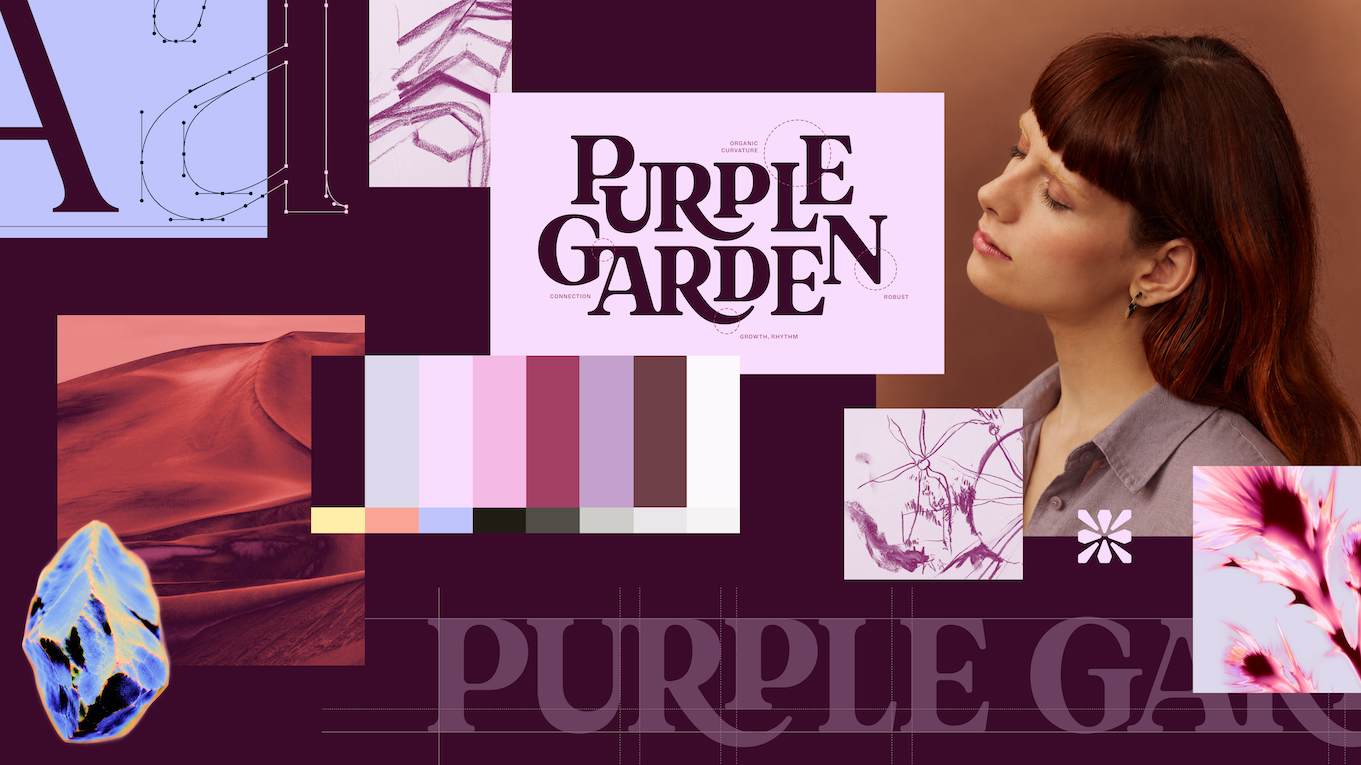
The color palette is, naturally, a rich tapestry of purples, symbolizing intuition, wisdom, and higher consciousness. However, Mother Design consciously expanded this to include a broader, earthier, and richer palette of seven hues. This deliberate choice aimed to differentiate Purple Garden from competitors, who often rely on a more limited and sometimes flatter spectrum. The richer palette creates a more sophisticated and inviting visual experience, avoiding common clichés while still drawing on universally recognized spiritual symbolism.
The Voice of the Brand: Active Contemplation
The linguistic aspect of the rebrand is equally as crucial as its visual components. The messaging needed to strike a delicate balance: encouraging customers to engage and take action without resorting to the often-used, pressure-driven tropes of urgency common in the industry.
"We also used pictures of nature, but they appear transformed through these solarised glows, so they have a new, magical quality to them," Jo Tulej explains. "Similarly, in messaging we had to find the right balance of engaging customers to take action without falling into the category tropes of urgency and pressure, ie. Book fast. Get answers. Act now. Instead, we created a voice based around a duality: Active Contemplation, that can meet you where you are and either guide you forward or slow down for more reflective moments."
This "Active Contemplation" voice embodies the brand’s ethos of providing guidance that is both proactive and reflective. It acknowledges that spiritual journeys are personal and unfold at different paces. The messaging aims to empower users, offering support for both forward momentum and moments of introspection, ensuring the brand feels like a supportive companion rather than a transactional service.
Evolution and Reflection: A Year of Mystical Rebrands
The Purple Garden rebrand is not an isolated success for Mother Design in the spiritual services sector. The agency also recently completed a rebrand for Keen, another prominent psychic services platform. The remarkable aspect of these two projects, as highlighted by Jo Tulej, is the distinctiveness of each outcome.
"This year we’ve been so lucky to rebrand not one but two psychic services platforms (Keen and Purple Garden)," Jo shares. "What has surprised me is how different the two product/brands now feel, and how divergently we’ve been able to explore and push their identities. Again, this all comes down to getting under the skin of the audiences and aims of the business in order to sharpen the creative ideas and design expression."
The success of these distinct rebrands underscores Mother Design’s commitment to bespoke solutions, tailored to the unique needs and audiences of each client. The agency’s ability to delve deep into the nuances of different spiritual platforms and translate them into compelling brand identities is a testament to their innovative approach.
The Impact of Intuitive Design
The impact of Mother Design’s intuitive and experimental process on the Purple Garden rebrand is profound. The initial séance experiment, a departure from traditional branding methodologies, provided a novel way to initiate the project.

"For the Purple Garden process specifically, I was struck by how the initial séance experiment gave us a totally different way of starting a branding project," Jo reflects. "It was slow, unclear and required a lot of trust and to a certain extent, vulnerability, from our team. By protecting this time, and removing a traditional ‘KPI’ from the output, I believe it gave our client a much richer, robust output, sensitive to the category and its audience."
This emphasis on "wild card" time – dedicated periods for exploration and experimentation, free from immediate performance metrics – is a cornerstone of Mother Design’s philosophy. It allows for the incubation of truly original ideas, fostering a creative environment where the intangible can be given form. This approach ensures that the final output is not just aesthetically pleasing, but deeply resonant and strategically aligned with the brand’s core values and objectives.
The detail and craft embedded within the Purple Garden identity are evident upon closer inspection. The organic, interconnecting letter placement within the wordmark, the meticulous experimentation with various processes to arrive at the visual style for "charged objects," and the subtle symbolism woven throughout the design all contribute to a rich and layered brand experience.
"There’s a ton of detail and craft that went into everything, for example, creating a wordmark with ligatures that feel as though they’re sprouting, and the organic, interconnecting letter placement," Jo elaborates. "The team spent a long time experimenting with lots of different processes and tools till they found a visual style for the charged objects that felt right for depicting spiritual experiences. I’m really proud of all those details that emerge the more you engage with the identity and the impact it has."
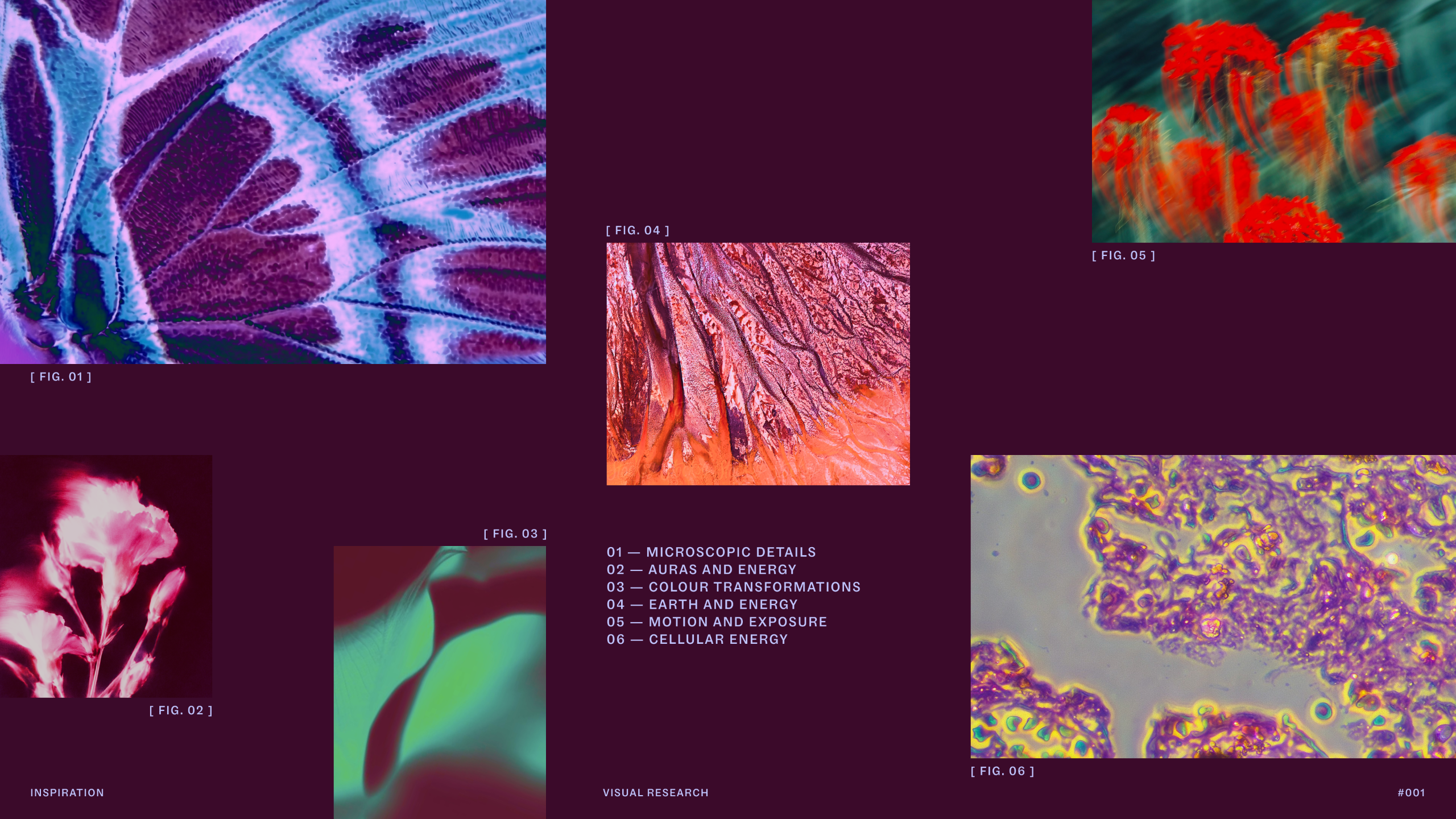
The culmination of these elements – the charged objects, the living type, and the guiding voice – coalesce to express the overarching concept of "Living Practice." This idea speaks to continuous growth and evolution, creating a cohesive and immersive brand world that feels organic and dynamic, rather than a collection of disparate elements.
In conclusion, the Purple Garden rebrand by Mother Design is a compelling case study in how to translate the intangible into a powerful and resonant brand identity. By embracing unconventional methods, fostering deep collaboration, and prioritizing intuitive creativity, Mother Design has not only revitalized Purple Garden’s visual presence but has also infused it with a sense of authentic spirituality that is poised to connect deeply with its audience and solidify its leadership in the market. The result is a brand that truly blooms, offering grounded guidance and a sense of continual growth to those who seek it.