
Fans Divided Over New Spider-Man Logo Design Ahead of "Brand New Day" Premiere
A seemingly minor detail on Tom Holland’s new Spider-Man suit has ignited a passionate debate among dedicated fans, with some praising the fresh aesthetic and others criticizing the execution of the iconic web-slinger’s emblem.
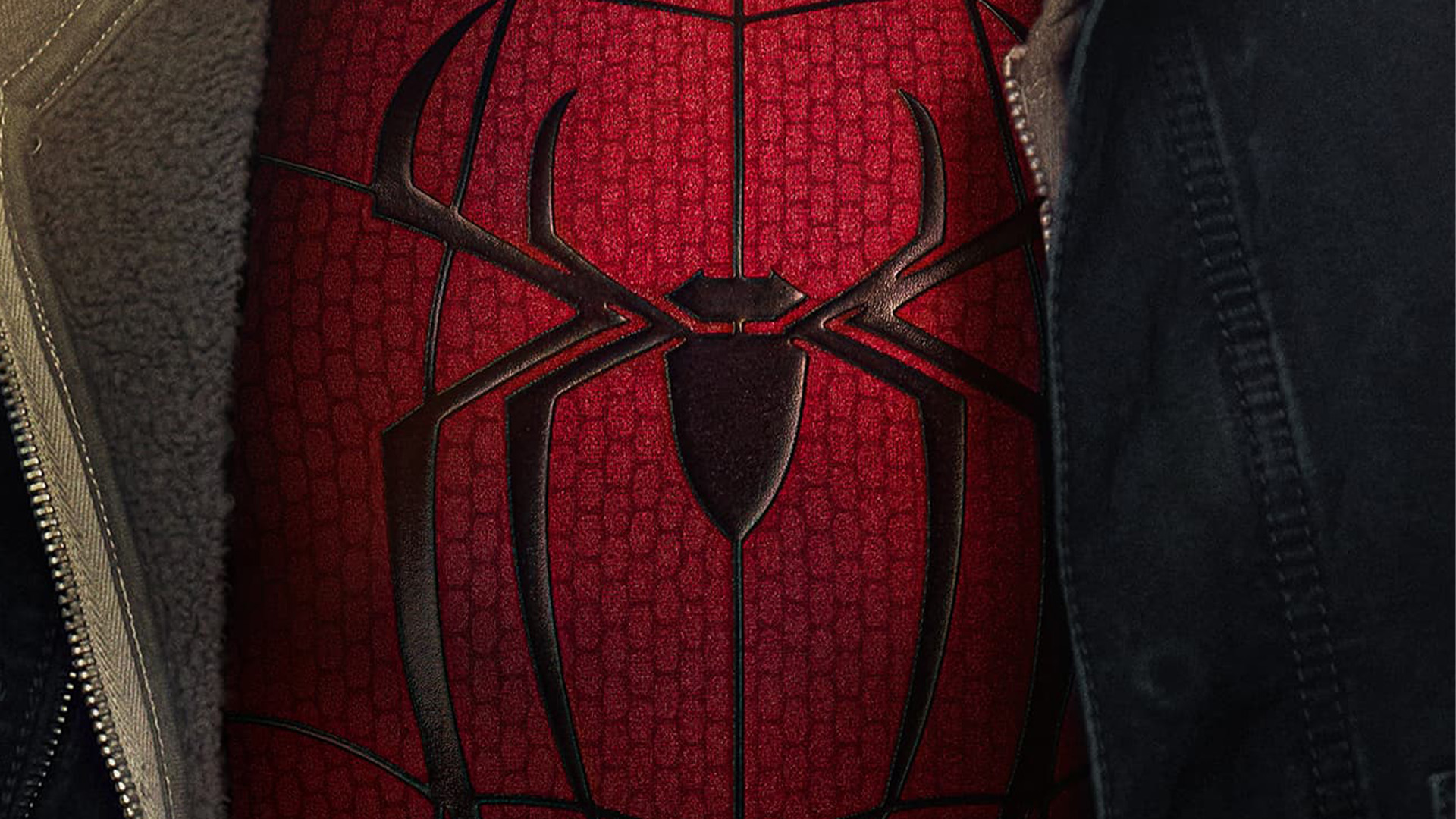
The anticipation for "Spider-Man: Brand New Day" has been palpable, fueled by a steady stream of promotional materials that offer tantalizing glimpses into the upcoming cinematic adventure. Among these releases, a recent poster has captured particular attention, not only for showcasing the lower half of leading man Tom Holland’s unmasked face but also for featuring a redesigned Spider-Man logo. While the image has generated significant excitement, a segment of the fanbase has zeroed in on what they perceive as a flaw in the logo’s design, sparking a lively and sometimes contentious discussion across social media platforms.
The Spider-Man logo, a globally recognized symbol of heroism and resilience, has undergone numerous iterations throughout its storied history, appearing in comic books, animated series, and a diverse range of film franchises. This rich visual legacy means that any new interpretation of the emblem carries a considerable weight of expectation and scrutiny. It is within this context that the latest iteration of the logo, seen adorning Holland’s new suit, has become a focal point for both admiration and critique, proving that even subtle shifts in design can provoke strong reactions from a devoted audience.
The Controversy Unveiled: A Matter of Spider-Legs
The spark that ignited this online firestorm originated from a post on X (formerly Twitter) by a user who expressed a specific dissatisfaction with the logo’s anatomy. "I don’t like how the top legs connect to each other," the user declared, accompanied by an image of the new logo. This seemingly innocuous observation quickly resonated with other fans, highlighting a perceived anomaly in the way the upper appendages of the spider emblem were rendered.
Historically, Spider-Man logos have often featured distinct and well-defined leg structures. However, the new design presents a more condensed and stylized interpretation, where the upper legs appear to merge or connect in a manner that some find aesthetically jarring. This condensed approach has led to a visual ambiguity that has polarized the fanbase, transforming a minor graphic detail into a subject of intense debate.
The user’s initial critique was met with a range of responses. One fan attempted to offer a rational explanation, suggesting, "It’s not intentional logo design, it’s just the web running behind the logo." This explanation, however, did not entirely appease the original poster, who responded, "Oh I see it now, thanks. But honestly I feel like that makes it even weirder?" This exchange encapsulates the divide: for some, understanding the technical or contextual reason behind the design alleviates the concern; for others, the perceived oddity persists regardless of the explanation.
Further comments from the online community echoed the sentiment of disappointment. One user described the new design as "over designed," implying a lack of clarity or an excess of unnecessary elements. Another, identifying as a graphic designer, lent their professional opinion, stating, "As a Graphic Designer I agree, has to be a reason!" This assertion suggests that the design choices might not align with established principles of effective logo creation, further fueling the debate among those with an eye for visual detail.
A Legacy of Logos: The Evolving Spider Emblem
To understand the current debate, it’s crucial to acknowledge the extensive visual history of the Spider-Man logo. From the bold, blocky emblems of the early comic books to the more dynamic and nuanced designs featured in different film eras, the spider has been a constant, yet ever-evolving, visual motif.
-
Early Comic Era (1960s-1970s): The foundational Spider-Man logo was characterized by its simplicity and directness. Often rendered in stark black and white or bold primary colors, the spider was depicted with clear, segmented legs, projecting a sense of raw power and menace. This era established the core visual language of the character’s branding.
-
The Animated Age (1980s-1990s): With the advent of animated series, the logo began to incorporate more fluid lines and dynamic poses. While retaining the essential spider form, these iterations often featured a more stylized, almost acrobatic, representation, reflecting the character’s agility and movement through the urban landscape.
-
The Sam Raimi Trilogy (2000s): Tobey Maguire’s Spider-Man films introduced a more metallic and three-dimensional take on the logo. Often depicted with a glossy sheen and pronounced depth, these logos aimed for a more polished and cinematic feel, aligning with the blockbuster nature of the films. The leg structure remained largely recognizable, though often integrated into a more sculpted emblem.

-
The Amazing Spider-Man Films (2010s): Andrew Garfield’s portrayal saw a shift towards a sleeker, more angular design. The spider emblem became more abstract, with sharper lines and a streamlined silhouette. This era emphasized a modern, almost futuristic, interpretation of the iconic symbol.
-
The Marvel Cinematic Universe (MCU) Era (2010s-Present): Tom Holland’s Spider-Man has been associated with a variety of logo designs, often tailored to the specific suit he wears. These designs have ranged from the classic web-shooter inspired emblems to more stylized and integrated symbols. The "Brand New Day" poster’s logo represents a further evolution within this ongoing cinematic narrative, prompting the current discussion about its design merits.
Each of these eras reflects not only the prevailing design trends of their time but also the specific narrative and thematic intentions of the Spider-Man stories they represent. The ongoing adaptation of the logo underscores its importance as a flexible and enduring symbol, capable of reflecting the changing face of the hero and his universe.
Supporting Data: Fan Reactions and Design Principles
The debate surrounding the new Spider-Man logo is not merely anecdotal; it’s a reflection of broader trends in how audiences engage with and critique visual branding, particularly for beloved intellectual property.
-
Social Media Amplification: Platforms like X serve as immediate and powerful channels for fan discourse. The original tweet gained significant traction, with replies and quote tweets showcasing a spectrum of opinions. This rapid dissemination of individual viewpoints amplifies the collective sentiment, allowing for a swift gauge of public reception. The use of hashtags related to "Spider-Man," "Marvel," and "logo design" further increases visibility.
-
The "Uncanny Valley" of Design: In graphic design, there’s a concept akin to the "uncanny valley" in robotics, where something is almost, but not quite, right, leading to a sense of unease. The new logo’s connected "top legs" could be interpreted as falling into this category for some viewers. The visual cue is familiar, but the execution deviates subtly, creating a dissonance that some find unsettling.
-
Expert vs. Enthusiast Opinions: The inclusion of a "Graphic Designer" commenting on the logo highlights the interplay between professional critique and fan enthusiasm. While enthusiasts often bring passion and deep familiarity with the source material, professional designers can offer insights into established design principles, such as balance, negative space, and clarity of form. The fact that a professional designer also found the logo questionable lends weight to the criticisms.
-
The Power of Nostalgia and Expectation: Decades of exposure to various Spider-Man logos have created deeply ingrained expectations. Any deviation from these established norms can trigger a strong reaction, particularly if it’s perceived as a step backward or a departure from what makes the symbol iconic. Fans are not just looking at a new design; they are comparing it to a rich tapestry of visual history.
-
The "Brand New Day" Context: The very name of the upcoming installment, "Brand New Day," suggests a fresh start and a departure from the past. This thematic element might influence how fans perceive design changes. Some might embrace radical shifts as fitting the narrative, while others might feel that the core iconography should remain sacrosanct.
Official Responses: Silence and Speculation
As of the publication of this article, there has been no official statement from Marvel Studios or the creative team behind "Spider-Man: Brand New Day" directly addressing the fan discourse surrounding the new logo design. This silence is not uncommon in the entertainment industry. Studios often prefer to let their creative output speak for itself and may avoid engaging in debates over minor design elements, which could potentially amplify the controversy or distract from the film’s core message.
However, the absence of an official response does not negate the impact of the fan discussion. It leaves room for speculation and interpretation:
-
Intentional Design Choice: The current design could be a deliberate artistic choice by the filmmakers and designers. Perhaps the connected legs are meant to symbolize a new aspect of Peter Parker’s journey, a more integrated or perhaps even strained connection to his heroic identity. The "web running behind the logo" explanation, while offered by a fan, could be closer to the intended rationale, suggesting a layered visual effect rather than a flawed emblem.
-
Subtle Evolution: The design might represent a natural evolution of the Spider-Man symbol within the MCU. As the character matures and faces new challenges, his visual representation might also adapt. The condensed design could be a reflection of a more streamlined, efficient, or even battle-hardened persona.
-
Focus on the Narrative: It’s possible that Marvel views the logo as a secondary element to the overarching narrative. While visual appeal is important, the primary focus remains on the story, characters, and action. The debate over the logo, while vocal online, might be considered a minor concern in the grand scheme of promoting a major cinematic release.
-
Future Revisions (Unlikely): While highly improbable for a major film release, in some cases, significant and widespread negative fan reaction to a key visual element can, in extremely rare instances, lead to minor adjustments in subsequent promotional materials. However, for a feature film’s primary emblem, this is an unlikely scenario.
The lack of official comment allows the fan base to continue their dissection and interpretation, a testament to their engagement and passion for the character. This speculation, in itself, contributes to the pre-release buzz surrounding "Spider-Man: Brand New Day."
Implications: More Than Just a Logo
The controversy surrounding the Spider-Man logo, while seemingly focused on a small detail, carries broader implications for how media franchises are consumed and how fans interact with them in the digital age.
-
The Power of the Fan Voice: This debate underscores the immense power that dedicated fan communities wield in shaping the perception of a brand. Their opinions, amplified by social media, can influence public sentiment and even, in some cases, subtly guide future creative decisions. The ability for any fan to voice their critique and have it potentially reach a wide audience is a defining characteristic of contemporary media consumption.
-
The Evolving Nature of "Iconic": What makes a logo "iconic" is not static. It is a living entity, constantly reinterpreted and re-evaluated by new generations and in new contexts. The "Brand New Day" logo challenge is part of this ongoing dialogue, pushing the boundaries of what the Spider-Man symbol can represent. It prompts questions about whether an icon should remain immutable or evolve alongside the character and the times.
-
Design as a Narrative Element: The debate highlights how design choices are increasingly viewed not just as aesthetic decisions but as integral components of storytelling. Fans are looking for meaning and intention behind every visual cue, seeking to understand how a particular design choice reflects the character’s arc and the film’s themes.
-
The Challenge of Balancing Tradition and Innovation: For long-standing franchises like Spider-Man, there’s a delicate balance to strike between honoring established traditions and introducing fresh, innovative elements. The "Brand New Day" logo controversy exemplifies this challenge. While innovation is often necessary to keep a franchise relevant, it risks alienating segments of the fanbase who are deeply attached to the familiar.
-
Anticipation and Engagement: Ultimately, even a contentious design can contribute to the overall buzz and anticipation for a film. The passionate debate, while sometimes critical, signifies a high level of engagement and investment from the audience. It demonstrates that fans care deeply about the character and his visual representation, ensuring that "Spider-Man: Brand New Day" will enter the cultural conversation with significant momentum, fueled by both excitement and lively discussion. The logo, intended as a visual herald of the film’s arrival, has inadvertently become a catalyst for a deeper engagement with the very essence of what makes Spider-Man endure.


Leave a Comment