Coca-Cola Unveils Refreshed Global Identity: A Masterclass in Amplifying Iconic Branding
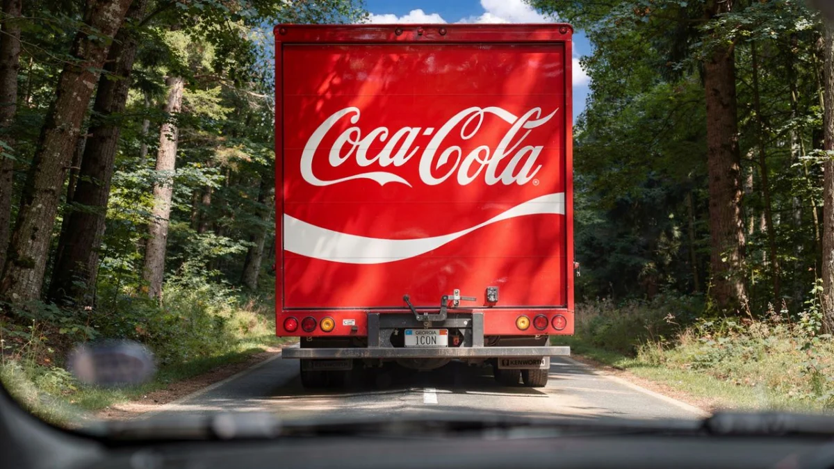
The world’s most recognizable beverage brand, Coca-Cola, has undergone a subtle yet significant visual refresh, designed to unify its identity across a vast global landscape of touchpoints. The ambitious brief handed to the renowned design agency Jones Knowles Ritchie (JKR) was deceptively simple: "Make Coca-Cola more Coca-Cola." This directive underscored a strategic imperative to amplify the most potent and enduring elements of the brand’s visual heritage, ensuring they resonate with greater impact in an ever-evolving marketplace.
This initiative, while not a complete overhaul of the brand’s foundational identity, represents a monumental undertaking. It’s a testament to Coca-Cola’s deep-seated understanding of its brand equity and its commitment to maintaining a consistent and powerful presence worldwide. The project required a delicate balance between honoring decades of iconic design and injecting renewed vitality for contemporary audiences.
The Genesis of a Refreshed Identity: A Strategic Imperative
The decision to embark on this visual refresh stemmed from a clear strategic objective: to create a more cohesive and impactful brand experience across all consumer touchpoints. In an era of diverse media channels, from digital advertising and social media to physical packaging and in-store displays, a unified visual language is paramount. The goal was to ensure that every interaction a consumer has with Coca-Cola reinforces its core identity, evoking the familiar feelings of joy, refreshment, and togetherness that have become synonymous with the brand.
The agency JKR, known for its expertise in revitalizing established brands, was tasked with translating this strategic vision into tangible design solutions. Their mission was not to reinvent Coca-Cola, but to excavate and elevate the elements that have made it an enduring global icon. This meant a deep dive into the brand’s history, its core visual assets, and the emotional connections it has forged with consumers over generations.
A Deep Dive into the Design Process: Amplifying the Essence
The core challenge for JKR was to identify and amplify the most critical brand elements. This involved a rigorous process of analysis, experimentation, and refinement. The agency focused on key visual components that have defined Coca-Cola’s identity for decades:
- The Coca-Cola Red: This specific shade of red is not merely a color; it’s an emotional trigger, instantly recognizable and deeply embedded in consumer consciousness. The refresh aimed to ensure its vibrancy and consistency across all applications, making it a more dominant and impactful element.
- The Spencerian Script Logo: The iconic Coca-Cola script, with its distinctive flourishes and elegant curves, is perhaps the most recognizable logo in the world. The refresh sought to ensure its clarity, legibility, and timeless appeal, making it stand out even more prominently. Subtle adjustments may have been made to optimize its rendering across various digital and print platforms, ensuring it retains its characteristic charm without appearing dated.
- The Contour Bottle Silhouette: While not always explicitly present in every visual, the iconic silhouette of the Coca-Cola contour bottle is a powerful symbol of the brand. Its unique shape has become an intrinsic part of Coca-Cola’s visual lexicon, representing refreshment and quality. The refresh likely considered how to subtly allude to or incorporate this iconic form into broader brand communications.
- The "Dynamic Ribbon" Device: This flowing red band, often seen trailing the Coca-Cola logo, has been a consistent element in the brand’s visual identity. The refresh would have focused on optimizing its integration and impact, ensuring it enhances the overall composition and adds a sense of movement and dynamism.
The process of "making Coca-Cola more Coca-Cola" involved a meticulous examination of how these elements interact and how they can be presented with greater emphasis. This could have involved:
- Strategic Cropping and Placement: Experimenting with how the logo and other graphic elements are positioned and scaled within various layouts to maximize their visual weight.
- Color Palette Refinement: While the core red remains, the refresh might have involved a considered approach to supporting colors, ensuring they complement and enhance the primary brand hue without competing with it.
- Typography Optimization: Beyond the main logo, the refresh would have addressed the typography used in supporting text and headlines, ensuring it aligns with the brand’s established aesthetic while maintaining readability.
- Visual Hierarchy: Establishing a clear hierarchy of visual elements, ensuring that the most important brand identifiers are always the most prominent.
A Chronology of Iconic Design: Evolution, Not Revolution
It is crucial to understand that this latest refresh is not an anomaly but rather a continuation of Coca-Cola’s long-standing commitment to evolving its visual identity while preserving its core essence. Examining the brand’s logo history reveals a fascinating narrative of subtle yet strategic adjustments that have kept Coca-Cola relevant across generations.
- Late 19th Century Origins: The Coca-Cola logo, in its nascent form, emerged in the late 1880s, featuring the distinctive Spencerian script that would become its hallmark. Early iterations were simpler, reflecting the design sensibilities of the era.
- Early 20th Century Refinements: As the brand grew, minor tweaks were made to the logo’s spacing, weight, and embellishments. The iconic red became increasingly prominent, establishing its association with the brand.
- Mid-20th Century Consolidation: The post-war era saw a period of relative stability in the logo’s design, solidifying its recognizable form. The contour bottle also began to gain significant traction as a powerful visual symbol.
- Late 20th Century and Beyond: The latter half of the 20th century and the early 21st century have witnessed Coca-Cola adapting its visual presence to new media and evolving consumer expectations. This has included periods where the logo was presented in different contexts, sometimes simplified for digital applications, and other times amplified for prominent advertising campaigns. However, the fundamental elements – the script, the red, and the spirit of the brand – have remained remarkably consistent.
This latest refresh, therefore, is not a departure from this historical trajectory but rather a strategic acceleration of its core principles. It’s about taking the established DNA of Coca-Cola and presenting it with a renewed sense of confidence and impact.
Supporting Data and the Power of Recognition
The enduring success of Coca-Cola is not merely a matter of good marketing; it is underpinned by robust data that underscores the power of its brand recognition. Studies consistently place Coca-Cola among the most valuable and recognizable brands globally. This refresh aims to leverage this existing equity and make it even more potent.
The impact of a strong visual identity can be measured in several ways:
- Brand Recall: A unified and amplified visual presence leads to higher brand recall. Consumers are more likely to recognize and remember Coca-Cola when its core visual elements are consistently and powerfully presented.
- Emotional Connection: The established visual cues of Coca-Cola evoke specific emotions and associations. By reinforcing these cues, the brand can deepen its emotional connection with consumers, fostering loyalty and preference.
- Perceived Value: A strong and consistent brand identity can contribute to a perception of higher quality and value. Consumers are often willing to pay a premium for brands they trust and recognize.
- Market Share and Sales: Ultimately, the effectiveness of a brand refresh can be gauged by its impact on market share and sales. A successful visual update that resonates with consumers can contribute to increased consumption.
The refresh by JKR likely involved extensive consumer research and testing to ensure that the amplified elements were not only aesthetically pleasing but also psychologically impactful, triggering the desired brand associations.
Official Responses: A Commitment to Timelessness
Official statements from Coca-Cola and JKR have emphasized the strategic intent behind the refresh, highlighting the agency’s deep understanding of the brand and the collaborative nature of the project.
According to sources within Coca-Cola, the brief to JKR was rooted in a desire to "celebrate and amplify what makes Coca-Cola, Coca-Cola." This suggests a conscious effort to avoid unnecessary disruption and instead focus on enhancing the brand’s inherent strengths. The company has expressed confidence that the refreshed identity will further solidify Coca-Cola’s position as a beloved global icon.
Jones Knowles Ritchie, in their own commentary, has spoken about the immense privilege and responsibility of working on such an iconic brand. Their approach has been described as one of deep respect for Coca-Cola’s heritage, coupled with a keen understanding of how to translate that heritage into a contemporary visual language. The agency’s focus has been on "stripping back to the essentials and then amplifying them."
The "making of" video released by JKR, which reportedly features "gorgeous retro imagery," offers a glimpse into the agency’s inspiration and their meticulous process. This visual narrative likely reinforces the idea that the refresh is a thoughtful evolution, drawing strength from the brand’s rich past.
Implications for the Future: A Blueprint for Enduring Brands
The Coca-Cola visual refresh has significant implications, not just for the beverage giant, but for brands across all industries seeking to maintain relevance and impact in a dynamic global market.
- The Power of Amplification over Revolution: This project serves as a powerful case study for the idea that sometimes, the most effective strategy is not a radical reinvention, but a strategic amplification of what already works. For brands with deep heritage, understanding and enhancing existing equity can be more potent than introducing entirely new concepts.
- Consistency is Key: The emphasis on unifying identity across all touchpoints highlights the critical importance of consistency in brand communication. A fragmented visual identity can dilute brand recognition and weaken consumer trust.
- The Role of Design Agencies: The success of this project underscores the value of specialized design agencies like JKR, who possess the expertise to dissect complex brand architectures and translate strategic objectives into impactful visual solutions. Their ability to blend creative vision with a deep understanding of consumer psychology is invaluable.
- Balancing Heritage and Modernity: Coca-Cola’s refresh demonstrates a masterful ability to balance its rich heritage with the demands of the modern era. The brand remains instantly recognizable while feeling fresh and relevant to contemporary consumers. This delicate equilibrium is a hallmark of enduring brands.
- Emotional Resonance in Design: The refresh serves as a reminder that effective branding goes beyond aesthetics; it taps into emotional connections. By amplifying visual elements that have historically evoked positive feelings, Coca-Cola is reinforcing its emotional bond with consumers.
In conclusion, Coca-Cola’s visual refresh, spearheaded by Jones Knowles Ritchie, is more than just a cosmetic update. It is a strategic masterclass in brand management, demonstrating how to harness the power of iconic visual assets to create a more unified, impactful, and enduring brand identity. By choosing to "make Coca-Cola more Coca-Cola," the brand has reaffirmed its commitment to its legacy while ensuring its continued relevance in the global marketplace for generations to come.