The Architecture of Anxiety: Inside the Unsettling Production Design of ‘Widow’s Bay’
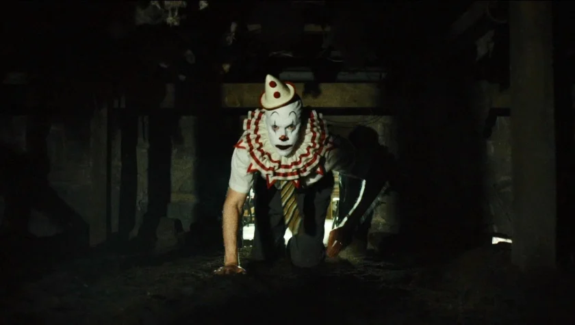
In the realm of modern prestige television, horror is often relegated to the shadows or the supernatural. However, in Apple TV+’s Widow’s Bay, the most terrifying element isn’t always what lurks in the dark—it is the very walls, floors, and geography of the island itself. While the sight of Tim Baltz in smeared clown makeup provides an immediate, visceral jolt, the show’s true power lies in its architectural manipulation, a feat orchestrated by veteran production designer Steve Arnold and a team dedicated to making New England’s "best-kept secret" feel like a living, breathing trap.
Main Facts: A Masterclass in Tonal Precision
Widow’s Bay, created by Katie Dippold and directed by the visionary Hiro Murai, follows the descent of Mayor Tom Loftis (Matthew Rhys) as he attempts to revitalize a sleepy, accursed New England island by transforming it into a high-end tourist destination. In doing so, he inadvertently awakens ancient, subterranean forces that have long simmered beneath the town’s quaint exterior.
To bring this "accursed island" to life, the production turned to Steve Arnold, a designer whose eclectic resume includes the psychological rigors of Mindhunter, the spiritual dread of Midnight Mass, and the blockbuster aesthetics of Sam Raimi’s original Spider-Man. For Widow’s Bay, Arnold was tasked with a unique challenge: creating a world that felt "Dr. Caligari strange" without losing its grounding in reality.

The show excels by avoiding over-the-top gothic tropes. Instead, it relies on "forced perspective," period-accurate set dressing, and a philosophy of "analog horror." By prioritizing physical builds over digital environments, the production team created a space where the characters—and the audience—feel physically swallowed by their surroundings.
Chronology of Creation: From Concept to Claustrophobia
The aesthetic journey of Widow’s Bay began with a specific mandate from creator Katie Dippold and director Hiro Murai. They wanted a look that was expressive but restrained. Arnold describes the initial goal as avoiding sets that were "too dramatic" in a traditional sense. Instead, they sought a subtle, creeping wrongness—a world that looks normal at a glance but reveals its teeth upon closer inspection.
The Influence of German Expressionism
Early in the pre-production phase, the team looked to the silent era, specifically The Cabinet of Dr. Caligari. The goal was to imbue the sets with a sense of "sudden threat." This meant that while most of the town of Widow’s Bay looks like a standard coastal village, certain interiors were engineered to shift tonally as the narrative tension escalated.

The Construction of the Breakwater Hotel
By the time the production reached Episode 2, "Lodging," the need for total environmental control became paramount. Rather than filming in a real New England inn, Arnold advocated for a complete interior build of the "Breakwater Hotel." This allowed the team to manipulate every variable:
- Lighting: Integrated fixtures that could dim or shift color to unsettle the protagonist.
- Layout: Hallways designed to feel either cavernously empty or impossibly narrow.
- The "Captain’s Suite": A room filled with an absurd number of tiny, unnecessary closets, creating a sense of hidden spaces and voyeurism.
The Shift to Period Horror
As the series progressed into Episode 6, "Our History," the chronology shifted back to the island’s frontier roots. Directed by Ti West, this episode required a transition from the modern "tourist trap" aesthetic to a stark, austere past. Arnold’s team utilized heritage sites like the Rebecca Nurse Homestead but redressed them to strip away any sense of "museum-quality" comfort, replacing it with the raw, sharp-angled reality of early settler life.
Supporting Data: The Mechanics of "Forced Perspective"
One of the most talked-about sequences in the series involves Mayor Loftis (Rhys) navigating a crawl space beneath the Breakwater Hotel. To achieve the desired level of panic, Arnold utilized "production design sorcery" known as forced perspective.

The Crawl Space Engineering
In a move that mirrors the psychological breakdown of the characters, the crawl space set was built with a sloping floor that rose upward while the ceiling sloped downward. As the character moved deeper into the space, the physical dimensions literally shrank around him.
- Movable Walls: The back wall of the set was on a track, allowing the crew to extend the depth of the tunnel mid-scene, making the character’s journey feel infinite and increasingly hopeless.
- The Stone Room: This subterranean location was adjusted with similar geometry to create a "What’s going on here?" reaction from the viewer, utilizing non-Euclidean angles that defy natural logic.
The Geography of the Hand
Perhaps the most subtle piece of "supporting data" in the show’s design is the map of Widow’s Bay itself. When tasked with designing the island’s shape, Arnold took a primitive, analog approach. He placed his own hand on a piece of paper, traced the outline, and then "ruggedized" the edges to make it look like a natural landmass.
Online "sleuths" and fans have since pointed out that the island resembles a skeletal hand gripping the sea. Arnold confirmed this intentionality, noting that the design represents a hand that has "gripped the lives of all these people… they can’t get away."

Official Perspectives: The Creator and Designer’s Philosophy
In interviews regarding the show’s visual identity, Steve Arnold emphasizes a "gut feeling" developed over 42 years in the industry. His approach to Widow’s Bay was rooted in the tangible.
The Rejection of Digital
"I still draw everything by hand with a pencil," Arnold told IndieWire. "There’s a different connection, and it’s hard to describe what is missing when it’s done digitally. Digital is good for many things. But when I’m drawing something, I start figuring it out."
This philosophy extended to the set dressing. Arnold was "adamant" about including vintage phone booths and analog board games. These items serve a dual purpose: they evoke a sense of nostalgia that is "comforting yet creepy" and highlight the isolation of the island. In a world of smartphones, a broken phone booth is a monument to the inability to call for help.

Collaboration with Directors
The synergy between Arnold and directors like Hiro Murai and Ti West was essential for the show’s "butcher knife" lighting. In Episode 6, Betty Gilpin’s Sarah Warren is often framed in slivers of light that cut through the darkness of the period cabins. Arnold designed these spaces specifically to facilitate these "sharp angles," ensuring that the production design and the cinematography were in a constant, terrifying conspiracy.
Implications: The Legacy of New England Gothic
The success of Widow’s Bay’s production design has broader implications for the television industry, particularly regarding the "Analog Horror" trend. By choosing to build sets like the Breakwater Hotel and repurposing physical locations (such as turning a modern lobster shack into a 19th-century dock), the show demonstrates that physical craftsmanship often outweighs CGI in creating lasting psychological impact.
Budgetary Efficiency vs. Narrative Cohesion
The production’s clever reuse of sets—expanding the Breakwater basement into the town hall’s emergency shelter for the finale—proves that budgetary constraints can actually foster creativity. This interconnectedness of sets mirrors the interconnectedness of the island’s history; the characters are literally walking through the repurposed bones of their ancestors’ failures.

The "Presence" of the Set
Ultimately, the design of Widow’s Bay suggests that a location can be a character in its own right. The "Presence" Arnold injected into the rooms—through off-color combinations, handmade furniture, and claustrophobic hallways—affects the performances of actors like Matthew Rhys and Betty Gilpin. When a set is built to physically close in on an actor, the resulting claustrophobia isn’t just "acting"—it’s a visceral reaction to the environment.
As Widow’s Bay continues to stream on Apple TV+, it stands as a testament to the power of traditional production design. It reminds us that while monsters are scary, a room that doesn’t want you to leave is much, much worse. Steve Arnold and his team haven’t just built a set; they’ve built a trap that the audience is all too happy to step into.