The Industrial Echo: How a Humble Train Stencil Forged a Bold New Identity for Helsinki’s Train Factory
Helsinki, Finland – In the ever-evolving landscape of brand identity, the pursuit of the perfect logo can often feel like chasing a fleeting muse. Yet, for the creative minds at hasan & partners, the spark of inspiration for their latest project, "The Train Factory," was found not in a grand vision, but in the utilitarian markings of industrial history. This transformative rebranding of a historic locomotive manufacturing site into a vibrant hub of food, drink, sport, and culture showcases a masterful blend of historical reverence and contemporary design, proving that even the most unassuming elements can form the bedrock of a powerful brand.
The challenge presented by Train Factory was significant. Situated in the heart of Helsinki, the sprawling complex was once the engine room of Finnish rail engineering, a place where countless locomotives, the very arteries of national transport, were forged. This rich industrial past, however, could have easily led to a design that was either overly literal or steeped in a nostalgia that failed to resonate with a modern audience. Instead, hasan & partners embarked on a journey to unearth the site’s soul, seeking a unique narrative that would breathe new life into its storied walls.
Unearthing the Core: The Power of the Unseen
The genesis of any successful brand identity lies in deep research and an understanding of the client’s essence. For hasan & partners, this meant delving beyond the obvious historical markers of the train factory. They recognized that true character often resides in the subtle, often overlooked details that define a space’s operational history. It was within this meticulous examination that they discovered their muse: a small, unpretentious graphic etched onto the sides of train cars. This was not an emblem of pride or a testament to engineering prowess, but a purely functional symbol – a mark indicating the precise points where a vehicle could be safely lifted for maintenance.
This utilitarian symbol, invisible to the casual observer yet critical to the daily operations of the factory, resonated deeply with the design team. It represented a hidden language, a silent testament to the site’s industrial purpose. The brilliance of hasan & partners’ approach was their ability to see beyond its practical application and envision its potential as a symbolic anchor for a new era.
A Symbol Reimagined: From Mechanic to Metaphor
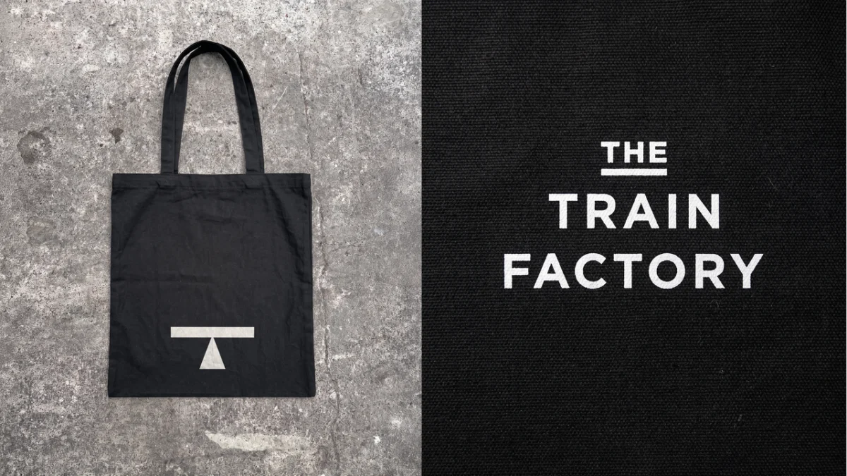
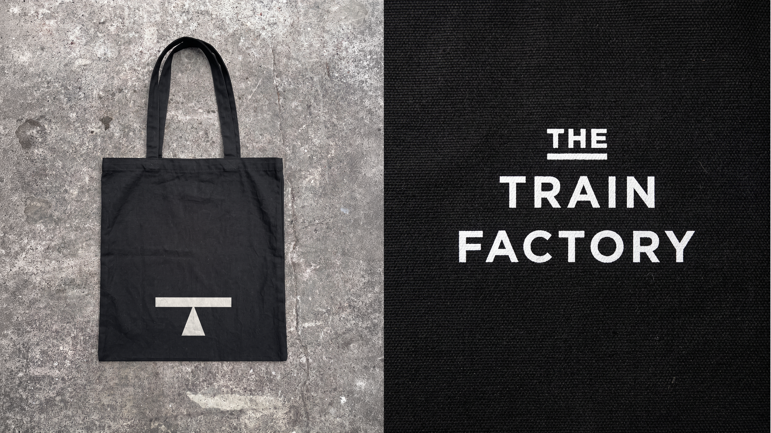
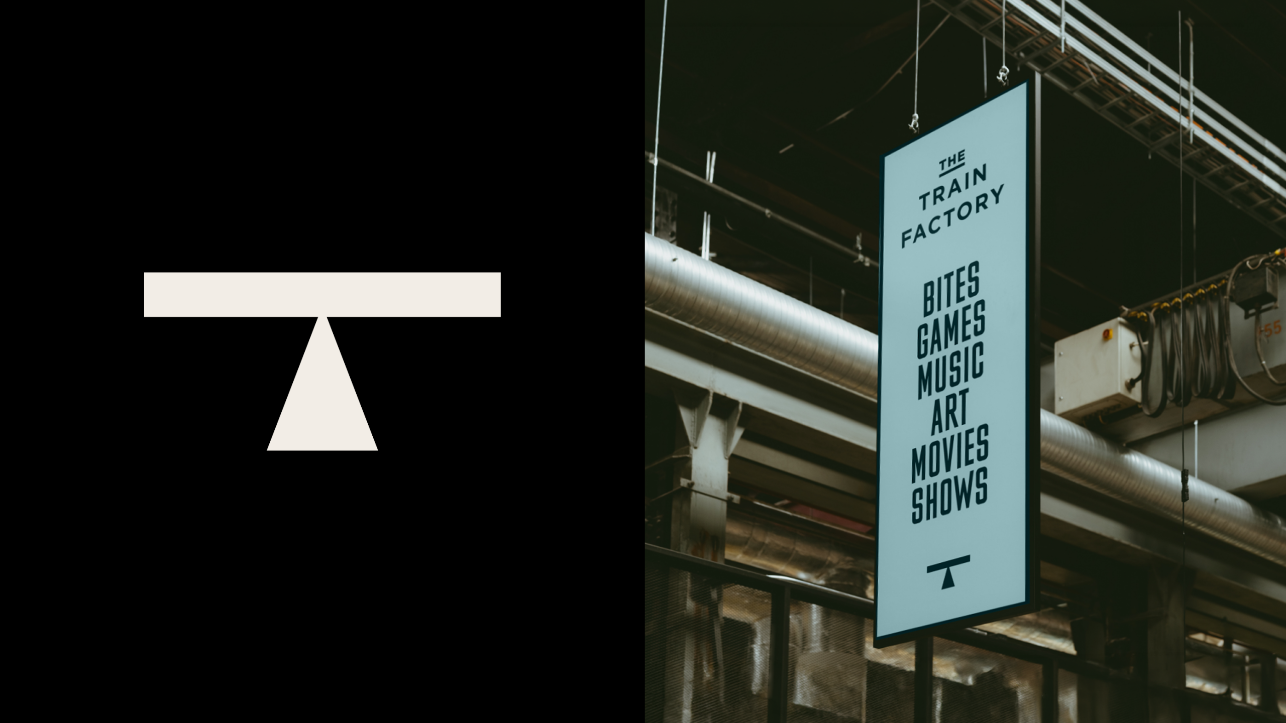
The transformation of this humble lift point graphic into the primary "T" logo for The Train Factory is a masterclass in conceptual design. The original mark, designed for clarity and function, possessed an inherent geometric strength. hasan & partners meticulously refined this utilitarian form, retaining its core structure while imbuing it with a modern aesthetic. The result is a logo that is both instantly recognizable and deeply symbolic.
The "T" logo, in its clean, minimalist rendition, speaks to the industrial heritage of the site. Its angularity and starkness evoke the machinery and precision that once defined the manufacturing halls. Yet, it also signifies a new beginning, a forward-looking identity that embraces the multifaceted offerings of The Train Factory. This is not merely a letter; it is a testament to the power of repurposing, a visual metaphor for elevating the past into a vibrant present.
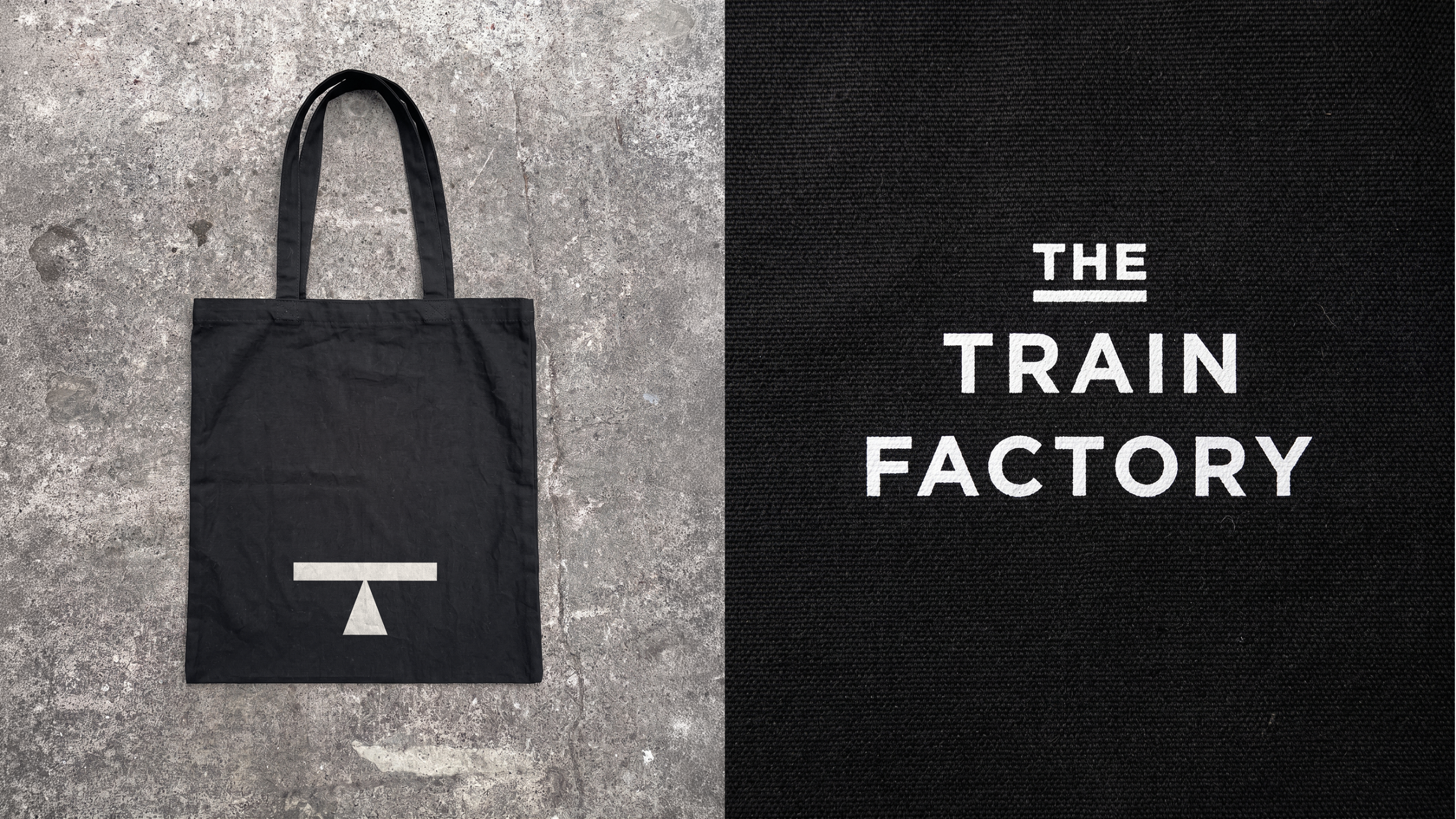
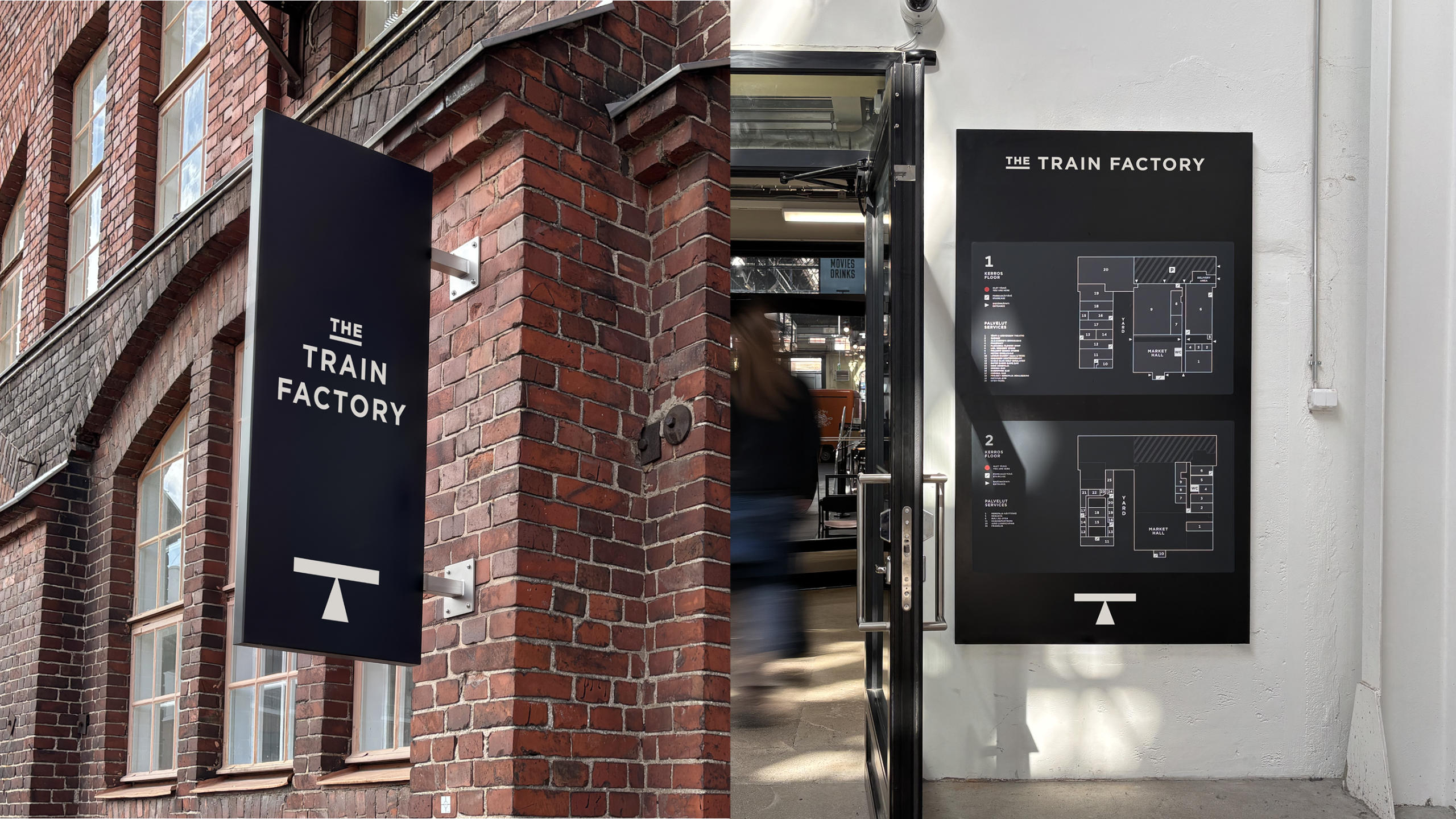
The logo’s application across various touchpoints further amplifies its impact. From the discreet embroidery on a chef’s uniform to the bold signage adorning the building’s exterior, the "T" becomes a consistent thread, weaving together the diverse elements of The Train Factory. It serves as a silent narrator, whispering tales of its industrial origins while boldly proclaiming its new identity as a destination for contemporary experiences.
The Industrial Canvas: A Space Reborn
The Train Factory itself is more than just a venue; it is a living testament to the power of adaptive reuse. The historic locomotive manufacturing site, a colossal structure of brick and steel, has been meticulously reimagined to accommodate a dynamic mix of culinary delights, vibrant sporting events, and engaging cultural experiences. The architectural integrity of the original building has been preserved, allowing the raw, industrial aesthetic to coexist harmoniously with modern amenities.
The pale blue hanging sign that proudly proclaims "The Train Factory, Bites Games Music Art Movies Shows" suspended from exposed ductwork is a prime example of this synergy. It elegantly bridges the gap between the site’s utilitarian past and its multifaceted present, hinting at the diverse offerings within. Similarly, the wayfinding signage, mounted on the weathered red brick exterior, not only guides visitors but also pays homage to the building’s enduring character.
The interior spaces are a testament to thoughtful design, where industrial elements like exposed concrete and metalwork are juxtaposed with contemporary furnishings and vibrant lighting. This creates an atmosphere that is both raw and sophisticated, a unique environment that stimulates the senses and encourages exploration. The presence of an outdoor seating area, sheltered by rows of grey umbrellas and overlooking the imposing red brick facade, further emphasizes the integration of the past and present, offering a tranquil space to enjoy the offerings within the historic walls.
The Philosophy of Purposeful Design: Beyond the Trend
The success of The Train Factory’s brand identity also offers a valuable commentary on contemporary design trends. The article touches upon the discourse surrounding the perceived decline of minimalist, geometric, sans-serif logos. While acknowledging that this style has, at times, been overused and unthinkingly applied, particularly within the tech industry, it firmly refutes the notion that such design principles are inherently flawed.
The critical distinction, as highlighted by the Train Factory case study, lies in the reason behind the design choice. A minimalist sans-serif is not inherently weak; it becomes so when adopted as a mere trend, devoid of a deeper connection to the brand’s narrative. In the case of The Train Factory, the sans-serif typography is not a superficial choice; it is an organic evolution from a historically significant graphic. It carries the weight of the site’s industrial legacy in its very form, giving it an authenticity and depth that transcends fleeting trends.
This approach underscores a fundamental principle of effective branding: the identity must be rooted in the core of the business, not dictated by external fads. The choice of a clean, geometric aesthetic for The Train Factory is not arbitrary; it is a deliberate and meaningful decision that amplifies the brand’s story and resonates with its environment.
The Enduring Legacy: More Than Just a Logo
The branding of The Train Factory is a powerful reminder that great design is about more than just aesthetics; it’s about storytelling and creating meaningful connections. The hasan & partners’ ability to transform a mundane industrial marking into a compelling brand symbol is a testament to their creative vision and strategic thinking.
This project demonstrates that even in an era saturated with design trends, there is immense value in looking to the past for inspiration. By unearthing the unique history of a place and finding meaning in its forgotten details, designers can craft identities that are not only visually striking but also deeply resonant and enduring. The Train Factory, through its revitalized identity, stands as a beacon, proving that when design is infused with purpose and history, it can elevate the ordinary into the extraordinary, creating a truly unforgettable experience for all who enter its storied walls. The "T" logo, born from the functional needs of a bygone era, now proudly heralds a new chapter of innovation, culture, and community within Helsinki’s iconic industrial heart.