
From Coolers to Culture: Yeti and Wieden+Kennedy Portland Unveil the ‘Four Letters’ Brand Platform
In the landscape of modern consumer goods, few brands have managed to transition from a niche utilitarian tool to a global lifestyle signifier as effectively as Yeti. Founded on the simple premise of building a cooler that wouldn’t break, the Texas-based company has evolved into a powerhouse of “gorpcore” and outdoor enthusiast culture. Their latest move, a sprawling brand campaign titled “Four Letters,” developed in partnership with the legendary creative agency Wieden+Kennedy Portland, signals a definitive new chapter in the brand’s history.
By deconstructing their iconic four-letter wordmark and reimagining it through the lens of various subcultures, Yeti is no longer just selling insulation; they are selling the grit, determination, and identity of the people who use their products.
Main Facts: The ‘Four Letters’ Campaign
The centerpiece of the new "Four Letters" platform is a high-octane, one-minute anthem film that serves as a visceral tribute to the brand’s diverse user base. While Yeti’s origins are deeply embedded in the world of professional angling and hunting, this campaign marks a deliberate pivot toward a broader definition of "the outdoors."
The Creative Concept
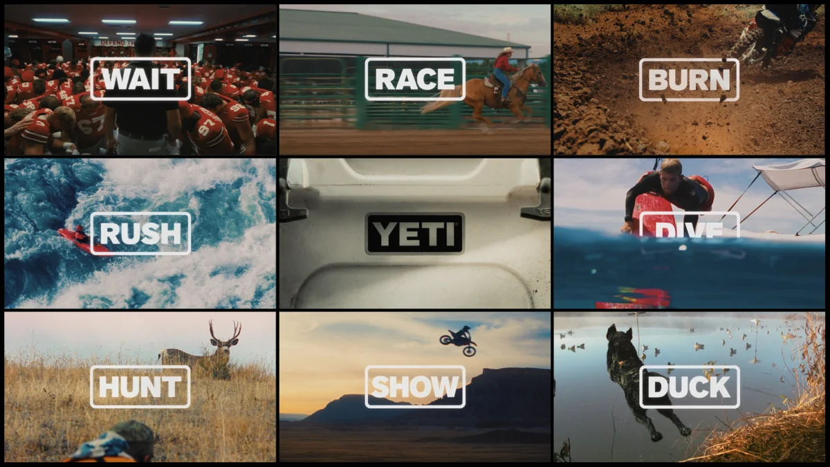
The campaign’s brilliance lies in its simplicity. The Yeti logo—a bold, sans-serif four-letter word—is used as a typographic anchor. Through clever editing and motion graphics, the word "YETI" transforms into other four-letter verbs and nouns that define the lives of its customers. These include:
- RACE: Representing the high-stakes world of competitive cycling and automotive sports.
- RIDE: A nod to the equestrian, mountain biking, and skating communities.
- HOLD: Capturing the physical tension of rock climbing and weightlifting.
- DIVE: Highlighting the brand’s continued relevance in aquatic and marine environments.
The Production Powerhouse
To execute a vision of this scale, Yeti once again tapped Wieden+Kennedy Portland, the agency responsible for some of the most iconic sports and lifestyle marketing in history (most notably for Nike). The campaign features a fast-paced montage of real-world "doers." The production credits reflect a "who’s who" of high-end commercial post-production:
- Agency: Wieden+Kennedy Portland
- Editorial: Cartel
- VFX: Pariah
- Color: Trafik
The film eschews the traditional "product shot" in favor of "lifestyle in action." Rather than focusing on the ice-retention capabilities of a Tundra cooler, the camera lingers on the sweat of a chef in a high-pressure kitchen and the dust kicked up by a stunt jumper.
Chronology: The Evolution of an Outdoor Icon
To understand the significance of the "Four Letters" campaign, one must look at the meteoric rise of Yeti since the mid-2000s.
2006: The Genesis
Brothers Roy and Ryan Seiders founded Yeti in 2006 out of sheer frustration. As avid outdoorsmen, they were tired of the handles breaking off their coolers and the lids caving in during fishing trips. They decided to build a cooler that was "over-engineered"—a rotomolded beast that could withstand a bear attack and keep ice frozen for days. The original Tundra cooler was priced at $300, a staggering sum at a time when most coolers cost $30.
2010–2015: The Cult of the Cup
While the coolers built the brand’s reputation for toughness, the introduction of the Rambler tumblers and drinkware allowed Yeti to enter the daily lives of millions. The brand moved from the back of a pickup truck to the office desk and the suburban kitchen. By 2015, Yeti had become a status symbol, with its logo appearing on hats, shirts, and window decals across the United States.
2023: “Don’t Get Them A Yeti”
Last year, Yeti and W+K Portland launched a provocative campaign titled “Don’t Get Them A Yeti.” The campaign’s premise was that Yeti products are so durable and specialized that you shouldn’t buy one for someone who isn’t truly dedicated to their craft. It was a masterclass in "anti-marketing" that reinforced the brand’s premium, "built-for-the-pro" positioning.
2024: The Launch of “Four Letters”
The current campaign represents the culmination of this evolution. Having established that their products are "over-built," Yeti is now focusing on the emotional and psychological drive of its users. The "Four Letters" platform is designed to be evergreen, allowing the brand to swap in new four-letter words as they expand into new markets and communities.
Supporting Data: The Business of “Doing”
Yeti’s expansion into broader lifestyle categories is backed by significant market shifts and financial performance.
Market Diversification
According to industry reports, the "premium outdoor" market has seen a 15% year-over-year growth as consumers increasingly prioritize durability and brand heritage over low prices. Yeti’s pivot to include chefs, skaters, and surfers is a strategic response to the "gorpcore" trend—a fashion movement where functional outdoor gear is worn in urban environments.

Financial Resilience
In its recent quarterly earnings, Yeti has shown a consistent increase in its "Direct-to-Consumer" (DTC) sales. By building a brand that resonates emotionally with specific communities (like the skating or culinary worlds), Yeti reduces its reliance on wholesale retailers and builds a more loyal, high-margin customer base.
The "Four-Letter" Psychology
Marketing experts note that the use of four-letter words in the campaign taps into a primal linguistic shorthand. Four-letter words in English are often associated with action, impact, and sometimes "grit" (itself a four-letter word). By aligning the brand name with these verbs, Yeti creates a cognitive bridge between the product and the user’s personal identity.
Official Responses and Strategic Vision
While Yeti executives often let the creative work speak for itself, the brand’s philosophy has always been centered on the concept of the "Pro."
The "Doer" Philosophy
In previous statements regarding their marketing strategy, Yeti leadership has emphasized that they don’t use "actors" in their commercials. They use "Ambassadors"—real professionals and elite athletes who actually use the gear in the field. This authenticity is the bedrock of the "Four Letters" campaign.
The creative team at Wieden+Kennedy Portland, led by Global CCO Karl Lieberman and ECDs Pierre Jouffray and Derek Szynal, sought to capture the "relentless pursuit" of these individuals. The agency’s goal was to show that whether you are "Riding" a horse or "Holding" a heavy barbell, the common denominator is the need for gear that doesn’t quit.
Creative Commentary
Industry analysts suggest that this campaign is W+K doing what they do best: finding the "soul" of a brand. Just as they turned Nike from a shoe company into a symbol of athletic excellence, they are turning Yeti from a cooler company into a symbol of "the grit it takes to do what you love."
Implications: What This Means for the Future of Retail
The "Four Letters" campaign has several long-term implications for Yeti and the wider retail landscape.
1. Breaking the "Outdoor" Silo
Yeti is successfully moving beyond the "hunting and fishing" category. By including stunt jumpers and urban chefs, they are positioning themselves as a universal brand for anyone who values quality. This significantly increases their Total Addressable Market (TAM). If a product is "hardwearing" enough for a mountain climber, the logic goes, it is certainly high-quality enough for a weekend tailgater or a daily commuter.
2. The Battle for Brand Loyalty
In an era where "dupes" (cheaper imitations) are rampant on social media, Yeti is doubling down on brand equity. You can buy a cheaper cooler that looks like a Yeti, but you can’t buy the culture or the "Four Letters" association. This campaign is a defensive moat against lower-priced competitors like Stanley or Ozark Trail, focusing on the meaning of the logo rather than the specs of the lid.
3. A Template for Global Expansion
The "Four Letters" concept is remarkably scalable. As Yeti expands further into European and Asian markets, the campaign can be easily adapted. The imagery of a person "Diving" or "Racing" is universal, transcending language barriers while keeping the iconic four-letter logo at the center of the narrative.
4. Setting a New Standard for Production
The cinematic quality of the "Four Letters" anthem sets a high bar for outdoor brands. By employing top-tier VFX and color grading houses, Yeti is signaling that it views its brand communications as "content" rather than just "advertising." This aligns with the modern consumer’s preference for storytelling over hard-selling.
Conclusion
Yeti’s "Four Letters" campaign is more than just a clever play on a logo; it is a declaration of identity. By aligning its name with the verbs of action—Race, Ride, Hold, Dive—the brand has successfully transitioned from a piece of equipment to a partner in the pursuit of passion. Under the creative guidance of Wieden+Kennedy Portland, Yeti has proven that in the world of branding, sometimes the most powerful stories are the ones told with the fewest letters. As the brand continues to grow, it remains anchored by the same grit that started it all in 2006, proving that while their audience may change, the "YETI" name remains a shorthand for excellence.


Leave a Comment