
Gotham Variable: A Revolution in Typographic Flexibility and Expression
Monotype unveils a monumental upgrade to its iconic typeface, ushering in a new era of design control with Gotham Variable.
In the dynamic landscape of graphic design, where adaptability and precise expression are paramount, Monotype has unveiled a significant evolution of one of its most celebrated creations: Gotham Variable. This groundbreaking update to the universally recognized Gotham typeface promises to redefine typographic flexibility, offering designers unprecedented control over weight and width through a single, highly optimized file. Gotham Variable represents not just an iteration, but a fundamental leap forward, building upon a legacy of widespread adoption and cementing its place at the forefront of contemporary communication.
A Legacy Forged in Global Communication
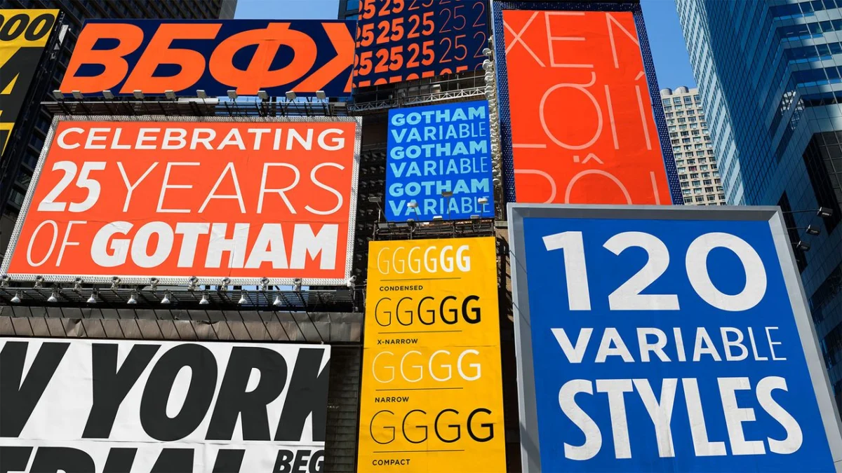
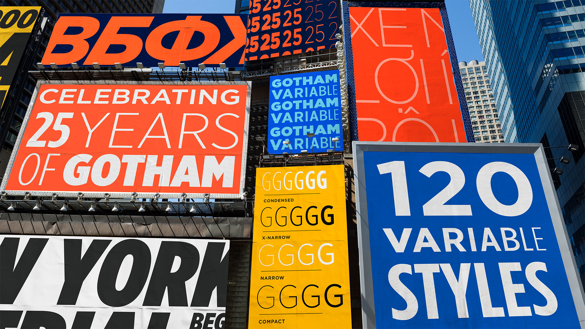
Gotham, originally conceived by Jonathan Hoefler and Tobias Frere-Jones and released by Hoefler & Co., has become an indispensable element in the fabric of global communication since its debut on the January 2001 cover of GQ magazine. Its distinctive humanist sans-serif aesthetic, characterized by geometric forms and a friendly yet authoritative presence, has resonated with a diverse array of prominent entities. From the streaming giant Netflix and the global beverage icon Coca-Cola to the United States Postal Service and the venerable television institution Saturday Night Live, Gotham has consistently lent its voice to some of the world’s most impactful brands and organizations. Now, twenty-five years after its inception, this enduring typeface embarks on a new chapter, poised to empower designers with a fresh dimension of creative freedom and seamless adaptability.
The Power of Variable: Consolidation and Control
The core innovation of Gotham Variable lies in its consolidation of numerous static font files into a single, streamlined entity. This architectural shift offers a cascade of benefits, most notably enhanced performance. By reducing the number of files required, Gotham Variable significantly accelerates load times, a critical factor in today’s fast-paced digital environment. Furthermore, this consolidation simplifies implementation across a multitude of platforms and devices, ensuring a consistent and polished typographic experience regardless of the context.
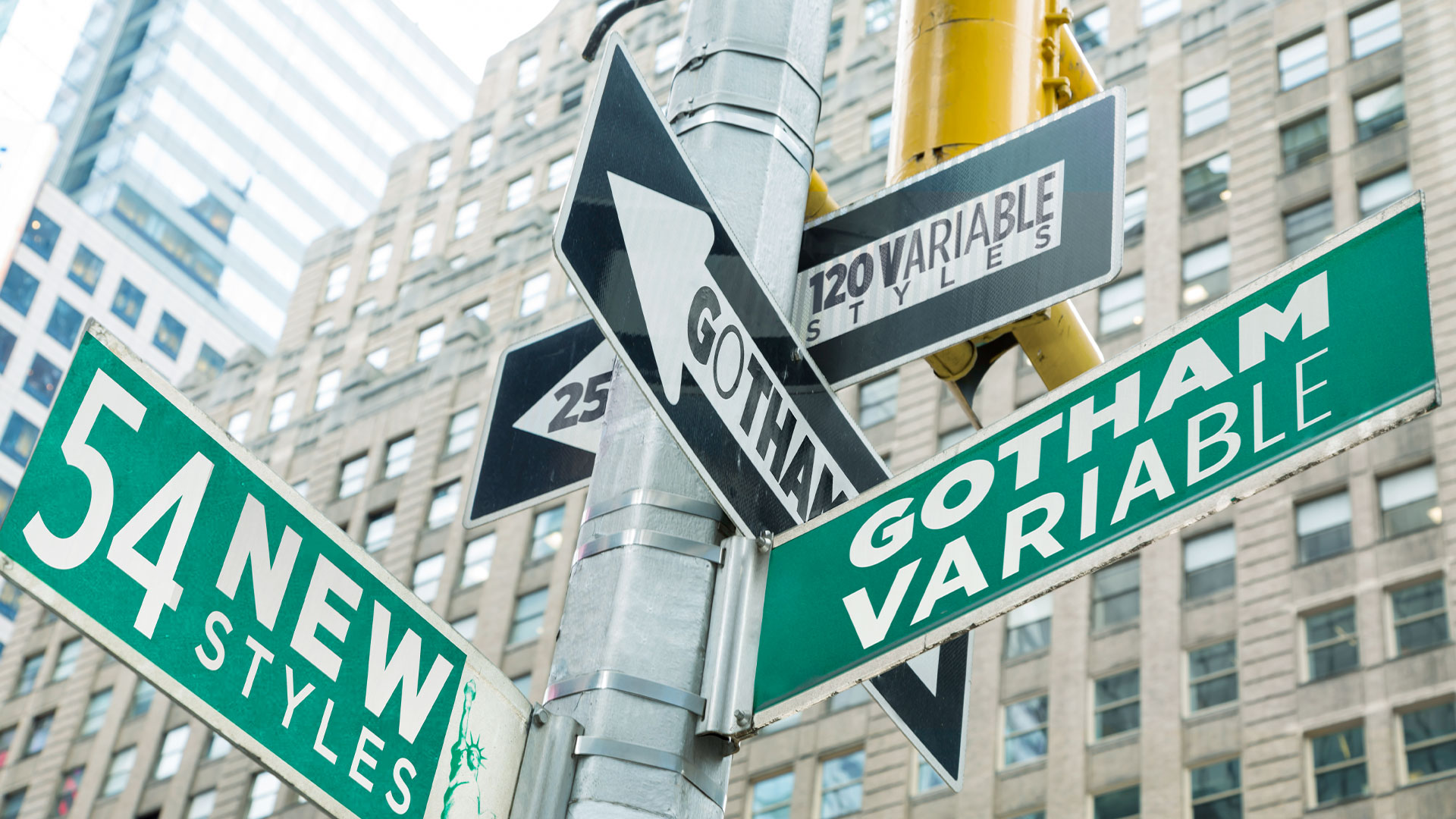
Beyond its technical efficiencies, Gotham Variable boasts unparalleled adaptability. It seamlessly integrates across various screens, operating systems, and design contexts, all while meticulously preserving the beloved and instantly recognizable qualities of the original Gotham. The introduction of 54 new intermediate styles is a testament to this enhanced adaptability. These additions include subtle, nuanced variations in weight, offering finer gradations for precise visual hierarchy, alongside a newly introduced ‘Compact’ width. This expansion provides designers with an even richer palette of options to perfectly match their creative intent, allowing for micro-adjustments that can significantly impact the overall aesthetic and readability of a design.

The Strategic Timing of an Evolution
The decision to introduce Gotham Variable at this juncture is a deliberate and strategic one, rooted in the maturation of variable font technology. Sara Soskolne, who transitioned from her role as Senior Designer at Hoefler & Co. to Executive Creative Director at Monotype and lead designer for Gotham Variable, articulates the reasoning behind the timing. "We’re at a point with variable fonts where they are more what we have come to expect from a workhorse family, rather than an experiment, an add-on, or a nice-to-have," she explains.
Soskolne further elaborates on the complexities of adapting an established typeface. "Reverse engineering variability into an existing and very widely used family is a trickier task than creating a new family that’s conceived as variable from the start. Since Gotham was not designed with variable functionality in mind, I think it made sense to wait a little to make sure variable fonts had reached a critical mass of adoption and expectation before embarking on creating a variable version of a family like Gotham." This patient approach ensures that the implementation of variable technology is not only technically sound but also aligns with current industry standards and user expectations, maximizing the impact and utility of this significant upgrade.
An Obvious Candidate for Transformation
Gotham’s ubiquitous presence and inherent versatility made it a natural and compelling candidate for this evolutionary leap. "Gotham has spent 25 years earning an extraordinary kind of trust, from political campaigns to billboards, and across some of the world’s most iconic brand identities," Sara Soskolne emphasizes. This deep-seated trust and widespread recognition underscore the importance of a thoughtful and respectful transformation.
The design philosophy behind Gotham Variable was to explore its potential for expansion without sacrificing its core identity. "With Gotham Variable, we tried to imagine what this typeface could become without losing sight of its powerful legacy," Soskolne states. "Many of the styles in Gotham Variable have never existed before. Making them feel like they always belonged was the hardest part, and the most essential." This commitment to maintaining the typeface’s intrinsic character while introducing new possibilities speaks to the meticulous craftsmanship and deep understanding of Gotham’s DNA that informed the development process.
Expanding Horizons: Language Support and Enhanced Glyphs
Beyond its core variable functionality, Gotham Variable introduces significant enhancements to its language support. This expanded coverage now includes Vietnamese, a language characterized by complex diacritics, stacked accents, and tone marks. The successful integration of these intricate typographic elements ensures that Gotham Variable can serve a broader global audience with the same clarity and aesthetic appeal. Furthermore, the typeface has seen enhancements to its Cyrillic and Bulgarian character sets, further solidifying its international reach and usability.
Jordan Bell, a Senior Type Designer at Monotype, highlights the challenges and triumphs associated with this linguistic expansion. "Adding language support to an existing typeface family is no quick and easy task. Getting the proportion and style right for these new glyphs was essential to stay true to Gotham’s DNA. Particularly for the hook and horn, matching Gotham’s expressiveness was key," he notes. This dedication to detail ensures that the new glyphs are not merely functional additions but are seamlessly integrated, maintaining the typeface’s distinctive personality.
A Personal Journey Through Gotham’s Evolution
For Sara Soskolne, the development of Gotham Variable represents a deeply personal and ongoing connection with the typeface. Her relationship with Gotham spans nearly two decades, beginning with her early collaborations on its expansion. This journey involved incremental forays, such as the addition of extended numeric sets and expanded Latin language support. It progressed to the significant undertaking of filling the width range between Gotham’s original and Condensed extremes, culminating in the release of its full 66 static styles in 2009. Later, this family was further expanded to encompass Greek and Cyrillic scripts for the 2015 release.
More recently, Soskolne’s work with Manual Creative on bespoke decorated styles of Gotham Condensed for the Obama Foundation provided a valuable opportunity to revisit and re-engage with the typeface. This project served as a crucial testing ground, allowing her to explore the limits of Gotham’s adaptability while ensuring it retained its core essence, ultimately paving the way for the new Variable expansion.
Living in New York City, Soskolne also benefits from a constant, personal connection to Gotham’s vernacular sources in the city’s signage. This proximity to the typeface’s origins provides a unique perspective and a continuous source of inspiration, grounding her professional work in a tangible, lived experience. "And, living in NYC this whole time, on a personal level I’ve had the good fortune of living with some of Gotham’s vernacular sources in signage around the city, to the extent these still exist," she shares.
Navigating the Nuances: Technical and Design Challenges
The development of Gotham Variable was not without its challenges, primarily stemming from the intricate process of integrating new functionalities onto an established design. "To my mind, the main challenges came from the fact of grafting things like variability and Vietnamese language support onto an existing family," Sara Soskolne candidly admits.

The introduction of variable functionality meant that the subtle design adjustments previously hidden within the spaces between static styles were now exposed and accessible to users. "Suddenly all the spaces in between Gotham’s static styles – which were where we hid the sleight of hand involved in making them look the way they do – are now visible and completely accessible to users," she explains. "So we had to be very intentional and critical about how that was handled." This required a meticulous re-evaluation of the typeface’s underlying structure to ensure that the transitions between different weights and widths were smooth, aesthetically pleasing, and maintained the intended character.
The integration of Vietnamese support presented its own set of complexities. "In adding Vietnamese support, because it’s a language that includes stacked accents (which often require more vertical space to incorporate), but we couldn’t go changing the line height of Gotham, we needed to include these across the whole design space without them feeling cramped or crowded," Soskolne notes. This constraint necessitated innovative solutions to accommodate the necessary vertical space for accents without compromising the typeface’s overall proportions or forcing undesirable line spacing adjustments.
Underlying these specific challenges was the constant temptation to overhaul foundational design choices. "Underlying all of this is the temptation, once you’re opening up the hood, to turn this into a Gotham 2.0 and revisit some of those very early decisions that are causing some trouble later on," Soskolne acknowledges. However, the team prioritized continuity and backward compatibility. "But we agreed very early on to keep this new expansion fully backwards compatible and only expand what’s available to users, not to change anything that existed previously, which I think was absolutely the right call." This commitment to preserving the original design’s integrity while introducing new possibilities is a hallmark of successful typographic evolution.
The Pinnacle of Pride: A Beloved Family Reimagined
When asked about her proudest achievement with Gotham Variable, Sara Soskolne’s response is heartfelt and comprehensive. "I’m probably most proud of how this all came together to create a variable version of such a beloved family that still feels utterly like Gotham at every moment." This sentiment speaks volumes about the delicate balance achieved between innovation and fidelity.
As someone who has become a custodian of Gotham over the years, rather than one of its original creators, Soskolne feels a profound responsibility to the typeface’s foundational intent and DNA. "Since I wasn’t one of the original designers of Gotham, but have increasingly become its custodian over the years, I have a deep sense of responsibility to the intent behind it and the DNA that was created by those original designers," she explains. This sense of stewardship makes the process of adding new styles more challenging but also more rewarding when executed successfully.
Among the specific elements she is particularly excited about is the new ‘Compact’ width. Designed to offer the visual efficiency of narrower spacing while retaining the aesthetic characteristics of the original width, it represents a subtle yet impactful improvement for text setting. "So, I’m particularly excited about the new Compact width we’ve added in between the original and Narrow widths, which is meant to visually look just like the original width but set more efficiently in text," she shares.
Soskolne also finds enduring fascination in the variable width slider’s dynamic interplay. "And even after staring at it for months, I never get tired of playing with the variable width slider and watching those stroke endings change their orientation in between the Extra Narrow and Condensed. There’s still plenty sleight of hand in this version, we just had to find different places to hide it!" This playful yet precise manipulation of form underscores the sophisticated engineering and artistic vision embedded within Gotham Variable.
Accessibility and Further Exploration
Gotham Variable is now readily available through Monotype’s comprehensive platforms, including Monotype Fonts, Monotype Connect, and MyFonts. This widespread accessibility ensures that designers across the globe can readily incorporate this powerful new tool into their workflows.
For those seeking a deeper understanding of this transformative update, Monotype offers extensive resources. Further details and insights into the evolution of Gotham Variable can be found by visiting Monotype’s dedicated page.
The advent of Gotham Variable marks a significant milestone in the evolution of digital typography. It stands as a testament to Monotype’s commitment to innovation, their respect for typographic legacy, and their dedication to empowering designers with tools that foster creativity, efficiency, and unparalleled expressive control. This is not merely an update; it is a fundamental reimagining of a modern classic, poised to shape the visual landscape for years to come.


Leave a Comment