
The Architecture of Play: Ben Sears and the Evolution of the "Young Shadow" Universe
The landscape of contemporary independent comics is often divided between the hyper-detailed realism of graphic memoirs and the slick, vectorized efficiency of commercial children’s literature. However, a third path exists—one defined by atmosphere, tactile geometry, and a profound understanding of the "language of drawing." At the forefront of this movement is Ben Sears, whose latest release, Young Shadow & The Watchdogs, marks a significant evolution in a career characterized by visual finesse and a playful subversion of genre tropes.
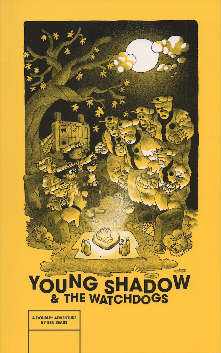
Published by Fantagraphics, Young Shadow & The Watchdogs serves as a sequel to Sears’ previous superhero-adjacent outing, Young Shadow. Yet, rather than doubling down on the punching and "straightforward superhero action" of its predecessor, this new volume takes a lateral step into a world of sports-inflected supernaturalism. It is a work that prioritizes character interiority and environmental storytelling, confirming Sears’ status as one of the most evocative stylists in the medium today.
Main Facts: A Haunted Diamond and the "Watchdogs"
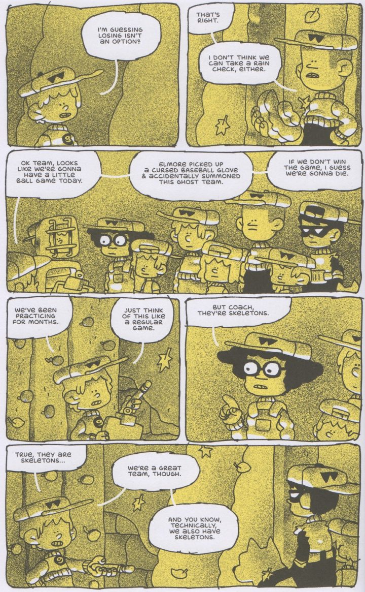
At its core, Young Shadow & The Watchdogs is a narrative of high-stakes necromancy disguised as a youth sports story. The premise is reminiscent of a classic Halloween special: a cast of children, known as the Watchdogs, inadvertently summon spirits from beyond the grave using a haunted baseball glove. To survive this supernatural encounter, the children must defeat a team of ghosts in a game of baseball.
The book’s release, strategically timed with the start of the professional baseball season, highlights Sears’ ability to blend mundane Americana with the fantastic. The protagonist, Young Shadow—previously established as a nocturnal vigilante—is seen here in a more communal light, playing on a team with his friends. This shift from solo heroism to team dynamics allows Sears to explore the "Watchdogs" as a collective unit, moving away from the "calculated" feel of many modern children’s comics toward something more intuitive and organic.
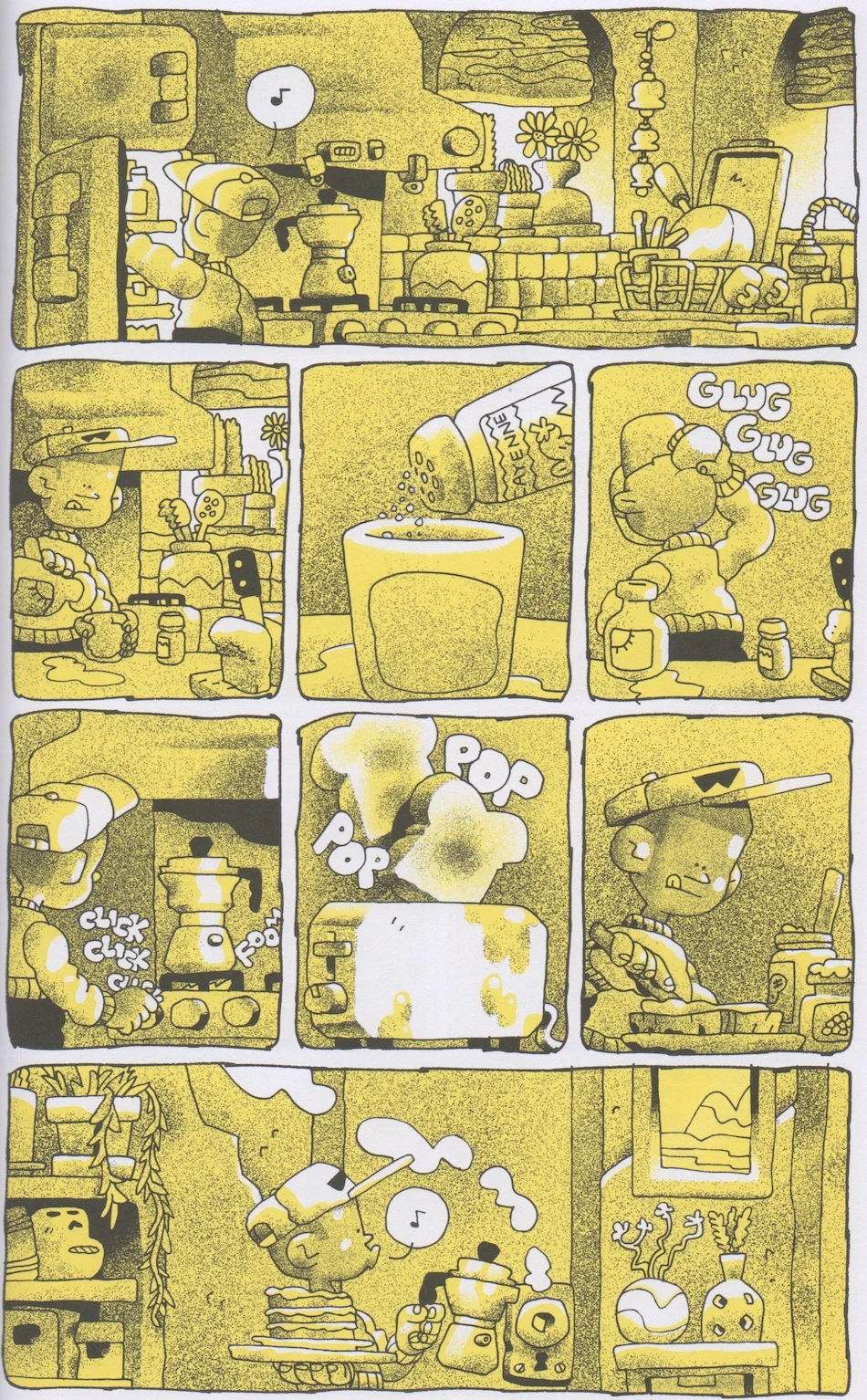
Fantagraphics has opted for a single-color, original paperback treatment for the volume. This format—affordable yet aesthetically "sumptuous"—positions the work as both an accessible entry point for younger readers and a collectible object for art enthusiasts. The color palette has shifted from the orange hues of the first book to a "purer yellow," creating a lambent, atmospheric glow that defines the book’s nighttime setting.
Chronology: From Koyama Press to Fantagraphics
To understand the significance of The Watchdogs, one must trace Ben Sears’ trajectory through the indie comic ecosystem. His early visibility came through the Plus Man books, published by the now-defunct (but legendary) Koyama Press. Those works were characterized by vibrant, full-color palettes and a sense of "daytime" adventure.
Following the Plus Man era, Sears transitioned to Fantagraphics for the first Young Shadow book. This move signaled a shift in tone toward the "low-poly" and the atmospheric. Between these major releases, Sears has maintained a presence in the self-publishing and "minicomic" scene, with titles like Tunnel Vision—a Risograph-printed blue-tone exploration—and Empanada, which featured service-worker protagonists and more adult-oriented anxieties.
Young Shadow & The Watchdogs represents the culmination of these various threads. It retains the "squat" character proportions of his earlier work but infuses them with a greater sense of quietude and geographical exploration. By moving the characters from the animal shelters and rooftops of the first book to the baseball diamond of the second, Sears is building a "Mario Tennis"-style spin-off universe, where the characters remain consistent but the genre framework is fluid.
Supporting Data: The Visual Language of "Spraypaint" and "Bricks"
The most striking element of Sears’ work is his unique rendering style. Critic Brian Nicholson notes a specific "spraypaint tool" aesthetic in Sears’ shading—a scatter-plot of pixels that creates a textured, forgiving edge to the figures. This technique bears a striking resemblance to the faint trace of a fingerprint in a clay figure, evoking the tactile warmth of Aardman Animations (the creators of Wallace & Gromit).
The Influence of Architecture and Gaming
Sears’ visual world is heavily influenced by a "low-poly" video game aesthetic, where the sense of shape in individual elements—like a single brick—contributes to the overall sense of geography. This "Mat Brinkman influence" (referencing the underground cartoonist known for his intricate, maze-like structures) is evident in Sears’ love for architecture. Each building in the Watchdogs’ world feels like it could be explored in a three-dimensional space, providing a sense of immersion that transcends the two-dimensional page.
Color and Light
The choice of a monochrome yellow palette for The Watchdogs is not merely an aesthetic whim. The yellow "wavers" against the spraypaint greytone grain, casting a light that feels both ancient and electric. This "visual world breathes a bit more" than Sears’ previous works, utilizing more quiet panels and less dialogue. By stripping away the distractions of a full-color spectrum, Sears forces the reader to focus on the dimensionality and shape of the environments.
Official Responses and Creative Philosophy
In past dialogues regarding his work, Ben Sears has often been modest about the thematic depths of his character choices. When asked why his protagonists are almost exclusively children, Sears has previously responded with a simple "I don’t know." However, critical analysis suggests a deeper intentionality.
The use of children allows Sears to bypass the "cynicism and complaint" that often bogs down adult-oriented fiction. In Sears’ world, driving around, working in animal shelters, or being a superhero are activities undertaken for the sheer pleasure of exploration. This "freedom to explore" is the hallmark of childhood, and Sears’ work embodies this potential.
Furthermore, Sears’ approach to "All-Ages" content is a deliberate departure from the "simulacrum of reading" found in many modern children’s books. Rather than using simple glyphs and repetitive dialogue, Sears provides a "richness to the environment" that encourages children to examine the art itself. The drawings provide their own language, teaching the reader how to look at the world, how to draw it, and how to understand dimensionality outside the rigid structures of formal education.
Implications: The "Mignola Path" and the Future of All-Ages Comics
The trajectory of Ben Sears’ career invites comparisons to Mike Mignola, the creator of Hellboy. Like Mignola, Sears is a "distinct stylist" whose visual identity is so strong that it can elevate any premise, from a simple baseball game to a complex supernatural epic. The implication is that Sears is currently "doing right by his future self," building a loyal fanbase of young readers who will follow his stylistic evolution for decades to come.
The "Reluctant Reader" Market
There is a growing trend of recommending comics like Young Shadow to "boys who don’t like to read" or "reluctant readers" who prefer video games. Sears’ work, alongside Jason Shiga’s Adventuregame Comics, fills a vital niche. It offers a lack of "character interiority" that appeals to those who prefer action and exploration, yet it provides a visual complexity that rewards deep attention.
Subverting Genre Traps
Perhaps the most significant implication of Young Shadow & The Watchdogs is its refusal to be trapped by the conventions of its genre. It is a sports comic that isn’t really about sports; it is a superhero comic where no one gets punched. By using the "Watchdogs" as a vehicle for atmospheric storytelling, Sears is sidestepping the traps of both the superhero industry and the sanitized world of children’s publishing.
As the book concludes—with the Watchdogs inevitably winning their game and avoiding exile to the underworld—the reader is left with the sense that Sears himself is winning a larger game. He is creating a visual language that is both a "Mario Tennis" to his "Super Mario World" and a profound education in the art of seeing. Whether he continues to follow the "Mignola path" into more atmospheric work or chooses to sharpen his character writing for comedic effect, Sears remains one of the few cartoonists capable of making the "low-stakes" feel utterly essential.

")

Leave a Comment