
The Art and Science of Font Pairing: Avoiding Common Pitfalls for Design Success

In the intricate world of visual design, typography often serves as the silent architect of communication. It’s the subtle whisper that guides the reader, the bold statement that commands attention, and the harmonious arrangement that imbues a brand with personality. Yet, despite its profound impact, the selection and combination of typefaces – known as font pairing – remains a common stumbling block for even seasoned designers. A seemingly minor misstep in this crucial area can lead to a cascade of visual friction, undermining the coherence and impact of an entire brand identity.
This article delves into the nuanced art of font pairing, dissecting the most prevalent mistakes made by designers and offering expert-driven solutions. Drawing on insights from six experienced designers and typographers, we aim to equip creators with the knowledge to navigate this complex landscape and forge compelling typographic systems that resonate with clarity and purpose.
The Subtle Art of Typographic Harmony
The initial impression of a brand identity is often built upon a foundation of strong visual elements: a robust logo, a well-chosen color palette, and a balanced layout. However, as many designers discover, the true magic, or the subtle breakdown, often lies in the interplay of typography. When two fonts are chosen without careful consideration, they can create a low-level visual dissonance that quietly erodes the overall aesthetic. This isn’t merely an issue of personal preference; it’s a fundamental aspect of design that can determine the success or failure of a project.
The consequences of poor font pairing extend beyond mere aesthetics. Inconsistent or jarring typography can confuse the audience, dilute brand recognition, and ultimately, weaken the brand’s message. This article aims to shed light on these common pitfalls, offering practical advice and strategic approaches to elevate your typographic choices from merely functional to truly impactful.
Common Font Pairing Mistakes and How to Avoid Them
The journey to successful font pairing is paved with potential errors. Understanding these common traps is the first step towards crafting harmonious and effective typographic systems.

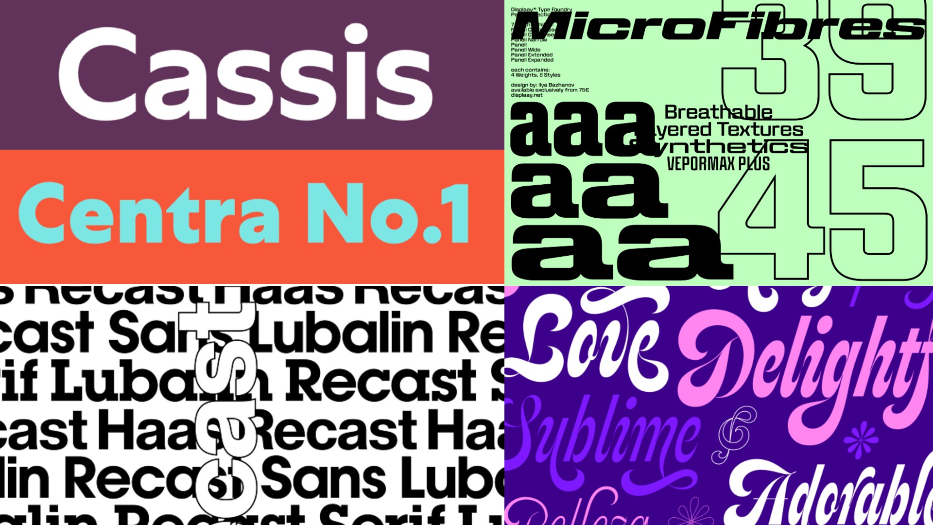
1. The Siren Song of Similarity: Pairing Fonts That Are Too Alike
One of the most insidious mistakes is selecting two typefaces that are superficially similar but subtly different. Imagine pairing two geometric sans-serifs that share a general aesthetic but diverge in minute details – a slightly different x-height, a minor variation in terminal design, or an almost imperceptible difference in stroke weight. This creates a visual "itch" for the observer.
Charlie Beeson, Design Director at FutureBrand, articulates this challenge vividly: "Pairing two geometric sans-serifs that are very similar doesn’t look like a choice; it looks like a mistake. Viewers get hung up on those tiny yet jarring differences in x-heights or terminals, creating a visual itch." The intended effect of distinct typographic voices is lost, replaced by a sense of unease and an unconscious questioning of the designer’s intent.
Alice Munday, Design Director at Curious, echoes this sentiment. "Using two fonts that are too similar in style can create a disjointed feeling, and the decision to be different feels like it lacks intention," she states. "Why use both if they do the same job?" The fundamental principle here is that contrast, when deliberate and well-executed, sharpens the overall design. If the hierarchy between the chosen fonts isn’t immediately apparent, it reads as an accidental juxtaposition rather than a thoughtful pairing.
The Solution: Embrace deliberate contrast. When pairing typefaces, the relationship should be immediately readable and serve a clear purpose. Instead of searching for fonts that are "almost the same," seek out combinations that offer distinct personalities while maintaining a visual dialogue. This might involve pairing a robust serif with a clean sans-serif, or a geometric sans-serif with a humanist one. The key is to ensure that each font possesses its own character, allowing them to complement rather than compete.
2. The Ambiguity of Roles: Failing to Define Clear Responsibilities for Each Font
Even when a font pairing appears aesthetically pleasing, its effectiveness can be undermined if the distinct roles of each typeface within the design system are not clearly defined. When designers are unsure about when to deploy one font over the other, inconsistency inevitably creeps in across various touchpoints, leading to a subtle unraveling of the brand’s visual integrity.
Natasha Lucas, a designer specializing in visual identity, highlights this critical issue: "Problems arise when these roles are left undefined. Designers may begin using typefaces interchangeably or introducing unnecessary variation across touchpoints. This creates inconsistency, weakens the coherence of the brand, and can dilute recognition of the brand voice over time."
Mat Desjardins, founder and creative director at Pangram Pangram, emphasizes that function must always precede aesthetics. "Don’t pair fonts just because they share surface traits like sharp terminals or quirky details," he advises. "Focus on how they behave: proportions, spacing, texture, and purpose within the layout." A well-defined role for each font ensures that one might be designated for headlines, providing impact and drawing attention, while the other serves as the workhorse for body copy, prioritizing readability and flow.
The Solution: Establish a clear typographic hierarchy and assign specific roles to each font. Before you even begin pairing, ask yourself: what is the primary function of each typeface? Will one be used for headlines, another for subheadings, and a third for body text? Or will you employ one font for display purposes and another for more functional text? Clearly defining these roles from the outset will prevent interchangeable usage and ensure that each font contributes meaningfully to the overall design system. Alice Munday adds, "When font pairings contrast each other well, it sharpens the overall design. Each font elevates the other and has a clear role to fill. You aren’t just looking for something totally different, but something different enough to make the other even better."
3. The Cacophony of Clamor: Pairing Fonts That Are Too "Loud"
A common and often overlooked pitfall is the tendency to pair two highly expressive and attention-grabbing display fonts. While each font might possess individual merit, their combined presence can create a cacophony, where both demand to be the focal point, resulting in a loss of clarity and hierarchy.
Charlie Beeson aptly describes this scenario: "This is like hiring two lead singers for the same gig; they just end up shouting over each other. When everything is a hero, nothing is, and the system lacks hierarchy and harmony." The visual impact intended by using bold display fonts is diluted when they compete for attention.
Mat Desjardins concurs, explaining the temptation to combine multiple expressive fonts: "You like one expressive font, then another, and think: why not use both? But unless there’s a very specific concept behind it, combining two loud voices usually creates tension, not hierarchy. A display face can bring character and presence, while a body font should focus on clarity and rhythm. When both try to stand out, they end up competing instead of working together."
The Solution: Embrace the principle of "one speaks, the other listens." In an ideal pairing, one font takes the lead, commanding attention and setting the tone, while the other plays a supporting role, facilitating readability and providing a stable foundation. This means selecting one font that is inherently more expressive or visually dominant for headlines or key messaging, and pairing it with a more subdued, highly legible font for body copy or supporting information. As Mat puts it, "Let one speak, and make sure the other knows when to stay quiet." This strategic approach ensures that the design possesses a clear hierarchy and a sense of visual order.
4. The Serif Stumbling Block: Unthinkingly Pairing Two Serif Typefaces
Pairing two serif typefaces is not inherently a mistake, but it is an area that demands significant expertise and a nuanced understanding of typographic subtleties. Without careful consideration, two serif fonts can easily clash, creating confusion and undermining the intended aesthetic.
Riccardo De Franceschi, Creative Director at Dalton Maag, uses a compelling analogy: "It’s a bit like wearing a jacket and a pair of trousers of slightly different colours. Pulling it off requires complete commitment and detailed knowledge of the nuances." The danger lies in selecting two serifs that are too similar in their origin or style, yet feel disparate in their expression. This can lead to a confusing visual experience for the reader.
The Solution: Opt for deliberate contrast within the serif family, or consider super-families. If you choose to pair two serif fonts, ensure there is a clear, intentional contrast in their characteristics. This could be a difference in historical style (e.g., pairing a transitional serif with a modern serif), weight, or contrast between thick and thin strokes. Alternatively, a more foolproof approach is to leverage "super-families" – font families that offer both serif and sans-serif variants, meticulously designed to complement each other. Riccardo suggests using families like Dalton Maag’s Aldgate and Bankside. "They both deliver a healthy visual contrast, but feel like they belong together as harmonious pairs." This approach guarantees a cohesive and polished user experience by providing a built-in typographic harmony.
5. The Monotony of Neglect: Overlooking Typographic Hierarchy
Even when working with a single, well-chosen typeface family, a common mistake is to treat all its weights and sizes as interchangeable. This can result in designs that feel flat, undifferentiated, and lacking in visual dynamism.
Jenny Truong, Associate Creative Director and Lead Designer at Park & Battery, highlights this issue: "It’s a mistake to ignore the potential of hierarchy by using the same font style and weight across headers, subheads, and body copy. It can make the design feel flat and monotonous, lacking in visual distinction between elements. It’s vital to take advantage of the font family’s full range of weights and styles, as these bring personality and contrast to even the most neutral typefaces."
The subtle variations within a font family – from light to bold, condensed to expanded – are powerful tools for establishing visual order and guiding the reader’s eye. Ignoring these variations leads to a missed opportunity for creating engaging and informative layouts.
The Solution: Embrace the full spectrum of a font family. To combat monotony, consciously utilize the range of weights, styles, and sizes offered by your chosen typeface. Reserve bolder weights and larger sizes for headlines and key information, while employing lighter weights and smaller sizes for body text and supporting details. Jenny advises, "Sticking to no more than two or three distinct type styles is the sweet spot. Take particular care with sizing, capitalization, and letter spacing, as these help to make designs visually dynamic." By strategically employing these variations, you can create a compelling visual hierarchy that enhances readability and aesthetic appeal, even within a single font family.
6. The Paradox of Simplicity: Pairing Fonts When One Might Suffice
In a surprising yet common oversight, designers often assume that every brand necessitates multiple typefaces. However, the most effective typographic systems are not always built on complexity. Sometimes, the best "pairing" decision is to commit to a single, versatile font.
Natasha Lucas observes, "One of the most common mistakes in font pairing is assuming that every brand needs multiple typefaces. In many cases, a single typeface is enough to create a distinctive and highly functional identity system. Introducing additional fonts without clear consideration can dilute brand recognition and create unnecessary complexity for execution." Over-reliance on multiple fonts can, paradoxically, lead to a less cohesive and memorable brand identity.
Furthermore, Eleni points out that modern type design offers solutions within a single typeface through optical size variations. These are designs specifically engineered to perform optimally at different scales, from tiny text to large display headlines.
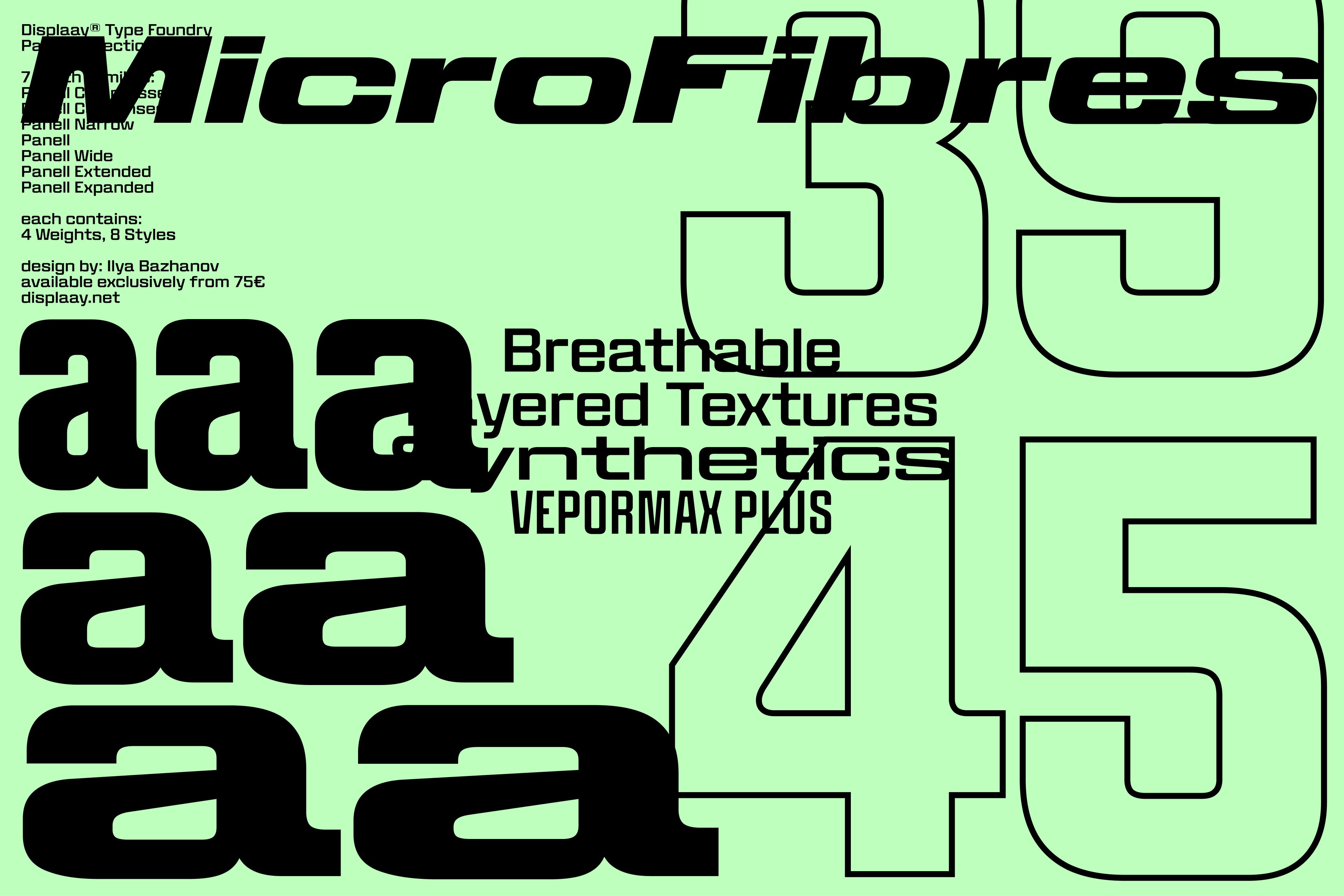
The Solution: Consider the power of a single, well-chosen typeface or a font with optical size variations. Before embarking on a multi-font pairing, rigorously assess whether a single, robust typeface family can fulfill all your typographic needs. Many contemporary font families are designed with extensive stylistic ranges and weights, offering ample flexibility. If a single font’s inherent variations aren’t sufficient, explore typefaces with optical size axes, such as Dalton Maag’s Haas Recast. This typeface, for instance, features a tracking axis that allows for tighter spacing in titles and more open spacing in text, enabling it to serve multiple purposes within a single layout while maintaining a cohesive typographic hierarchy. This approach simplifies execution and strengthens brand consistency.
The Cornerstone of Effective Typography: Deliberation and Purpose
The overarching principle that underpins all successful font pairing, and indeed all typographic decisions, is deliberation and purpose. Every choice, whether you are combining two distinct typefaces or leveraging the versatility of a single font family, must be intentional, legible, and justifiable.
As Natasha Lucas eloquently puts it, "Strong typography systems are not built around quantity, but purpose." If you cannot clearly articulate why each typeface is present and what specific role it plays in communicating your message, then it likely has no place in your design.

The art of font pairing, therefore, is not about accumulating a collection of beautiful typefaces, but about understanding their individual characteristics and orchestrating them into a symphony of clear, impactful, and memorable communication. By understanding and avoiding these common pitfalls, designers can elevate their craft, ensuring that their typography not only looks good but also serves its fundamental purpose: to communicate effectively.


