The Evolutionary Mutation: Re-evaluating the Chaykin and Preiss Adaptation of The Stars My Destination
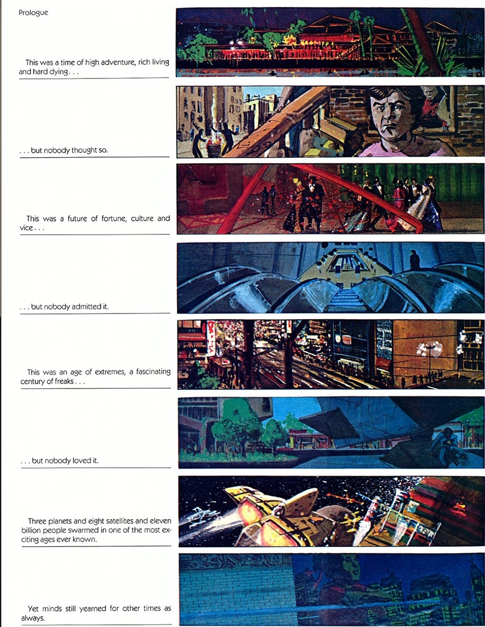
“It was a golden age, a time of high adventure, rich living, and hard dying… but nobody thought so.”
The opening line of Alfred Bester’s 1956 masterpiece, The Stars My Destination (originally titled Tiger! Tiger! in the UK), serves as a poignant epitaph for the American comics industry of the late 1970s. It was an era defined by a frantic search for legitimacy, a period where the "old world" of newsstand dominance was dying, and a "new world" of the direct market and the "graphic novel" was struggling to be born. Amidst this upheaval, a singular project emerged that defied the standard trajectory of the medium’s evolution: the graphic adaptation of Bester’s novel by packager Byron Preiss and artist Howard Chaykin.
While the "graphic novel" eventually standardized into the visual language of panels, speech bubbles, and gutters, Preiss and Chaykin’s The Stars My Destination represents a fascinating, beautiful mutation—a path not taken that remains one of the most ambitious experiments in the history of sequential art.
Main Facts: A Defiant Hybrid of Text and Image
The adaptation of The Stars My Destination is an anomaly in the landscape of 20th-century American comics. Rather than a traditional "comic book" adaptation that translates prose into dialogue-heavy panels, the Preiss-Chaykin project functions as a piece of "illustrated fiction." It is an odd, sprawling beast that occupies the liminal space between a Victorian illustrated tome, a William Blake manuscript, and a modern comic.
Key facts regarding the production include:
- Creative Team: Written by Alfred Bester (original prose) and adapted/packaged by Byron Preiss, with comprehensive art and design by Howard Chaykin.
- Format: A large-format graphic novel that retains approximately 80% of Bester’s original text, juxtaposing it with Chaykin’s experimental visuals.
- Publication History: After several production delays, it was serialized in the magazine Heavy Metal before being collected as a two-volume set by Marvel’s creator-owned imprint, Epic Comics.
- The "Fiction Illustration" Initiative: The book was part of Byron Preiss’s broader attempt to elevate comics by adapting high-concept science fiction and noir (including works by Harlan Ellison and Roger Zelazny) into a more "adult" format.
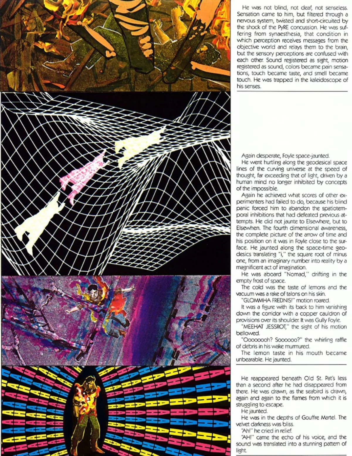
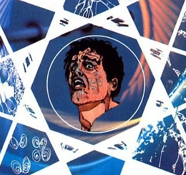
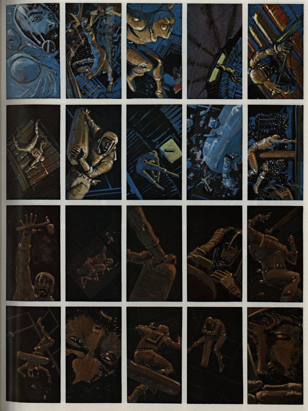
Unlike its contemporaries, the work does not shy away from the density of Bester’s prose. Instead of stripping the narrative to its skeletal plot, Chaykin’s art acts as an emotional and atmospheric companion to the text, utilizing a variety of styles—from impressionistic washes to early computer-generated graphics—to capture the protagonist’s descent into madness and eventual transcendence.
Chronology: From Pulp Novel to Graphic Milestone
To understand the significance of this adaptation, one must look at the timeline of both the source material and the medium’s shifting identity.
1956: The Birth of a Classic
Alfred Bester publishes The Stars My Destination, a pyrotechnic reimagining of The Count of Monte Cristo set in a future where "jaunting" (teleportation) has upended the social and economic order. The novel is immediately recognized for its "wide-screen" imagination and its protagonist, Gully Foyle—a base, uneducated sailor who is transformed by a singular obsession for revenge.
Mid-1970s: The Preiss Vision
Byron Preiss, an ambitious editor and packager, launches his "Fiction Illustration" line. His goal is to move comics away from the "childish" connotations of the 1930s pulp era and toward the sophisticated New Wave science fiction of the 1960s. He recruits top-tier talent, including Jim Steranko, to bridge the gap between prose and art.
1977–1979: The Chaykin Collaboration
Howard Chaykin, then a rising star known for his work on Star Wars and Ironwolf, begins the monumental task of visualizing Bester’s complex world. The project becomes a labor of love and a showcase for Chaykin’s evolving style. However, the production is plagued by the financial instability of the period, leading to a staggered release.
1980s: Serialization and Collection
The work finds its home in the pages of Heavy Metal, the American version of Métal Hurlant, which provided the perfect counter-cultural context for such an experimental work. Eventually, Marvel’s Epic Comics imprint collects the work, cementing its status as a foundational "graphic novel," even as its internal structure remained vastly different from the works of Will Eisner or Art Spiegelman.
Supporting Data: The "Noble Failures" of the Preiss Initiative
The success of The Stars My Destination is best understood when contrasted with the other projects in Byron Preiss’s "Fiction Illustration" series. Most of these experiments are now regarded as "noble failures."
Preiss’s initiative included:
- Jim Steranko’s Chandler: Red Tide: Often cited as a visual masterpiece, it nonetheless suffered from a disconnect between the text and the art. The prose attempted to mimic Raymond Chandler but lacked the soul of the noir tradition, leaving the art to do the heavy lifting for a hollow story.
- The Illustrated Harlan Ellison: Despite featuring art by greats like Tom Sutton and Ralph Reese, the collection often felt like two separate entities—prose and illustration—vying for the reader’s attention rather than synthesizing into a new form.
The Stars My Destination succeeded where these failed because of the inherent synergy between Bester’s writing and Chaykin’s visual temperament. Bester, who had a background in comics writing (having penned scripts for Green Lantern in the 1940s), wrote with a "pulp brain" but a "guru’s heart." His prose was already cinematic and visual. Chaykin didn’t have to "fix" the text; he only had to inhabit it.
Data from the adaptation shows that Chaykin utilized:
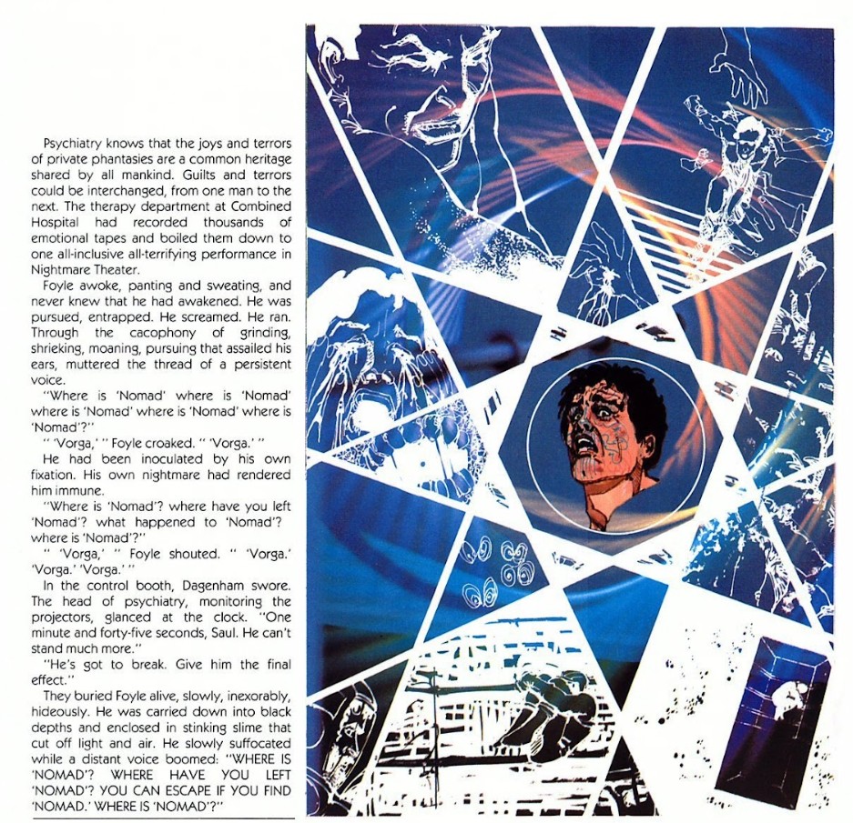
- Mixed Media: Incorporating collage and early digital patterns to represent "jaunting" and the effects of the explosive PyrE.
- Variable Page Layouts: Shifting from traditional paneling to full-page splashes where the text is integrated into the architecture of the scene, reminiscent of William Blake’s illuminated books.
Critical Context and Industry Response
At the time of its release, the industry was divided on how to categorize the work. The term "graphic novel" was being fought over by creators like Will Eisner, who favored a more "comic-strip" derived approach.
The Aesthetic Critique
Critics of the era often pointed out that the work was "too much of a book" to be a comic and "too much of a comic" to be a book. However, the response from the science fiction community was overwhelmingly positive. Bester’s return to the limelight via this adaptation reminded the literary world of his contribution to the genre—specifically his ability to make the "impossible comprehensible."
The Chaykin Factor
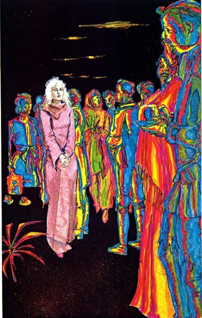
For Howard Chaykin, the project was a turning point. It allowed him to shed the constraints of standard superhero anatomy and storytelling. Industry peers noted that Chaykin was "drawing emotionally" rather than just narratively. If you were to remove the names from the cover, the sheer variety of styles—from Victorian classicism to 70s psychedelic impressionism—might make it unrecognizable as a Chaykin work, yet it remains perhaps his most cohesive artistic statement.
Implications: A Dead End or a Hidden Path?
The primary implication of The Stars My Destination is that it represents an evolutionary "dead end"—but not because of a lack of quality. It is a dead end because it requires a level of synthesis that is incredibly difficult to replicate.
The Rarity of the Format
For this style of "illustrated fiction" to work, three things must align:
- Visually Minded Prose: The writer must provide enough sensory detail to inspire the artist without becoming redundant.
- A Polyglot Artist: The artist must be willing to abandon their "signature style" to serve the specific needs of the text.
- Editorial Patience: The packaging requires a high level of design work that standard comic book production schedules rarely allow.
The Legacy of Gully Foyle
The adaptation’s conclusion—where Foyle gives the power of total destruction (PyrE) to the common man—mirrors the book’s own philosophy. It is an act of radical trust in the reader. Bester and Chaykin trusted that the audience could handle a narrative that was dense, difficult, and visually demanding.
In the decades since, the graphic novel has largely moved toward the "cinematic" style of decompressed storytelling and minimalist dialogue. The Preiss-Chaykin adaptation stands as a reminder that there was once another way to tell a story—a way that embraced the full power of the written word alongside the limitless potential of the image. It remains, as the book’s final pages suggest, a work "prepared to await the awakening" of a new generation of readers who crave something more than the standard panel-and-gutter fare.