The Visual Spectacle of Metastation: A Deep Dive into BMO’s Metadoggoz*
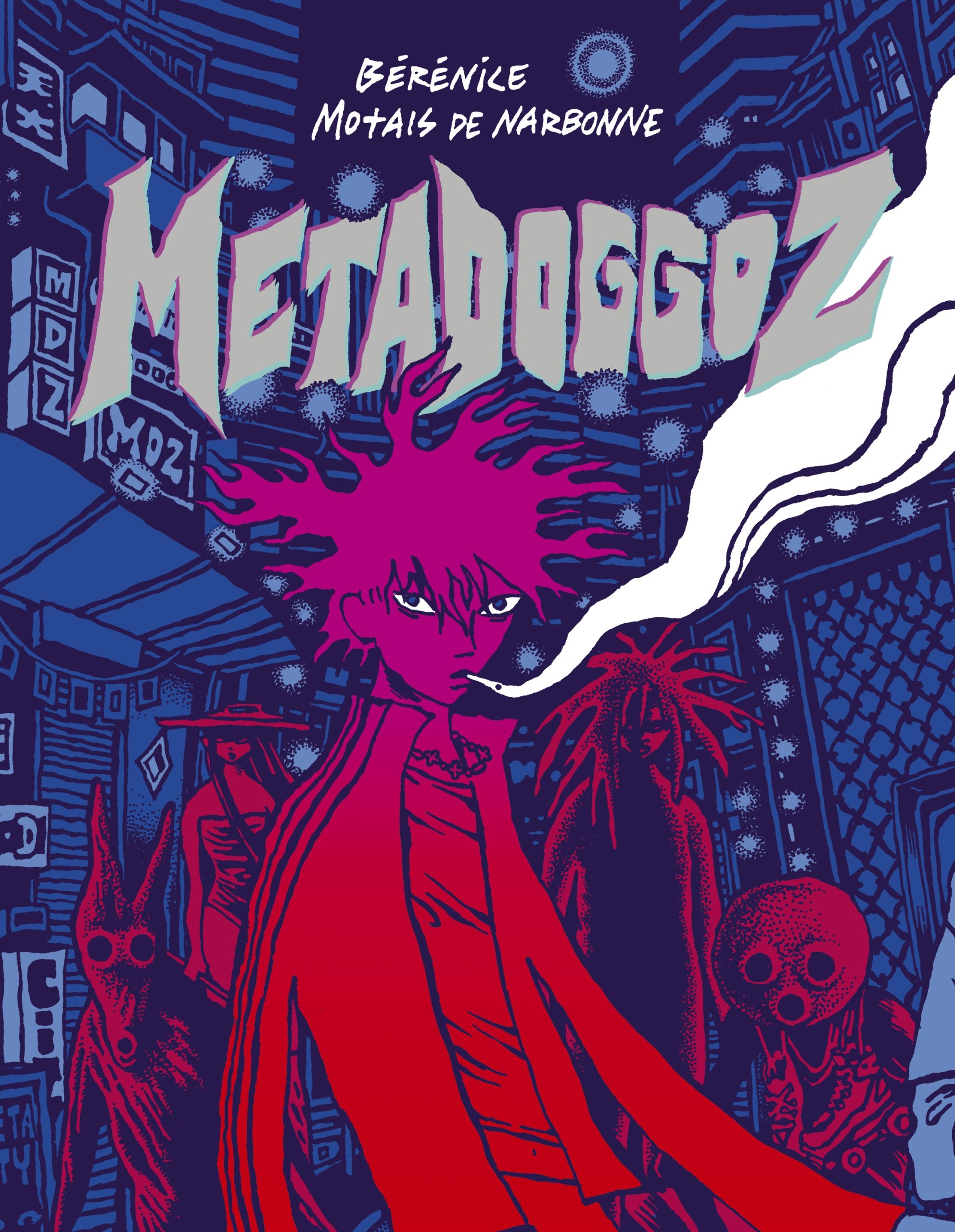
The landscape of contemporary French graphic novels has long been a breeding ground for avant-garde aesthetics and gritty, speculative fiction. Earlier this year, the critical spotlight fell on EPHK’s Harpy, a high-octane exploration of urban sci-fi. Now, the conversation shifts to a similarly ambitious, though narratively enigmatic, work: Metadoggoz. Authored by Bérénice Motais de Narbonne—stylized as B*MO—this graphic novel represents a significant, if polarizing, addition to the modern cyberpunk canon.
While Metadoggoz excels as a masterclass in visual storytelling and atmospheric world-building, it simultaneously challenges the reader’s patience with a narrative structure that prioritizes "vibes" over traditional cohesion. It is a work that exists in the liminal space between 1990s tabletop role-playing game (TTRPG) aesthetics and a distinctly 2020s preoccupation with identity and digital decay.
Main Facts: The Aesthetic Triumph of the Metastation
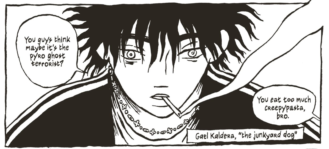
At its core, Metadoggoz is a 200-plus page journey into the "Metastation," a sprawling, high-tech megacity that serves as both the setting and the primary antagonist of the story. The protagonist, Gael Kaldera, is introduced as a quintessential cyberpunk anti-hero—defined by asymmetrical hair, sharp angles, and a perpetual cloud of cigarette smoke.
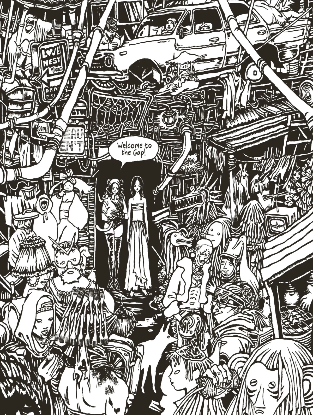
The book is published in stark black and white, a choice that highlights BMO’s extraordinary technical proficiency. Critics and readers alike have noted that while the plot may feel skeletal, the artwork is "pyrotechnic." BMO utilizes sophisticated layouts, masterful negative space, and intricate ink-work to create a sense of depth that often surpasses the written word.
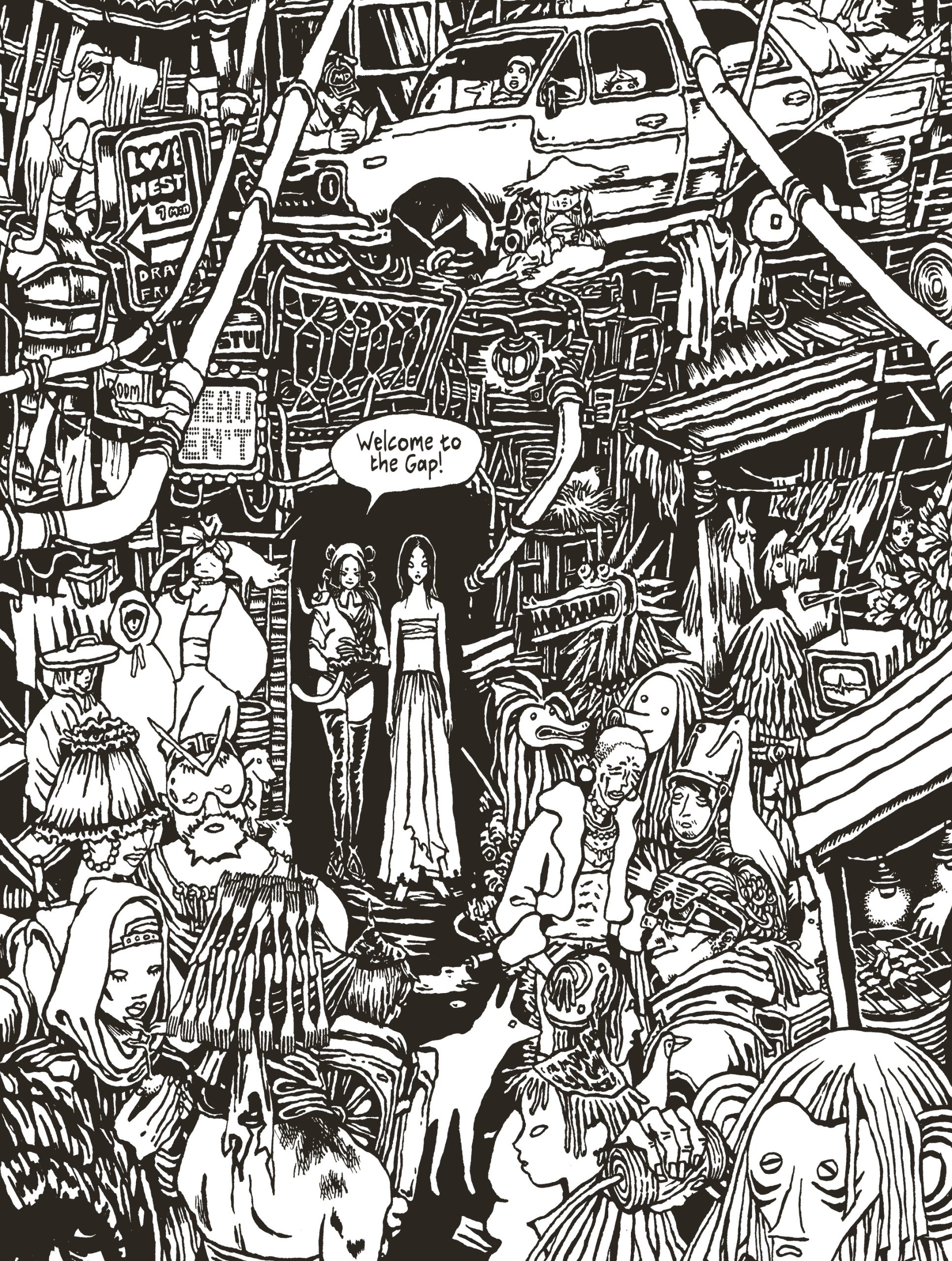
The primary conflict—to the extent that one is clearly defined—follows Gael as he navigates the Metastation’s underbelly, aided by potent club drugs and a cast of "lowlifes" whose names and archetypes evoke the gritty atmosphere of Shadowrun or World of Darkness. The story eventually transitions into "the Gap," an intra-urban liminal space where Gael encounters Borisse, a mystic healer, and Naomi, a secondary protagonist who propels the book toward its visually spectacular conclusion.
Chronology: From Quitter la Baie to the Cyberpunk Present
To understand the weight of Metadoggoz, one must look back at BMO’s trajectory as a creator. The world of the Metastation did not emerge in a vacuum; it is an expansion of the fictional universe BMO began constructing six years ago in their debut graphic novel, Quitter la Baie (Leaving the Bay).
- 2018: The Foundation. Quitter la Baie introduced readers to B*MO’s penchant for atmospheric, character-driven sci-fi. It established the artist as a talent to watch in the French "Bandes Dessinées" scene, particularly for their ability to render complex urban environments.
- The Interim Years: During the six-year gap between major releases, B*MO refined their visual style, moving toward a more aggressive, high-contrast ink style that echoes the "zine culture" of the 1980s and the indie webcomic explosion of the 2000s.
- 2024/2026: The Release of Metadoggoz. The publication of Metadoggoz marks a return to this shared universe, albeit with a much higher degree of visual ambition. It arrived on the heels of other French exports like Harpy, signaling a resurgence of "French Cyberpunk" that seeks to give international audiences a break from reality by dragging them into a more stylized, albeit dystopian, fantasy.
Supporting Data: Narrative Thinness vs. Visual Density
The central tension in reviewing Metadoggoz lies in the disparity between its narrative and its art. An analysis of the book reveals a lopsided distribution of content that may frustrate traditional readers while enthralling visual purists.
The Narrative Deficit
Quantitative assessments of the book suggest that out of over 200 pages, only approximately 15 to 20 pages contain what could be described as "plot-moving" dialogue or action. The narrative flies past coherence at lightning speed, often leaving the reader to fill in the gaps. This "vibe-based" storytelling is a hallmark of certain indie circles, but in Metadoggoz, it creates a paradox: the book is a "page-turner" because there is so little text to digest, yet it demands a slow, methodical look because the art is so dense.
Visual Influences and Execution
B*MO’s art style is a sophisticated hybrid of several eras:
- 1980s Punk Sensibility: The "crust-punk" aesthetic and the focus on subcultures recall the DIY zine movement.
- 1990s TTRPGs: The character designs and the "urban fantasy" elements of the Metastation bear a striking resemblance to the artwork found in early Shadowrun sourcebooks.
- 2000s Indie/Webcomics: The exploration of sexuality, personal identity, and out-of-body experiences feels rooted in the experimental digital comics of the early millennium.
The use of black and white is not a cost-saving measure but a stylistic weapon. B*MO’s shading and line work make the pages "pop" with a kinetic energy that color often mutes. Every splash page serves as a standalone piece of art, making the book a rewarding experience for those who view comics as a visual-first medium.
Official Responses and Critical Reception
While "official" statements from the publisher are often marketing-heavy, the critical reception from outlets like The Comics Journal provides a more nuanced "official" record of the book’s impact.
The consensus among critics, including veteran reviewer Leonard Pierce, highlights a recurring frustration: the "youth argot" and translation. References to "creepypasta" and "fuckboys" appear in the English translation, terms that some argue feel a decade out of date for a story set in the near future. It remains unclear if this is a flaw of the original French script or a byproduct of the translation process, but it serves as a minor distraction from the otherwise immersive world-building.
Comparisons to EPHK’s Harpy have also become a standard part of the critical discourse. Both books are viewed as "visually dynamite" works that suffer from a lack of fleshed-out supporting casts. Critics argue that while the leads (like Gael Kaldera) are striking, the worlds they inhabit would be more compelling if the secondary characters were given more substance and "heft."
Implications: The Future of "Vibe-First" Graphic Narratives
The release and reception of Metadoggoz have broader implications for the graphic novel industry and the evolution of the cyberpunk genre.
The Shift Toward Visual Primacy
Metadoggoz stands as a testament to a growing trend in indie comics where the "experience" of the art takes precedence over the "mechanics" of the story. In an era dominated by high-speed digital consumption, a book that functions as a 200-page "mood board" or an extended visual trip offers a different kind of value proposition. It suggests that there is a significant market for "art-house" comics that prioritize atmosphere over the traditional hero’s journey.
The Cyberpunk Renaissance
The book also signals a shift in how cyberpunk is handled. Moving away from the corporate espionage tropes of the 1980s (William Gibson/Ridley Scott), BMO’s work leans into the "liminal" and the "mystical." By focusing on the "Gap" and out-of-body experiences, Metadoggoz* suggests that the future of the genre may lie in exploring the internal, psychological effects of a high-tech dystopia rather than just the external, political ones.
Conclusion for the Reader
Ultimately, Metadoggoz is a book that demands to be seen, even if it doesn’t always demand to be "read" in the traditional sense. It confirms BMO as a formidable talent in the realm of visual design and layout. For readers who value the "pyrotechnic" potential of the comic book page and are willing to forgive a skeletal plot in exchange for a haunting, beautifully rendered world, Metadoggoz* is an essential, if challenging, addition to the shelf. It is a work of power and heft that carries its narrative slow patches through sheer artistic momentum, proving that in the hands of a master illustrator, the "vibe" can sometimes be enough.