The Wizarding World’s New Look: HBO’s Harry Potter Rebrand Sparks Fierce Fan Debate

The upcoming HBO series adaptation of the beloved Harry Potter saga has ignited a firestorm of controversy, not over its casting or narrative direction, but over a seemingly minor detail: the redesign of the iconic Hogwarts house crests. This shift from the familiar movie emblems to a new, more minimalist aesthetic has polarized the fanbase, prompting discussions about artistic evolution, brand identity, and even the very definition of "decay" in the digital age.
The Spark of Discontent: A Tale of Two Crests
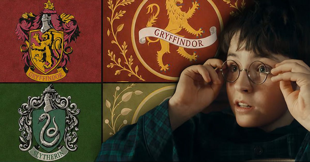
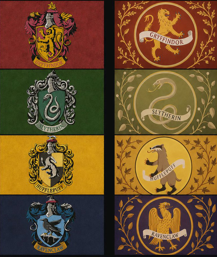
The controversy erupted following HBO’s preview documentary, "Finding Harry: The Craft Behind the Magic," which offered a first look at the visual identity for the upcoming series. While the core colors of the Gryffindor, Slytherin, Ravenclaw, and Hufflepuff houses remain, the emblems themselves have undergone a dramatic transformation. The intricate, heraldic designs that graced the movie posters and merchandise have been replaced by simpler, bolder icons, often featuring larger, more stylized animal mascots within circular frames.
This departure from the established visual language has been met with a visceral reaction from a significant portion of the Harry Potter fandom. Many fans, deeply attached to the aesthetic of the Warner Bros. films, view the new designs as a dilution of the franchise’s magical essence and a symptom of a broader trend towards soulless minimalism in design.
A Visual Evolution or a Creative Compromise?
The original Hogwarts house crests, as depicted in the Harry Potter films, were elaborate and detailed works of art. Each crest was designed in the style of classical family heraldry, complete with helmets, shields, and ornate mantles. These designs exuded a sense of history, tradition, and the grandeur befitting a centuries-old institution of magic. For fans, these crests were more than just logos; they were visual anchors to the rich lore and magical world J.K. Rowling created.
HBO’s new designs, in contrast, are markedly simpler. They prioritize readability and scalability, likely with the demands of modern digital platforms and diverse merchandise in mind. The intricate details have been pared down, replaced by cleaner lines and more prominent central figures. While some argue this makes the logos more accessible and modern, for many, it sacrifices the very soul of the originals.
The Book vs. The Screen: A Point of Contention
Interestingly, one aspect of the redesign sees the new series aligning more closely with J.K. Rowling’s original descriptions in the books. The Ravenclaw crest, for instance, now features an eagle, as stated in the literature, a departure from the movie’s depiction of a raven. This correction, however, has done little to quell the wider discontent. Critics argue that the overall aesthetic shift overshadows this textual fidelity.
The mascots themselves have always been a source of discussion. While Gryffindor’s lion and Slytherin’s serpent are well-known, the original book series never explicitly linked the mascots to the house names in a literal sense. The film adaptations embraced this, creating iconic visuals. The new designs, by simplifying the mascots, may inadvertently draw further attention to the perceived disconnect between name and symbol for some.
Echoes of a Wider Design Debate: Minimalism and AI Fears
The backlash against the new Harry Potter crests is not an isolated incident. It taps into a broader cultural conversation about the pervasive influence of minimalism in logo design. Many fans lament what they perceive as a homogenization of visual identity, where distinctiveness is sacrificed for a generic, "tech-bro" aesthetic.
X (formerly Twitter) and Reddit have become battlegrounds for these sentiments. One widely shared sentiment captures the frustration: "Beautifully decorated vivid heraldic compositions or bleak generic minimalistic circles with shabby sticks that look like it’s grandma old plates that were forgotten in a park after a picnic and will remain there because nobody cares enough to return for them."
Perhaps the most alarming accusation leveled against the new designs is that they appear to be AI-generated. This concern, fueled by the perceived lack of artistic nuance and occasional inconsistencies in line weight and centering, speaks to a growing anxiety about the role of artificial intelligence in creative fields. "This has to be AI," one user speculated. "The centering is off for the animals, the thickness of the lines is inconsistent, the shape of the badges is off." This fear, whether founded or not, highlights a deep-seated concern about the future of craftsmanship and originality.
A Chronology of the Controversy: From Teaser to Tirade
- December 2023 (Anticipated): HBO announces its intention to produce a new Harry Potter television series, sparking initial excitement.
- Early 2024 (Specific Date Unclear): HBO releases a preview documentary, "Finding Harry: The Craft Behind the Magic," which includes glimpses of the new Hogwarts house crests.
- March 2024 (Approximate): Images of the new crests begin circulating widely on social media and fan forums, igniting the initial wave of debate.
- March – April 2024: The controversy escalates as fans share their criticisms, compare the new designs to the movie originals, and express concerns about minimalism and AI generation. Hashtags like #HarryPotterHBO and #HogwartsCrests trend.
- April 2024 (Ongoing): The debate continues to rage across various platforms, with articles and opinion pieces emerging from design publications and fan sites. The core arguments revolve around artistic merit, brand loyalty, and the perceived direction of modern design.
Supporting Data: Fan Outcry and Expert Commentary
The sheer volume of online discussion underscores the intensity of the fan reaction. Platforms like X, Reddit, and dedicated Harry Potter fan sites are flooded with comments, memes, and visual comparisons. The sentiment is overwhelmingly negative, with a significant portion of the fanbase expressing disappointment and anger.
Design experts, while often more measured, acknowledge the challenges of reinterpreting iconic visuals. The need for modern branding solutions often clashes with the deep emotional connections fans have to established aesthetics. The debate highlights a fundamental tension between commercial necessity and fan sentiment.
Official Responses: Silence Amidst the Storm
As of this reporting, HBO has not issued a formal, comprehensive statement directly addressing the backlash against the new Hogwarts crests. Their initial presentation of the designs within the documentary suggests a deliberate creative choice, likely made with extensive market research and branding considerations.
The lack of an official response could be interpreted in several ways:
- Confidence in the Design: HBO may be confident that the designs will resonate with a broader audience once the series launches and the context is established.
- Strategic Silence: They might be choosing not to engage directly with fan criticism, understanding that such debates are common for major franchise reboots and may even generate publicity.
- Focus on Production: The production team may be prioritizing the development and filming of the series, with design decisions considered final.
However, the absence of a statement leaves a void that is being filled by speculation and further fan interpretation.
Implications: The Future of Fandom and Brand Evolution
The controversy surrounding the Harry Potter crest redesign has far-reaching implications:
- The Power of Nostalgia and Fan Investment: This situation powerfully illustrates the deep emotional connection fans have to beloved franchises. For many, the visual elements are as integral to the experience as the narrative itself. Reimagining these elements, even with good intentions, risks alienating a core audience.
- The Balancing Act of Modernization: HBO faces the perpetual challenge of modernizing beloved brands for new generations while retaining the essence that captivated original fans. The minimalist trend, while efficient for digital platforms, can come across as sterile and uninspired when applied to worlds rich in fantasy and detail.
- The Growing Influence of AI in Design: The pervasive fear of AI-generated art, even in relation to a seemingly straightforward logo redesign, is a significant indicator of anxieties surrounding automation and artistic integrity. This will likely lead to increased scrutiny of design processes and a demand for transparency.
- The Evolving Definition of "Art": The accusations of "decay of art" highlight a philosophical debate about what constitutes artistic value. Is it the intricate craftsmanship of the past, or the clean, functional efficiency of the present? The Harry Potter crests have become a proxy for this larger discussion.
- Brand Identity in the Digital Age: The debate underscores the critical importance of brand identity in a hyper-connected world. A logo is no longer just an emblem; it’s a cultural signifier that carries with it years of history, emotion, and expectation. Any alteration carries significant weight.
Ultimately, the success or failure of HBO’s new Harry Potter crests will likely be judged by the reception of the series as a whole. However, the fervent debate they have ignited serves as a potent reminder that in the realm of beloved franchises, design is never just about aesthetics; it’s about legacy, identity, and the enduring magic that fans hold dear. The wizarding world may be entering a new era on screen, but the debate over its visual identity suggests that the magic of nostalgia is a force that cannot be easily redesigned.