A Century of Stewardship: Wiedemann Lampe Unveils Transformative Brand Identity for Gunnersbury Park & Museum
LONDON — As Gunnersbury Park & Museum prepares to celebrate its centenary as a public space, the West London landmark has unveiled a comprehensive new visual identity and wayfinding system. Designed by the award-winning branding agency Wiedemann Lampe, the project marks a pivotal moment in the estate’s history, seeking to unify its diverse offerings—from sprawling heritage landscapes and elite sports facilities to a localized museum—under a single, cohesive strategic banner.
The rebrand arrives at a critical juncture for the 72-hectare site. Managed since 2018 by the Gunnersbury Estate Community Interest Company (CIC) on behalf of Ealing and Hounslow Councils, the destination has faced the modern challenge of "identity fragmentation." While the park remains a beloved local "green lung," the museum and its historical significance have often been overshadowed by the sheer scale of the outdoor recreational spaces. The new identity, built around the core concept of "Life’s Rich Tapestry," aims to rectify this imbalance, ensuring the site is recognized as a premier cultural destination for the next hundred years.
1. Main Facts: The "Life’s Rich Tapestry" Strategy
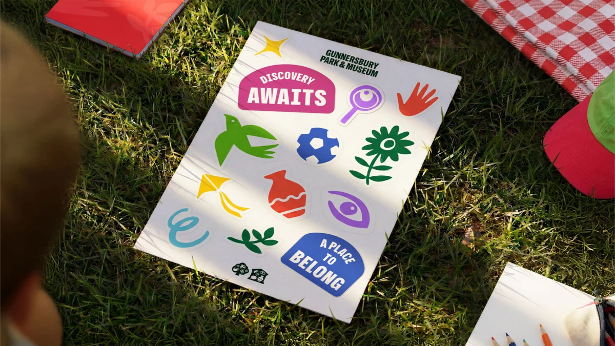
The centerpiece of Wiedemann Lampe’s work is a modular branding system designed to be as flexible as the park itself. Recognizing that Gunnersbury serves a vast array of stakeholders—including weekend runners, local historians, families, and sports teams—the agency avoided a "one-size-fits-all" logo. Instead, they developed a visual language that celebrates the "many lives" of the park.
A Tri-Color Architecture
To solve the visibility issues between the park and the museum, Wiedemann Lampe introduced a distinct yet harmonious color palette:
- Park Green: Reflecting the 72 hectares of heritage landscape and open space.
- Museum Purple: A nod to the regal history and the "hidden gem" status of the museum collections.
- Shared Yellow: A high-visibility "action" color used for cross-site communications, events, and the new wayfinding system.
Illustrative Storytelling
Moving away from corporate minimalism, the agency collaborated with renowned illustrator Rebecca Sutherland. Sutherland’s custom illustrations depict the minutiae of Gunnersbury life: from specific wildlife found in the community gardens to historical artifacts within the museum and seasonal community events. These illustrations serve as a "connective tissue," humanizing the brand and making the historical archives feel accessible to a modern, digital-first audience.
The Centenary Mark
As the site approaches its 100th anniversary of public ownership, a dedicated centenary mark has been integrated into the system. This allows the CIC to brand anniversary-specific programming—exhibitions, galas, and community workshops—without drifting away from the core brand equity established by the new identity.

2. Chronology: From Private Estate to Modern CIC
The evolution of Gunnersbury Park is a reflection of London’s own shifting social landscape. To understand the necessity of the rebrand, one must look at the timeline of its transition from a private playground for the elite to a public asset.
- Pre-1926: The Rothschild Era: Once the private estate of the Rothschild family, the land was a symbol of 19th-century opulence, featuring grand mansions and meticulously landscaped gardens.
- 1926: Public Opening: The site was purchased for public use, jointly owned by the boroughs of Ealing and Hounslow. For decades, it operated under traditional municipal management.
- 2018: The CIC Transition: In a move toward long-term financial and environmental sustainability, the Gunnersbury Estate CIC was formed. This shift allowed for more agile management and a focus on heritage conservation and community engagement.
- 2024–2025: The Rebrand Commission: Recognizing that the physical infrastructure of the park had been improved through various grants, the CIC identified a "visibility gap." Visitors were using the park but not the museum; the wayfinding was outdated, and the digital presence was fragmented. Wiedemann Lampe was brought in to bridge this gap.
- 2026: The Centenary Milestone: The full rollout of the identity coincides with the 100th anniversary, positioning the park not just as a historical relic, but as a thriving, modern community hub.
3. Supporting Data and Strategic Design
The scale of the Gunnersbury project is significant. Managing a 72-hectare site (approximately 180 acres) requires more than just a pretty logo; it requires a functional "operating system" for physical space.
Solving the "Museum Invisibility" Problem
Internal data suggested that while footfall in the park was high, a significant percentage of visitors were unaware that the large mansion on-site housed a fully functioning museum. The new branding addresses this through "modular lockups." When the museum is the primary focus, the purple colorway and museum-specific icons take precedence. However, in general park signage, the museum is integrated as an equal partner to the landscape, rather than an afterthought.
Wayfinding as User Experience
The most immediate physical change for visitors is the overhaul of the wayfinding system. Historically, the park’s sprawling nature made it difficult to navigate, with many visitors sticking to the perimeter paths.
- Yellow Iconography: Using the high-contrast "Shared Yellow," the new signs are icon-led to bypass language barriers and appeal to younger visitors.
- Non-Prescriptive Navigation: Unlike traditional park signage that dictates a specific path, the new system encourages "discovery." It highlights points of interest—the Japanese Garden, the museum, the sports hub—and allows visitors to curate their own journey.
- Modular Implementation: Given the budget constraints of public-sector-adjacent entities, the wayfinding system is designed to be modular. Signs can be updated or added incrementally without requiring a complete overhaul of the hardware.
Tone of Voice and Photography
Beyond the visual, Wiedemann Lampe overhauled the "voice" of Gunnersbury. The new style guide moves away from academic, "museum-speak" toward a tone that emphasizes "human moments." The photography style now focuses on the people using the space—the sweat of a runner, the curiosity of a child in the museum, the quiet of a gardener—rather than just static shots of the architecture.
4. Official Responses: A Vision for the Future
The leadership at both the agency and the estate view this rebrand as an essential tool for institutional growth.

Benji Wiedemann, Executive Creative Director and Co-founder of Wiedemann Lampe, emphasized the importance of maintaining the site’s complexity:
"We wanted to deliver an identity and wayfinding system that reflected the enjoyment and joyfulness of the park, distinguishes it from London’s other green spaces, and supports its ambition for the future. Gunnersbury is many things to many people, and its offer is both broad and evolving. The strategy needed to bring focus without flattening or oversimplifying that richness."
Wiedemann further noted that the "Life’s Rich Tapestry" concept was born out of the site’s unique dual-borough ownership and its history of hosting diverse communities. By treating the brand as a tapestry, the agency could weave together the disparate elements of sport, history, nature, and community without one element dominating the others.
Representatives from the Gunnersbury Estate CIC noted that the new identity is a key pillar of their sustainability strategy. By raising the profile of the museum and the venue hire opportunities (such as weddings and corporate events) through a more professional and attractive brand, the estate can generate the revenue necessary to maintain the 72 hectares of heritage land.
5. Implications: Branding the "Public Good"
The Gunnersbury rebrand carries implications that extend beyond the borders of West London. It serves as a case study for how heritage sites and public parks can compete in a crowded cultural marketplace.
The Competitive Cultural Landscape
In a city like London, where residents are spoiled for choice with the Royal Parks and national museums, local heritage sites often struggle for relevance. By adopting a high-level design aesthetic usually reserved for major galleries like the Tate or the V&A, Gunnersbury is signaling its intent to be viewed as a top-tier destination.

Future-Proofing through Flexibility
The modularity of the Wiedemann Lampe system is a direct response to the "identity crises" many historical sites face. As public needs change—perhaps with a greater emphasis on environmental education or digital exhibits—the brand can adapt. The "Life’s Rich Tapestry" platform allows for new "threads" to be added to the brand without tearing the existing fabric.
Strengthening Community Identity
For the residents of Ealing and Hounslow, the rebrand offers a sense of pride. A clear, professional identity fosters a sense of "place-making," turning a generic park visit into a branded experience that feels curated and valued. As the estate enters its second century, the new visual and navigational systems provide the "clearer public face" needed to ensure that Gunnersbury remains not just a relic of the past, but a vital, vibrant part of London’s future.
In conclusion, Wiedemann Lampe’s work for Gunnersbury Park & Museum is a masterclass in balancing heritage with modernity. By focusing on the "rich tapestry" of the site’s life, they have created a brand that is as much about the people who visit as it is about the history they are visiting. As the yellow signs begin to dot the landscape and the new purple museum banners rise, Gunnersbury is finally ready to tell its full story to the world.