Bloomington’s Bold ‘B’ Sparks Controversy: City Logo Redesign Faces Public Scrutiny

Bloomington, Indiana – In an era where visual identity is paramount, cities across the globe are increasingly investing in rebranding efforts to project a modern and appealing image. However, this pursuit of fresh aesthetics can often ignite passionate public debate, particularly when a new design fails to resonate with the very communities it aims to represent. The City of Bloomington, Indiana, is the latest municipality to find itself at the center of such a controversy, as its proposed new logo has drawn sharp criticism from residents and local commentators, primarily for its perceived resemblance to an unflattering anatomical feature.
This unfolding situation echoes a pattern seen in other municipalities, such as Visalia, California, and Florence, Alabama, where logo redesigns have been met with public backlash. While the intention behind these updates is often to modernize and streamline a city’s image, the execution can sometimes lead to unintended consequences, especially when significant public funds are involved. Bloomington’s experience highlights the delicate balance between achieving a contemporary design and maintaining a connection with local sentiment and identity.
The Genesis of a New Identity: From Local Roots to a Bold ‘B’
For nearly four decades, the City of Bloomington has been represented by a distinctive geometric logo. Adopted in 1986, this design was conceived as a harmonious blend of local heritage and artistic inspiration. Its core elements drew from the natural beauty of the region, specifically the peony and the trout lily, flowers deeply rooted in local flora. Furthermore, it incorporated influences from traditional 19th-century quilt patterns, a nod to the area’s folk art traditions, and the very geometry of Bloomington’s Downtown Square, which, by definition, is square. This multifaceted approach aimed to create an emblem that was both aesthetically pleasing and deeply symbolic of Bloomington’s history and character.
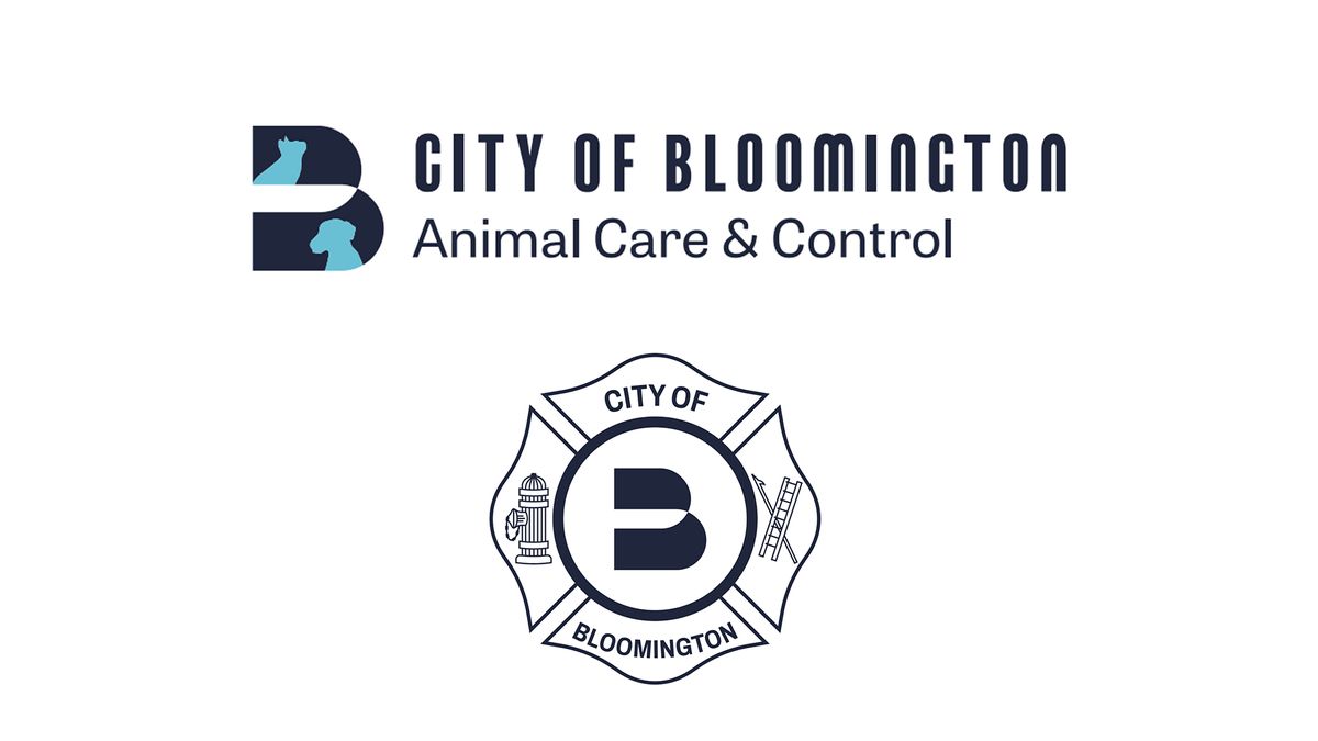
However, the city’s administration has opted for a radical departure from this established visual language. The proposed new branding system centers around a prominent, stylized letter ‘B’. This shift signifies a move away from intricate symbolism towards a more minimalist and universally recognizable mark. The broader brand identity is designed to encompass various city services and departments, suggesting a desire for a cohesive and scalable visual framework across all municipal operations.

The Unforeseen Resemblance: When ‘B’ Becomes a ‘Butt’
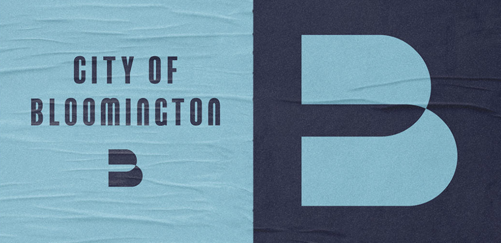
The primary catalyst for the widespread public discontent surrounding Bloomington’s new logo is its striking and, for many, unavoidable resemblance to a human posterior. The design, characterized by two large, rounded lobes meeting at a central point, has been widely interpreted as suggestive of buttocks. This interpretation has quickly overshadowed any intended symbolism or design merit, transforming the rebranding exercise into a public relations challenge.
Dave Askins, the editor of the local news outlet B Square Bulletin, articulated this sentiment with blunt candor in a widely circulated op-ed. His headline, "Proposed new Bloomington logo looks like a butt," encapsulates the prevailing public sentiment. Askins, while acknowledging some positive aspects of the design, such as its attractive color palette and modern typography, ultimately finds the anatomical resemblance to be a critical and insurmountable flaw.
"The two enormous rounded lobes, pinched together at the center, do not just allow that interpretation. They practically invite it," Askins wrote. He further elaborated on the logo’s suggestive nature, noting that with a slight adjustment, it could be seen as depicting someone discreetly releasing gas. "Rotate the logo 90 degrees clockwise, and it cannot be denied: It’s the image of someone using the common technique of lifting one butt cheek to quietly release a fart."
This stark critique, amplified through social media and local news discussions, has resonated with a significant portion of Bloomington’s residents. The perceived lack of foresight in the design process, particularly concerning such an obvious and potentially embarrassing visual association, has led to widespread disappointment and a questioning of the decision-making process behind the rebrand.

The Evolution of the Logo: A Visual Timeline
1986: The Introduction of the Original Logo
Bloomington adopts its long-standing official logo. This design, inspired by local flora (peony and trout lily), regional quilt patterns, and the city’s square-shaped downtown, aims to encapsulate the city’s heritage and natural beauty. Its intricate, geometric pattern is seen as a unique and symbolic representation of the city.
[Image: City of Bloomington logo design before]
(Image credit: City of Bloomington)
Early 2020s: The Need for a Modernization
City officials identify a need to update Bloomington’s visual identity to better reflect a modern, forward-thinking municipality. The existing logo, while historically significant, is perceived by some as dated and potentially difficult to reproduce across all digital and physical platforms.
[Date of Proposal – Implied to be recent based on article context] Proposed New Logo Revealed
A new logo, featuring a prominent, stylized letter ‘B’, is introduced. This design aims for simplicity, scalability, and a contemporary aesthetic. The broader brand system includes variations for different city departments.

[Image: City of Bloomington logo design after]
(Image credit: City of Bloomington)
September 2, [Year of Article] Proposed Logo Presented to City Council
The new logo is formally presented to the City of Bloomington Council for consideration. This presentation is expected to be met with public commentary and potentially heated discussion from council members and attendees.
Supporting Data and Public Reaction
The controversy surrounding Bloomington’s new logo has not been confined to local news outlets. Discussions have erupted on online platforms, including Reddit, where users have shared their reactions and critiques. The sentiment expressed on these forums largely mirrors the concerns raised by Dave Askins, with many users finding the logo’s resemblance to a backside to be undeniable and problematic.
The comparison to other generic ‘B’ logos used by various businesses and organizations further fuels the argument that the new design lacks originality and local distinctiveness. Examples cited include the logos of a law firm, an online boat marketplace, and a social networking app, all of which feature similar abstract ‘B’ forms. This raises questions about the uniqueness and memorability of Bloomington’s new visual identity.
"A good city logo does not have to contain the courthouse dome, a limestone block, a bicycle, a tree or any other literal Bloomington symbol. In fact, trying to incorporate any of those iconic references would almost certainly be a mistake," argues Askins. "But if the design is going to be abstract, the abstraction still needs enough personality to become unmistakably ours."
The financial implications of a rebranding project are often a point of contention. While the article does not explicitly detail the cost of Bloomington’s redesign, it alludes to the fact that "the cost of the rebrand gets out," suggesting that public expenditure is a factor in the public’s scrutiny. Unpopular and controversial rebranding efforts can lead to wasted taxpayer money, further exacerbating public dissatisfaction.
Official Responses and the Path Forward
As of the article’s publication, the City of Bloomington Council was scheduled to formally review the proposed logo at their next regular meeting on September 2nd. It is anticipated that this meeting will serve as a crucial platform for residents to voice their opinions and for city officials to address the growing concerns.
The article does not yet include official statements from city representatives or the design firm responsible for the new logo. However, the strong public reaction suggests that the city administration will need to engage in a transparent and responsive dialogue with its constituents. This may involve explaining the design rationale in more detail, acknowledging the public’s concerns, and potentially reconsidering aspects of the proposed branding.
Dave Askins’ suggestion of incorporating a "cheek check" with focus groups, particularly teenagers and elderly men, highlights a potential strategy for future design processes. This humorous yet insightful suggestion underscores the importance of diverse perspectives and rigorous testing to avoid such embarrassing design oversights.
Implications and Lessons Learned
The Bloomington logo controversy serves as a potent reminder of the complexities involved in municipal rebranding. It underscores the critical need for:
- Public Engagement: Involving the community early and often in the design process can help build consensus and mitigate negative reactions.
- Objective Review: Employing diverse focus groups and seeking unbiased opinions can help identify potential issues before a design is finalized.
- Meaningful Symbolism: While abstract designs can be effective, they should ideally possess a unique quality that connects them to the entity they represent, avoiding generic or easily misinterpreted forms.
- Transparency in Cost: Clearly communicating the financial investment in rebranding efforts and demonstrating value for taxpayer money is essential.
The future of Bloomington’s visual identity remains uncertain. Whether the city will proceed with the ‘B’ logo, make significant revisions, or revert to a modified version of its original emblem, the controversy has undoubtedly highlighted the significant public interest and emotional investment residents have in their city’s representation. This situation offers valuable lessons for municipal leaders and design professionals alike, emphasizing that a successful rebrand is not just about aesthetics but also about fostering trust, understanding, and a shared sense of identity within the community. The "butt" logo incident, while perhaps embarrassing, may ultimately lead to a more thoughtful and community-aligned design process for Bloomington.