CD Projekt Red’s Fiery Phoenix: A Rebrand Ignites Unexpected Culture War
Warsaw, Poland – In the often-turbulent world of video game development, few studios command the same level of anticipation and scrutiny as CD Projekt Red. Renowned for its critically acclaimed "The Witcher" series and the ambitious "Cyberpunk 2077," the Polish developer recently unveiled a refreshed visual identity, centered around an updated iteration of its mythological firebird emblem. However, what should have been a straightforward brand evolution has, bafflingly, been thrust into the heart of a contentious culture war, particularly within the United States, prompting bewilderment and disbelief among industry observers and fans alike.
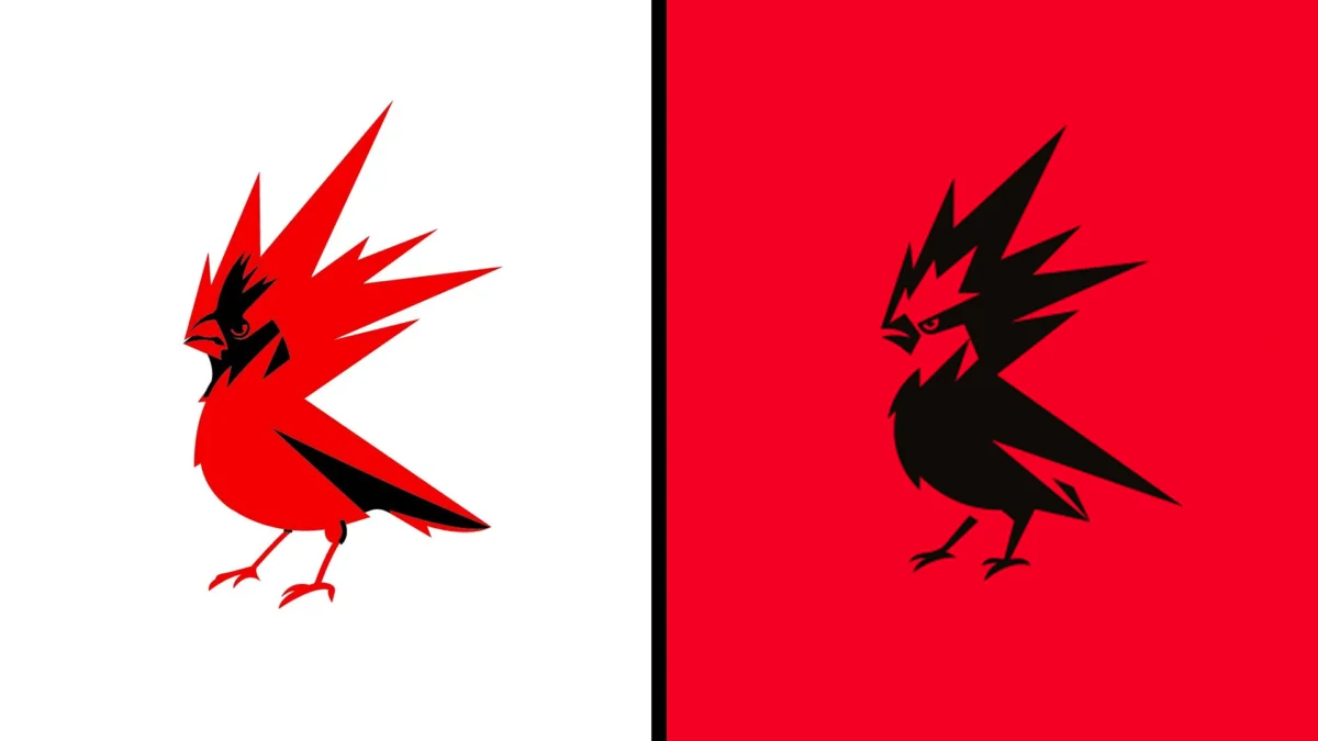
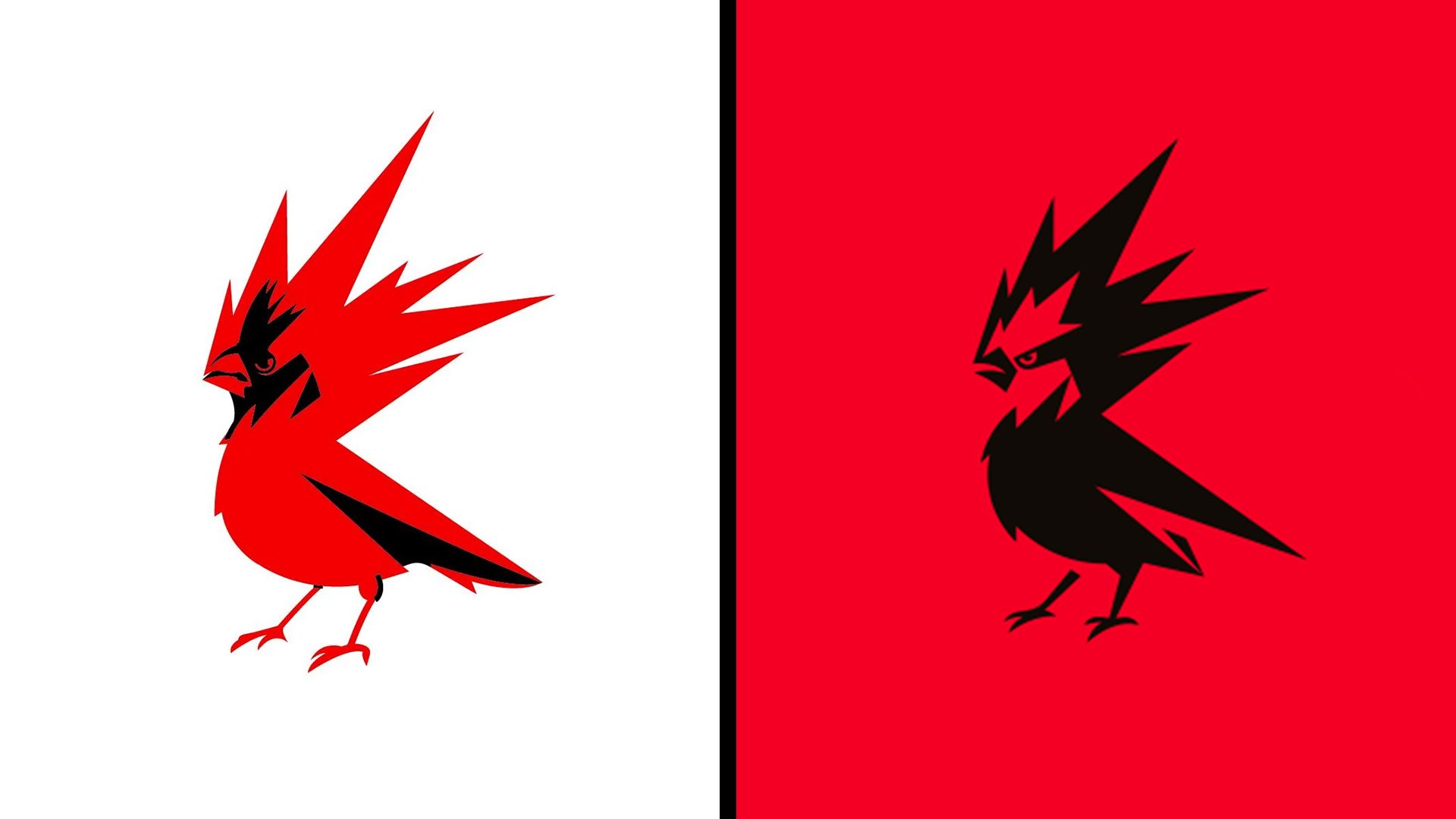
The redesigned logo, featuring a more stylized and aggressive firebird with an open beak and sharper talons, represents a significant evolution from its previous iteration. This update, intended to convey a more modern, confident, and energetic brand presence, has ironically become a lightning rod for anachronistic political accusations, drawing comparisons to everything from "woke ideology" to "communism" and even "white erasure." This unexpected backlash stands in stark contrast to the overwhelmingly positive reception CD Projekt Red has garnered in recent times for its player-friendly initiatives, such as the free "The Witcher 3: Wild Hunt" next-gen upgrade.
A Symbol Reimagined: From Cardinal to Mythological Firebird
CD Projekt Red’s iconic emblem has long been rooted in Slavic folklore, specifically the "raróg," a tiny, fiery spirit often depicted as a bird, believed to bring good fortune. The previous logo, in use since 2014, bore a striking resemblance to the northern cardinal, a vibrant red bird known for its distinct plumage. While this representation captured the studio’s aspiration for boldness and confidence, it was a more literal interpretation of its namesake.
The recent rebranding aims to move beyond this literal interpretation and imbue the emblem with a more mythical and dynamic quality. According to the studio’s official statement, the new design is intended to be "more mature, confident, and energetic," while also being more adaptable for various digital and physical applications. The sharpened lines, open beak, and more pronounced claws contribute to a more aggressive and powerful aesthetic, aligning with the fiery, untamed nature of the raróg. Furthermore, the increased emphasis on the color red, a core element of the studio’s identity, is a logical progression, echoing the "Red" in CD Projekt Red, a name originally inspired by the red bricks of their first office in Łódź, Poland.
A History of Generosity and a Glimpse of the Future
The timing of this visual refresh also coincides with a period of significant goodwill for CD Projekt Red. Their recent announcement at Gamescom of a free next-gen remaster for "The Witcher 3: Wild Hunt" was met with widespread acclaim from gamers. This move, seen as a strategic masterstroke, not only reinforces brand loyalty but also generates anticipation for upcoming expansions like "Songs of the Past" (scheduled for 2027) and the highly anticipated "The Witcher 4" (slated for 2028). Such acts of considerable generosity from a major corporation have, in some quarters, been ironically misconstrued.
The very notion that such player-centric initiatives could be perceived as anything other than sound business strategy is a source of bewilderment. CD Projekt Red, as the parent company CD Projekt is listed on the Warsaw Stock Exchange, operates within a distinctly capitalist framework. Yet, the reactions on social media platforms, particularly X (formerly Twitter), have painted a wildly different picture, one where even a logo tweak can be twisted into a political statement.
The "Culture War" Enters the Digital Arena: Misinterpretations and Accusations
The most perplexing aspect of this rebranding saga is its entanglement with the ongoing culture wars, particularly in the US. The updated logo, with its more assertive and abstract design, has been interpreted by some as a signal of "woke ideology." This is a notion that the article’s author finds particularly baffling, given the logo’s intended meaning and the visual shift towards a more powerful, almost gladiatorial aesthetic.
Online discourse has seen the new logo described with terms like "modernized and DEIfied," and as a product of a "woke mind virus." More extreme accusations have labeled the rebrand as "white erasure in favour of posting commie colours," a sentiment that suggests a dramatic misunderstanding of both the logo’s origins and the historical context of color symbolism. The shift from a predominantly red-on-white design to a black-on-red scheme has been particularly contentious, with some linking these colors to the US anti-fascist movement Antifa. This interpretation is a significant leap, ignoring the historical and cultural significance of these colors, and by extension, casting a shadow over established brands like Netflix and Coca-Cola Zero, which also prominently feature red and black.
Deconstructing the Symbolism: Rebellion, Heritage, and Passion
It is crucial to delve into the historical and cultural context of the colors and symbols employed by CD Projekt Red. Black and red have indeed been associated with rebellion and revolutionary movements since at least the Paris Commune of the 1870s and the Spanish anarcho-syndicalists of the early 20th century. However, this association was not a new development with the recent rebrand; it was an integral part of the studio’s original design philosophy.
As Co-CEO Adam Badowski articulated during the 2014 rebranding, the choice of the northern cardinal and the color red was deeply symbolic. He stated, "we are rebels, and rebels are free. Just like birds. The northern cardinal is what we see ourselves in the industry: intrepid, bold and confident; flying high and aiming even higher." He further elaborated on the significance of the color: "cardinal RED, is something that connects it with another bird, a mythological creature close to our cultural roots and heritage – the Raróg, a small firebird believed to bring luck to people. RED stands for energy, the inner fire that drives us; it represents something very close to everyone here in the studio – the creativity and passion we harness from within ourselves to make the best RPGs in the world."
The updated raróg, while visually evolved, continues to embody these core tenets. The symbolism of rebellion, heritage, passion, and the inner fire that fuels creativity remains the cornerstone of CD Projekt Red’s identity. The rebrand is not a departure from these principles but rather a more refined and potent expression of them.
Implications and the Future of Brand Perception
The controversy surrounding CD Projekt Red’s logo redesign serves as a stark reminder of the increasingly polarized digital landscape and the ease with which established symbols can be co-opted and distorted for political agendas. For a company that has built its reputation on delivering high-quality, narrative-driven experiences and fostering a strong connection with its player base, this unexpected foray into culture war skirmishes is an unfortunate distraction.
It raises questions about the future of brand perception in an era where every design choice, no matter how innocuous, can be subjected to intense ideological scrutiny. While CD Projekt Red has historically demonstrated resilience and a commitment to its artistic vision, the persistence of such misinterpretations could, in the long run, dilute the intended message of their branding.
The developer’s actions, particularly their recent generosity towards their fanbase, suggest a company focused on its craft and its community. The updated raróg, a symbol of passion and rebellion, continues to represent this ethos. The irony of its current association with anachronistic political anxieties is a testament to the complex and often irrational dynamics of online discourse. As the dust settles, it is hoped that the industry and its audience can look beyond the manufactured controversies and appreciate the evolved identity of a studio that continues to push the boundaries of interactive entertainment, fueled by the very "inner fire" their revamped logo now so vividly portrays.
The author, Joe, is a freelance journalist and editor at Creative Bloq, with a focus on the creative industries. He also works as a project manager at Hermana Creatives, a design agency specializing in visual content for the hospitality sector. His insights into design trends and the broader cultural impact of creative work offer a valuable perspective on this unfolding story.