
A New Visual Language for Leadership: Inside Manual’s Three-Year Journey to Design the Obama Presidential Center
The intersection of history, community, and design has reached a new pinnacle with the recent unveiling of the visual identity for the Obama Presidential Center (OPC). Tasked with what many in the industry consider the "brief of a lifetime," the San Francisco-based design studio Manual, led by husband-and-wife duo Tom Crabtree and Patricia Callaway, has spent the last three years crafting a comprehensive visual system for the landmark institution.
Located on 19 acres of Chicago’s historic South Side, the Obama Presidential Center is not merely a repository for archives; it is a sprawling, multi-faceted campus designed to foster active citizenship. As the Center opens its doors to the public, the visual identity created by Manual serves as the connective tissue between the Obama Foundation’s global mission and the physical experience of a site expected to welcome over 700,000 visitors annually.
Main Facts: A Groundbreaking Brief for a Modern Monument
The Obama Presidential Center represents a departure from the traditional model of American presidential libraries. While most such institutions serve as retrospective museums—static monuments to a completed term—the OPC is designed as a "living" entity. The campus comprises a museum, a community forum, an athletic center, and a public park, all integrated into the fabric of the South Side.

Manual’s role was to translate this philosophy of "active participation" into a visual language. The studio was commissioned in 2023 to develop a system that could scale from digital interfaces and global foundation branding to physical signage and wayfinding across the 19-acre site.
Key Components of the Identity System:
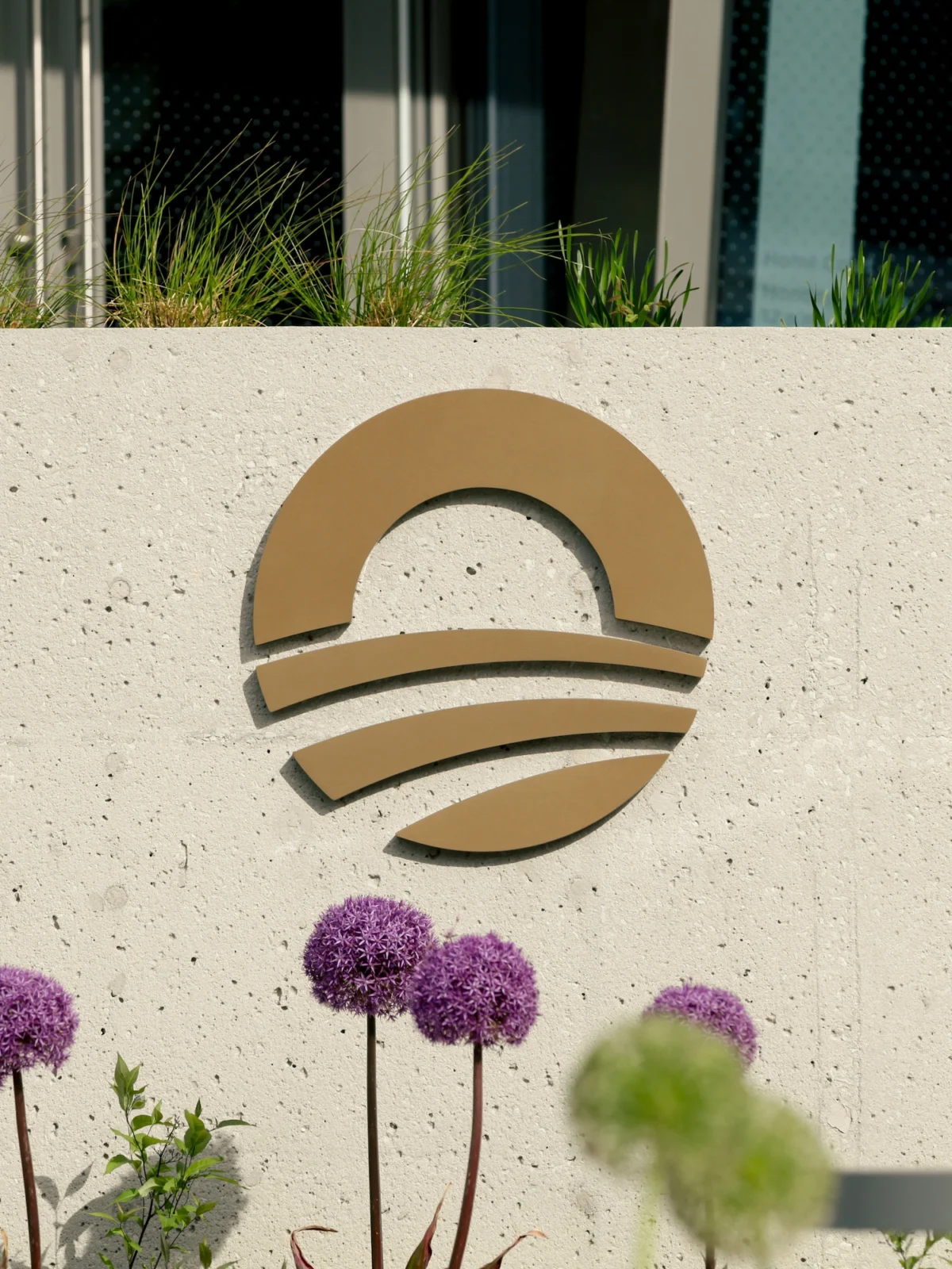
- The Logo: A sensitive evolution of the iconic "Rising Sun" logo originally created for the 2008 campaign, now optimized for modern applications.
- Typography: An expansion of the "Gotham" typeface—the font forever linked to the Obama presidency—into a versatile family of styles including Slab, Stencil, and Inline.
- Color Palette: A move toward a more vibrant, energetic scheme that incorporates primary blues and greens, reflecting both the natural landscape of the park and the energy of the community.
- Wayfinding: A comprehensive physical signage system that guides visitors through the museum and public grounds using a monochromatic, textural base punctuated by expressive illustrations.
Chronology: From Strategy to Signage (2023–2026)
The journey to the Center’s opening was a phased, multi-year collaboration between Manual and the Obama Foundation. The project was divided into two distinct but overlapping stages: the revitalization of the Foundation’s brand and the implementation of the Center’s physical identity.
2023–2024: The Foundation’s Visual Evolution
Upon being awarded the brief in 2023, Manual’s first priority was to refine the overarching identity of the Obama Foundation. The goal was to maintain the brand equity of the "Rising Sun" while preparing the organization for its next chapter. During this period, the studio focused on motion graphics, digital-first color palettes, and the development of a custom typographic system.

2025: The Brand Reveal and Physical Translation
In 2025, the refreshed Foundation identity was officially unveiled. However, for the designers at Manual, the work was only half-finished. The team spent the following year figuring out how to "spatialise" the brand. This involved collaborating with architects and exhibition designers to ensure that the visual system felt native to the physical structures on the South Side.
2026: The Public Opening
In recent weeks, the Obama Presidential Center officially opened its doors. The result is a seamless transition from the Foundation’s digital presence to the physical experience of walking through the museum and community spaces. The identity is now fully operational, serving as the interface for hundreds of thousands of visitors.
Supporting Data: The Mechanics of the Design
To understand the scale of Manual’s achievement, one must look at the technical details of the "visual system." The studio’s work had to be both monumental enough for a presidential institution and approachable enough for a neighborhood community center.

The Typographic Heritage
One of the most significant aspects of the project was the evolution of Gotham. Originally designed by Tobias Frere-Jones, Gotham became the "voice" of the 2008 "Hope" campaign. Rather than abandoning this legacy, Manual worked with the Foundation to expand it.
The introduction of Gotham Slab, Gotham Stencil, and Gotham Inline allowed for a hierarchy of information:
- Gotham Slab: Used for authoritative, monumental statements and architectural headers.
- Gotham Stencil: Employed for utilitarian signage and industrial applications, nodding to the "action" and "work" of community building.
- Gotham Inline: Used for more decorative or celebratory moments, adding a layer of elegance and transparency.
Wayfinding as Narrative
With 19 acres to navigate, wayfinding was a critical challenge. Manual’s solution was to use a restrained, monochromatic palette for the primary signage, allowing the architecture to speak. However, they introduced "pops" of color—specifically primary blues and greens—to highlight points of interest and community zones. This ensures the experience is intuitive without feeling overly prescriptive or institutional.

Anticipated Impact
The Obama Foundation expects the Center to be a significant economic and cultural engine. Supporting data suggests:
- 700,000+ annual visitors.
- $3.1 billion in projected economic impact for the city of Chicago.
- 19 acres of revitalized public space, including a new branch of the Chicago Public Library located on-site.
Official Responses: A Mission-Driven Collaboration
For the founders of Manual, the project was as much about shared values as it was about aesthetics. In statements following the opening, the designers emphasized the collaborative nature of the three-year process.
Tom Crabtree, Creative Director at Manual, highlighted the unique nature of the Center:
"Many presidential institutions are formal, historical and retrospective. The Obama Presidential Center is different. It is active, public-facing, community-centred and forward-looking. It’s all about participation, leadership and action. To play even a small part in its design was a real honour and a career highlight for our studio."

Patricia Callaway, Partner at Manual, reflected on the emotional weight of the project:
"In the times we are living in, there is something deeply rewarding about working on a project rooted in the belief that people can come together to make things better. The Obama Foundation was such a fantastic partner at every stage… we were all working toward one shared goal: to create a place and experience truly worthy of the Foundation’s mission."
The Obama Foundation has also signaled that this visual identity is intended to be a "living system" that will evolve as the Center hosts different programs, from athletic events to international leadership summits.
Implications: Redefining the Presidential Legacy
The success of Manual’s work on the Obama Presidential Center has broader implications for the design of public institutions and the concept of "Presidential Branding."

1. From Archives to Activism
Traditionally, presidential libraries are built to protect the past. Manual’s design system proves that these spaces can be branded as engines for the future. By moving away from the "informal, prescriptive experience" of traditional museums, the OPC sets a new standard for how public figures can engage with their legacy in a way that prioritizes the visitor’s agency.
2. The South Side’s Visual Landmark
The choice of Chicago’s South Side is central to the Obama narrative. Manual’s visual identity avoids the "gentrified" look of many modern museum brands, instead opting for a system that feels robust, inclusive, and tied to the city’s urban fabric. This approach helps bridge the gap between a global foundation and a local neighborhood.
3. A Template for Civic Branding
As civic institutions worldwide struggle to remain relevant in a digital age, the OPC’s identity offers a blueprint. It demonstrates how a brand can be cohesive across multiple touchpoints—from a social media post to a granite-carved inscription—without losing its soul.

In conclusion, the Obama Presidential Center is more than a building; it is a visual and physical manifestation of a philosophy. Through three years of meticulous design, Manual has ensured that every visitor, whether they are a local student or a global tourist, feels the core message of the Obama Foundation: that change is not something that happens to us, but something we create together. As the sun rises on this new Chicago landmark, its visual identity stands as a testament to the power of design to inspire action.


