Jif’s Subtle Evolution: A Masterclass in Brand Longevity Amidst the Era of Polarizing Rebrands
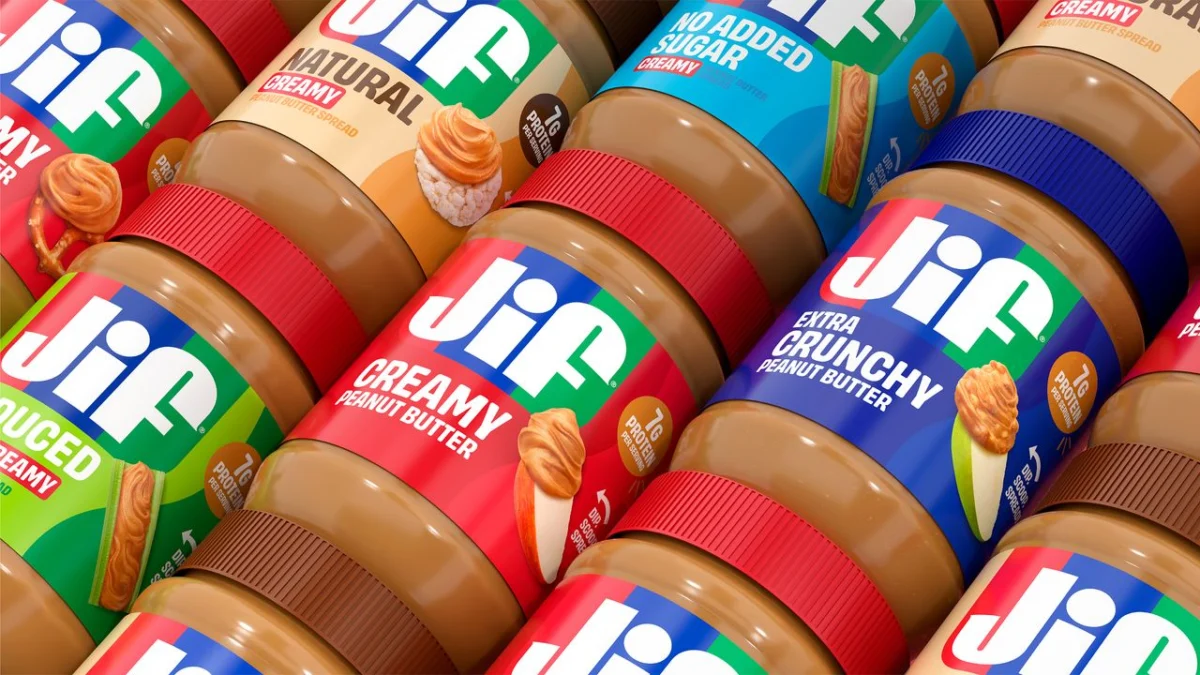
In the often tumultuous landscape of brand evolution, where a single design tweak can ignite a firestorm of public opinion, Jif, the iconic peanut butter brand, has quietly undergone a significant visual refresh. This transformation, the first major overhaul in three decades, has largely flown under the radar, a stark contrast to the seismic shifts and often controversial redesigns that have become commonplace in the digital age. While other brands court attention through radical reinvention, Jif’s approach underscores a strategic adherence to its established identity, prioritizing functional refinement over the fleeting allure of public discourse.
This subtle yet significant evolution prompts a deeper examination of modern branding strategies. It begs the question: in an era where online backlash can be swift and brutal, is the safest path forward also the most effective? Jif’s story offers a compelling case study in maintaining brand relevance and consumer trust through measured, intentional change.
The Quiet Revolution: Unpacking Jif’s New Look
The visual changes to Jif’s branding, while understated, represent a deliberate step towards a more contemporary aesthetic. The most noticeable alteration is the removal of the dated drop-shadow border that previously framed the Jif logo. This seemingly minor adjustment contributes to a cleaner, more streamlined appearance. Simultaneously, the brand has reintroduced its distinctive tri-color banner, a nod to its heritage that resonates with long-standing consumers. This iconic element, now presented with a fresh vitality, reinforces Jif’s recognizable identity.
The overall effect is a logo that feels both familiar and revitalized. It’s a look that is undeniably effective in its clarity and modernity, yet it lacks the audacious flair that often captures immediate public attention. This deliberate restraint, however, is precisely what may contribute to its long-term success. In a world saturated with attention-grabbing designs, Jif’s refined approach might be the key to enduring relevance, even if it means sacrificing immediate fanfare.
A Legacy of Consistency: The Evolution of a Peanut Butter Icon
The history of Jif’s branding is a testament to the power of consistency. For decades, the brand has been synonymous with quality and a comforting familiarity for consumers. Its visual identity has been a constant presence on kitchen shelves, evoking memories of childhood and shared meals. This deep-seated connection with its audience makes any significant alteration a delicate balancing act.
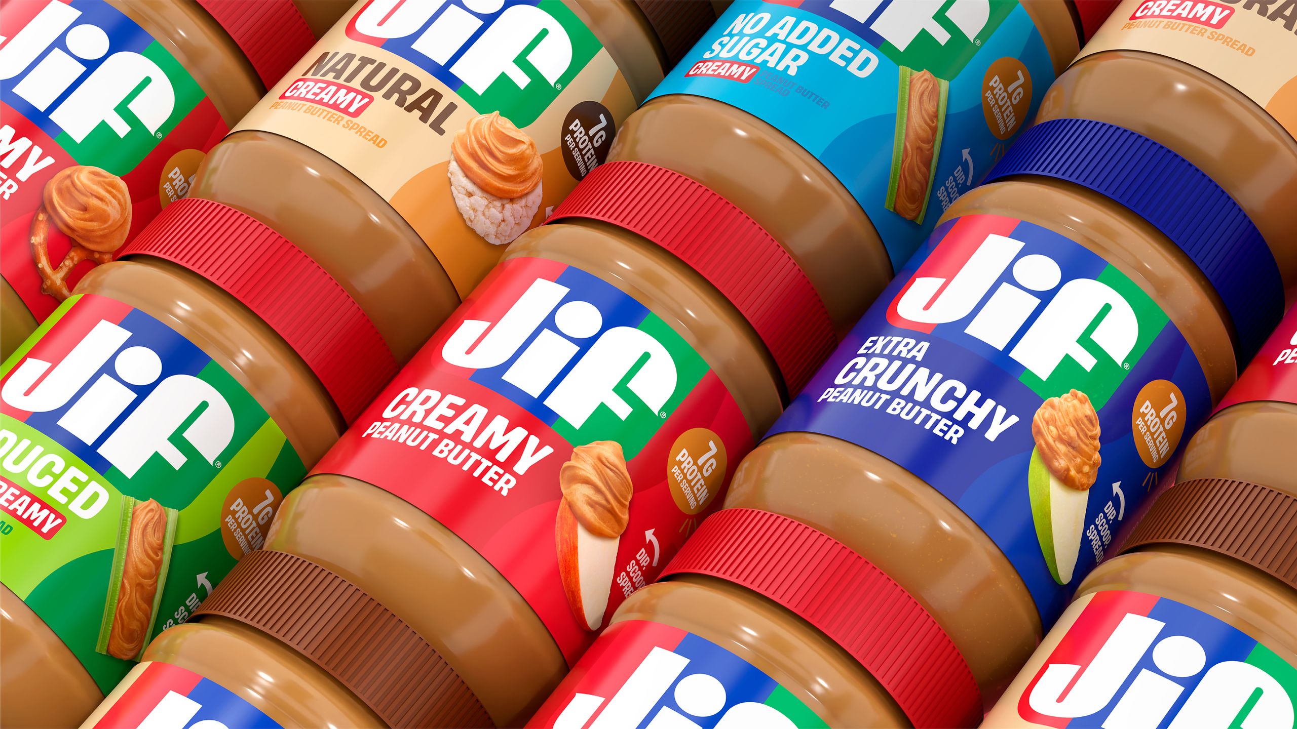
The decision to undertake a rebrand after 30 years indicates a recognition of the need to adapt to evolving consumer expectations and design trends. However, the brand’s commitment to its core values is evident in the nature of the changes. Instead of a complete departure, Jif has opted for a measured evolution, ensuring that the new look remains intrinsically linked to the brand’s established legacy. This strategy is rooted in the understanding that for a brand as deeply ingrained as Jif, consumer continuity is paramount. The new branding, therefore, is refined, modern, and fresh, but crucially, it does not alienate the loyal customer base that has come to rely on its familiar presence.
The Branding Backlash: Navigating the Digital Minefield
The contemporary branding landscape is characterized by a heightened sensitivity to design changes. Rebrands, particularly those undertaken by major corporations, are often met with intense scrutiny and a barrage of opinions, primarily fueled by social media. This environment can feel akin to a "witch trial," where brands are either lambasted for playing it too safe or criticized for making drastic, unwelcome alterations.
Recent high-profile rebrands, such as Instagram’s controversial logo update, have demonstrated the power of public opinion to shape the perception of a brand’s visual identity. The intensity of these reactions often stems from a deep emotional connection consumers have with established brands. When these familiar visual cues are altered, it can feel like a disruption of a long-held relationship.
In this context, Jif’s understated rebrand appears to be a strategic maneuver to sidestep the pitfalls of widespread criticism. By opting for subtle refinements rather than a radical overhaul, Jif has minimized the potential for significant backlash. This approach, while potentially less exciting in terms of generating immediate buzz, offers a more sustainable path to brand acceptance. It acknowledges that in the current climate, the "best rebrands aren’t necessarily the most radical; they’re the ones that build on a brand’s existing legacy."
The Unspoken Advantage: Why Subtlety Can Be a Strength
The paradox of modern branding is that while consumers often crave innovation, they also cherish familiarity. The online discourse around branding tends to ignite most fiercely when there is something to vehemently disagree with. Grand reinventions, while offering a wealth of talking points, also present a larger surface area for criticism. Purists may decry the loss of a brand’s "soul," while design critics might label the changes as an attempt to be overly trendy.
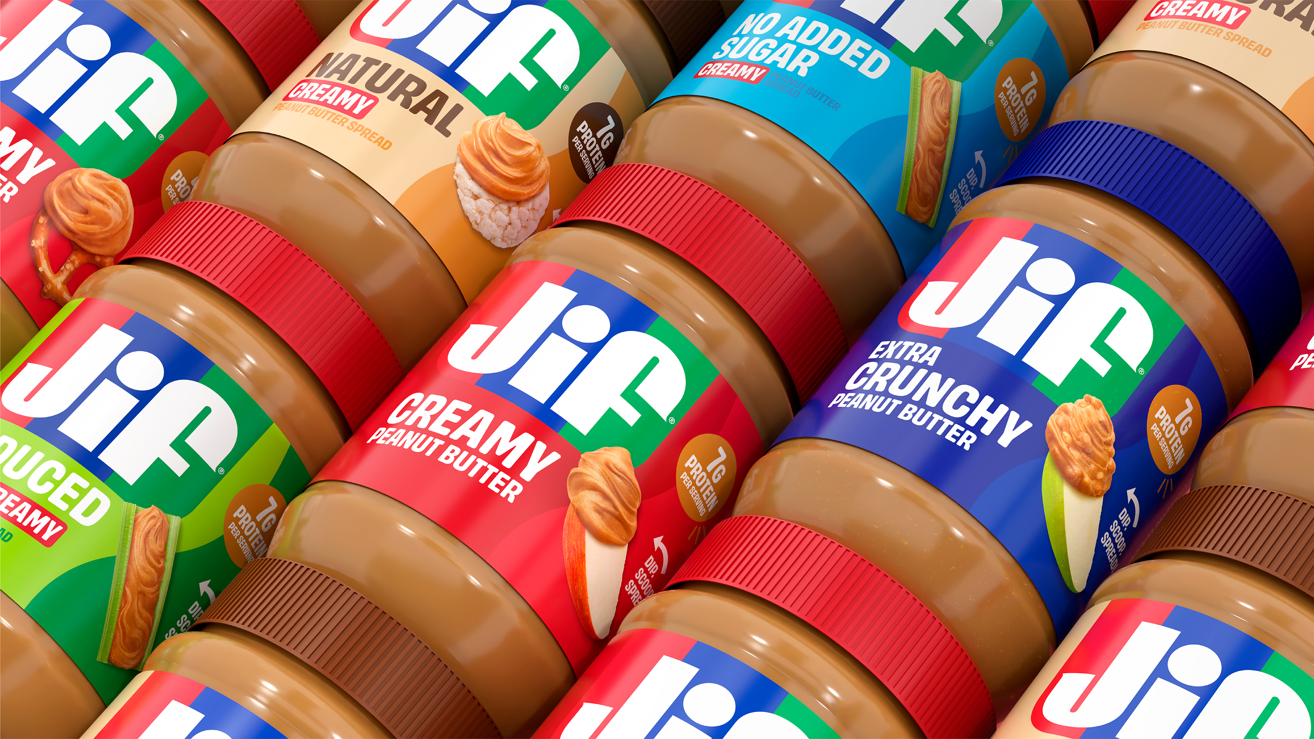
Jif’s rebrand, by contrast, is too functional to become a viral sensation for its controversial aspects. The absence of a polarizing element means there’s less fodder for widespread online debate. This "safe" approach, while perhaps perceived as unexciting by some, effectively shields the brand from the kind of public "execution" that can damage reputation and erode consumer trust.
In essence, Jif’s quiet evolution presents a critical choice for brands in the modern era: do you prioritize widespread attention, even if it comes with the risk of significant criticism, or do you focus on functional refinement that maintains consumer continuity and a strong brand legacy, even if it means flying under the radar? Jif’s strategy suggests that for a brand with such a deep-seated presence, the latter may be the more prudent and ultimately more successful path to long-term brand health.
Looking Ahead: The Enduring Power of Brand Integrity
Jif’s recent visual update serves as a compelling reminder that brand evolution does not always require a seismic shift. In an era where loud and often divisive branding strategies dominate headlines, Jif’s quiet, deliberate approach highlights the enduring power of brand integrity and consumer continuity. The brand’s ability to subtly refresh its identity while retaining its core essence speaks volumes about its understanding of its audience and its commitment to long-term relevance.
As the branding world continues to grapple with the impact of social media and the ever-present demand for novelty, Jif’s strategy offers a valuable lesson. It suggests that true brand longevity is not always about chasing fleeting trends or courting controversy, but about thoughtfully nurturing and refining an identity that resonates deeply with consumers. The subtle glow-up of Jif’s logo may not have set the internet ablaze, but it has likely solidified its position as a beloved and enduring presence on supermarket shelves for years to come. In a world that often mistakes noise for progress, Jif’s quiet evolution is a testament to the power of well-executed, considered change.