The Enduring Appeal of the Mascot: How Monster Munch’s Timeless Design Dominates a Shifting Branding Landscape
In an era where brands are constantly seeking innovative ways to capture consumer attention, the humble mascot has experienced a significant resurgence. From Apple’s ubiquitous "Little Finder Guy" to Crocs’ beloved "Niles the Croc," and even Sony’s ambitious foray into creating a character to rival the iconic Hello Kitty, brand mascots are not just surviving; they are thriving in 2026. While many brands opt for radical redesigns, transforming familiar faces into digital kaiju or subjecting beloved characters to existential crises, one classic British corn crisp brand, Monster Munch, has demonstrated the potent power of a well-crafted character that can withstand the test of time with minimal intervention.
This enduring appeal is a testament to the strategic brilliance of character design, a field that continues to evolve yet often circles back to fundamental principles of recognition, playfulness, and emotional connection. The recent refresh of Monster Munch, a brand that has graced supermarket shelves for over four decades, serves as a compelling case study in how to honor heritage while embracing contemporary design sensibilities.
The Mascot Renaissance: A Strategic Imperative
The current landscape of brand communication is characterized by an overwhelming deluge of information. In this environment, memorable characters act as powerful anchors, cutting through the noise and fostering a direct, emotional connection with consumers. Mascots offer a tangible, anthropomorphic representation of a brand’s identity, personality, and values. They can simplify complex brand messages, evoke nostalgia, and inject an element of fun and memorability into otherwise utilitarian products.
The examples cited—Apple’s Finder Guy, Crocs’ Niles, and Sony’s new character—all underscore a key trend: brands are investing in characters that are not only visually appealing but also strategically designed to resonate with target audiences across various demographics and platforms. This isn’t merely about creating a cute face; it’s about developing a brand ambassador capable of driving engagement, building loyalty, and ultimately, boosting sales.
However, the path of mascot evolution is not always smooth. Brands like Kellogg’s have experimented with radical reinventions, transforming the iconic Corn Flakes rooster into a colossal 3D kaiju, a bold move that sparks conversation and captures a modern, visually dynamic aesthetic. Similarly, Kraft Heinz has engaged in more experimental, even unsettling, marketing campaigns, seemingly "torturing" their Jet-Puffed marshmallows, a strategy that, while attention-grabbing, raises questions about the long-term impact on brand perception. These examples highlight the inherent risk and reward associated with significant brand overhauls.
Monster Munch: A Masterclass in Timeless Design
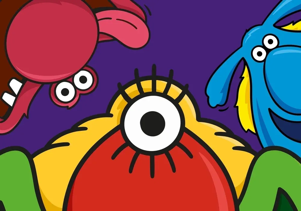
In stark contrast to these more dramatic transformations, the recent redesign of Monster Munch by PepsiCo’s European design team offers a masterclass in subtle yet effective brand evolution. The core of the Monster Munch brand has always been its trio of distinct, quirky monster characters. These characters, first introduced by Smiths in 1977, have remained the central figures, a testament to their inherent design strength and enduring appeal.
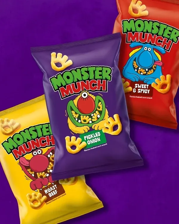
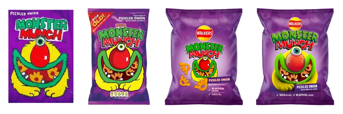
The brand’s journey over the past four decades, particularly since its acquisition by PepsiCo in 1989, has seen several packaging refreshes. While these updates have aimed to keep the brand relevant, some have inadvertently diluted the prominence of the monsters themselves, introducing elements that distracted from their core appeal. This is where the latest redesign shines. Instead of reinventing the wheel, the PepsiCo team has strategically chosen to amplify what has always worked: the monsters.
The Subtle Art of Refinement: Key Design Elements
The refresh is characterized by a "light touch," a deliberate approach that acknowledges the brand’s long history and the need to avoid alienating its loyal fanbase. Jon Bailey, senior design manager at PepsiCo, emphasized this cautious yet strategic methodology in his LinkedIn post. The key elements of the redesign include:
- A Tweaked Logo and New Monogram: While the iconic Monster Munch logo remains recognizable, subtle refinements have likely been made to enhance its legibility and modern appeal. The introduction of a new monogram offers a concise visual identifier that can be used across various applications.
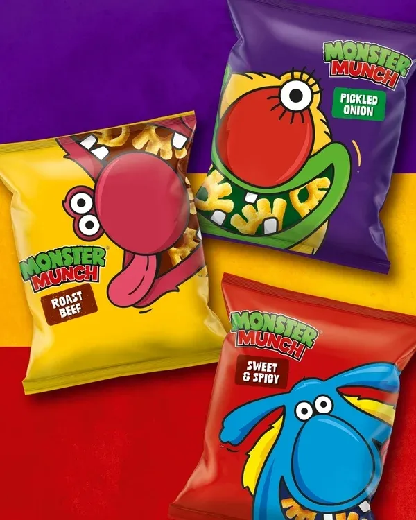
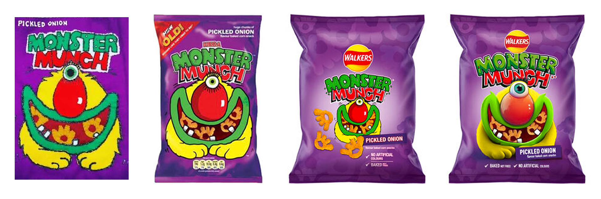
- Updated Illustrations: The most significant change lies in the redrawn monster illustrations. The shift away from the computer-generated 3D look and gradient backgrounds of recent years signifies a return to a simpler, bolder aesthetic. This move not only highlights the brand’s nostalgic appeal but also emphasizes the inherent charm and character of the original designs. The new illustrations are playful yet refined, retaining the well-recognized elements that fans have come to love.
- Packaging Design and Photography: The overall packaging design has been updated to ensure that the monsters are once again the undisputed stars. The previous trend of prominently featuring a larger Walkers logo has been reversed, placing the Monster Munch brand and its characters front and center. This strategic decision reinforces the brand’s independent identity and its rich legacy. The new photography likely complements the refreshed illustrations, creating a cohesive and appealing visual experience.
This approach is particularly noteworthy when compared to the 2019 rebrand of Monster Munch alongside other Walkers brands like Quavers and Wotsits. That update, while aiming to create a visual link within the broader Walkers portfolio, resulted in a "now dated-looking" gradient and a prominent Walkers logo. This approach, while seemingly logical from a portfolio management perspective, overlooked the established equity of Monster Munch as a standalone legacy brand. The latest refresh wisely reverts this decision, allowing Monster Munch to reclaim its individual brand identity and the spotlight it deserves.
A Look Back: The Evolution of the Monster Munch Persona
The enduring success of Monster Munch’s mascots is deeply rooted in their initial conception and subsequent, albeit subtle, evolution. Launched in 1977 as "The Prime Monster," the characters were designed to be distinct and instantly recognizable. Their unique colors and forms immediately associate them with specific flavors, even as those flavors have shifted over time. This immediate visual cue is a powerful tool in the competitive snack aisle.
The characters possess an almost Muppet-like quality – slightly off-kilter, full of personality, and capable of evoking a sense of fun and mischief. This relatability, combined with their distinct visual identities, has allowed them to transcend fleeting design trends. The recent move to a simpler, flatter aesthetic for the monster illustrations effectively strips away any visual clutter, allowing their inherent charm and character to shine through once more. This is not a radical departure but a thoughtful refinement, a recognition that the original design principles were sound.
The question of whether the crisps themselves are meant to resemble the monsters’ paws or the pickled onion monster’s eye and lashes is a charming anecdote that speaks to the enduring mystery and playful ambiguity of the brand’s design. It’s a detail that sparks conversation and reinforces the brand’s whimsical nature.
Supporting Data: The Power of Nostalgia and Recognition
The success of such a nuanced refresh can be attributed to several factors, supported by broader trends in consumer behavior and marketing:
- Nostalgia Marketing: Consumers, particularly millennials and Gen Z, have a strong affinity for brands that evoke positive childhood memories. Monster Munch, a brand with a history spanning over four decades, taps directly into this powerful emotional connection. By returning to a design that feels familiar yet refreshed, PepsiCo is leveraging the potent force of nostalgia to re-engage existing customers and attract new ones.
- Brand Equity: Monster Munch possesses significant brand equity, built over years of consistent presence and memorable advertising. Radical redesigns risk alienating loyal customers who have developed an emotional attachment to the existing brand identity. The subtle refresh preserves this equity while modernizing the visual presentation.
- Simplicity and Clarity: In a visually saturated world, simple, clear design principles are often the most effective. The move away from 3D graphics and gradients towards a bolder, flatter aesthetic enhances legibility and makes the brand more adaptable across various media, from packaging to social media avatars.
- The "Return to Basics" Trend: There’s a growing appreciation for authenticity and craftsmanship in design. The Monster Munch refresh aligns with this trend by emphasizing hand-drawn qualities and a less overtly "digital" feel, suggesting a more human and considered approach to design.
Official Responses: A Strategic Rationale
The official rationale behind the Monster Munch redesign, as articulated by Jon Bailey, senior design manager at PepsiCo, underscores the brand’s long-standing heritage. His emphasis on a "cautious approach" speaks volumes. It indicates a deep understanding that the brand’s strength lies in its continuity and the established recognition of its characters.
"The monster characters have been around since the brand’s launch in 1977," Bailey noted. This historical context is crucial. The characters are not merely design elements; they are integral to the brand’s narrative and consumer identity. The decision to prioritize these characters in the redesign reflects a strategic understanding that they are the primary drivers of brand recognition and loyalty.
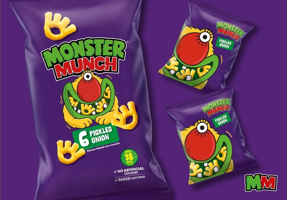
The move away from the larger Walkers logo on the front of the packaging is also a significant strategic decision. While it might have served to integrate Monster Munch into a broader corporate portfolio, it potentially diminished the brand’s individual appeal. By reinstating Monster Munch as the primary focus, PepsiCo is signaling a renewed commitment to the brand’s distinct identity and its independent market presence.
Implications: The Enduring Power of Iconic Design
The Monster Munch redesign offers several important implications for the broader branding and design landscape:
- A Reaffirmation of Character-Driven Branding: In an age of abstract logos and minimalist design, the Monster Munch story is a powerful reminder that well-executed characters can be incredibly effective brand assets. They offer a unique blend of personality, memorability, and emotional resonance that abstract marks often struggle to achieve.
- The Value of Heritage and Subtle Evolution: The success of this refresh suggests that brands with strong heritage should not shy away from evolving their visual identity. However, the Monster Munch example highlights the critical importance of how this evolution occurs. Subtle refinements that honor the past while embracing modern design principles can be far more effective than radical overhauls.
- Strategic Design as a Competitive Advantage: The Monster Munch redesign is not just an aesthetic update; it’s a strategic move designed to bolster the brand’s market position. By reinforcing its core strengths, the brand is better positioned to compete in a crowded snack market. This underscores the idea that design is not merely decorative but a powerful tool for achieving business objectives.
- The Future of Mascots: The resurgence of mascots, exemplified by Monster Munch’s successful refresh, suggests that brands will continue to invest in character-driven strategies. The key will be to create characters that are not only visually appealing but also authentic, adaptable, and capable of fostering genuine connections with consumers across an increasingly diverse media landscape.
In conclusion, the Monster Munch redesign is a compelling illustration of how a brand can successfully navigate the complexities of modern branding by honoring its legacy while embracing strategic evolution. By placing its iconic monsters back at the forefront, the brand has not only refreshed its visual identity but has also reaffirmed the enduring power of timeless character design in capturing hearts, minds, and market share. In a world constantly chasing the next big trend, Monster Munch stands as a potent reminder that sometimes, the most effective path forward is to elegantly refine what has always been great.