
Handmade Coffee: A Sanctuary of Craft and Connection in Pune’s Bustling Kalyani Nagar
Pune, India – In the vibrant and ever-evolving urban landscape of Kalyani Nagar, Pune, a new establishment has emerged, not merely as another café, but as a deliberate sanctuary designed to foster a slower pace of life and cultivate meaningful connections. "Handmade" is a testament to the power of thoughtful design in shaping experience, offering a stark contrast to the transient nature of many of its neighboring establishments, particularly those that often overlook the needs of families and the desire for extended stays. This unique café, brought to life by the creative vision of Rare Ideas, is redefining hospitality through its unwavering commitment to an ethos of visible care, tangible warmth, and a profound sense of community.
The Genesis of a Community Living Room
The genesis of Handmade can be traced to a desire to create a space that actively encourages repeat visits and the nurturing of consistent relationships. In a city characterized by its dynamic pace, Handmade stands as an intentional counterpoint, prioritizing a "slower rhythm of hospitality." This philosophy is not just an abstract concept; it is meticulously woven into the fabric of the café’s design and operational strategy. Unlike many cafés that are designed for quick stops and transient interactions, Handmade is conceived as a destination, a place where patrons feel invited to linger, to connect, and to simply be. This is especially crucial for families, who often seek environments that are not only welcoming but also accommodating to the presence of children, allowing for relaxed outings and shared moments.
Rare Ideas, the design agency behind Handmade’s striking identity, understood that to achieve this ambitious vision, the branding needed to be more than just aesthetically pleasing. It needed to embody the café’s core values. Their strategic positioning statement encapsulates this perfectly: "Handmade is a community living room, built on the belief that care is something you can see, touch and feel." This powerful declaration sets a clear benchmark for the brand, emphasizing that the tangible aspects of the café’s design and service are directly linked to the emotional experience of its patrons. The importance of a strong, well-defined positioning cannot be overstated in the realm of branding, as evidenced by the caliber of winners in prestigious accolades such as the Brand Impact Awards 2025, which consistently celebrate brands that achieve remarkable impact through clear strategic direction.

Weaving Craftsmanship into the Visual Narrative
The core of Handmade’s design philosophy lies in making the concept of "made from scratch" palpable and visually engaging. Rare Ideas meticulously translated this ethos into a design language that celebrates craft, prioritizes texture over flat surfaces, and embraces subtle imperfections as hallmarks of authenticity. This deliberate choice moves away from sterile, mass-produced aesthetics and instead leans into a narrative of human touch and artisanal creation.
The design system is characterized by an approachable structure and a sense of calm, achieved through a controlled use of space and a restrained yet evocative color palette. This approach ensures that the visual elements contribute to the overall atmosphere of tranquility and warmth, rather than overwhelming the senses.
The Emblematic Mark: A Symbol of Handmade Authenticity
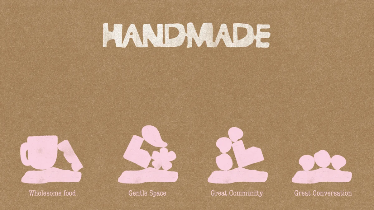
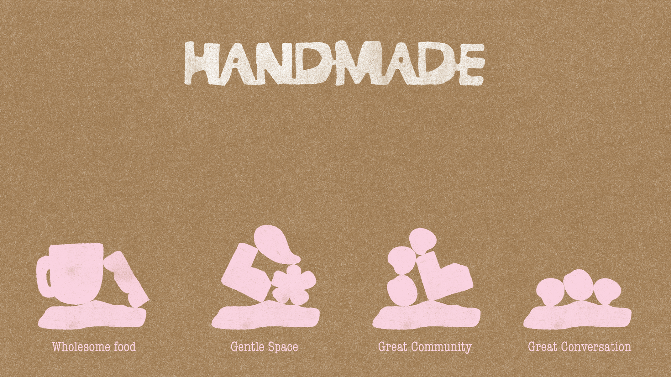
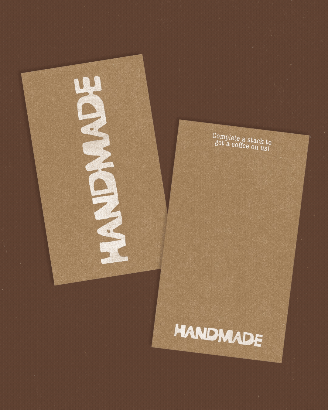
At the heart of Handmade’s visual identity is its distinctive mark. This emblem draws inspiration from traditional craft practices such as block-printing and clay-based artistry. Its design intentionally mimics the appearance of a stamp, featuring a thick silhouette and soft edges that convey a sense of warmth and approachability. Crucially, the mark incorporates slight irregularities, a deliberate nod to the inherent variations found in truly handmade objects. This imperfection is not a flaw but a feature, reinforcing the café’s commitment to authenticity and the beauty of the human hand. The stamp-like quality also lends itself to versatile application across various touchpoints, from packaging to signage, ensuring a consistent and recognizable brand presence.
A Palette Rooted in Nature and Nurturing
The color palette employed by Rare Ideas is deeply symbolic, further reinforcing the café’s narrative of care and groundedness. A deep, rich brown forms the foundation, evoking the earth, soil, and a sense of being firmly rooted. This grounding element is complemented by a clean, clear white, which introduces a sense of clarity and spaciousness. Accents of muted pink and soft yellow add warmth, gentleness, and a touch of subtle vibrancy, preventing the palette from becoming overly somber and instead infusing it with a nurturing quality. This carefully curated selection of colors contributes significantly to the café’s calming and inviting ambiance, creating a sensory experience that aligns perfectly with its core message.
The Modular System: Adaptability and Cohesion
Beyond the primary mark, Rare Ideas developed a modular system of organic shapes that further extends the brand’s visual language. These shapes, inspired by natural forms, are characterized by their subtle imperfections and their inherent modularity. This means they can be combined and repeated in various configurations, creating a dynamic yet cohesive system that can be adapted across a wide range of applications.
This adaptable system finds its expression across all customer touchpoints. From the intricate details on menus to the clear and welcoming signage, the organic shapes and their subtle irregularities ensure a consistent brand experience. This visual continuity reinforces the Handmade ethos at every interaction, making the brand memorable and deeply ingrained in the patron’s perception. The modularity also allows for future expansion and adaptation, ensuring the brand can evolve while maintaining its core identity.
Elevating the Experiential Dimension
The design of Handmade extends beyond static visuals to encompass the very experience of being within the café. This holistic approach ensures that the physical environment and the functional elements all contribute to the overarching narrative of care and craftsmanship.
Interactive Elements: Engaging the Senses and the Mind
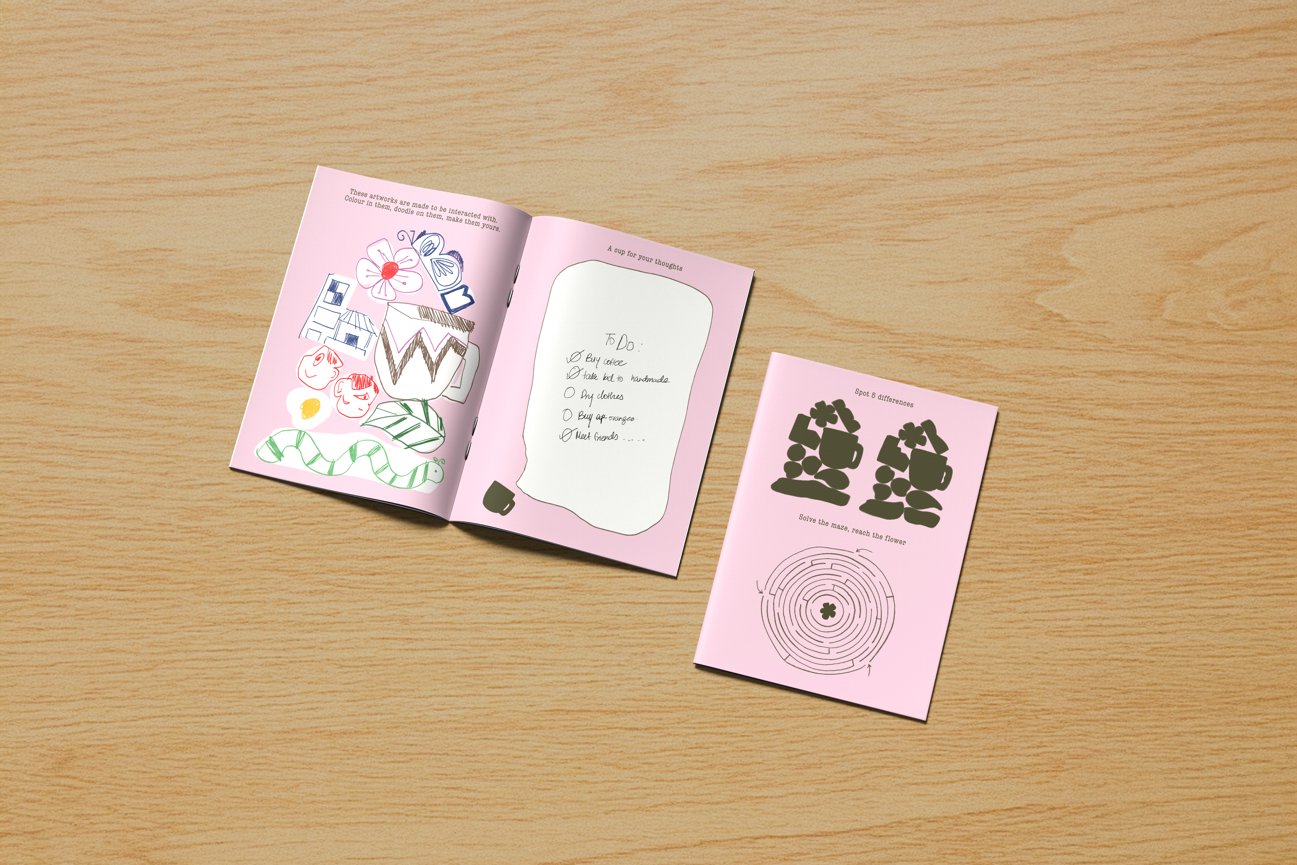
One of the most innovative aspects of Handmade’s design is its integration of interactive elements that actively engage patrons. Coasters, for instance, are not merely functional items but canvases for creativity. Designed to be drawn on, they offer parents a welcome opportunity for a moment of respite while their children are engaged in a creative activity. This thoughtful detail speaks volumes about the café’s understanding of its diverse clientele and its commitment to providing a truly family-friendly environment. By transforming a mundane object into a tool for engagement, Handmade fosters a sense of playfulness and encourages shared experiences, further solidifying its role as a community hub.
Tactile Surfaces and Sensory Richness
The emphasis on texture is a recurring theme throughout Handmade’s design. From the choice of materials to the subtle finishes, every surface is intended to be felt and experienced. This tactile richness adds a layer of depth and sophistication to the café, inviting patrons to engage with the space on a deeper, more sensory level. The deliberate use of textured elements moves away from the often-impersonal feel of many modern establishments and instead creates an environment that feels warm, inviting, and deeply human.
A Refreshing Elegance: A Harmonious Synthesis
The overall impression of Handmade is one of "refreshing yet elegant" design. This is not an accidental outcome but the result of a meticulously planned and executed branding strategy. Rare Ideas has successfully synthesized a narrative of craft, care, and community into a cohesive and compelling brand identity. The café’s success lies in its ability to offer an experience that is both grounding and uplifting, providing a much-needed respite from the demands of modern life.
The café’s design is a masterclass in how branding can transcend mere aesthetics to shape user experience and foster genuine connection. By focusing on the tangible aspects of "handmade" – the textures, the subtle imperfections, the thoughtful details – Handmade has created a space that feels authentic, nurturing, and deeply welcoming. It is a testament to the power of design to not only attract customers but to cultivate loyalty and create a lasting impression, proving that in the bustling heart of Pune, a slower, more connected approach to hospitality can truly stand out.
The success of Handmade serves as a powerful example of how a well-defined brand ethos, when translated into a comprehensive design strategy, can create an environment that resonates deeply with its target audience. It highlights the growing appreciation for authenticity, craftsmanship, and the creation of spaces that prioritize human connection and well-being. In a world increasingly dominated by the digital and the ephemeral, Handmade offers a welcome reminder of the enduring value of the tangible and the profound impact of thoughtful, human-centered design.


Leave a Comment