Heritage in Motion: Sporting Clube de Portugal Unveils Comprehensive Visual Identity Overhaul for 120th Anniversary
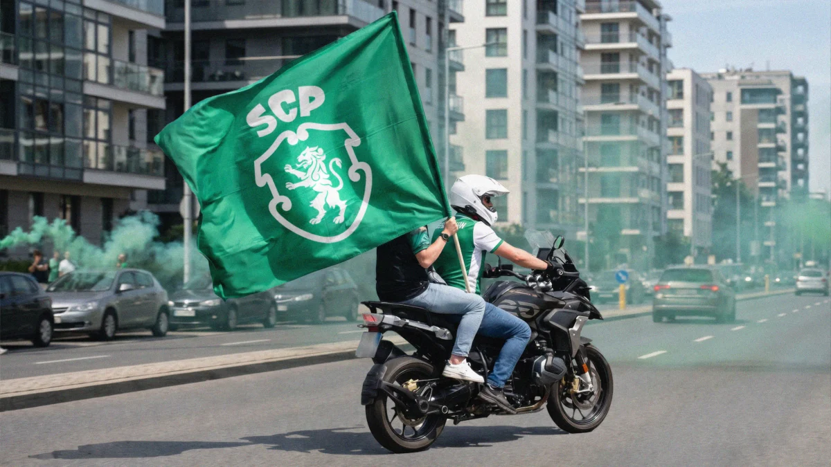
In the high-stakes arena of professional football, few tasks are as fraught with peril as the redesign of a club’s crest. For the supporters, a crest is not merely a logo; it is a sacred emblem, a repository of generational memories, and a visual shorthand for identity. To change it is to tinker with the soul of an institution. It is within this delicate context that Sporting Clube de Portugal (SCP) has unveiled its first major visual identity update in a quarter-century.
Timed to coincide with the club’s landmark 120th anniversary, the redesign—conducted in partnership with the global branding powerhouse JKR (Jones Knowles Ritchie)—represents a strategic pivot toward a more cohesive, digital-first future. By striking a calculated balance between historical reverence and modern minimalism, Sporting CP aims to solidify its position as a global brand while honoring the fierce loyalty of its Lisbon-based faithful.
Main Facts: A Balanced Evolution of Iconography
The new visual identity is not a radical departure but a refined "evolutionary" step. The project’s centerpiece is a redesigned crest that draws heavily from the club’s widely beloved 1945 badge. This decision reflects a broader trend in sports branding: the "return to roots" movement, which seeks to strip away the over-embellished gradients and 3D effects of the early 2000s in favor of clean, flat-design principles that perform better on digital screens and merchandise.
Key Components of the New Identity:
- The Refined Crest: The shield has been subtly reshaped for better geometric balance. The central lion has been redrawn with sharper, more intentional lines, and the "SCP" monogram has been refined to improve legibility at small scales.
- The "Sporting Sans" Typeface: A bespoke font family developed specifically for the club. It takes inspiration from the crown-like qualities of the reimagined SCP monogram, providing a unique typographic voice across all club communications.
- The Five Symbols: The branding system is built around five core pillars: the "Porta 10-A" (the stadium’s iconic entrance), the green-and-white horizontal stripes, the shield, the lion, and the SCP monogram.
- "The Code" Philosophy: Beyond the graphics, the identity is anchored in a brand philosophy known as "The Code." This concept emphasizes the club’s famous academy mission: "developing the person before the athlete," a nod to its history of producing world-class talents like Cristiano Ronaldo and Luís Figo.
By consolidating these elements into a single, versatile system, Sporting CP and JKR have created a toolkit that allows the club to speak with a unified voice, whether on a Champions League jersey, a social media post, or a lifestyle apparel line.
Chronology: From 1906 to the Digital Age
To understand the significance of this redesign, one must look at the timeline of Sporting CP’s visual history. Since its founding in 1906, the club has navigated several distinct eras of branding, each reflecting the aesthetic and commercial priorities of the time.

1906–1945: The Formative Years
In its early decades, Sporting’s identity was somewhat fluid, utilizing various iterations of the lion and shield. The focus was on establishing the club as a premier multi-sport institution in Lisbon.
1945: The Golden Standard
The 1945 crest is often cited by historians and fans as the "purest" version of the Sporting emblem. It featured a simplified lion on a green shield with the SCP initials. This version remained the primary inspiration for the 2024 redesign, as it represents a period of significant growth and prestige for the club.
2001: The Modernist Shift
The last major update occurred 25 years ago, at the dawn of the digital age. This version introduced more complex detailing, including yellow/gold accents and a more stylized lion. While it served the club through two decades of success, it eventually began to feel dated in an era dominated by mobile-first design and "flat" aesthetics.
2024: The 120th Anniversary Rebrand
As the club approached its 120th year, the leadership recognized that the existing identity was fragmented. Different departments were using varying versions of the logo, and the brand lacked a cohesive "lifestyle" appeal. The partnership with JKR was initiated to bridge this gap, culminating in the launch of the new system in late 2024.
Supporting Data: The Mechanics of the Redesign
The collaboration between Sporting CP and JKR was not merely an aesthetic exercise; it was a data-driven project aimed at solving functional branding issues. In the modern sports economy, a crest must be "responsive"—meaning it must look as good as a 16-pixel favicon on a smartphone as it does on a 50-foot billboard.

The Lion’s Anatomy
The new lion is a masterclass in synthesis. JKR designers analyzed the five previous iterations of the Sporting lion to create a "definitive" version. The mane’s detailing is particularly symbolic, featuring strokes that represent the passing of values from one generation to the next. This subtle storytelling is intended to resonate with older fans while appearing sleek to younger demographics.
Architectural Integration: Porta 10-A
One of the most innovative aspects of the rebrand is the use of "Porta 10-A." This is the specific entrance at the Estádio José Alvalade through which players enter the pitch. JKR took the ornate detailing of this physical gateway and converted it into a series of graphic patterns. These patterns are now used in the backgrounds of digital content, on the lining of official suits, and in stadium signage, creating a physical-to-digital link that grounds the brand in the club’s actual home.
Typographic Versatility
The creation of "Sporting Sans" addresses a common problem in football branding: the lack of a proprietary voice. Most clubs rely on off-the-shelf fonts that do not carry any specific club DNA. By deriving the font’s geometry from the SCP monogram, the club now possesses a typographic system that is instantly recognizable as "Sporting," even when the logo is not present.
Official Responses: A Vision for the Future
The launch of the new identity was accompanied by a clear message from both the club’s leadership and the creative team at JKR. The primary objective was to ensure that the club’s "ambition" was reflected in its visual language.
Sean Thomas, Global Executive Creative Director at JKR, emphasized that the project was a matter of stewardship rather than replacement. "This was not a case of starting from scratch," Thomas noted in an official statement. "It was about staying faithful to the club’s legacy and true to its loyal fans, while attracting and remaining relevant to the next generation and wider culture. Our job was to build a brand system that carries the spirit of Sporting CP forward without limits, a visual language as distinctive and ambitious as the club itself."

The club’s internal marketing team echoed this sentiment, highlighting that the "Code" philosophy was the "north star" of the project. By centering the brand on the idea of human development, Sporting CP distinguishes itself from clubs that focus solely on "winning at all costs." This positioning is particularly valuable in the global market, where Sporting is often viewed as the world’s premier "talent factory."
Implications: The Global Landscape of Sports Branding
Sporting CP’s redesign arrives at a time of significant upheaval in how sports teams present themselves. The "Juventus Effect" of 2017—where the Italian giants replaced their traditional crest with a minimalist ‘J’—sent shockwaves through the industry. It signaled a move away from "football clubs" and toward "global lifestyle brands."
However, the path to modernization is littered with failures. In 2018, Leeds United famously had to scrap a new crest design within hours of its unveiling following a massive fan revolt. More recently, Aston Villa underwent a protracted process of changing their badge, only to have to revisit the design after supporters expressed dissatisfaction with the new direction.
The "Middle Way" Strategy
Sporting CP appears to have successfully navigated these treacherous waters by choosing a "Middle Way." Unlike Juventus, they did not abandon their traditional heraldry. Unlike Leeds, they engaged in a deep study of their own history to ensure the new design felt earned.
The implications of this successful rebrand are twofold:

- Commercial Scalability: The new system allows Sporting to expand its merchandising efforts into "lifestyle" categories—such as streetwear and digital collectibles—where a traditional, overly complex football crest might feel out of place.
- Brand Consistency: In an era of global streaming and social media, a club’s visual identity is often the first point of contact for an international fan. A clean, consistent identity helps build brand equity more rapidly in emerging markets like North America and Asia.
Ultimately, the success of Sporting CP’s new identity will be judged by the fans in the stands at the Estádio José Alvalade. While a logo cannot win a trophy, it can provide the visual framework for a club’s greatest ambitions. By rooting their future in the aesthetics of their most successful past, Sporting CP and JKR have created a blueprint for how a historic institution can modernize without losing its soul.