Redefining the Cross: Team England’s Bold Visual Pivot for Glasgow 2026
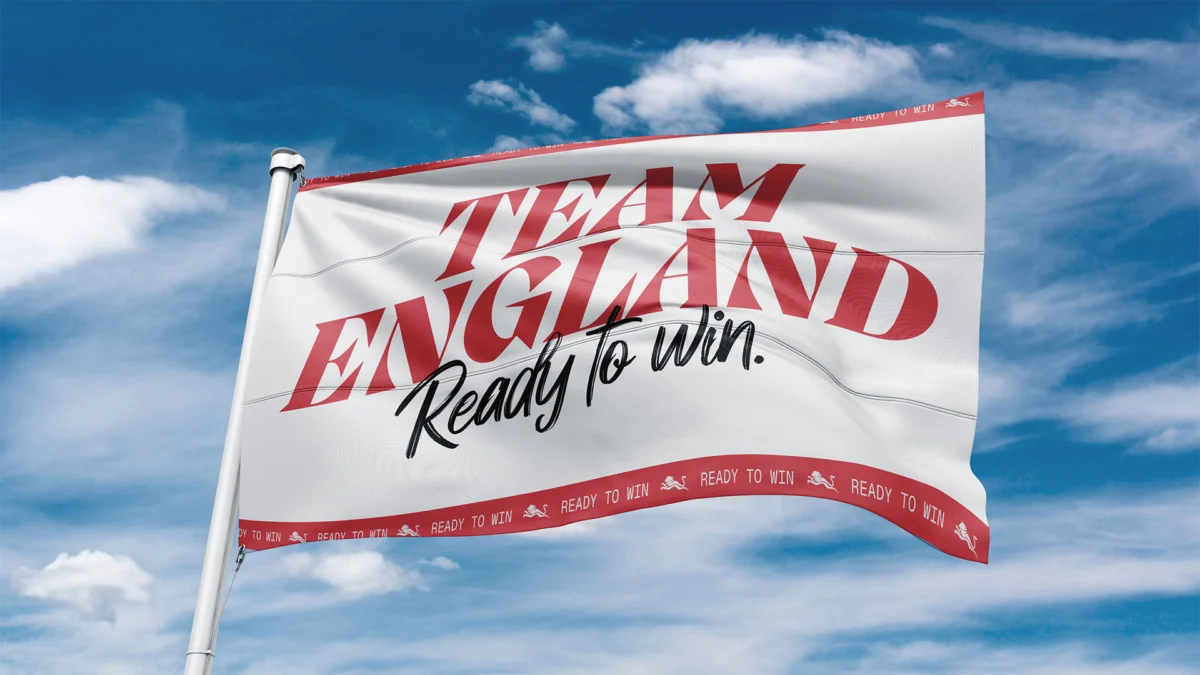
The St George’s Cross is, in its purest geometric form, a study in simplicity: two intersecting red bars atop a white field. Yet, in the contemporary cultural landscape of the United Kingdom, few symbols carry as much semiotic weight, or as much "baggage," as Alex Andlaw of Form Brands Studio puts it. As Team England prepares for the 2026 Commonwealth Games in Glasgow, the challenge of representing "Englishness" has moved beyond mere athletics into the realm of complex identity politics.
With the launch of the new "Ready to Win" campaign identity, Form Brands Studio has been tasked with a formidable objective: to reclaim and repurpose a contested national symbol for a modern, diverse, and inclusive sporting era. The result is a rebranding effort that seeks to navigate the narrow corridor between tradition and progress, aiming to inspire a new generation of athletes while acknowledging the fraught history of the symbols they wear.
Main Facts: The "Ready to Win" Identity
At the core of the new rebranding effort is the "Ready to Win" campaign. This is not merely a logo update; it is a comprehensive visual system designed to function across digital platforms, physical kits, stadium environments, and broadcast media. Form Brands Studio, a London-based creative agency known for its strategic approach to identity, was selected to lead this transition following the success of the 2022 Birmingham Games.
The central tension of the brief was the St George’s Cross. For years, the flag has been a flashpoint in British culture. To some, it is a symbol of community and sporting passion; to others, it is inextricably linked to far-right nationalism or colonial history. For a design team, this presents a "visual minefield."
The "Ready to Win" identity approaches this by deconstructing the flag. Rather than presenting the St George’s Cross as a static, immovable block, Form has treated it as a dynamic element. The red lines are often used as framing devices or "windows" into the lives and movements of the athletes. This "active" use of the symbol is intended to strip away the rigidity of the flag’s historical associations, replacing them with a sense of forward momentum and athletic excellence.
Key elements of the rebrand include:
- Dynamic Typography: A bespoke typeface that mirrors the agility of Commonwealth athletes.
- The "Motion Cross": A visual technique where the red bars of the flag appear to be in flux, suggesting speed and transition.
- Inclusive Imagery: A focus on the breadth of the English team, which includes para-athletes and competitors from a vast array of ethnic and social backgrounds.
Chronology: From Birmingham’s Legacy to Glasgow’s Future
The journey toward the 2026 rebrand began almost immediately after the closing ceremony of the Birmingham 2022 Commonwealth Games. Birmingham was a landmark event for Team England, providing a massive boost in public engagement and a record-breaking medal haul. However, the visual identity used in 2022 was tied specifically to the "Home Games" sentiment.
In 2023, the Commonwealth Games Federation (CGF) faced a crisis when Victoria, Australia, abruptly withdrew as the host for 2026, citing spiraling costs. This created a period of uncertainty for Team England’s branding strategy. The eventual confirmation of Glasgow as the host city in late 2024 shifted the creative requirements. The brand now needed to work in a "neighboring" context—representing England within another UK nation—which added another layer of sensitivity to the use of the St George’s Cross.
By early 2025, Form Brands Studio was deep into the developmental phase of "Ready to Win." The studio conducted extensive workshops with athletes and stakeholders to understand what the flag meant to them. Many athletes expressed a desire for a symbol that felt "modern" and "unburdened."
The campaign was officially soft-launched in mid-2025, with the full visual rollout scheduled to coincide with the one-year countdown to the Glasgow Games. This timeline ensures that by the time the opening ceremony begins in 2026, the new visual language will be deeply embedded in the public consciousness.
Supporting Data: The Semiotics of the Contested Symbol
To understand why this rebrand is so significant, one must look at the shifting public perception of English national symbols. According to data from the "British Social Attitudes" survey and various sociological studies on "Englishness," the St George’s Cross occupies a unique and often polarizing space compared to the Union Jack or the Scottish Saltire.

Research indicates that:
- Generational Divide: Younger demographics (ages 18–34) are significantly more likely to associate the St George’s Cross with "exclusionary nationalism" than older generations, who view it primarily through the lens of traditional heritage.
- The "Nike Precedent": In 2024, a controversy erupted when Nike modified the colors of the St George’s Cross on the back of the England football shirt. The ensuing backlash from traditionalists—and the defense from progressives—highlighted how sensitive the public is to any "tampering" with the flag.
- Sporting Neutrality: Interestingly, major tournaments (like the Euros or the Commonwealth Games) are the only times when the flag’s "favorability" rating spikes across all demographics. Sport acts as a temporary "sanitizer" for the symbol, allowing it to represent collective achievement rather than political affiliation.
Form Brands Studio leaned into this "sporting neutrality." By focusing on the performance aspect of the flag—using it as a finish line, a track lane, or a burst of energy—the design bypasses the political debate and anchors the symbol in the tangible reality of the competition.
Official Responses and Creative Philosophy
Alex Andlaw, reflecting on the studio’s philosophy, has been vocal about the responsibility designers hold when handling national iconography. "The St George’s Cross is a mandatory part of the brief, but it’s also a heavy one," Andlaw noted during the campaign launch. "Our job wasn’t to hide the flag, but to make it work for everyone. If a symbol feels like it belongs only to one group of people, it has failed as a national emblem."
The leadership at Team England has also expressed a commitment to this "evolved" Englishness. A spokesperson for the organization stated: "The ‘Ready to Win’ identity is about the future. Our athletes are diverse, multi-faceted, and proud to represent England. We wanted a look that reflected that complexity. The St George’s Cross is our heritage, but it shouldn’t be our cage. Form has helped us turn it into a platform."
Athletes have also weighed in on the new aesthetic. Several high-profile competitors noted that the deconstructed flag feels "less like a uniform and more like an armor of intent." By moving away from the "postcard" version of the flag, the rebrand allows athletes to bring their own personal identities into the fold without feeling overshadowed by a monolithic national symbol.
Implications: The Future of National Identity in Sport
The Team England rebrand for 2026 has implications that extend far beyond the Glasgow Games. It serves as a case study for how nations—particularly those with colonial histories—can navigate the modernization of their visual identities.
1. The "Post-Colonial" Design Shift
As the Commonwealth itself evolves, moving further away from its imperial roots toward a partnership of equals, the symbols of the "Home Nations" must follow suit. By softening the colonial overtones of the St George’s Cross through modern abstraction, Team England is signaling a shift in how it views its place within the Commonwealth.
2. Digital-First Branding
The "Ready to Win" campaign proves that national symbols must now be "liquid." They must look as good on a TikTok transition as they do on a physical blazer. This "digital-first" approach inherently favors abstraction over literalism, which helps in distancing the symbol from its more rigid, historical interpretations.
3. The Definition of "Englishness"
Perhaps the most significant implication is the ongoing attempt to define a positive, inclusive "English" identity that is distinct from "British" identity. For decades, the two were conflated. Now, with Scotland and Wales having very clear, celebrated national identities, England is in the process of finding its own. Sport is the primary laboratory for this experiment. If the "Ready to Win" campaign succeeds, it provides a template for how the St George’s Cross can be used to unite rather than divide.
As the countdown to Glasgow 2026 continues, the eyes of the design world and the sporting world will be on Team England. The success of this rebrand will not be measured just in gold medals, but in how comfortably the English public—and the athletes themselves—can wear the red and white. Through the lens of Form Brands Studio, the St George’s Cross is no longer just a flag; it is a declaration of readiness, a symbol of motion, and a work in progress.