The Scribble Revolution: Why Brands are Embracing Imperfection in the Age of Artificial Intelligence
In an era defined by the pixel-perfect precision of Large Language Models (LLMs) and the sterile minimalism of Silicon Valley "blanding," a counter-cultural movement is manifesting on the streets of London and the feeds of global trend-watchers. At the heart of this movement is a deliberate embrace of the messy, the handwritten, and the "childlike." What was once dismissed as a niche aesthetic choice is now being recognized as a profound psychological reaction to the encroachment of Big Tech and Artificial Intelligence into every facet of human creativity.
According to Kyle Raymond Fitzpatrick, author of the influential Trend Report newsletter, the shift toward scrawled logos and "ugly-cool" aesthetics is far more than a passing fashion. It is a territorial claim on human authenticity. As AI becomes capable of generating flawlessly polished designs in seconds, brands are finding that the only way to prove a "human touch" is to lean into the imperfections that a machine would instinctively correct.
Main Facts: The Aesthetic of "Childlike Anarchy"
The epicenter of this visual shift is Jolene, a London-based bakery and restaurant group that has become a global case study in "analog branding." While Jolene has been a staple of the London food scene for seven years, its Shoreditch location on Redchurch Street, opened in 2021, has recently crystallized the trend.
The Anatomy of the Trend
The "messy aesthetic" is defined by several key visual markers that stand in direct opposition to traditional corporate identity:
- Hand-Written Typography: Moving away from the ubiquitous sans-serif fonts (like Helvetica or Gotham) that have dominated the tech industry for a decade, brands are opting for logos that look like they were scrawled with a crayon or a blunt marker.
- Tactile Materiality: The use of "dusty pink" bricks, untreated wooden accents, and speckled ceramic cups (such as those by Carmel Eskell) creates a sensory environment that feels grounded in the physical world.
- Intentional Asymmetry: The design language rejects the "golden ratio" and grid-based layouts favored by digital interfaces, opting instead for what Jolene’s founder, Jeremie Cometto-Lingenheim, calls "childlike anarchy."
- The Paradox of the "Aesthetic Spot": Despite its "anti-tech" look, the aesthetic is highly "Instagrammable." It appeals to a generation of consumers who use high-tech devices to document and share experiences that feel low-tech and authentic.
The Role of Studio Frith
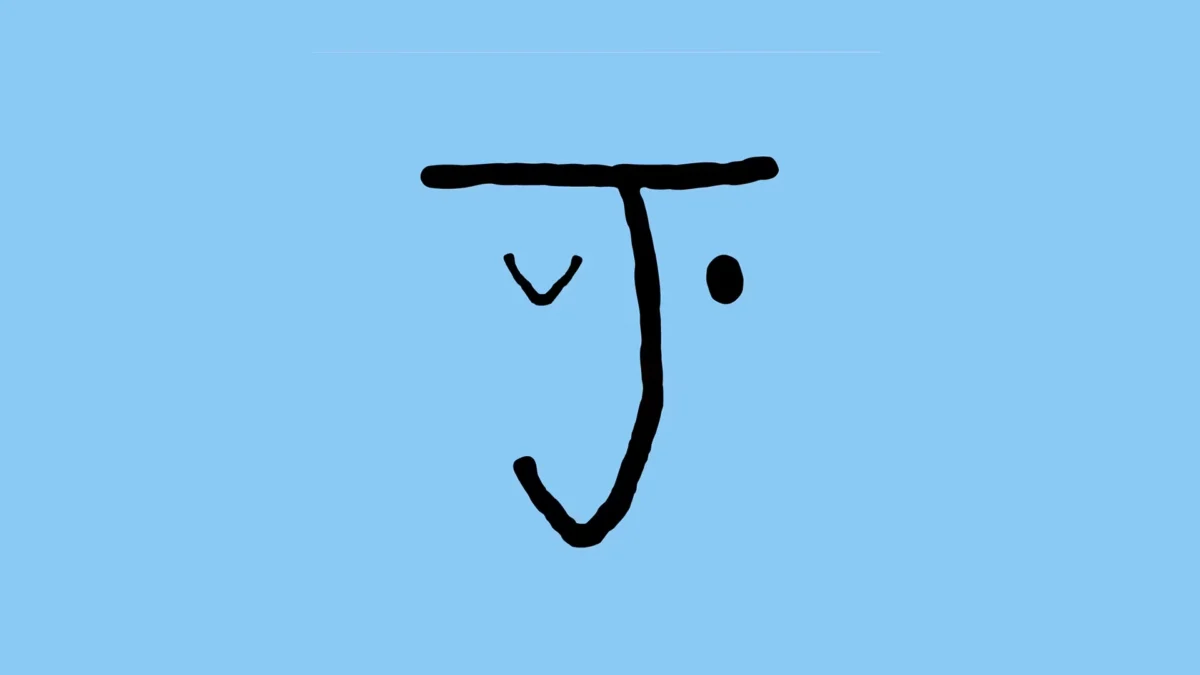
The visual identity of Jolene was crafted by Studio Frith, a design agency known for its avant-garde approach to branding. The logo—a series of loose, shaky strokes—has caused a stir in the design community. It challenges the conventional wisdom that a brand must look professional, stable, and "expensive." Instead, it suggests a brand that is approachable, raw, and fundamentally human.
Chronology: From "Blanding" to the Great Scrawl
To understand the rise of the messy aesthetic, one must look at the visual trajectory of the last fifteen years of corporate design.
2010–2018: The Era of "Blanding"
During the mid-2010s, the design world witnessed a phenomenon known as "blanding." Major global brands—from Airbnb and Google to Saint Laurent and Burberry—all moved toward nearly identical, minimalist, sans-serif logos. The goal was legibility on mobile screens and a sense of "tech-forward" efficiency. This era prioritized the removal of friction and the elimination of personality in favor of global scalability.
2018–2021: The Birth of Jolene and the Analog Pivot
Jolene launched its first location seven years ago, entering a market that was just beginning to tire of hyper-polished "millennial pink" cafes. By the time Jolene opened its Redchurch Street location in 2021, the cultural pendulum had swung. The pandemic had accelerated digital fatigue, and consumers were hungry for spaces that felt "lived-in" and unrefined.
2022–2024: The AI Explosion and the Reaction
The release of DALL-E, Midjourney, and ChatGPT marked a turning point. As AI began producing high-fidelity imagery and perfectly structured text, the "cost" of perfection dropped to zero. Consequently, perfection lost its value as a luxury signal. In response, the "human mark"—the shaky hand, the ink smudge, and the inconsistent letterform—became the new premium indicator of authenticity. Kyle Raymond Fitzpatrick’s analysis positions the current obsession with Jolene’s aesthetic as the peak of this "Post-AI" visual language.
Supporting Data: The Value of Authenticity in a Digital Economy
The success of the "messy" trend is backed by shifting consumer behaviors and economic data regarding brand loyalty.
The "Uncanny Valley" of Branding
Market research suggests that as AI-generated content becomes more prevalent, consumers are developing a heightened sensitivity to "manufactured" perfection. A 2023 study on consumer trust indicated that 72% of Gen Z consumers prefer brands that "feel real" over those that "look perfect." The Jolene aesthetic leverages this by intentionally staying out of the "uncanny valley"—the space where something looks almost human but feels slightly off because it is too symmetrical or clean.
The "Social Media Halo" Effect
Despite its analog roots, the "messy" look performs exceptionally well in digital metrics. Data from retail analytics firms show that "authentic-looking" spaces (those featuring raw materials and handwritten signage) see a 30% higher engagement rate on platforms like Instagram and TikTok compared to traditional "luxury" interiors. The Redchurch Street location of Jolene has become a "cultural bullseye" because it provides a high-contrast background for digital creators—the messy, pink brick provides a "tactile" texture that pops against the glass-and-metal interface of a smartphone.
The Economic Growth of Jolene
The strategy is clearly working from a business perspective. What started as a single bakery has expanded into a mini-empire of five bakeries and three restaurants across London. This growth suggests that the "childlike anarchy" of the branding is not a deterrent to commercial success but rather its primary engine.
Official Responses: Insights from the Creators
The philosophy behind the messy aesthetic is best explained by those who built it and those who analyze it.
Jeremie Cometto-Lingenheim, Founder of Jolene
Cometto-Lingenheim has been vocal about the brand’s rejection of traditional marketing polish. He describes the identity created by Studio Frith as an embrace of "childlike anarchy." In interviews, he has suggested that the goal was to create a space that felt like it had "always been there," avoiding the "newness" that often feels cold and clinical in modern developments.
Kyle Raymond Fitzpatrick, Trend Report
Fitzpatrick’s analysis provides the broader cultural context. He argues that we are witnessing a "reaction against Big Tech." In his view, when every app and every website uses the same sleek, optimized interface, the human spirit rebels by seeking out the "scrawled." He posits that "messiness is a form of privacy and a form of protest—it’s something the algorithm can’t quite categorize or replicate without looking like a parody."
Studio Frith
The design studio has defended the "shaky" logo as a sophisticated piece of communication. Their perspective is that branding should be a "conversation," not a "monologue." By using a logo that looks like it could have been drawn by a customer or a child, they lower the barrier between the institution and the individual, creating an emotional resonance that a corporate font cannot achieve.
Implications: The Future of Identity in the Age of Automation
The shift toward messy aesthetics at brands like Jolene has significant implications for the future of marketing, urban design, and human labor.
1. The De-Valuation of Technical Perfection
As AI tools become standard in design suites, the technical ability to create a "clean" logo will no longer be a marketable skill. The value will shift toward "creative direction" and the ability to inject "soul" or "friction" into a brand. We may see a rise in "Analog Consultants" whose jobs are to intentionally roughen the edges of digital-first companies.
2. The Rise of "Tactile Retail"
The success of Jolene’s physical spaces—characterized by wooden accents and ceramic cups—suggests that the future of brick-and-mortar retail lies in sensory experiences that cannot be replicated online. If you can buy the bread via an app, the reason to visit the store is to touch the pink brick and see the handwritten menu. This "tactile retail" will become the primary defense against the total domination of e-commerce.
3. Authenticity as a Luxury Good
We are entering an era where "Human-Made" will become a premium certification, similar to "Organic" or "Fair Trade." Brands that can visually signal their human origins through "messy" aesthetics will be able to command higher price points. The Jolene logo is, in essence, a "Humanity Certificate" that justifies the premium price of its artisanal sourdough.
4. The Risk of "Pseudo-Authenticity"
The danger of this trend is that Big Tech and corporate giants will eventually attempt to "automate the mess." We are already seeing AI filters that add "film grain" or "handwritten" fonts to digital ads. However, Fitzpatrick argues that the human eye is remarkably good at spotting "calculated messiness." For the trend to remain effective, it must remain rooted in genuine, localized human effort—like the specific, irregular scrawl of a bakery in Shoreditch.
Conclusion
The "messy" branding of Jolene and the insights of Kyle Raymond Fitzpatrick highlight a pivotal moment in design history. As we move further into the digital frontier, our visual language is ironically retreating toward the most basic elements of human expression: the scribble, the rough surface, and the imperfect line. This "childlike anarchy" is not a sign of regression, but a sophisticated defense mechanism—a way for brands and individuals to say, in a world of perfect algorithms, "I am here, I am flawed, and I am human."