The Architecture of Arrakis: How Concept Art Defined the Visual Language of Denis Villeneuve’s ‘Dune’
The 2021 release of Denis Villeneuve’s Dune: Part One represented more than just a successful adaptation of Frank Herbert’s "unfilmable" novel; it was a watershed moment for cinematic world-building. While the film’s narrative pacing and performances received high praise, it was the visual identity—a staggering blend of subterranean brutalism and harsh naturalism—that ultimately secured its place in film history, earning it six Academy Awards, including Best Production Design and Best Visual Effects.

At the heart of this achievement lies an expansive collection of concept art produced by a global team of elite illustrators and designers. This body of work, much of which is chronicled in the seminal volume The Art and Soul of Dune, reveals the meticulous process of translating Herbert’s dense prose into a coherent, tactile reality. From the dragonfly-inspired ornithopters to the moisture-sealing stillsuits, the concept art did not merely serve as a reference for the VFX team; it functioned as the foundational blueprint for a new era of science fiction.

Main Facts: The Aesthetic Pillars of Dune
The visual development of Dune: Part One was guided by a singular mandate from director Denis Villeneuve and Production Designer Patrice Vermette: the world must feel "grounded, weathered, and ancient." To achieve this, the team moved away from the glossy, neon-soaked aesthetics of contemporary sci-fi, opting instead for a style often described as "Analog Futurism."

The Three Power Structures
The concept art focuses on three distinct visual identities that define the film’s geopolitical landscape:

- House Atreides: Characterized by "Nordic Melancholy." Their designs feature deep greens, heavy fabrics, and architecture that reflects the lush, water-rich environment of their home planet, Caladan.
- The Fremen: Defined by "Survivalist Functionalism." Their gear, specifically the stillsuits, represents a peak of biological engineering, designed to integrate the human body into the desert ecosystem.
- House Harkonnen: Defined by "Industrial Brutalism." The Harkonnen aesthetic is one of intimidation—massive, bulbous, oily shapes and architecture that suggests a total lack of regard for the natural world.
The Design Team
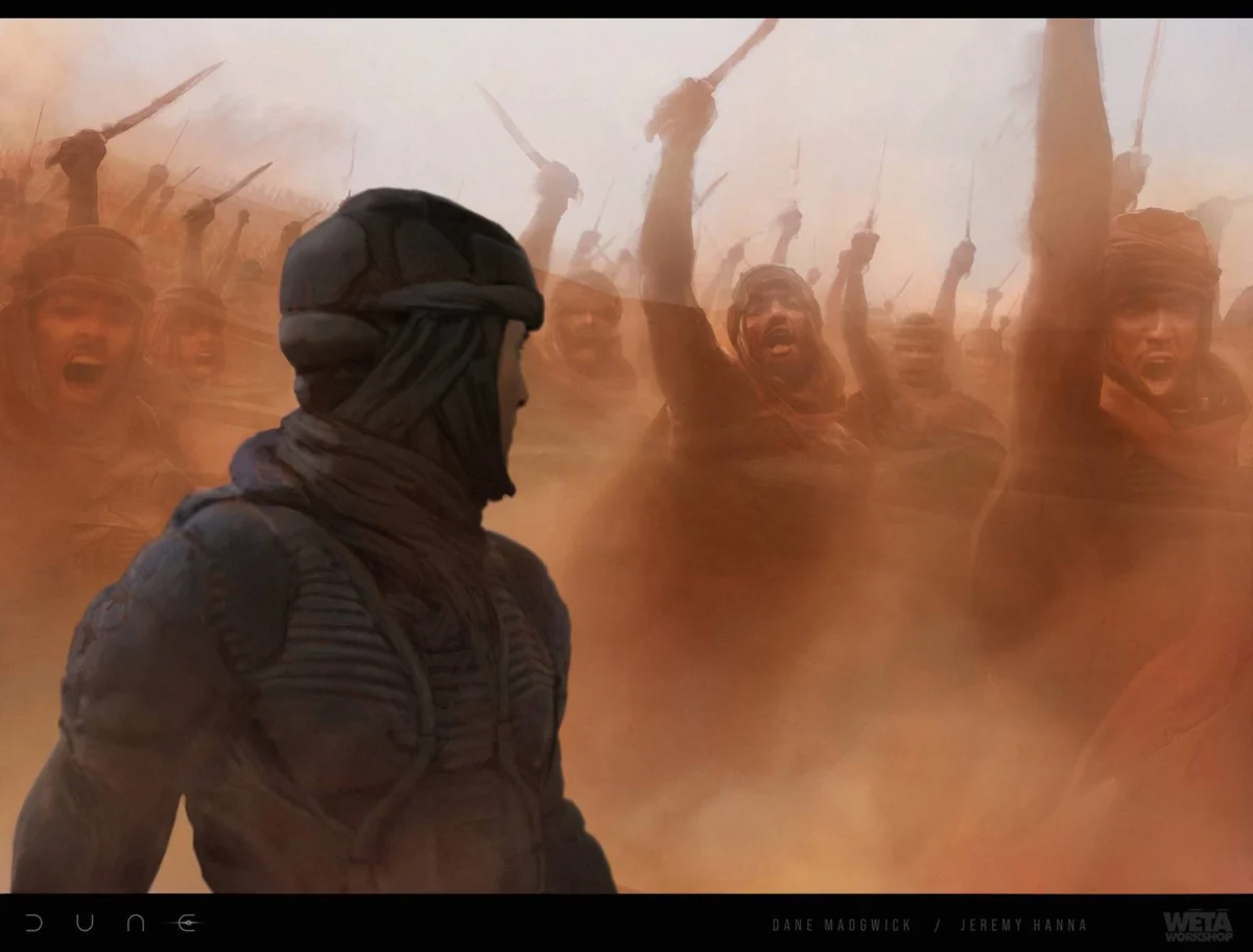
The project utilized a "Murderer’s Row" of concept talent, including Dane Madgwick, Deak Ferrand, Ed Natividad, George Hull, Jeffrey Read, Jerad S. Marantz, Jeremy Hanna, Joseph Cross, Kamen Anev, Keith Christensen, Nivanh Chanthara, Peter Popken, Seungjin Woo, Steve Burg, and Carlos Huante. Each artist was tasked with a specific niche, from weapon ergonomics to planetary-scale architecture.

Chronology: From Page to Pre-Visualization
The development of Dune’s visual language was a multi-year endeavor that preceded the first day of principal photography by nearly two years.

Phase 1: Intellectual Foundations (2017–2018)
In the earliest stages, Villeneuve and Vermette spent months simply talking about the "logic" of the world. They studied the architecture of the Soviet era, the works of Brazilian architect Oscar Niemeyer, and the harsh landscapes of Jordan and Norway. The goal was to understand why a building on Arrakis would look a certain way. They concluded that to survive 800-degree winds and sun, buildings must be sloped to deflect heat and built deep into the rock.

Phase 2: The Sketching of the Impossible (2018–2019)
Artists like Deak Ferrand and George Hull began producing the first "key art"—broad strokes that defined the scale. This was the period when the Ornithopter was born. Rejecting the "box with wings" approach, George Hull looked to nature, specifically dragonflies, to create a vehicle that felt aerodynamically plausible in a high-pressure desert atmosphere.

Phase 3: Technical Refinement (2019–2020)
As the project moved toward filming, artists like Keith Christensen and Jerad S. Marantz focused on the "macro" details. They spent months on the stillsuit, ensuring that every tube, pump, and fabric layer looked like it served a mechanical purpose in recycling water. Simultaneously, Ed Natividad worked on the "everyday" items—Fremen compasses, sand compactors, and thumpers—ensuring that even the smallest prop felt like it had been used for generations.

Supporting Data: An Artist-by-Artist Breakdown
The recently showcased collection of concept art highlights the specific contributions of the lead designers:

- George Hull & Steve Burg (Industrial Design): These artists were responsible for the "heavy metal" of Dune. Hull’s work on the Bene Gesserit ships and the massive Atreides frigates established a sense of overwhelming scale. Burg’s designs for the Spice Harvesters and Carryalls emphasized the industrial, clunky nature of Arrakis’ spice-mining operations, portraying them as vulnerable prey for the desert’s apex predators.
- Deak Ferrand & Peter Popken (Architecture): Ferrand was instrumental in designing the city of Arrakeen. His sketches show the transition from small-scale dwellings to the "Residency," a structure so massive it dwarfs mountains. Popken’s interior designs for the palace hallways used light and shadow to create a sense of religious awe and claustrophobic dread.
- Keith Christensen & Nivanh Chanthara (Costume and Character): Christensen’s work on the Baron Harkonnen’s armor and the Bene Gesserit ceremonial robes blended high-fashion with medieval religious iconography. Chanthara provided the "gritty" layer, offering rougher, more aggressive takes on the Harkonnen soldiers, emphasizing their status as "occupiers."
- Carlos Huante (Creature Design): Perhaps the most daunting task fell to Huante: the Sandworm (Shai-Hulud). The art shows a move away from the "toothed monster" trope. Instead, Huante designed the worm with a baleen-like mouth, inspired by whales, suggesting a creature that filters sand for nutrients. This made the worm feel like a god-like force of nature rather than a simple predator.
Official Responses: The Visionary Philosophy
In various interviews following the film’s release, the production team emphasized that the concept art was never meant to be "fantasy."

"I didn’t want to make a movie that was about the future," Denis Villeneuve stated during a 2021 press tour. "I wanted to make a movie that felt like a documentary about a culture we don’t know, but that is grounded in our own history. The concept art had to reflect that. It had to feel like everything had a weight, a smell, and a history."

Patrice Vermette, the Production Designer, echoed this sentiment regarding the brutalist architecture: "The sun is the enemy on Arrakis. When we were looking at the concept art for the buildings, we asked: ‘How do you protect yourself?’ That led to the thick walls and the angles. We didn’t design for beauty; we designed for survival. The beauty came from the honesty of that survival."

George Hull, discussing the Ornithopters, noted the difficulty of the task: "Denis was very specific. He wanted to see the vibration of the wings. He wanted to feel the bird-like fragility and the insect-like agility. The concept art went through dozens of iterations because it had to look like it could actually fly."

Implications: A New Standard for Sci-Fi
The success of the visual design in Dune: Part One has had immediate and lasting implications for the film industry and the science fiction genre.

1. The Death of the "CGI Look"
Dune proved that audiences are craving "Tactile Realism." By basing their concept art on physical laws and brutalist architecture, the team created a world that felt more "real" than many contemporary dramas. This has influenced subsequent productions to favor "Big Miniature" work and location shooting over 100% digital environments.

2. The Commercialization of Concept Art
The massive popularity of The Art and Soul of Dune and the subsequent interest in the individual artists’ portfolios (on platforms like ArtStation) demonstrate a growing public appetite for the "behind-the-scenes" intellectual process. Concept art is no longer seen as a discarded step in production but as a standalone art form.

3. Setting the Stage for Part Two
The foundation laid in the first film’s concept art allowed the sequel, Dune: Part Two (2024), to expand into even more radical territories, such as the black-and-white "ink-world" of Giedi Prime. The consistency of the visual language established by artists like Deak Ferrand and Keith Christensen ensured that even as the scale grew, the world remained tethered to the same logic.

4. Cultural Impact
The "Dune Aesthetic"—muted tones, oversized silhouettes, and desert-chic—has permeated beyond cinema into high fashion and interior design. The work of these concept artists has redefined what the "future" looks like in the collective imagination: no longer shiny and chrome, but dusty, heavy, and ancient.

In conclusion, the concept art for Dune: Part One represents a monumental collaboration between directorial vision and artistic execution. By prioritizing the "soul" of the world over mere spectacle, the design team created a cinematic environment that will be studied by filmmakers and artists for decades to come. For those looking to delve deeper into these visions, The Art and Soul of Dune remains the definitive record of how a masterpiece was built from the sand up.