A New Dawn for ACOTAR: Sarah J. Maas Unveils Bold New Covers, Igniting Fan Frenzy and Design Debate
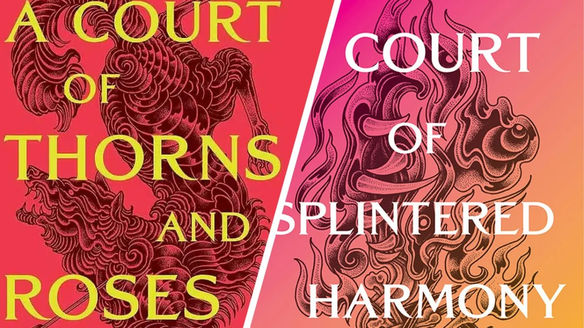
Sarah J. Maas, the titan of the romantasy genre, has sent ripples of excitement and consternation through her devoted fanbase with the unveiling of the cover art and titles for the next two installments in her immensely popular "A Court of Thorns and Roses" (ACOTAR) series. The forthcoming books, "A Court of Splintered Harmony" and "A Court of Forgotten Melody," are slated for release in October 2026 and January 2027, respectively. However, it is the dramatic visual departure from the series’ established aesthetic that has captured the most attention, sparking a fervent debate within the ACOTAR community and beyond.
The new cover designs, characterized by vibrant, candy-colored gradient aesthetics, represent a stark contrast to the signature brooding, jewel-toned, and intricately illustrated style that has become synonymous with the ACOTAR saga. This bold stylistic shift has ignited a passionate discussion among fans, with reactions ranging from enthusiastic embrace of the new direction to vocal disappointment and confusion. The visual transformation, as detailed below, is not merely cosmetic but hints at a potential evolution in the narrative and thematic focus of this beloved literary universe.
The Evolution of the ACOTAR Aesthetic: From Brooding to Bright
For years, the "A Court of Thorns and Roses" series has cultivated a distinct visual identity. The original novels, and indeed many subsequent installments in the romantasy genre, have often leaned into a more gothic and mysterious aesthetic. This typically involves deep, rich jewel tones – emerald greens, sapphire blues, ruby reds – set against dark backgrounds, often adorned with intricate, illustrative details that evoke the magical and often dangerous worlds within. The typography has also been a key element, with a distinctive serif font lending an air of timeless fantasy.
This established visual language has been instrumental in building the ACOTAR brand and creating an instantly recognizable presence on bookshelves and online. It has perfectly encapsulated the series’ initial tone: a blend of dark fairy tale, intense romance, and perilous adventure. Fans have come to associate these visual cues with the emotional depth, high stakes, and passionate relationships that define Feyre and Rhysand’s journey, as well as the wider cast of characters.
The revelation of the covers for "A Court of Splintered Harmony" and "A Court of Forgotten Melody" marks a significant departure from this established norm. Instead of the familiar dark, opulent palettes, the new covers embrace a vibrant, almost effervescent, gradient design. One cover features a striking pink-to-yellow gradient, while the other showcases a turquoise-to-yellow blend. These bright, cheerful color combinations, reminiscent of a sunset or a tropical paradise, are coupled with a more minimalist, modern design approach. The illustrative elements, if present, are less pronounced, allowing the bold color blocks to dominate.
This shift has understandably elicited a strong reaction from a fanbase that has grown deeply attached to the existing aesthetic. For many, the dark, jewel-toned covers are an integral part of the ACOTAR experience, evoking the very essence of the Fae realms and the characters’ often tumultuous journeys. The new, brighter aesthetic, while undeniably eye-catching, has been perceived by some as jarringly out of sync with the series’ established tone and themes.
Unveiling the Next Chapter: Titles and Release Dates
Sarah J. Maas made the official announcement of the new book titles and cover art via her Instagram account, a platform she frequently uses to connect with her global readership. The revealed titles, "A Court of Splintered Harmony" and "A Court of Forgotten Melody," offer tantalizing clues about the narrative direction of these upcoming novels. While specific plot details remain under wraps, the titles themselves suggest a focus on themes of discord, memory, and perhaps the re-establishment of order or understanding within the Fae world.
The release dates are strategically positioned, with "A Court of Splintered Harmony" set to launch in October 2026 and "A Court of Forgotten Melody" following in January 2027. This staggered release schedule allows fans to savor each new installment and builds anticipation for the continuation of the saga.
Crucially, Maas has indicated that these next two books will usher in a new narrative arc, referred to as the "Valkyrian Cycle Movement." This arc will delve into the stories of the Valkyries, an ancient and formidable clan of female warriors. This focus on the Valkyries, a group known for their power, resilience, and distinct culture within the ACOTAR lore, suggests a significant expansion of the series’ world-building and a potential exploration of new characters and conflicts. The shift in focus to these powerful warriors may well be reflected in the series’ new visual identity.
Fan Reaction: A Divided Fandom
The ACOTAR fandom is renowned for its passion and engagement, and the unveiling of the new covers has certainly amplified these qualities. Social media platforms, particularly X (formerly Twitter) and Reddit, have become hotbeds of discussion and debate.
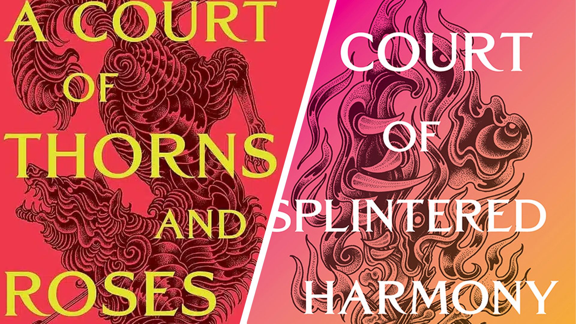
On one side of the divide are fans who have embraced the new aesthetic with enthusiasm. They see the bright, modern covers as a refreshing and exciting evolution, a sign that Maas is willing to take creative risks and push the boundaries of the romantasy genre. For some, the bolder colors and cleaner design represent a move towards a more contemporary and perhaps more accessible visual representation of the series. They argue that the vibrant colors can still convey a sense of magic and wonder, and that the shift might better reflect the maturing themes and character development within the series. Some have even drawn parallels to the evolving design trends in the broader publishing industry, suggesting that Maas is keeping pace with contemporary visual language.
However, a significant portion of the fanbase has expressed their disappointment and even dismay. For these readers, the previous cover art was an intrinsic part of the series’ identity and appeal. They associate the darker, more intricate designs with the series’ core themes of magic, danger, and the complex emotional landscapes of its characters. The bright, gradient covers, in their view, feel somewhat generic and may not adequately represent the depth and intensity of the ACOTAR universe. Some critics have compared the new aesthetic unfavorably to trends from the mid-2010s, suggesting a potential misstep in design direction. The concern is that the new covers might not convey the same sense of epic fantasy and mature romance that fans have come to expect.
This division highlights the powerful connection readers form not only with the stories themselves but also with the visual representation of those stories. The cover art serves as the initial gateway to a book, and for a series as beloved as ACOTAR, any significant change is bound to provoke strong opinions.
Design Implications: Beyond the ACOTAR Series
The visual shift in the ACOTAR series’ cover design has broader implications for the romantasy genre and the book cover design industry as a whole. For a long time, there has been a recognizable "romantasy" cover aesthetic, often characterized by a brooding, dark, and somewhat illustrative style, frequently featuring silhouetted figures or evocative landscapes. This trend has been both a boon and a bane for the genre, making it easily identifiable but also leading to a degree of visual homogenization.
Sarah J. Maas, as a leading figure in the genre, has the power to influence trends. Her previous cover designs have undoubtedly contributed to the established romantasy visual language. The bold departure with the new ACOTAR covers could signal a deliberate attempt to break away from genre conventions and establish a new visual identity. This could encourage other authors and publishers to experiment with more diverse and unexpected design approaches, moving beyond the perceived limitations of the current trends.
On the other hand, the mixed reaction from the fanbase also underscores the inherent risks associated with deviating from a successful and beloved formula. Publishers and authors often grapple with the balance between innovation and tradition, especially when dealing with established franchises. The ACOTAR series has a massive and vocal following, and while the new covers might attract new readers, they risk alienating a segment of the existing readership if the visual disconnect is too profound.
The discussion also touches upon the broader perception of "romantasy book cover design." Some critics have argued that the genre has, at times, suffered from a lack of originality in its visual presentation. The current debate around the ACOTAR covers, therefore, becomes a microcosm of a larger conversation about artistic expression, market trends, and the evolving expectations of readers in the digital age. Whether this new direction is a strategic move that will redefine the genre’s visual landscape or a polarizing choice that alienates a portion of its dedicated audience remains to be seen.
Looking Ahead: The Valkyrian Cycle and Beyond
The introduction of the "Valkyrian Cycle Movement" signifies a significant new phase for the "A Court of Thorns and Roses" series. The focus on the Valkyries, a group of powerful female warriors, suggests a narrative that might explore themes of strength, sisterhood, and perhaps a more direct confrontation with ancient threats. This shift in narrative focus could also be interpreted as a thematic justification for the more vibrant and dynamic cover art. The bright colors might symbolize a new era of empowerment, resilience, and perhaps even a more optimistic outlook for the characters and their world, even amidst potential conflict.
As the release dates for "A Court of Splintered Harmony" and "A Court of Forgotten Melody" draw nearer, the anticipation within the ACOTAR community will undoubtedly continue to build. The debate over the cover art, while intense, is a testament to the deep connection fans have with Sarah J. Maas’s creations. Ultimately, the success of these new installments will depend on the strength of the stories they tell and the way they continue to captivate readers, regardless of the colors adorning their covers. The "Valkyrian Cycle" promises to be a compelling new chapter, and its visual presentation has already guaranteed it a prominent place in the ongoing conversation surrounding the future of romantasy literature.