Archery World Cup Unveils Striking New Brand Identity, Aiming for Unmissable Spectacle
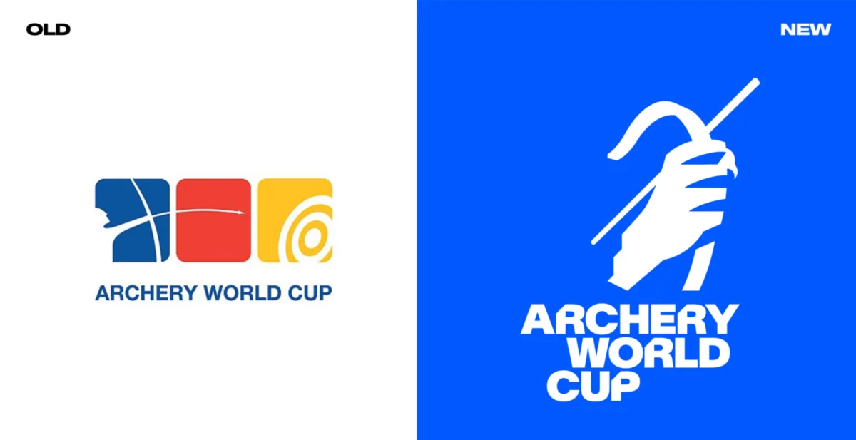
London, UK – October 26, 2023 – In a significant move to elevate its global profile and enhance spectator engagement, World Archery has launched a comprehensive rebrand for its premier competition, the Archery World Cup. The ambitious undertaking, spearheaded by the design studio Arecibo, aims to inject dynamism, narrative, and unparalleled excitement into the sport, moving beyond the precision of the archers to focus on the thrilling drama of the competition itself. This bold redesign arrives amidst the sport’s 20th-anniversary celebrations and is set to be fully implemented ahead of the final in Saltillo, Mexico, on September 12-13.
The rebrand comes at a time when sports logo redesigns are increasingly fraught with public scrutiny. Recent controversies, such as the backlash surrounding proposed new logos for Newcastle United, underscore the delicate balance required to innovate while respecting established fanbases and historical identities. However, the Archery World Cup’s new visual identity appears poised to sidestep such pitfalls, presenting a refreshingly modern and compelling aesthetic that promises to captivate both seasoned enthusiasts and new audiences alike.
A Bold Leap from the Past: Addressing the Need for Modernization
The previous Archery World Cup logo, characterized by its target face-inspired tricolour rounded squares, was widely perceived as a relic of a bygone era. In the landscape of contemporary sporting brands, it lacked the visual punch and dynamism necessary to convey the intensity and prestige of a world-class competition. Beyond its dated appearance, the old branding suffered from significant fragmentation. There was a distinct lack of cohesive identity across its various applications, with no defined system rules leading to inconsistent and unprofessional presentations at different venues.
Crucially, World Archery recognized that the existing logo failed to communicate the true stakes of the tournament. The intangible yet immense value of the trophy – the ultimate symbol of archery excellence – was not adequately represented. This disconnect between the brand’s visual presentation and the sport’s inherent drama and significance prompted the urgent need for a fundamental overhaul.
The "Can’t Miss" Strategy: Redefining the Spectator Experience
Arecibo’s strategic approach to the rebrand was distilled into a potent two-word mantra: "Can’t Miss." This guiding principle was designed to resonate on multiple levels, communicating a dual imperative: that the archer cannot miss the shot, and that the audience cannot miss the show. This strategic pivot signals a significant shift in focus, moving from a purely athlete-centric perspective to one that deeply considers the spectator’s emotional journey and engagement.
Graham Anderson, from Arecibo, articulated the core philosophy behind this strategic shift: "The drama and intrigue is not in the super-human skill of the archers but when a shot is missed," he explained. "So I shifted the organisation’s emphasis for the contest from pure sporting values to the spectator’s experience. The key move is introducing more opportunities for narrative and intrigue while still honouring the precision and skill of the sport. Narrative could be pulled from its global stages, characterful athletes, emotional intensity, and sporting excellence. Every stage, every shot, every story matters."

This "Can’t Miss" ethos has been meticulously applied to every facet of the rebrand. Each design decision was rigorously evaluated against key questions: Does this clearly communicate what’s at stake? Does it reinforce our core values? Does it connect the individual shot to the broader season and our audience to our archers? This disciplined approach ensures that the brand’s messaging is consistent, impactful, and deeply rooted in the essence of the competition.
A New Visual Language: Iconography, Typography, and Colour
The redesigned Archery World Cup logo itself is a masterclass in symbolic representation. While drawing inspiration from the significance of the trophy, much like the FIFA World Cup 2026 logo, it cleverly avoids a literal depiction. Instead, it presents a stylized icon with a distinctive 45-degree angle and a stepped shape at the end of the arm. This design element is not merely aesthetic; it serves as a dynamic visual device, capable of being applied across a multitude of formats and contexts, ensuring a consistent and recognizable brand presence.
The icon and wordmark are designed for versatility, capable of separating when required, allowing the icon to transform into a powerful graphic element in its own right. This modularity enhances the brand’s adaptability across diverse media, from large-scale stadium banners to small digital icons.
Complementing the new logo is AWC Baikal, a custom variable typeface commissioned from the Lausanne-based foundry, Newglyph. This bespoke typeface offers a sophisticated range of weights, from condensed light to extended bold, providing designers with extensive creative flexibility. A key feature of AWC Baikal is the integration of the logo’s characteristic angle, lending an expressive and unique custom aesthetic that directly links back to the brand’s foundational visual language.
The color palette has also undergone a significant transformation. A dual-system approach has been adopted, with a core palette of sophisticated blues forming the bedrock of the main identity. This is complemented by a broader spectrum for the stadium design system, allowing for vibrant and engaging visual environments. The overarching goal was to create a system that is not only more consistent and user-friendly but also brimming with personality and able to adapt to the unique character of each host city.
A Modular System for Global Consistency and Local Flavor
Arecibo’s solution to the challenge of global consistency and adaptability lies in a modular design kit. This kit empowers host cities to build upon a defined framework, ensuring a unified brand experience while allowing for local customization. The system includes a squared grid template of scalable frames with designated areas for brand and sponsor logos, clear rules for hierarchy, and specified dimensions to guarantee sponsor visibility on camera.
Crucially, core brand elements are designed to be recolorable but never redrawn. This allows each stage of the competition to possess its own distinct visual identity, reflecting the unique spirit of its location, while remaining seamlessly integrated into the overarching Archery World Cup brand. This approach ensures that whether the competition is held in a bustling metropolis or a serene countryside, the brand’s integrity is maintained.
The same thoughtful philosophy has been applied to motion graphics. An After Effects template has been developed with fixed branding elements and editable content. This empowers local teams to create dynamic video assets that align with the brand’s visual identity without requiring constant oversight from central design teams. This efficiency ensures that impactful visual content can be produced consistently and effectively, further reinforcing the "Can’t Miss" message.
The Impact and Future of the Archery World Cup Brand
The Archery World Cup rebrand represents a significant evolution for the sport, moving beyond its traditional perception of quiet precision to embrace the inherent drama, narrative, and emotional intensity of elite competition. By focusing on the spectator’s experience and framing the sport through the lens of "Can’t Miss," World Archery is poised to attract a wider audience and foster deeper engagement.
The successful implementation of this comprehensive rebrand, developed by Arecibo and AWC Baikal, signals a commitment to modernizing the sport’s visual identity and marketing. As the Archery World Cup continues its journey, this new branding promises to make every arrow, every shot, and every story truly unmissable. The coming years will undoubtedly reveal the full impact of this strategic design initiative, as it reshapes how the world perceives and experiences the thrilling world of competitive archery.