Mastering the Craft: A Deep Dive into Digital Artistry for Gaming Giants
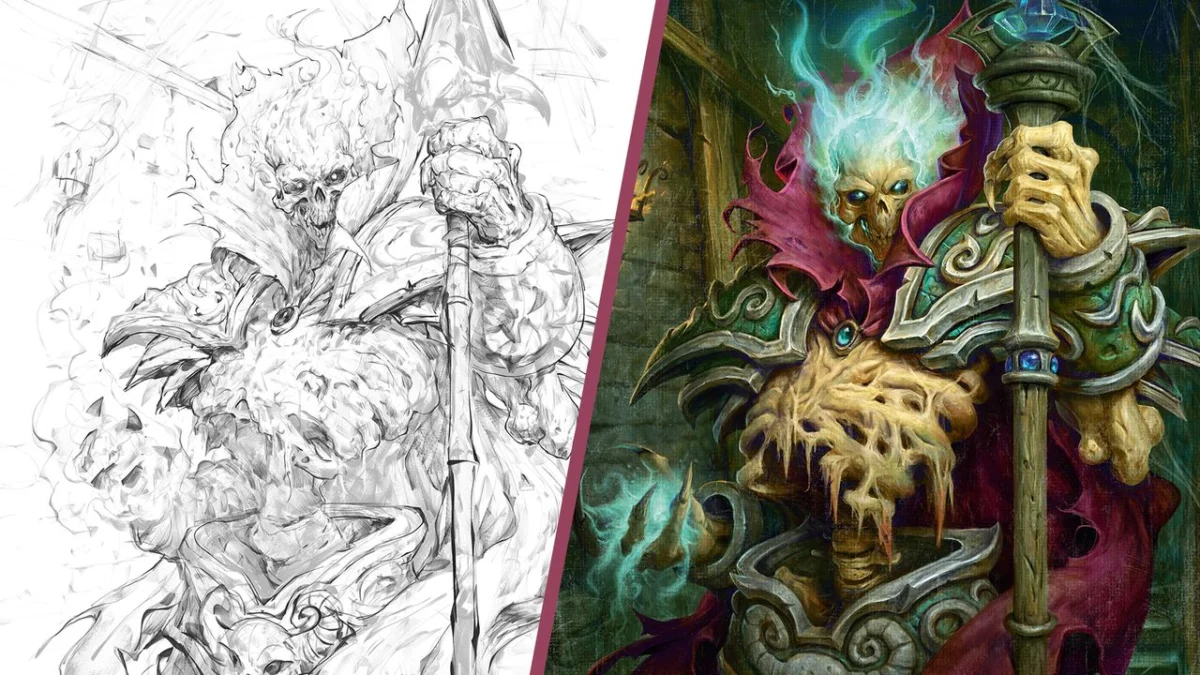
By Cole Eastburn
In the competitive realm of digital art for the gaming industry, success hinges not only on raw talent but also on a meticulously crafted process. This comprehensive guide offers an exclusive look into the workflow of a seasoned artist, revealing the strategic thinking and step-by-step execution required to create compelling visuals for industry titans like Blizzard Entertainment, Games Workshop, and Wizards of the Coast. From deciphering the initial art brief to the final polish, this tutorial demystifies the journey of a digital illustration, providing invaluable insights for aspiring and established artists alike.
The creation of impactful game art is a complex interplay of creative vision, technical skill, and client collaboration. This article delves into the artist’s personal methodology, illuminating the tools, techniques, and conceptual frameworks that underpin the development of breathtaking character art and environmental designs. By understanding the rationale behind each stage, artists can elevate their own work, ensuring that their creations not only meet but exceed client expectations, resonating with players and contributing to the immersive worlds they inhabit.
The Foundation: Understanding the Art Brief
The genesis of any professional illustration lies in the art brief, a crucial document that serves as the project’s blueprint. This initial phase is paramount, as it establishes the core objectives, provides essential reference materials, and outlines the desired mood and thematic direction as envisioned by the art director or the creative team.
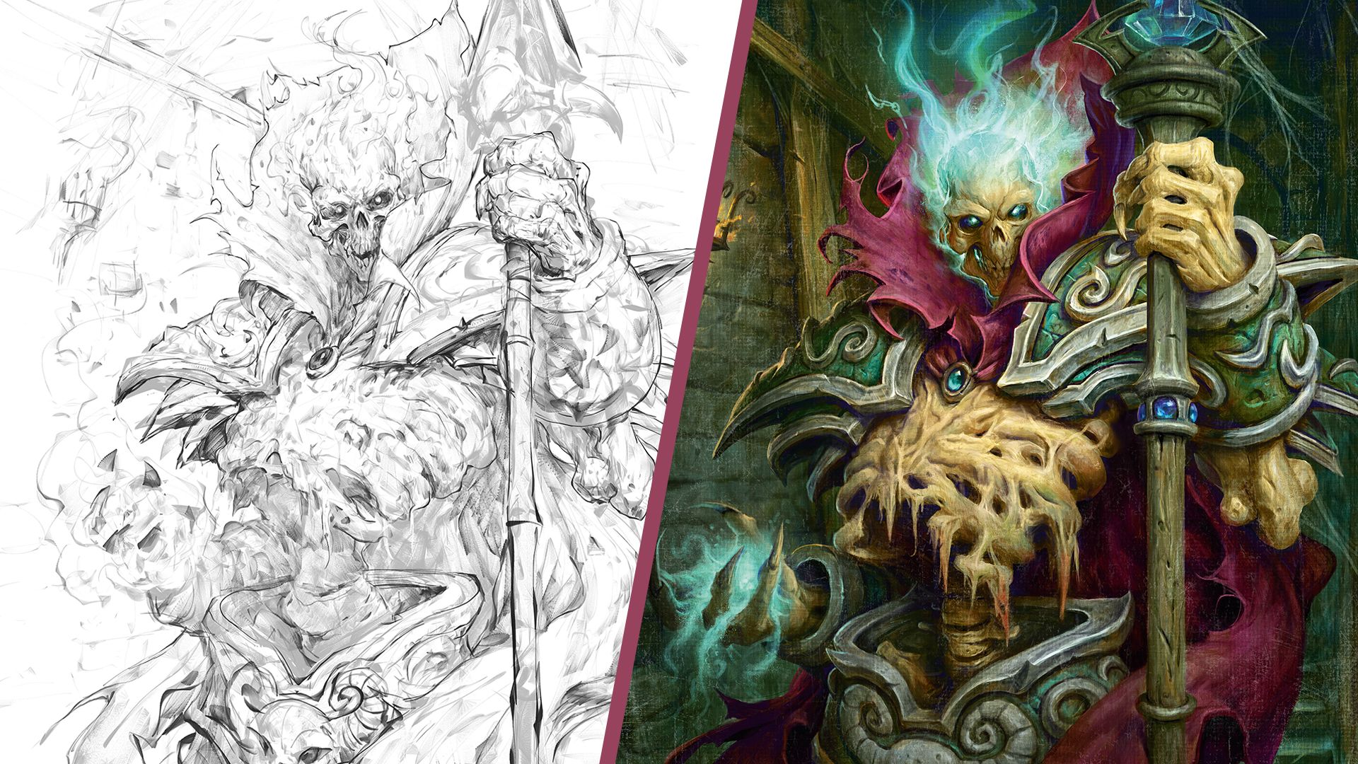
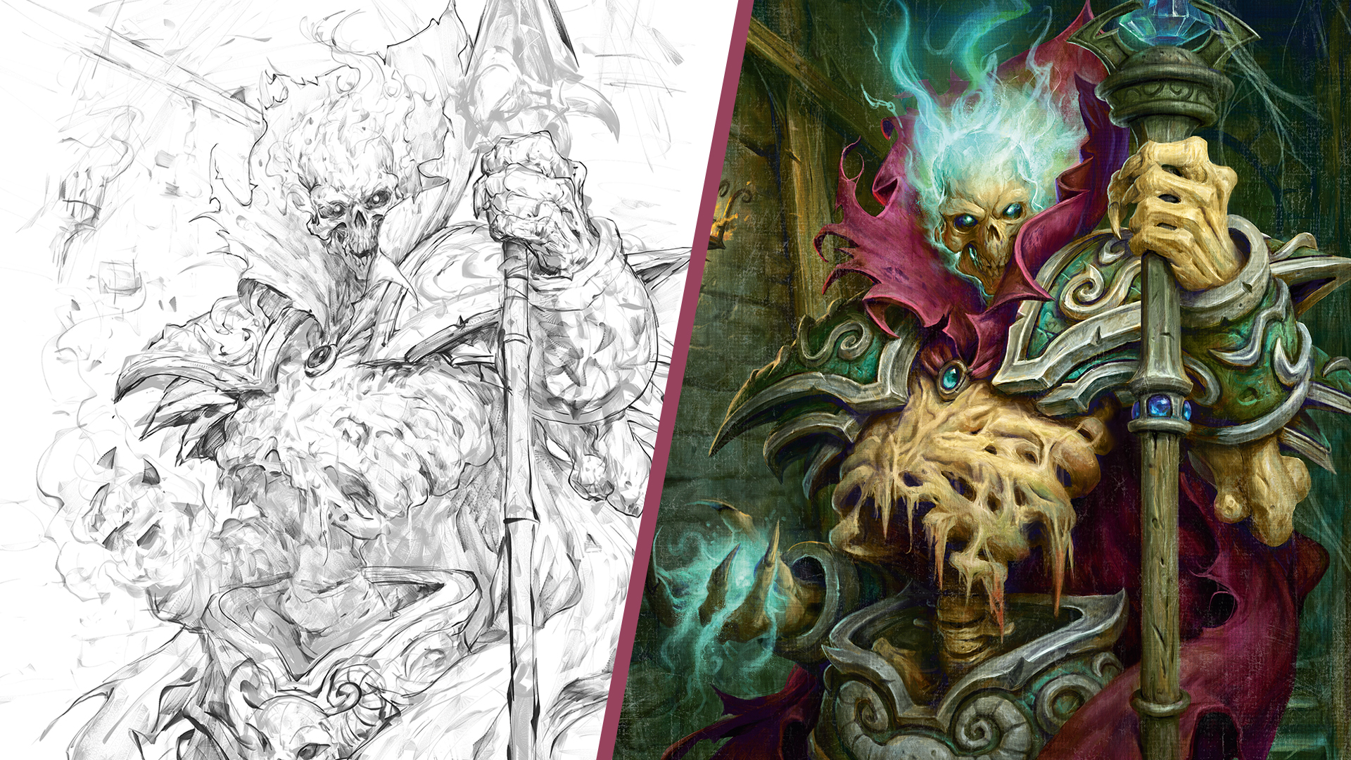
"This is the very first step when working for a client professionally," explains Eastburn. "You will be given an art brief with the goals of the piece, reference images you might need, and the mood that the art director or team is going for." For the specific illustration discussed, the brief was a concise yet evocative directive: "Thalnos looking powerful." This broad description, while offering considerable creative latitude, necessitates a deep understanding of how to translate abstract concepts into tangible visual elements.
The artist’s immediate task is to internalize this directive and begin conceptualizing how to best amplify the intended mood and tone before any digital strokes are made. This involves extensive critical thinking, exploring various interpretations of "powerful" and considering how different visual cues—pose, lighting, composition, and environmental elements—can synergize to convey that specific feeling. This foundational understanding is what separates a mere rendering from a piece that truly captures the essence of a character or scene.
The Art of Exploration: Thumbnailing and Concept Iteration
The early stages of the creative process are characterized by rapid exploration and problem-solving. Thumbnailing, often an overlooked but critical step, allows artists to quickly experiment with a multitude of compositional ideas and visual narratives.
01. The Power of the Thumbnail
Eastburn emphasizes the transformative learning curve associated with this stage: "This step took me a long time to learn. Early on, I never gave thumbnails much thought: why do that when I can get right into the painting? I quickly learned don’t do that. I paid the price later by having to rework entire backgrounds, or elements that should have been solved in the thumbnail."
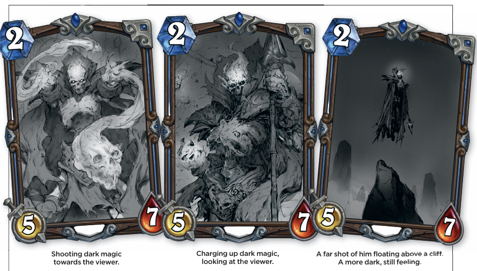
The primary objective of thumbnailing is not to produce a polished drawing, but to solidify fundamental aspects of the image. This includes establishing strong value structures, conveying the character’s expression and emotional tone, and effectively communicating the narrative of the piece. These initial sketches can appear rudimentary, even like "scribbles," as their purpose is purely to solve visual problems.
"Remember the goal is problem-solving, not making a finished drawing here, so as long as you figured out you want a big dark scribble in front or behind the tree, and the tilt of the sword going left and up, that’s the goal," Eastburn advises. The key is to ensure that the final thumbnail is legible enough for the art director to grasp the intended visual concept.
02. Diverse Options for Clarity
When developing thumbnails, Eastburn advocates for presenting a range of options that explore different moods and interpretations of the core brief, while still adhering to the overall objective. For the "Thalnos looking powerful" brief, this meant exploring various scenarios: an action-packed pose with magic radiating outwards, an ominous depiction of the character gazing down upon the viewer, or a more distant, god-like portrayal overlooking a landscape.
The strategic intent behind offering distinct options is to facilitate a more decisive client approval. Instead of presenting subtle variations in angle or composition with the same mood, the goal is to offer fundamentally different emotional and narrative directions. This approach empowers the art director to gravitate towards the mood that best resonates with their vision, rather than getting bogged down in minor aesthetic preferences.
Building the Structure: From Rough Sketch to Value Underpainting
With the conceptual framework established, the focus shifts to refining the drawing and laying the groundwork for color and detail. This phase involves meticulous attention to form, light, and shadow.
03. Refining the Form: The Rough Sketch
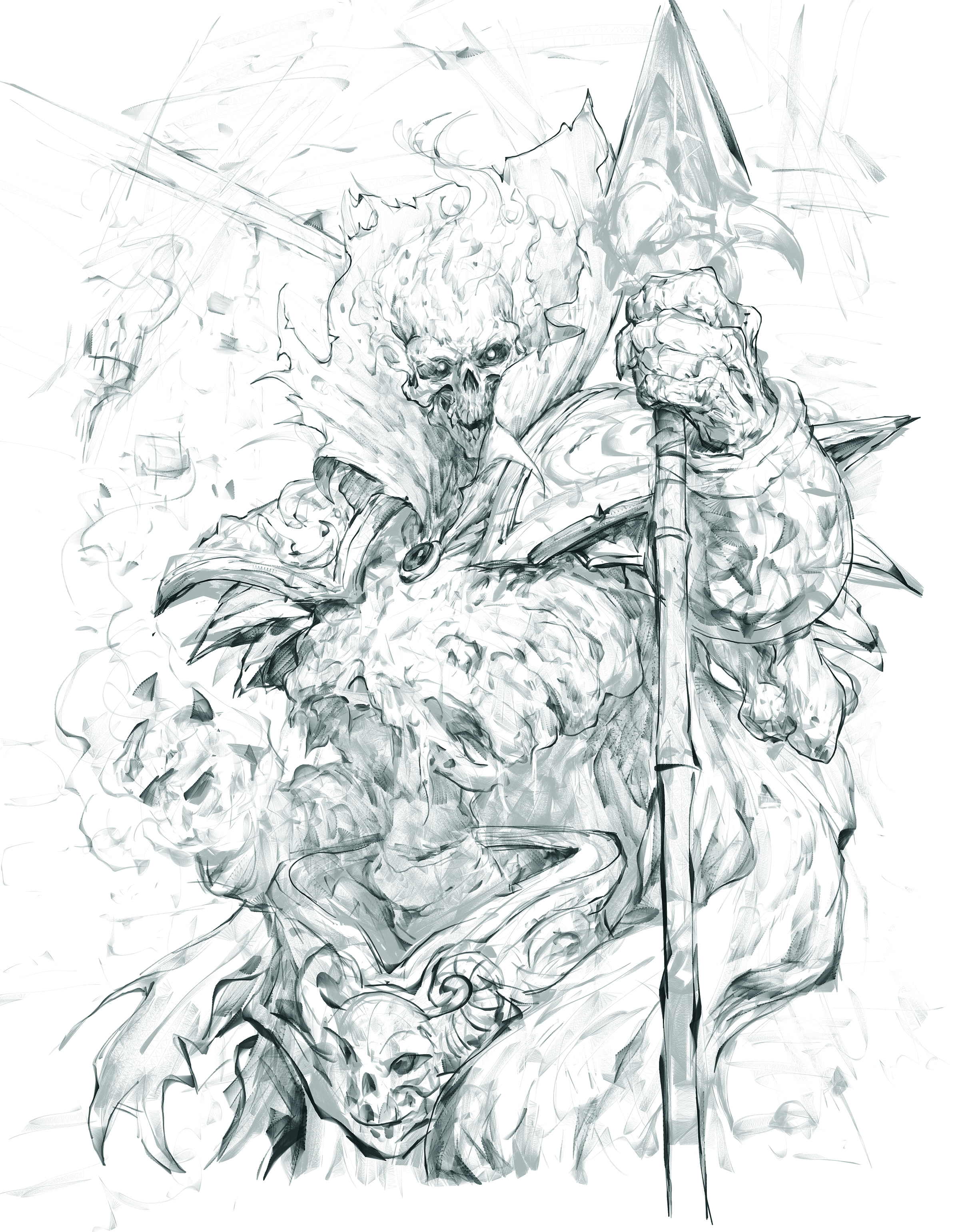
The rough sketch stage is where the chosen thumbnail begins to take on more defined form. "Here I take the thumbnail and start to figure out what areas of my subject are in light, which are in shadow, and fix major drawing issues such as proportion or perspective," Eastburn explains. This is performed in preferred digital art software, such as Krita, Clip Studio, or Photoshop.
The primary goal at this juncture is to ensure anatomical accuracy and precise placement of elements. This stage is about solidifying the underlying structure of the illustration, making sure that the character’s form is convincing and that all components are situated correctly within the composition.
04. The Power of Value: Rough Value Underpainting
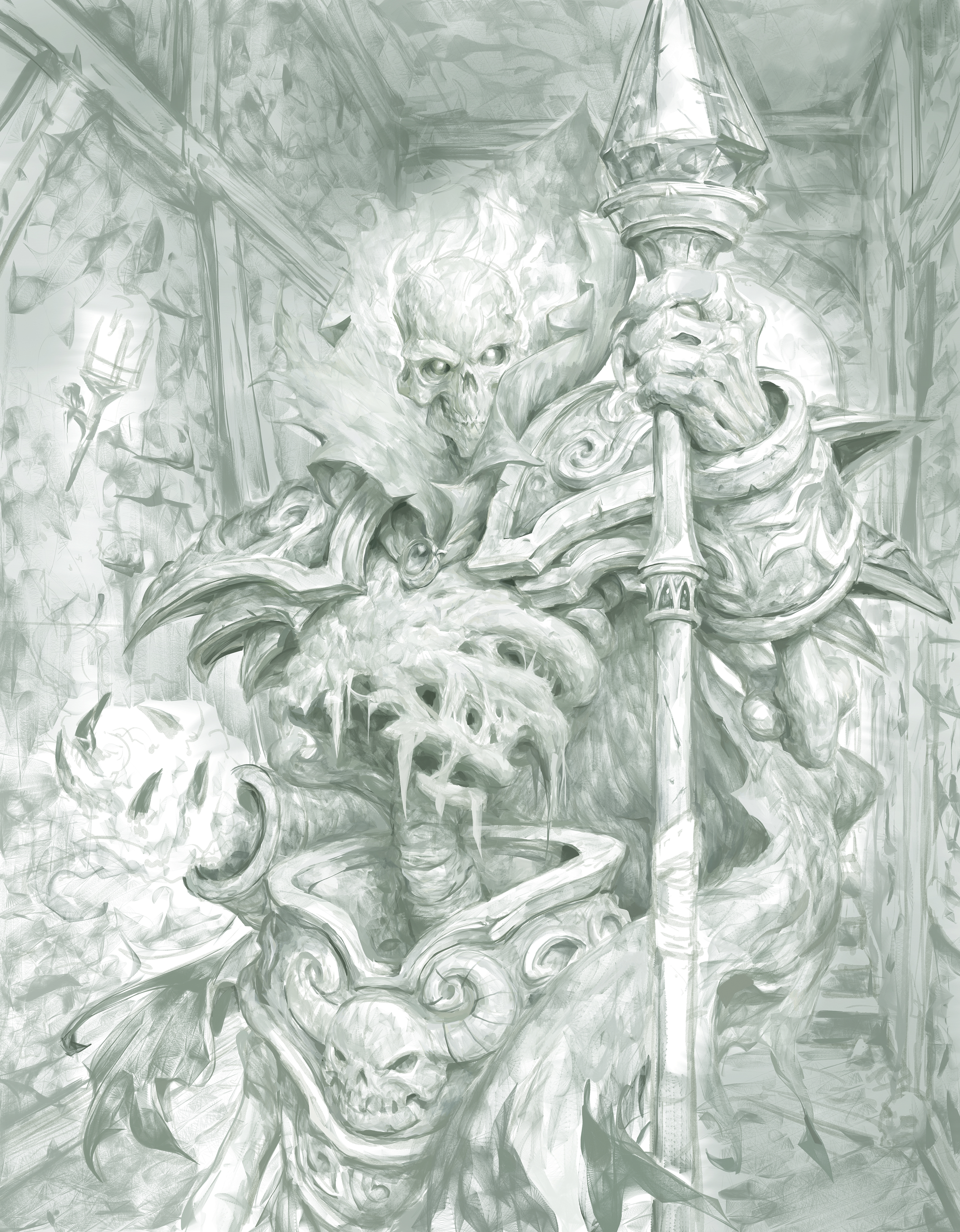
Eastburn often prioritizes value rendering before introducing color, akin to a traditional grisaille underpainting. "So here I start to render up my light and shadow shapes gradually," he states. This approach allows for a strong foundation of form and volume to be established.
In the example of Thalnos, the artist identified the skull and hand as the primary points of light, necessitating a deliberate darkening of other areas to emphasize these elements. While light direction is considered, artistic license is employed: "If a cast shadow that ‘would’ be there gives me a shape I don’t like, I leave it out. Remember, you’re in control here." This highlights the artist’s agency in shaping the visual narrative for maximum impact.
Introducing Color and Depth: From Roughs to Rendering
The introduction of color is a crucial step that breathes life into the grayscale foundation. This phase involves strategic color choices and gradual refinement.
05. Exploring Color Palettes: Quick Color Roughs
While Eastburn sometimes foregoes explicit color roughs for clients, preferring to solidify values first, he acknowledges their utility. "Honestly, I try to avoid colour roughs for clients because colour is so subjective, and I want the idea and mood approved without colour, and then add it after the value sketch approvals," he notes.
When color roughs are employed, the aim is to establish the dominant color relationships. This involves identifying the core palette—perhaps a "big red dragon" and a "blue wizard" in a "dark grey cave"—rather than detailing every minute hue. The focus is on ensuring that the major color masses harmonize with the established values and contribute to the overall mood.
06. Pushing the Values: The Value Push
As the illustration progresses, the artist meticulously refines the interplay of light and shadow. "I keep rendering and pushing my darks and lights, careful to leave myself room at both ends of the value scale to come up and down as I continue to render," Eastburn explains.
This stage involves a conscious consideration of the viewer’s visual path through the artwork. "Think of it as a small road trip: people need to stop and pee sometimes. Here, that rest stop is the inside of his cape, and the background behind him." This analogy emphasizes the strategic placement of areas of visual rest and areas of heightened detail to guide the viewer’s eye effectively.
07. The Gradient Map: Shifting the Undertones
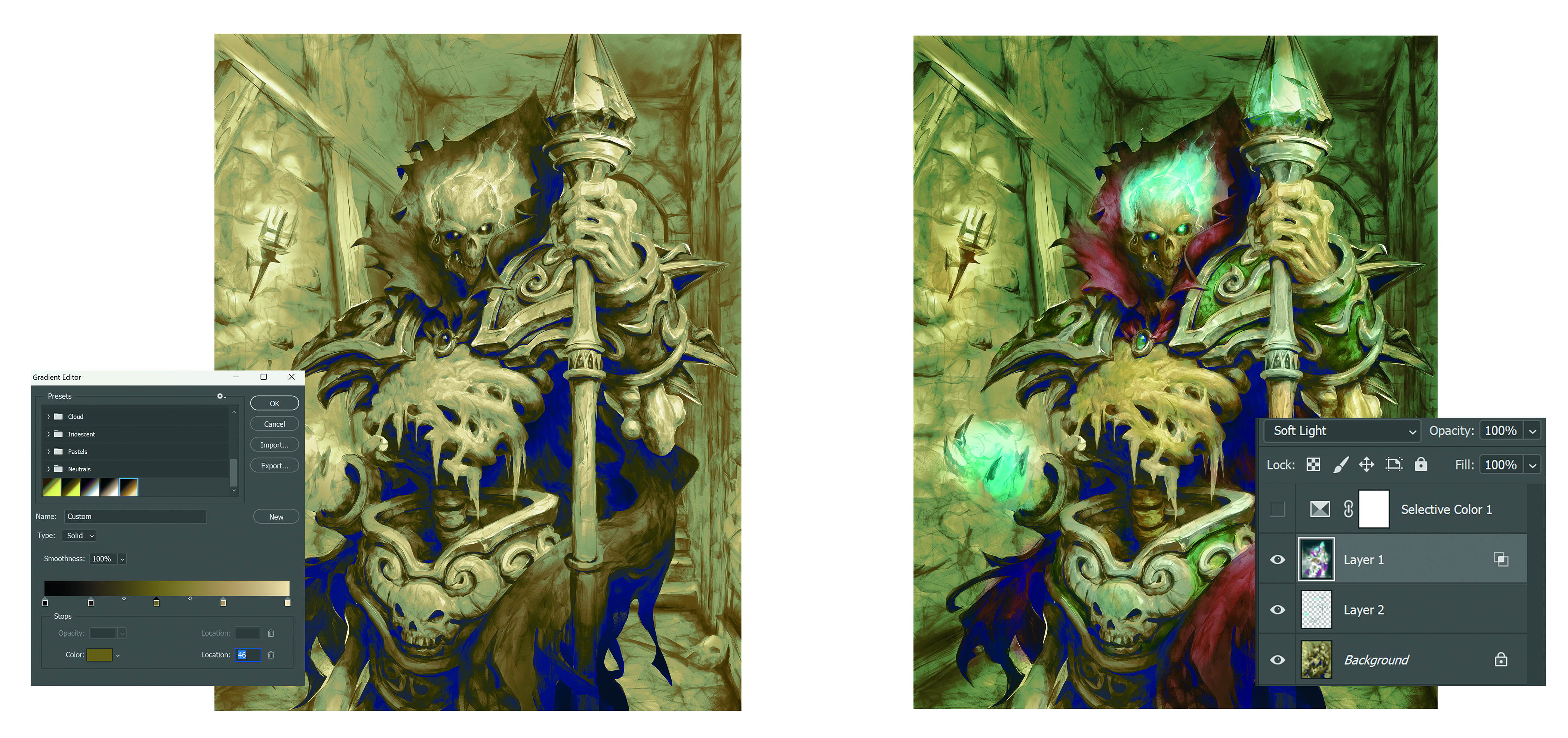
A gradient map layer is employed to transition the grayscale underpainting into a more vibrant color base. This technique is crucial for ensuring that subsequent color layers maintain their vibrancy and possess inherent color information, moving beyond a purely monochromatic foundation.
"This can be so many different combinations of colours," Eastburn observes. The choice of gradient colors can subtly influence the final palette, with complementary colors offering a neutralizing effect while analogous colors can enhance harmony. The digital medium allows for complete coverage, similar to how dried oil paint behaves.
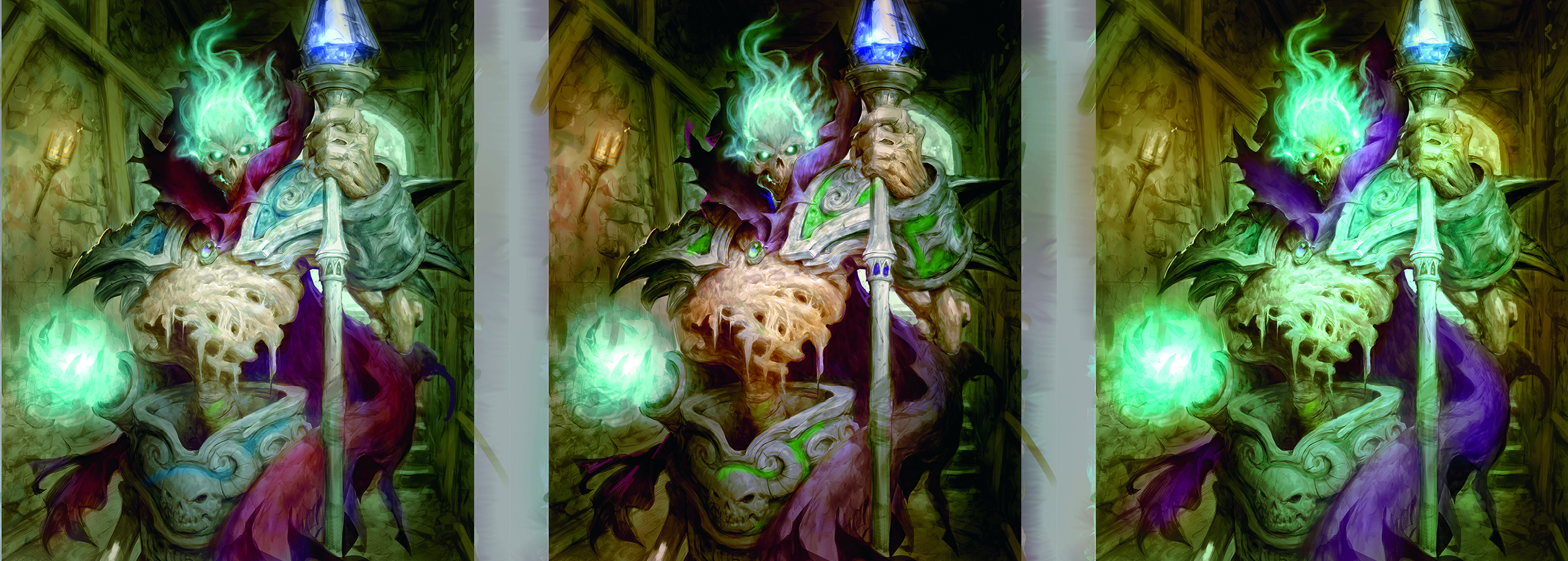
08. Layering Color and Light: Soft Light and Color Layers
The introduction of color is often achieved through a "soft light" layer, allowing for the integration of major color elements. In the Thalnos illustration, a deliberate choice was made to use warm tones for the cloak and bones, contrasted with a cooler palette for the surrounding environment.
Eastburn advocates for thinking in terms of "warms and cools" rather than specific hues like reds and blues. "Something is only light because it’s next to something dark; something is cool only because it’s next to something warm," he states, highlighting the relational nature of color perception. This strategic use of color contrast creates visual dynamism and guides the viewer’s attention.
Refining the Vision: Overpainting, Detailing, and Client Collaboration
The final stages of the artistic process involve bringing the illustration to a professional finish, incorporating intricate details, and ensuring client satisfaction through iterative feedback.
09. The Art of Overpainting
With the major colors and values established, the artist moves into the detailed rendering phase. "I usually try to focus on my focal area first, getting that to feel interesting and detailed as I want it, then move into the rest, still leaving room in my values to add those highlights and dark darks at the end," Eastburn explains. This focused approach ensures that the most critical elements of the artwork receive the highest level of attention.
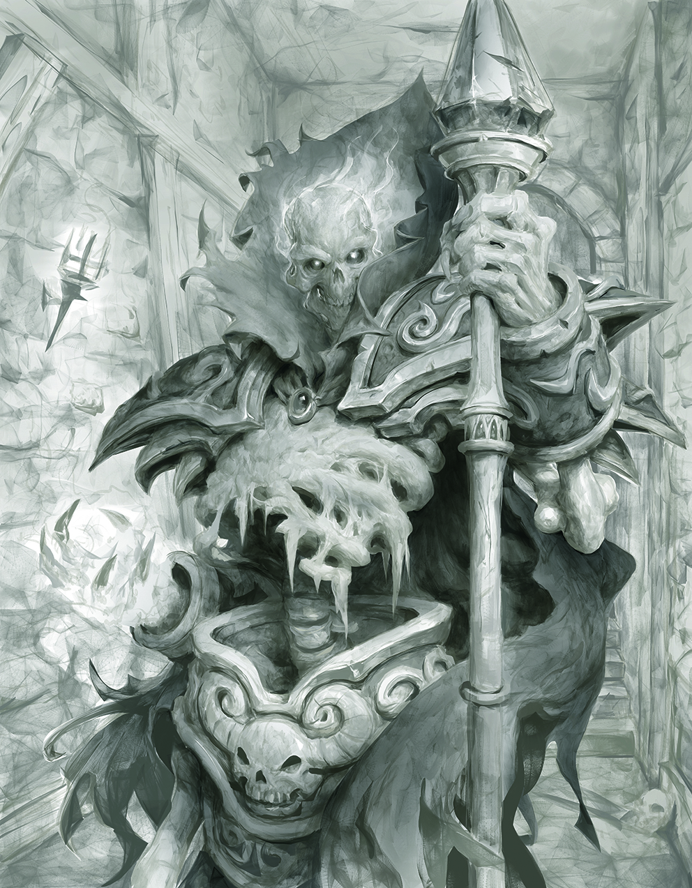
The goal is to translate the quality and finish of the focal point to the rest of the piece, maintaining a cohesive aesthetic.
10. Mid-Painting Check-in: The Touch Base
A critical aspect of professional client work is the "touch base" or mid-painting review. "When I have the painting looking pretty decent, I like to send it back over to the client for mid-painting thoughts before taking it all the way to final," Eastburn advises.
This collaborative step is vital for addressing any potential discrepancies or desired changes early in the process. It minimizes the risk of significant revisions closer to the deadline and ensures that the client’s evolving vision is incorporated effectively. For card game commissions, where artists often submit work in waves, proactive communication is particularly important to manage client workloads and expectations.
11. Weaving the Narrative: Detailing and Storytelling
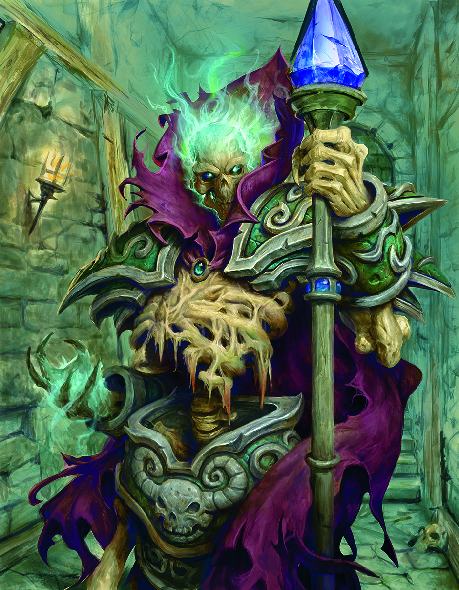
This stage involves the meticulous refinement of details that enrich the narrative and visual appeal of the artwork. "Here I glaze the background down more into the value I need so that the bright blue magic skull shines with a low opacity multiply layer," Eastburn describes.
The artist carefully adds elements like cobwebs and runes, ensuring they enhance rather than detract from the focal point. "I try not to add too many big-contrast shapes in the background to avoid bringing too much attention there." This principle of controlled contrast ensures that the background supports the main subject without becoming a distraction.
12. The Final Flourish: Final Details and Polish
As the illustration nears completion, the artist focuses on amplifying the most striking elements. "Towards the home stretch I start bringing in my darkest darks and my lightest lights," Eastburn states. Techniques like using dodge tools and specialized texture brushes can add a traditional, painterly feel.
The final polish involves carefully managing edges, adjusting color saturation, and enhancing contrast to ensure the artwork reads effectively, especially in its intended context, such as a game card. This stage is akin to applying a final varnish to a traditional painting, unifying the elements and bringing the piece to its full potential.
Conclusion: The Art of a Professional Workflow
The journey from a client’s brief to a finished, impactful digital illustration is a testament to the artist’s dedication, strategic thinking, and technical mastery. Cole Eastburn’s detailed walkthrough of his process provides a profound insight into the meticulous steps involved in creating art for leading gaming companies. By embracing these principles—from the foundational art brief and iterative thumbnailing to the nuanced application of value, color, and detail—artists can cultivate a workflow that is both creatively fulfilling and professionally successful. The art of digital illustration for the gaming industry is a dynamic blend of vision, discipline, and collaboration, and mastering this process is key to forging a lasting career in this exciting field.
This article originally appeared in ImagineFX. Subscribe to ImagineFX to never miss an issue. Print and digital subscriptions are available. Creative Bloq is now easier to access than ever before with our on-the-go app, which brings you all the content you know and love from our website, but in a super-streamlined design. Download the Creative Bloq app for iOS and Android.
Sign up to Creative Bloq’s daily newsletter, which brings you the latest news and inspiration from the worlds of art, design and technology.
About the Author:
Cole Eastburn has been an artist in the game industry for the last 22 years, including a long stint as a senior concept artist at Blizzard. He hopes this tutorial helps you with your future commissions and thanks you for taking the time to read through. If you like tutorials like this and would like more of his brushes, and also behind-the-scenes of the art he makes for clients, and personal work, please feel free to stop by his Patreon: patreon.com/cw/ColeEastburn.