The Evolutionary Mutation of the Graphic Novel: Revisiting Bester and Chaykin’s ‘The Stars My Destination’
“It was a golden age, a time of high adventure, rich living, and hard dying… but nobody thought so.”
The opening line of Alfred Bester’s 1956 science fiction masterpiece, The Stars My Destination (originally titled Tiger! Tiger! in the UK), serves as more than just a literary hook. It is a profound summation of the era in which the novel was eventually adapted into a visual medium. In the late 1970s, the American comic book industry was undergoing a turbulent metamorphosis. The "Old World"—defined by newsstand distribution, the strictures of the Comics Code Authority, and a perception of the medium as disposable children’s entertainment—was dying. In its place, a "New World" was struggling to emerge through the birth of the direct market, the rise of the "Enfants Terribles" of New Hollywood-style creators, and Will Eisner’s crusade to legitimize the "graphic novel."
Amidst this chaotic evolution, one particular project stood out as a beautiful, strange mutation: the Byron Preiss-produced and Howard Chaykin-illustrated adaptation of The Stars My Destination. Neither a traditional comic book nor a standard novel, it remains one of the most ambitious experiments in the history of visual storytelling.
Main Facts: The Intersection of Pulp and Prestige
The adaptation of The Stars My Destination was not merely a licensed cash-in; it was the flagship of an experimental movement led by packager and publisher Byron Preiss. Preiss sought to bridge the gap between high-concept science fiction literature and the visual dynamism of the comic book medium.
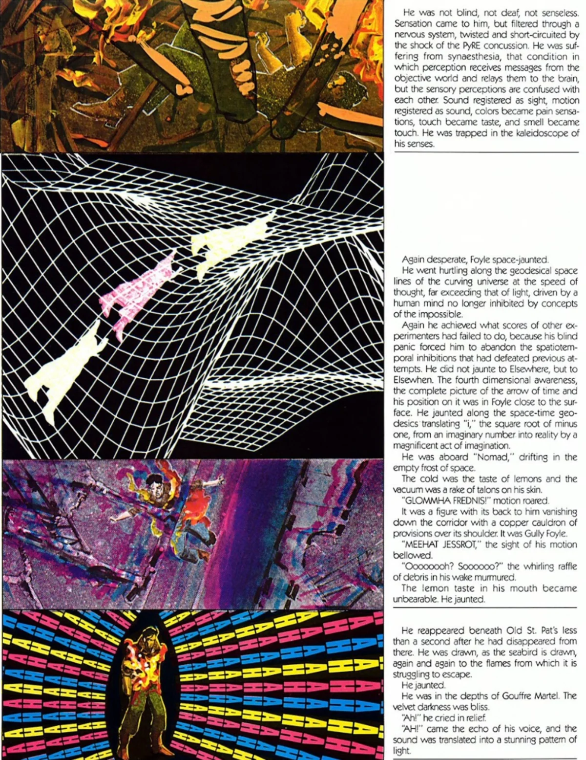
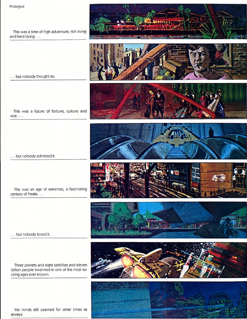
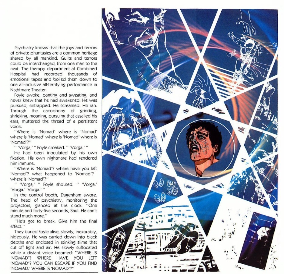
The project paired Alfred Bester, a Grand Master of science fiction with a secret history in the Golden Age of comics, with Howard Chaykin, a rising star known for his sophisticated, often transgressive visual style. The result was a work that defied easy categorization. It utilized a format Preiss termed "illustrated fiction," where blocks of text and full-page illustrations shared space in a manner reminiscent of Victorian serials or illuminated manuscripts, rather than the panel-and-word-balloon structure of standard comics.
Published sequentially in Heavy Metal magazine before being collected by Marvel’s Epic Comics imprint, the adaptation captures the visceral, frenetic energy of Bester’s prose. It follows Gully Foyle, a "clod" of a man who is left for dead in the vacuum of space and, fueled by a singular, burning desire for revenge, transforms himself into a polymath, a warrior, and eventually, a transcendent being.
Chronology: A Turbulent Path to Publication
The journey of The Stars My Destination from the printed page to the graphic format was as arduous as Gully Foyle’s trek across the solar system.
- 1956: Alfred Bester publishes The Stars My Destination. It revolutionizes science fiction by introducing "jaunting" (teleportation) and a gritty, proto-cyberpunk aesthetic.
- Early 1970s: Byron Preiss begins his "Fiction Illustration" initiative. His goal is to elevate comics by adapting the works of "New Wave" sci-fi authors like Harlan Ellison, Roger Zelazny, and Theodore Sturgeon.
- 1976–1977: Preiss secures the rights to Bester’s work. Howard Chaykin, fresh off his success with the Star Wars comic adaptation, is brought on board. The project is envisioned as a multi-part epic.
- 1978: The work begins appearing in the pages of Heavy Metal. The magazine’s European sensibilities and adult-oriented content provide the perfect home for Bester’s violent and sexually charged narrative.
- 1979: The first volume is published by Baronet Publishing. However, financial difficulties and the shifting landscape of the publishing industry lead to delays.
- 1992: Years after the initial experiment, Marvel’s Epic Comics finally collects the work in a complete, high-quality format, allowing a new generation to witness the "noble experiment" in its entirety.
Supporting Data: The Preiss Experiments and the "Noble Failure"
To understand why The Stars My Destination is held in such high regard, one must look at the context of Byron Preiss’s other "illustrated fiction" projects. Most are now remembered as "noble failures"—works that were ambitious in theory but lacked the cohesion to succeed in practice.
The Problem of Format
In works like Chandler: Red Tide (by Jim Steranko) or The Illustrated Harlan Ellison, the text and the art often felt divorced from one another. In Red Tide, the prose attempted to mimic the hardboiled style of Raymond Chandler or Mickey Spillane, but without the art, the writing stood bare as a pale imitation. Conversely, the art often felt like it was simply decorating the text rather than interacting with it.
The Bester Difference
What set The Stars My Destination apart was the unique background of Alfred Bester. Unlike many of his contemporaries, Bester had spent years writing for DC Comics in the 1940s. He is the man credited with writing the Green Lantern’s oath ("In brightest day, in blackest night…"). Because Bester grew up in the "visual" world of comics, his prose in the original novel was already inherently cinematic.
He wrote in "beats." He described action with the clarity of a storyboard artist. When Chaykin stepped in to adapt the work, he wasn’t just illustrating a book; he was translating a narrative that already spoke the language of the image.
Technical Versatility
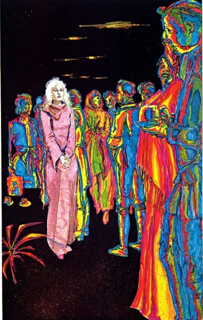
Howard Chaykin’s work on this project is a tour de force of technical experimentation. In an era before digital coloring and Photoshop, Chaykin utilized:
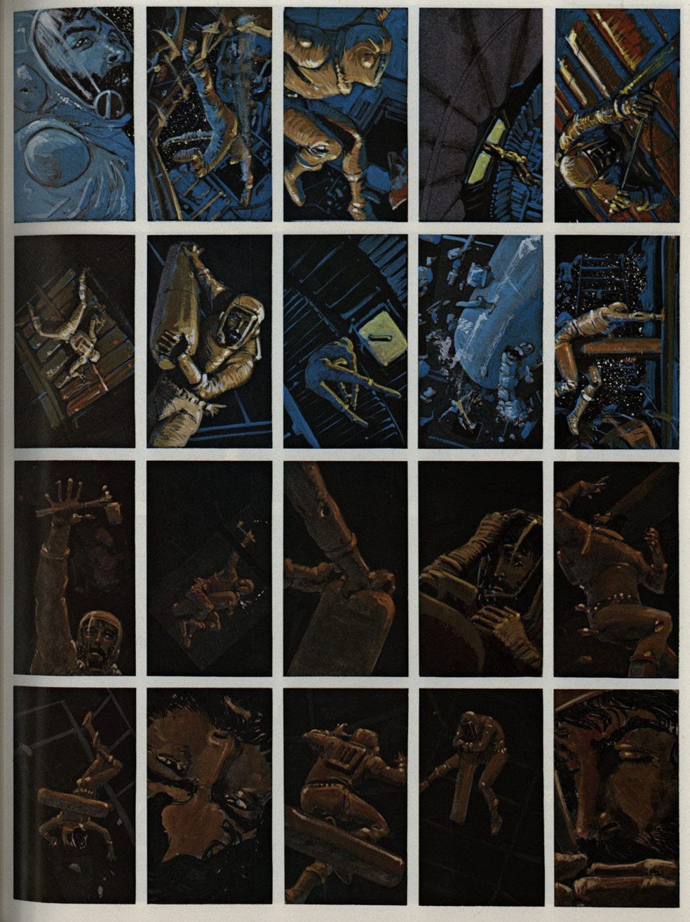
- Computer-generated patterns: Early experiments in digital textures to represent the "jaunting" effect.
- Impressionistic washes: Used to convey the internal psychological state of Gully Foyle.
- Classical realism: Anchoring the sci-fi elements in a tangible, gritty reality.
Statistical analysis of the adaptation shows that approximately 80% of Bester’s original prose was retained. This high percentage of text usually bogs down a graphic novel, yet Chaykin’s layouts ensured the "eye" never felt fatigued, moving the reader through the dense narrative at a breakneck pace.
Official Responses and Critical Reception
The reception of the Bester/Chaykin collaboration has evolved significantly over the decades. At the time of its initial release, it was viewed with a mix of awe and confusion.
The Industry Perspective
Comics traditionalists were often frustrated by the lack of traditional paneling. Scott McCloud, the noted comics theorist, famously defined comics as "juxtaposed pictorial and other images in deliberate sequence." By this strict definition, The Stars My Destination occasionally fails to be a "comic," as it often relies on single, static images paired with long columns of text.
However, the "New Wave" of creators in the late 70s saw it as a blueprint for the future. It proved that the "Graphic Novel" didn’t have to be just a long comic book; it could be a hybrid medium that demanded a higher level of literacy and visual acuity from the reader.
Critical Retrospective
Modern critics often compare the work to cinema rather than literature. In his analysis, journalist Tom Shapira likens the work to Chris Marker’s La Jetée—a film composed almost entirely of still photos that nonetheless achieves a sense of profound movement.
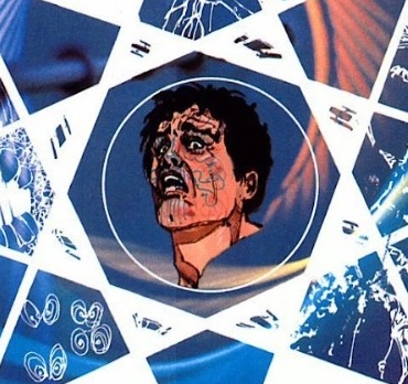
The consensus among sci-fi historians is that Bester’s story of Gully Foyle—a man who democratizes the power of ultimate destruction (the substance PyrE)—remains one of the most powerful conclusions in the genre. Chaykin’s ability to capture the "burning tiger" of Foyle’s tattooed face and the "cosmic guru" heart of the story’s climax is cited as a career-best achievement.
Implications: An Evolutionary Dead End?
Despite the brilliance of The Stars My Destination, the "illustrated fiction" format did not become the dominant mode for the graphic novel. As the 1980s progressed, works like Watchmen and The Dark Knight Returns solidified the "panel-and-balloon" style as the standard for the medium.
Why the Format Faded
- Complexity of Production: It required a specific type of writer-artist synergy that is rare. Most prose writers lack Bester’s visual "pulp brain," and most artists lack Chaykin’s patience for dense text.
- Reader Preference: The direct market audience eventually gravitated toward the "cinematic" flow of standard comics, finding the "illustrated novel" style too static.
- The "Morrison Problem": As noted by some critics, when modern comics scribes (like Grant Morrison) attempt dense prose-heavy sections, the "prose deficiencies" of the medium are often exposed. Bester was a master of the novel first; most comic writers are not.
The Lasting Legacy
The Stars My Destination stands as a reminder that the evolution of art is not a straight line. It is a series of "mutations," some of which flourish and some of which remain as beautiful, isolated artifacts.
This adaptation remains a "prepared awakening"—a testament to a time when creators were willing to break the medium to see what was inside. It suggests that the "graphic novel" is a broader church than we often give it credit for, capable of housing works that are "nothing and everything" all at once. For those seeking to understand the limits of visual storytelling, Gully Foyle’s journey remains the ultimate destination.