Toledo Bakery Unveils Delectable New Brand Identity, Inspired by the Art of Laminated Dough
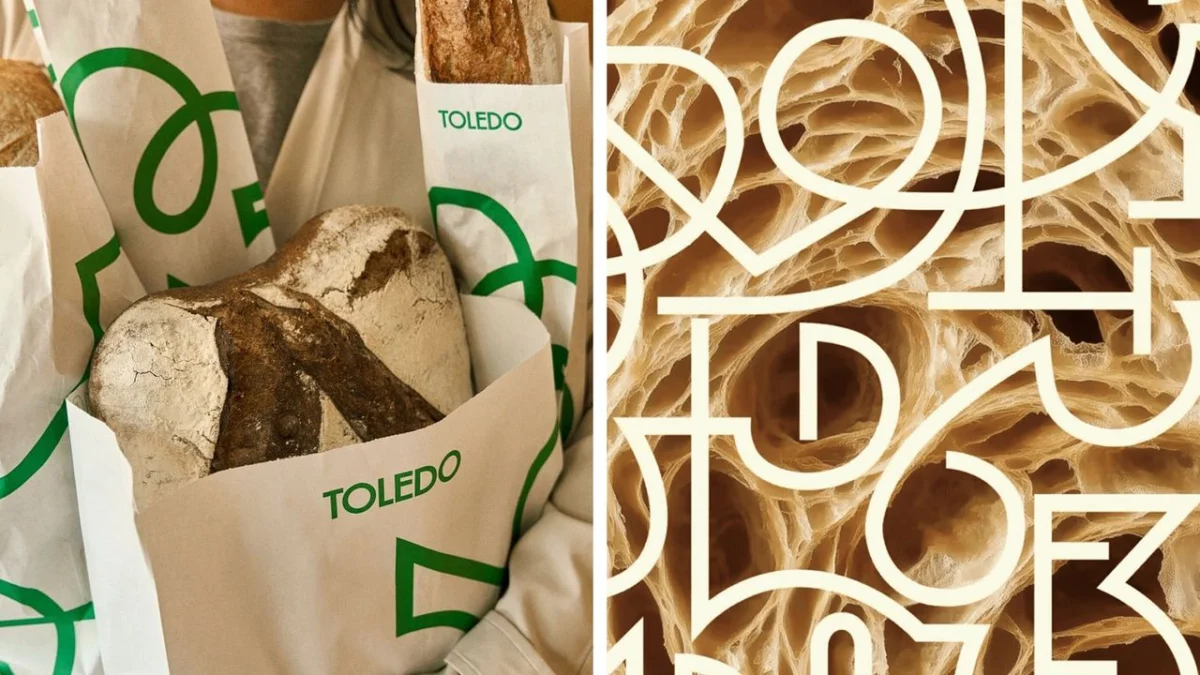
Montreal, Canada – In a move that is both aesthetically pleasing and deeply rooted in culinary tradition, Canadian bakery chain Toledo has unveiled a sophisticated and appetizing new brand identity. Designed by the innovative minds at Nouvelle Idée, the refreshed visual language draws its core inspiration from the very essence of Toledo’s craft: the intricate, airy pockets formed within its signature flaky, buttery laminated dough. This evocative approach not only captures the tactile and visual appeal of freshly baked goods but also promises to imbue the brand with a timeless yet contemporary sensibility, poised to captivate both long-standing patrons and a new generation of discerning customers.
The decision to anchor a brand’s visual identity in the organic, irregular shapes of baked goods might seem unconventional, especially in an era often dominated by minimalist, abstract logos. However, as the creative team at Nouvelle Idée demonstrates, such a grounding in product reality can yield a powerful and resonant narrative. This strategy allows the brand to tell a story that customers can intuitively feel and connect with, even if the precise genesis of the design isn’t immediately apparent. The result is a brand identity that is not just a logo, but a palpable representation of the quality, craftsmanship, and deliciousness that Toledo has come to embody.
The Genesis of a Visually Delicious Identity
The inspiration behind Toledo’s new branding lies in the meticulously crafted layers of laminated dough – the foundation of croissants, danishes, and other viennoiseries. When baked, these layers create a mesmerizing network of irregular air pockets, a testament to the baker’s skill and the quality of the ingredients. Nouvelle Idée has masterfully translated these ephemeral forms into a versatile and enduring visual system.
"The beauty of laminated dough is its inherent imperfection and organic nature," explains a spokesperson for Nouvelle Idée. "Each pocket is unique, a tiny testament to the hand-craftsmanship involved. We saw in these shapes a perfect metaphor for the artisanal quality of Toledo’s products – something that is both comforting and sophisticated, familiar yet always surprising."
This conceptual foundation has allowed for the development of a visual language that is remarkably flexible. The organic shapes, derived from the dough’s internal structure, have been adapted across a wide range of applications. From intricate patterns adorning packaging to subtle accents in in-store decor and signage, the motif provides a consistent and recognizable thread that ties the entire brand experience together. This adaptability ensures that the brand’s essence is communicated effectively, whether customers are encountering it on a pastry box, a storefront, or the chain’s digital platforms.
A Culinary Palette for Visual Storytelling
Complementing the structural inspiration is a carefully curated colour palette that further enhances the brand’s connection to its baked goods. The chosen hues evoke the warm, inviting tones associated with the baking process and its end products. Think of the golden-brown crust of a freshly baked loaf, the rich creaminess of butter, the comforting aroma of roasted coffee beans, and the soft, inviting shade of flour.
"We wanted the colours to feel as delicious as the products themselves," states the design team. "The palette is designed to evoke a sense of warmth, comfort, and indulgence. It’s about creating an emotional connection with the customer, reminding them of the simple pleasures of a perfectly baked treat."
This warm and inviting colour scheme is juxtaposed with a contemporary sans-serif wordmark. This contrast creates a dynamic tension within the branding, balancing the artisanal, almost ornamental quality of the dough-inspired graphics with a modern, clean, and legible typography. The wordmark itself is designed for clarity and accessibility, ensuring that the Toledo name is easily recognized and remembered, while the accompanying graphic elements add depth, personality, and a touch of handcrafted charm.
Chronology of a Rebrand: From Dough to Design
The journey to Toledo’s new brand identity was a thoughtful and iterative process, driven by a desire to authentically represent the bakery’s heritage and its commitment to quality. While specific dates for the project’s inception and completion are not publicly disclosed, the evolution of the brand can be understood through a conceptual timeline:
-
Phase 1: Conceptualization and Inspiration (The Dough’s Embrace): The initial phase involved deep immersion into the core of Toledo’s product. Designers studied the intricate structures of laminated dough, observing the unique patterns and textures created during the baking process. This involved detailed analysis of how heat and ingredients interact to form the signature airy layers. The goal was to find a visual language that was not merely decorative but deeply symbolic of the baking artistry.
-
Phase 2: Translation to Visual Language (From Pocket to Pattern): Once the inspiration was firmly established, Nouvelle Idée began translating these organic shapes into a cohesive graphic system. This involved abstracting the forms, creating adaptable motifs that could be scaled and applied across various media. The challenge was to retain the essence of the dough’s irregularity while ensuring the designs were clean, modern, and reproducible.
-
Phase 3: Palette Development (A Taste of Colour): Concurrently, the design team worked on defining the brand’s colour palette. This phase was heavily influenced by the sensory experience of baking and enjoying baked goods. Research likely involved observing the natural colours of key ingredients and the finished products, aiming for a palette that conveyed warmth, freshness, and a touch of indulgence.
-
Phase 4: Typography Selection (The Brand’s Voice): The choice of typography was critical in balancing the artisanal inspiration with a modern appeal. A contemporary sans-serif was selected to provide a clean, legible, and forward-looking counterpoint to the more decorative graphic elements. This decision ensures that the brand’s name is easily recognizable and communicates a sense of professionalism and accessibility.
-
Phase 5: Application and Refinement (Bringing it to Life): The final phase involved applying the newly developed brand elements across all touchpoints. This included packaging design, signage, in-store materials, and potentially digital assets. Extensive testing and refinement would have been undertaken to ensure the brand identity functioned seamlessly across all these applications, creating a unified and impactful customer experience.
Supporting Data and Design Principles
The success of Toledo’s rebrand can be attributed to several key design principles that have been expertly implemented by Nouvelle Idée:
- Authenticity: The brand identity is deeply rooted in the actual product. This authenticity resonates with consumers who value genuine craftsmanship and high-quality ingredients.
- Storytelling: The design tells a compelling story about Toledo’s heritage, its baking process, and the passion that goes into each product. This narrative creates an emotional connection beyond just the visual appeal.
- Flexibility and Scalability: The ability to adapt the core visual motifs across diverse applications is crucial for a multi-location chain. The organic shapes derived from dough pockets have proven to be remarkably versatile.
- Contrast and Balance: The juxtaposition of ornamental, organic graphics with a clean, modern sans-serif wordmark creates a sophisticated and balanced aesthetic. This prevents the branding from feeling overly fussy or too stark.
- Sensory Appeal: The colour palette and the inherent visual texture of the dough-inspired graphics evoke a sense of taste, smell, and touch, creating a multisensory brand experience.
This approach aligns with broader trends in branding that emphasize authenticity, storytelling, and creating a memorable sensory experience. In the competitive food industry, a brand that can visually communicate its quality and craftsmanship is likely to stand out.
Official Responses and Market Reception
While official statements from Toledo executives are not yet widely available, the initial unveiling of the rebrand has been met with considerable positive attention within design and food industry circles. Creative Bloq, in its initial report, highlighted the design’s effectiveness in evoking a visceral response, stating, "and it’s making me feel hungry." This immediate connection to appetite and desire is a strong indicator of the brand’s success in its primary objective.
Industry commentators have lauded Nouvelle Idée’s ability to translate a subtle, internal characteristic of baked goods into a universally appealing visual language. The rebrand is seen as a sophisticated step forward for Toledo, aiming to bridge the gap between its traditional artisanal roots and the expectations of a contemporary consumer base. The strategy of drawing inspiration directly from the product’s inherent qualities is a testament to a deep understanding of brand building within the food sector.
The bakery chain is likely anticipating a positive reception from its existing customer base, who will appreciate the continuation of the brand’s commitment to quality, now visually reinforced. For new customers, the fresh and inviting aesthetic is expected to pique interest and draw them into the Toledo experience. The success of such a rebrand will ultimately be measured by increased customer engagement, brand recognition, and, of course, sales.
Implications for the Future: A Recipe for Continued Success
The strategic rebranding of Toledo signifies more than just a cosmetic update; it represents a thoughtful evolution of the brand’s narrative and its connection with consumers. By drawing inspiration from the very heart of its culinary craft, Toledo has created a visual identity that is not only beautiful but also deeply authentic and resonant.
The implications of this rebrand are far-reaching. Firstly, it reinforces Toledo’s position as a premium bakery that values artisanal quality and traditional techniques, while simultaneously presenting itself as modern and forward-thinking. This dual appeal is crucial for sustained growth in today’s diverse market.
Secondly, the flexible visual system designed by Nouvelle Idée provides Toledo with a robust framework for future expansion and marketing efforts. The adaptable motifs can be easily integrated into new product lines, promotional campaigns, and digital content, ensuring brand consistency across all platforms. This inherent scalability is invaluable for a growing chain.
Furthermore, the rebrand sets a high bar for other businesses in the food industry. It demonstrates the power of authentic storytelling and the impact of a well-executed brand identity that is deeply connected to the product itself. In an increasingly saturated market, brands that can communicate their unique value proposition with such clarity and sensory appeal are poised for long-term success. Toledo’s new look is not just a visual upgrade; it’s a delicious promise of quality, craft, and an enduring connection with the art of baking.