
Unapologetically Meat: How Studio Blackburn Reimagined the Artisanal Butcher for Modern London
The high street butcher, once a staple of every British neighborhood, is undergoing a profound transformation. No longer just a place for a Sunday roast, the modern butcher must navigate a complex landscape of sustainability, ethical sourcing, and a diversifying demographic. In the heart of Southeast London, Ellis Butchers has emerged as a prime example of this evolution. By partnering with the renowned design firm Studio Blackburn, founder Nick Ellis has launched a brand identity that is—in their own words—“unapologetically meat.”
This rebranding effort goes beyond a mere logo change; it represents a sophisticated "multifaceted architecture strategy" designed to bridge the gap between a century of tradition and a vibrant, modern future. Spanning two distinct locations in Blackheath, the new identity for Ellis Butchers serves as a masterclass in how design can honor heritage while aggressively courting a new generation of consumers.
Main Facts: A Dual-Identity Brand Strategy
Ellis Butchers operates out of two primary locations within the London Borough of Greenwich: Blackheath Village and Blackheath Standard. While both shops fall under the "Ellis Butchers" umbrella, they serve distinct communities with different aesthetic expectations and shopping habits.
The core of the Ellis Butchers philosophy is centered on sustainable, whole-carcass butchery. This traditional method involves purchasing the entire animal from a farm and utilizing every part, a practice that significantly reduces waste and ensures a higher level of transparency and quality than the pre-packaged meat found in supermarkets.

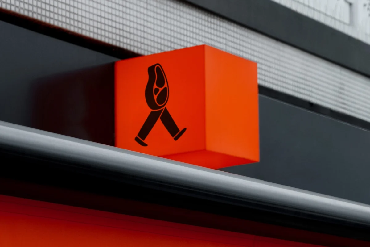
To translate this physical craft into a digital and visual language, Studio Blackburn was tasked with creating a brand that felt unified yet flexible. The resulting work features a "cast of characters"—playful, animated meat products led by a mascot named "Meat Ellis"—which appear on everything from shop signage and brown paper packaging to digital social media campaigns.
The Two Faces of Ellis Butchers
- Blackheath Village: A location steeped in history, featuring a century-long legacy of butchery. The branding here is conservative, sophisticated, and rooted in Victorian-era aesthetics, utilizing deep greens and classic tiling.
- Blackheath Standard: A more contemporary setting that required a "modern twist." The branding here utilizes vibrant orange accents, bold typography, and a "youthful" energy designed to appeal to younger families and professionals moving into the area.
Chronology: From Acquisition to Brand Launch
The journey of Ellis Butchers began with founder Nick Ellis’s vision to revitalize the independent butchery scene in Southeast London. Having acquired two established shops in different parts of Blackheath, Ellis recognized that a "one size fits all" approach to branding would fail to resonate with the specific micro-climates of the two neighborhoods.
Phase 1: The Brief (Early 2024)
Nick Ellis approached Studio Blackburn with a specific challenge: how to create a cohesive parent brand that allowed for local differentiation. The brief emphasized that the branding must reflect the "whole-carcass" ethos—meaning it shouldn’t shy away from the reality of meat production. It needed to be honest, high-quality, and "unapologetically meat."
Phase 2: Strategic Development
Studio Blackburn spent months developing a "multifaceted architecture strategy." This involved researching the history of the Blackheath Village site, which has housed a butcher for over 100 years. Simultaneously, they analyzed the demographic shifts in Blackheath Standard, an area seeing an influx of younger residents who value both provenance and modern design.

Phase 3: Design and Character Creation
Throughout the mid-portion of the project, the design team focused on the "unification" elements. This led to the creation of the meat characters. By personifying the products—such as a "walking sausage" or a friendly steak—Studio Blackburn aimed to make the concept of whole-carcass butchery more approachable and memorable without losing its premium edge.
Phase 4: Implementation and Launch (July 2024)
The physical transformation of the shops began in early summer. The Village shop was outfitted with traditional tiles and a classic logotype, while the Standard shop saw the installation of bold, orange-accented signage. The digital rollout followed, featuring short animations of "Meat Ellis" to introduce the brand to a wider London audience.
Supporting Data: Design Elements and Demographic Targeting
The success of the Studio Blackburn strategy lies in its granular attention to visual cues that signal specific values to the consumer.
The Palette of Tradition vs. The Color of Energy
In the Village location, the choice of a "sophisticated green" is a deliberate nod to British heritage. In color psychology, deep forest greens are associated with stability, nature, and high-end luxury. When paired with traditional white-and-green tiles, it evokes the "Old World" butcher shop, reassuring long-time residents of the shop’s commitment to quality.

Conversely, the Blackheath Standard location utilizes a "striking orange." Orange is a high-energy color that stimulates appetite and signals a break from tradition. By using this as an accent against bold, sans-serif typography, the brand immediately identifies itself as a modern, artisanal destination rather than a relic of the past.
The "Whole-Carcass" Factor
Data from the sustainable food sector suggests that consumers are increasingly wary of industrial meat processing. By highlighting the "whole-carcass" aspect in the brand’s storytelling, Ellis Butchers taps into a market segment that is willing to pay a premium for ethical sourcing. Studio Blackburn reinforced this by ensuring the branding felt "raw" and "honest"—avoiding the overly sanitized imagery often used by supermarkets.
Digital Integration
While the physical shops are the heart of the business, the "Meat Ellis" characters were designed specifically for the "digital-first" consumer. In an era where food discovery happens on Instagram and TikTok, having a "cast of characters" allows for more engaging storytelling than static photos of raw cuts of meat.
Official Responses: Studio Blackburn’s Vision
Representatives from Studio Blackburn have been vocal about the creative philosophy behind the project. They describe the work as a balance between honoring the past and defining a new category of retail.

“We developed a multifaceted architecture strategy to manage the two distinct shop personalities under the overarching Ellis Butchers umbrella,” a spokesperson for Studio Blackburn stated. “For the historic Blackheath Village location, we focused on tradition, using a classic logotype and a sophisticated green colour palette with traditional tiles to honour the shop’s century-long legacy.”
Addressing the contrast in the second location, the studio noted: “By contrast, the Blackheath Standard location has a modern twist, a vibrant, youthful identity using bold typography and striking orange accents to target a younger demographic.”
The studio also highlighted the role of the mascots in bridging the gap between the two styles. “To unify the branding, Studio Blackburn also created a cast of appealing meat characters, led by ‘Meat Ellis,’ which are used across both the physical stores and in signage as well as appearing across digital. The result is branding that feels at home in a familiar neighbourhood setting but contains a modern twist.”
Implications: The Future of Artisan Retail
The rebranding of Ellis Butchers carries significant implications for the future of independent retail in London and beyond.

1. The Survival of the High Street
As e-commerce continues to dominate, physical shops must offer an "experience" that cannot be replicated online. Ellis Butchers demonstrates that branding is a vital tool in creating this experience. By making the butcher shop a visual landmark in the neighborhood, they turn a routine chore into a destination visit.
2. Design as an Economic Driver
The decision to differentiate the two shops based on local demographics suggests a move toward "hyper-local" marketing. Instead of a bland, corporate consistency, Ellis Butchers uses design to show that they understand the specific "vibe" of each street. This level of customization is likely to become the standard for small business owners looking to compete with larger chains.
3. The "Ethivore" Movement
The "unapologetically meat" stance is a bold counter-narrative to the rise of plant-based alternatives. By focusing on sustainability and "whole-carcass" ethics, Ellis Butchers is carving out a niche for the "ethivore"—the consumer who chooses to eat meat but demands that it be sourced and processed with the highest level of respect for the animal and the environment.
4. Personification in Branding
The use of "Meat Ellis" and his companions represents a shift toward more playful, character-driven branding in the food industry. This humanizes the brand and creates an emotional connection with the consumer, making the business feel less like a faceless entity and more like a community personality.

In conclusion, the collaboration between Nick Ellis and Studio Blackburn has resulted in a brand identity that is as robust as the products it sells. By respecting the 100-year history of Blackheath Village while embracing the vibrant energy of Blackheath Standard, Ellis Butchers has positioned itself as a leader in the modern butchery movement. It is a testament to the power of design to preserve tradition while paving the way for a sustainable, "unapologetic" future.