The Auditory Narrative: How Bear Meets Eagle on Fire Reimagined Rumble’s Identity Through ‘Sound is Story’
In the hyper-visual landscape of modern branding, the auditory element of storytelling is frequently relegated to the background—a secondary layer designed to support the image. However, for Rumble, one of Australia’s premier boutique sound and music studios, sound is not merely a supplement; it is the foundation of the narrative itself. This philosophy has been brought to the forefront in a sweeping new rebrand executed by the Sydney-based creative powerhouse Bear Meets Eagle on Fire (BMEOF).
The rebrand, centered on the evocative positioning "Sound is Story," represents a nine-month creative odyssey that bridges the gap between static graphic design and immersive auditory experiences. By blending the illustrative prowess of legendary cartoonist Adrian Tomine with a modular, sound-first identity system, Rumble and BMEOF have set a new benchmark for how creative service studios communicate their craft to the world.
Main Facts: A Modular Identity Rooted in Craft
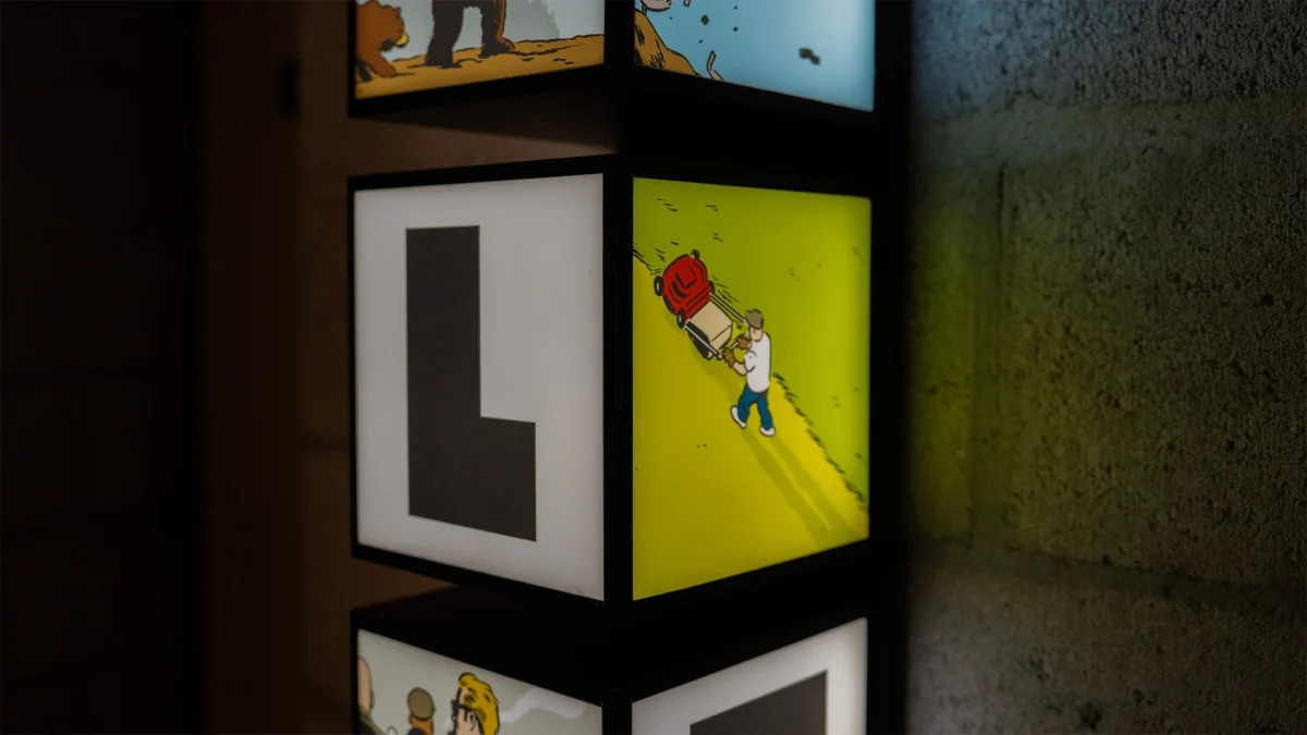
The core of the Rumble rebrand is a departure from traditional, static corporate identities. Instead of a singular logo or a fixed color palette, BMEOF developed a living system that prioritizes "micro-stories." At the heart of this system is a custom-designed wordmark featuring heavy, rounded letterforms. While the typeface provides a sturdy, tactile foundation—mimicking the physical "weight" of a low-frequency rumble—it is what lives within these letters that defines the new brand.
To populate the identity, BMEOF commissioned Adrian Tomine, the celebrated American cartoonist known for his iconic New Yorker covers and his minimalist, emotionally resonant graphic novels like Shortcomings and Killing and Dying. Tomine’s task was to create a suite of illustrations that could nestle inside the counters and curves of the "Rumble" letterforms.
The result is a collection of diverse, often surreal vignettes:
- Narrative Variety: The illustrations feature a motley crew of characters, including gun-wielding bears, eccentric mad scientists, menacing deep-sea monsters, and gritty motorbike gangs.
- The Modular System: For each of the six letters in the "Rumble" name, Tomine created four distinct scenes. This 24-scene matrix allows for thousands of potential combinations, ensuring the brand remains fresh and capable of telling a different story every time it is encountered.
- Multimedia Integration: These scenes exist both as static illustrations for print and editorial use and as motion graphics. Crucially, each scene is paired with a bespoke soundscape designed by the Rumble team, effectively turning the logo into a portfolio of their technical capabilities.
Chronology: Nine Months of Meticulous Development
The journey toward "Sound is Story" began nearly a year ago when Rumble founder Tone Aston realized that the studio’s existing branding did not fully reflect the depth of their artistic contribution to film, television, and advertising. The studio, which has built a reputation for high-end sound design and composition, needed a visual language that spoke to the process of creation rather than just the final product.

Phase 1: Conceptualization (Months 1–2)
BMEOF began by stripping back the studio’s mission. The team moved away from technical jargon—decibels, frequencies, and hardware—and focused on the emotional output of the work. This led to the "Sound is Story" mantra, a positioning that reframes the sound engineer as a narrator.
Phase 2: The Collaboration with Tomine (Months 3–6)
Selecting the right illustrator was critical. The team sought someone whose work felt "editorial" rather than "commercial." Adrian Tomine’s classic, clean-line style provided the perfect contrast to the heavy, bold typography. Over four months, Tomine worked closely with BMEOF to ensure the illustrations weren’t just decorative but felt like "stills" from a larger, untold movie.
Phase 3: Sound Design and Animation (Months 7–8)
Once the illustrations were finalized, the project moved back to Rumble’s home turf. The studio’s sound designers treated each of Tomine’s vignettes as a brief for a short film. They crafted unique soundscapes for the bears, the scientists, and the monsters, ensuring that the auditory "soul" of the brand was as crafted as its visual "body."
Phase 4: Launch and Implementation (Month 9)
The rebrand was rolled out across digital platforms, physical collateral, and a limited-edition brand book. The modular nature of the design allowed for a seamless transition across everything from social media snippets to large-scale environmental graphics.
Supporting Data: The Weight of Typography and the Logic of Motion
The technical execution of the rebrand relies on a sophisticated interplay between typography and negative space. The new "Rumble" logo uses a bespoke typeface characterized by its "heavy" presence. In branding psychology, heavy, rounded fonts are often associated with approachability combined with authority. For Rumble, this reflects a studio that is both world-class in its execution and deeply collaborative in its spirit.
The modularity of the 24 scenes (four per letter) serves a strategic purpose. In the digital age, brand fatigue is a significant risk. By creating a system with "thousands of possibilities," Rumble ensures that its visual identity can evolve without needing a complete overhaul.

Furthermore, the "editorial feel" mentioned by the creators is supported by the choice of a muted, sophisticated color palette and the use of high-quality paper stocks for physical applications. This positions Rumble not as a mere "vendor" in the advertising production chain, but as a "creative house" akin to a high-end film studio or a literary publisher.
Official Responses: Voices Behind the Vision
The leadership at both Rumble and Bear Meets Eagle on Fire have expressed that this project was a labor of love, driven by a shared respect for the "craft."
Tone Aston, founder of Rumble, emphasized the internal shift the rebrand represents. "This rebrand is about reinforcing our commitment to the craft of storytelling through music and sound," Aston stated. "Everything is designed to reflect that. We wanted our identity to be a living testament to what we do every day in the studio—taking a concept and giving it a voice, a mood, and a narrative arc through sound."
Micah Walker, Chief Creative Officer and Founder of Bear Meets Eagle on Fire, highlighted the dedication required to pull off such a complex, multi-layered identity. "Our folks have been working on this idea for a while, so it’s great seeing it all come together as a cohesive identity," Walker said. "It took a lot of time and love to get the balance right between Adrian’s incredible illustrations and the functional requirements of a brand logo. Massive props to the team for sticking with the details."
The collaboration with Adrian Tomine is also seen as a major coup for the project. By bringing a New York-based artist with no prior connection to the Australian advertising scene into the fold, BMEOF ensured that the brand would have a distinct, international aesthetic that stands out in a crowded local market.
Implications: Setting a New Standard for Creative Services
The Rumble rebrand carries significant implications for the wider creative and production industry. It signals a shift away from the "minimalist-tech" aesthetic that has dominated the 2010s and early 2020s—characterized by sans-serif fonts and flat, geometric icons—toward a more "maximalist-narrative" approach.

1. The "Artist-as-Brand" Trend
By employing a world-renowned cartoonist and focusing on micro-stories, Rumble is positioning itself as an artistic entity. This "editorial" approach suggests that the studio provides more than just a service; they provide a unique creative perspective. This is a powerful differentiator in an industry increasingly threatened by the commoditization of post-production services.
2. Audio-Visual Synergy
Most brands treat their logo as a silent mark. Rumble has challenged this by making sound an inextricable part of its visual identity. In an era where "sonic branding" is becoming a buzzword, Rumble’s approach is more organic and integrated than a simple three-note jingle. It demonstrates how sound can be used to add depth and "lore" to a brand.
3. Modular Longevity
The decision to create a modular system with 24 different scenes is a masterclass in future-proofing. As Rumble grows and takes on different types of projects—from horror films to whimsical animations—they can select the "scenes" within their logo that best match the tone of their current portfolio. This flexibility is essential for a studio that prides itself on versatility.
Conclusion
The collaboration between Bear Meets Eagle on Fire and Rumble is a rare example of a rebrand that manages to be both highly conceptual and deeply functional. By centering the identity on the phrase "Sound is Story," the teams have created a visual language that honors the invisible art of sound design.
Through the whimsical and sometimes dark illustrations of Adrian Tomine, Rumble now possesses a brand that is as much a piece of art as the soundscapes they produce. It is a reminder that in the world of storytelling, what we hear is just as important as what we see—and now, for Rumble, the two are finally in perfect harmony.