
A Cathedral of Confectionery: Inside Fortnum & Mason’s Landmark Launch of ‘The Biscuitorium’
In the heart of London’s Piccadilly, a new chapter in the storied history of British retail has been written. Fortnum & Mason, the grocer to the Royal Household and a global symbol of high-end gastronomy, has unveiled "The Biscuitorium"—a sprawling, 2,000-square-meter retail destination dedicated entirely to the art, heritage, and consumption of the biscuit.
Created in a high-profile collaboration with the award-winning creative agency Design Bridge and Partners, alongside interior specialists Design Theory, The Biscuitorium represents more than just a renovation of a department; it is a strategic reimagining of "retailtainment." By blending centuries-old recipes with cutting-edge visual identity and theatrical in-store experiences, Fortnum & Mason is betting on the humble biscuit to anchor its flagship’s future in an increasingly digital world.
Main Facts: A Grand Vision for the Humble Biscuit
The Biscuitorium is situated within Fortnum & Mason’s iconic Piccadilly flagship store, occupying a massive 2,000-square-meter footprint. This scale alone signals the department store’s commitment to the category. The project was executed by a "dream team" of design experts, led by Design Bridge and Partners—recently named Design Agency of the Year—who were tasked with creating a bespoke name and visual identity that felt both "unmistakably Fortnum’s" and entirely fresh.
Key highlights of the new space include:
- The "Made in Piccadilly" Counter: A live kitchen where Fortnum’s chefs handcraft biscuits in full view of the public.
- The Whoppalossus: A record-breaking biscuit for the brand, weighing 400g and measuring 15.5cm in diameter.
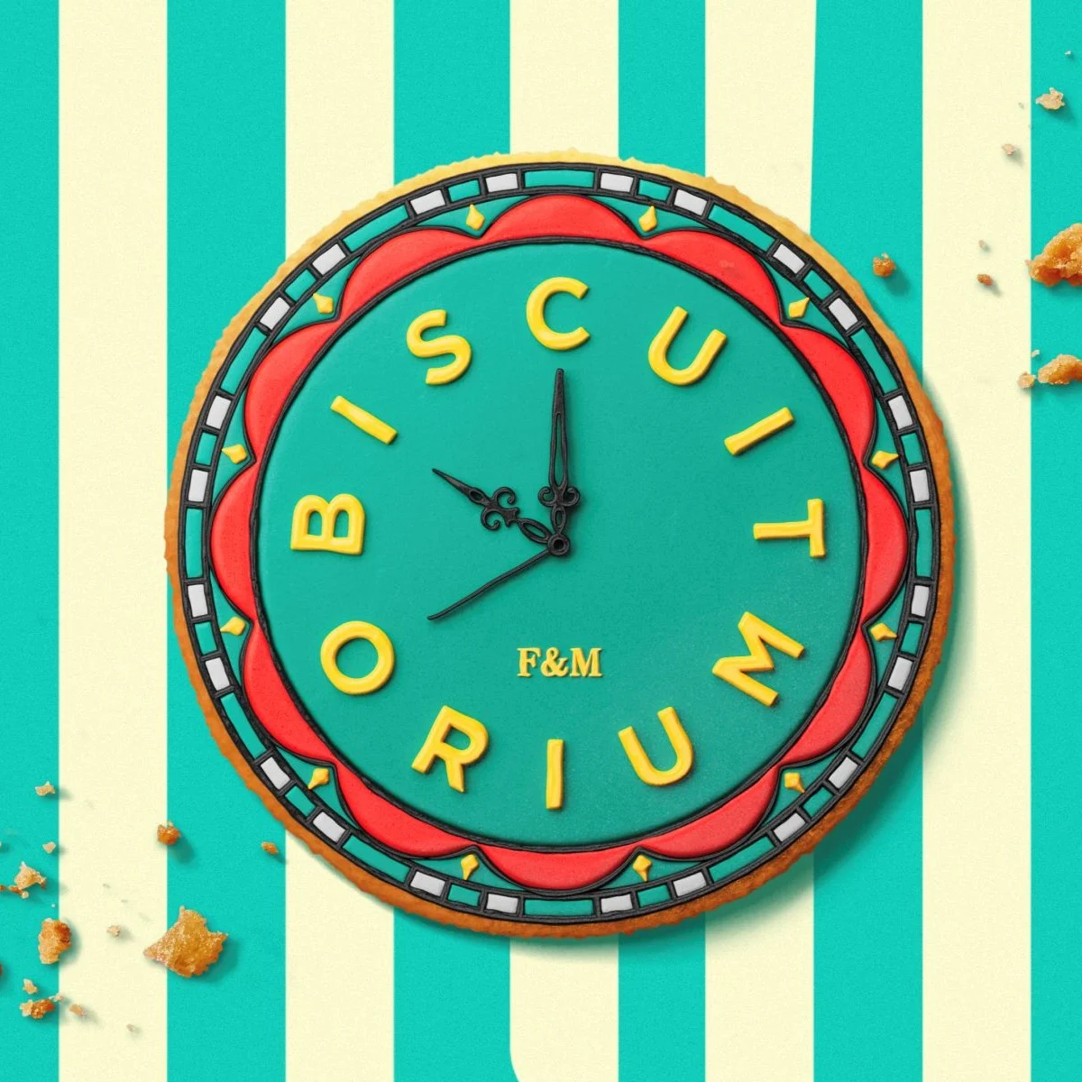
- The Visual Motif: A central branding element inspired by the store’s historic 1964 clock.
- The Biscuit House: A structural reimagining of the Piccadilly store made entirely of biscuits, crafted by the renowned artisans at Biscuiteers.
The launch is supported by six new biscuit ranges, including a sophisticated "Biscuit for Drinks" collection, designed to be paired with spirits, wines, and Fortnum’s signature teas.
Chronology: From Heritage Grocer to Modern Destination
To understand the significance of The Biscuitorium, one must look at the evolution of Fortnum & Mason. Founded in 1707, the brand has spent over three centuries defining the British palate. However, the "biscuit" as a retail category has traditionally been treated as a staple rather than a spectacle.
The journey toward The Biscuitorium began several years ago as part of a broader strategy to modernize the flagship experience. Fortnum & Mason recognized that in the post-pandemic landscape, physical retail must offer something that e-commerce cannot: sensory immersion and "theatre."
The development process involved:

- Conceptualization: Identifying the biscuit as a "hero" product that resonates with both domestic shoppers and international tourists.
- Branding Partnership: Engaging Design Bridge and Partners to move away from standard packaging toward a "destination" identity.
- Architectural Integration: Working with Design Theory to transform 2,000 square meters of floor space into a navigable, atmospheric journey.
- Product R&D: Developing new recipes, such as the Whoppalossus and the savory-sweet drink pairings, to ensure the culinary offering matched the design ambition.
- The Grand Opening: Launching the space with a multi-channel social media campaign, featuring zoetrope-style animations that bridge the gap between Victorian-era toys and modern digital content.
Supporting Data: Design Philosophy and Visual Language
The success of The Biscuitorium rests on its visual identity, which serves as a bridge between Fortnum’s 18th-century roots and 21st-century aesthetic sensibilities.
The Clock Graphic
Central to the branding is a graphic inspired by the large timepiece that has adorned the front of the Piccadilly store since 1964. This clock is more than a timekeeper; it is a piece of London’s architectural heritage. Design Bridge and Partners took the clock’s mechanical and aesthetic elements and translated them into a "playful addition" for packaging. This asset is flexible, appearing as a stamp of quality on physical boxes and as a dynamic, moving element in digital formats.
Color and Craftsmanship
The color palette of The Biscuitorium moves beyond the iconic "Eau de Nil" (Fortnum’s signature blue). While the classic blue remains a foundation, it is now accented by rich, jewel-like tones—deep emeralds, rubies, and sapphires—that reflect the premium nature of the ingredients.
Furthermore, the packaging incorporates "piped icing" stripes. This detail is a direct nod to the manual craftsmanship of the pastry chefs working in the "Made in Piccadilly" counter. By mirroring the physical product’s textures on the packaging, the designers have created a tactile experience for the consumer before they even take a bite.
The Whoppalossus Factor
Product innovation is a key data point in the launch. The "Whoppalossus" is a strategic product designed for social media shareability. At 400g, it is a "giant" in the industry, serving as a flagship item that captures the imagination and encourages "gift-giving" behavior, a primary driver for Fortnum & Mason’s revenue.
Official Responses: Transforming Ritual into Discovery
The leadership behind the project emphasizes that The Biscuitorium is not just about selling biscuits; it is about elevating a daily British habit into a ritual.
Claire Robertshaw, Global Executive Creative Director at Design Bridge and Partners, explained the naming and branding strategy: "By naming it ‘The Biscuitorium,’ we set out to transform biscuits from a fixture into a destination, creating a sense of theatre, ritual and discovery."
The choice of the word "Biscuitorium"—evoking the grandeur of an emporium or an auditorium—was intentional. It signals to the customer that they are entering a space of curated excellence.

Fortnum & Mason’s internal culinary team noted that the "Made in Piccadilly" counter is the heart of this "theatre." By allowing customers to smell the butter and sugar as biscuits are baked, and see the precision of the icing being applied, the brand reinforces its "maker" credentials in an era of mass production.
Implications: The Future of Luxury Retail
The launch of The Biscuitorium has significant implications for the luxury retail sector and the broader high street.
1. The Rise of "Retailtainment"
Fortnum & Mason is leaning heavily into the trend of "retailtainment." As shoppers increasingly turn to online platforms for convenience, physical stores must provide "shareable moments." The inclusion of the Giant Biscuit House—a detailed replica of the store itself—and the zoetrope-style social media campaign are designed specifically to be photographed and shared on platforms like Instagram and TikTok. This creates a virtuous cycle of organic marketing.
2. Category Elevation
By dedicating 2,000 square meters to a single product category, Fortnum & Mason is following a strategy of "category dominance." This mimics the approach seen in high-end beauty halls or watch rooms, where the environment is tailored to the specific nuances of the product. It suggests that luxury retailers are finding success by "going deep" on specific heritage categories rather than trying to be everything to everyone.
3. Bridging the Digital-Physical Divide
The collaboration with Design Bridge and Partners shows a sophisticated understanding of how branding must work across mediums. The clock motif and the icing textures translate seamlessly from a physical box to a 15-second mobile ad. This "phygital" approach is becoming the gold standard for heritage brands looking to stay relevant to younger, tech-savvy demographics without alienating their traditional base.
4. Culinary Sophistication
The "Biscuit for Drinks" range indicates a shift toward more sophisticated flavor profiles. By positioning biscuits as an accompaniment to alcohol, Fortnum’s is expanding the "use case" for the product. It moves the biscuit away from the "afternoon tea" niche and into the "evening entertaining" and "cocktail hour" markets, potentially increasing the average transaction value.
Conclusion
The Biscuitorium is a bold statement of intent from Fortnum & Mason. It proves that even the most traditional brands can innovate by looking closely at their own history. Through the expert design of Design Bridge and Partners and the immersive environment created by Design Theory, the Piccadilly flagship has secured its place as a must-visit destination for locals and tourists alike.
In the competitive world of luxury retail, Fortnum & Mason has demonstrated that the secret to success may just be a perfect blend of heritage, theatre, and the simple, universal joy of a well-made biscuit. As the "Whoppalossus" takes its place on the shelves, the message is clear: the biscuit has finally been given the stage it deserves.


Leave a Comment