The Evolution of an Icon: Coca-Cola Unveils a Masterclass in Global Brand Refinement
In an era of rapid digital transformation and shifting consumer loyalties, few brands carry the weight of a century and a half of history. Coca-Cola, perhaps the world’s most recognizable trademark, has announced a comprehensive refresh of its global visual identity. Led by the renowned branding agency Jones Knowles Ritchie (JKR), the initiative seeks to harmonize the brand’s presence across more than 200 markets while doubling down on the heritage that has made it a cultural mainstay since 1886.
The move is not a radical departure from the past but rather a sophisticated "amplification" of the brand’s core assets. By refining the iconic Spencerian script, the Dynamic Ribbon, and the signature red-and-white color palette, Coca-Cola aims to create a seamless consumer experience that bridges the gap between physical packaging and digital immersion.
Main Facts: A Unified Vision for a Global Giant
The new visual identity system is currently being rolled out across Latin America, Europe, the Middle East, and Asia. At its heart, the project is a response to the complexity of managing a brand of Coca-Cola’s scale. With operations in virtually every corner of the globe, the company faced the challenge of maintaining brand consistency without stifling local relevance.
Key highlights of the refresh include:
- Asset Refinement: A subtle but impactful modernization of the "Arden Square" and the "Dynamic Ribbon," ensuring they remain legible and impactful across all mediums, from giant billboards to tiny mobile icons.
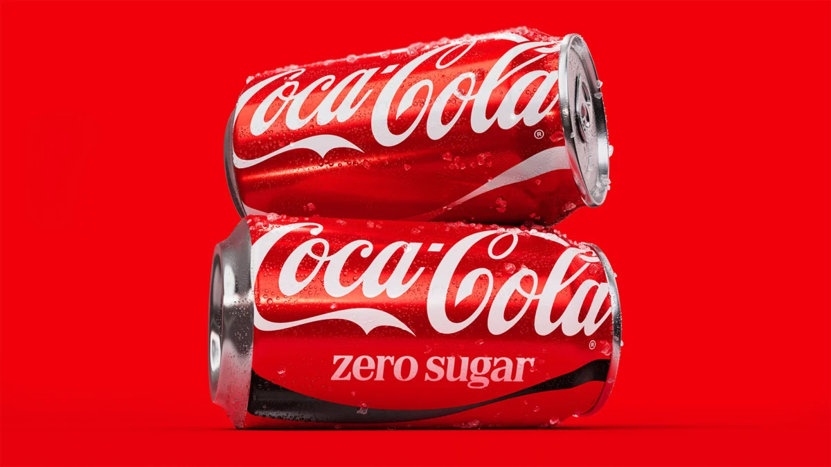
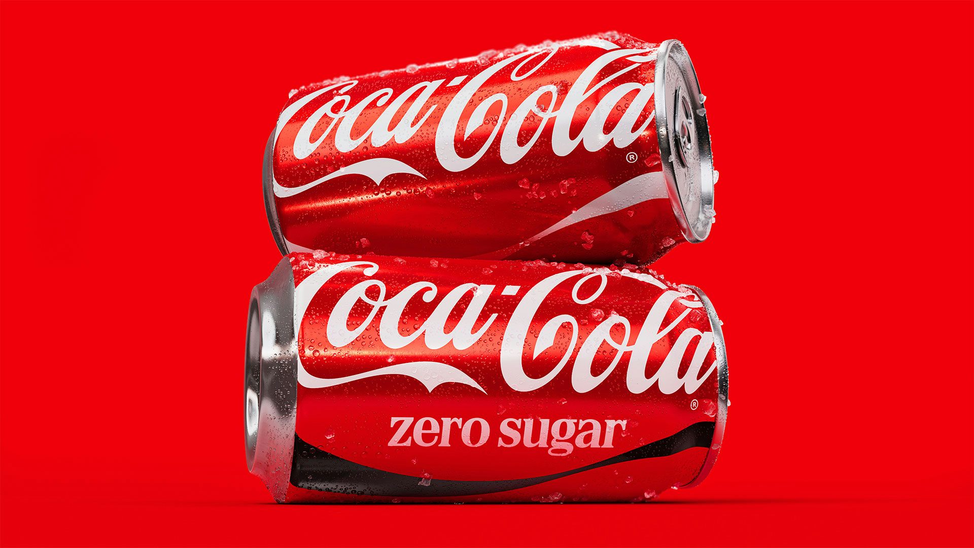
- Coca-Cola Zero Sugar Elevation: A distinct focus on the Zero Sugar variant, featuring larger typography and a more prominent black Dynamic Ribbon to distinguish it clearly from the original "Classic" red.
- Technological Integration: The introduction of AI-powered "Design Intelligence" tools and a centralized "Brand Center" to help internal teams and external partners implement the identity at scale.
- Collaborative Ecosystem: While JKR led the strategy and creative direction, the project involved a "best-of-the-best" roster of partners, including Brody Associates for typography and Adobe for governance tools.
Chronology: 140 Years of Visual Storytelling
To understand the significance of this refresh, one must look at the lineage of the Coca-Cola brand. The Spencerian script, first penned by Frank Mason Robinson in 1886, has survived world wars, economic depressions, and the rise of the internet.
The Early Years (1886–1940s)
In its infancy, Coca-Cola relied heavily on the elegance of its script. By the 1920s, the "contour bottle" (patented in 1915) had become as recognizable as the name itself. The brand established a "standard" red that would eventually become synonymous with the product.
The Era of Consistency (1950s–1990s)
The introduction of the "Dynamic Ribbon" (also known as the "white wave") in 1969 added a sense of movement and modernity. This era focused on mass-media dominance, ensuring that whether a consumer was in New York or Nairobi, the red can looked identical.
The Digital Fragmentation (2000s–2020)
As the media landscape fractured into social media, e-commerce, and experiential marketing, the brand’s visual identity began to experience "drift." Different markets experimented with various layouts, and the rise of sub-brands (Diet Coke, Zero Sugar, Life) created a visual language that was sometimes cluttered.
The 2024 Refresh: The "Operating System" Model
The current refresh marks a pivotal shift. Rather than viewing the brand as a set of static logos, Coca-Cola and JKR have reimagined it as a flexible "operating system." This allows for the core "DNA" of the brand to remain untouched while providing the "apps" (local marketing, digital activations) the freedom to adapt.
Supporting Data: The Mechanics of Refinement
The design philosophy behind the refresh is rooted in the concept of "salience." In a crowded marketplace, the goal is for the consumer to recognize the brand in a fraction of a second.
The Power of Red
Coca-Cola’s red is more than a color; it is a psychological trigger. Research in neuromarketing suggests that specific shades of red can stimulate appetite and create a sense of urgency. The JKR-led refresh cleans up the color application, ensuring the "Coke Red" is the hero across all touchpoints, reducing visual noise that had accumulated over the last decade.
The Zero Sugar Growth Engine
Data from beverage industry analysts indicates that the "Zero Sugar" segment is the primary growth driver for the carbonated soft drink category. To capitalize on this, the refresh gives Coca-Cola Zero Sugar a more assertive look. The use of black—historically associated with the "Zero" brand—is now more integrated into the Dynamic Ribbon and bottle caps, creating a premium, modern aesthetic that appeals to health-conscious younger demographics.

Global Scale and Implementation
Managing a brand across 200 markets is a logistical Herculean task. By introducing AI-powered Design Intelligence, Coca-Cola is automating the "policing" of the brand. These tools can analyze marketing assets in real-time to ensure they adhere to the new guidelines, drastically reducing the time it takes to launch global campaigns.
Official Responses: "Evolution, Not Revolution"
The leadership behind the project emphasizes that the goal was never to "fix" something that wasn’t broken, but to polish a masterpiece.
Tosh Hall, Global Chief Creative Officer at JKR, describes the project as an exercise in humility and heritage. "How do you even begin to reinvent a brand that’s 140 years old? The answer is you don’t," Hall stated. "Coca-Cola is the pinnacle of cultural relevance. Our job was to find what makes Coca-Cola the most recognizable version of itself, then amplify it for today. Think of it as a love letter to what makes Coca-Cola, Coca-Cola."
Hall further noted that the brand’s history is a "lineage of the best artists and creative leaders." The current work is intended to set the stage for the next 140 years, ensuring the assets are "future-proofed" for technologies that may not even exist yet.
Rapha Abreu, Global Vice President of Design at The Coca-Cola Company, highlighted the balance between global unity and local flexibility. "Our goal wasn’t to create a rigid global system," Abreu explained. "It was to create a stronger one, more iconic than ever. It’s like designing the operating system rather than every application."
Abreu stressed that while core assets like the script and the ribbon are non-negotiable, local markets still have the "creative license" to adapt photography and cultural messaging. "That balance is what allows Coca-Cola to feel both globally iconic and locally meaningful."

Implications: The Future of Global Branding
The Coca-Cola refresh sends a clear signal to the branding and marketing industry: in a world of "flat" design and minimalist trends, heritage is a competitive advantage.
1. The Death of "Blanding"
For the past decade, many global brands (particularly in tech and fashion) moved toward "blanding"—adopting generic sans-serif fonts and stripped-back logos. Coca-Cola’s decision to double down on its ornate Spencerian script and historical symbols suggests a return to "expressive branding." By leaning into its unique history, Coca-Cola differentiates itself from generic private-label competitors and newer "disruptor" brands.
2. AI as a Brand Guardian
The use of AI-powered governance tools marks a new frontier in brand management. Traditionally, brand guidelines were static PDF documents that were often ignored. By embedding these guidelines into AI tools, Coca-Cola is making brand consistency "frictionless." This will likely become the standard for all Fortune 500 companies moving forward.
3. The "Cola Wars" Re-Ignited
The refresh comes shortly after Pepsi unveiled its own major rebrand, which took a more "maximalist" and retro-inspired approach. While Pepsi opted for a bold, transformative change to signal a new era, Coca-Cola has chosen a path of refined continuity. This "Clash of Philosophies" will be a major case study for marketers in the coming years: is it better to reinvent or to reinforce?
4. Sustainability and Digital-First Packaging
While the visual refresh is the headline, the underlying system is designed to work better with sustainable packaging initiatives. Clearer typography and more efficient use of ink in the printing process (particularly on aluminum cans) align with the company’s "World Without Waste" goals. Furthermore, the high-contrast design is optimized for "thumb-stopping" visibility on mobile screens, acknowledging that many consumers now "meet" the brand on a smartphone before they ever see it on a shelf.
In conclusion, Coca-Cola’s new visual identity is a testament to the power of enduring design. By respecting the past while leveraging the technology of the future, the company has ensured that its "red thread" continues to run through the fabric of global culture. As Tosh Hall aptly put it, the answer was never outside the brand; it was always found within.