A Dragon’s Roar and a Warrior’s Resolve: Unveiling the Creation of an Epic Fantasy Cover
The commissioning of a debut fantasy novel cover is a pivotal moment, a visual handshake between the author’s imagination and the reader’s anticipation. For RF Obsydios’s inaugural foray into the genre, Armenia Edizioni entrusted the artistic vision to a digital illustrator whose passion for classic epic fantasy resonated deeply with the source material. This article delves into the intricate process behind the creation of the novel’s striking cover art, from initial concept to the final brushstroke, offering a behind-the-scenes glimpse into the fusion of artistic skill, narrative understanding, and technical execution.
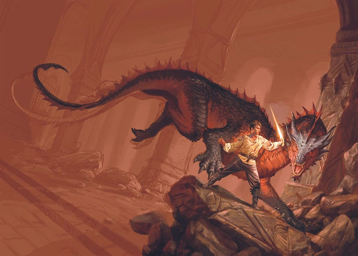
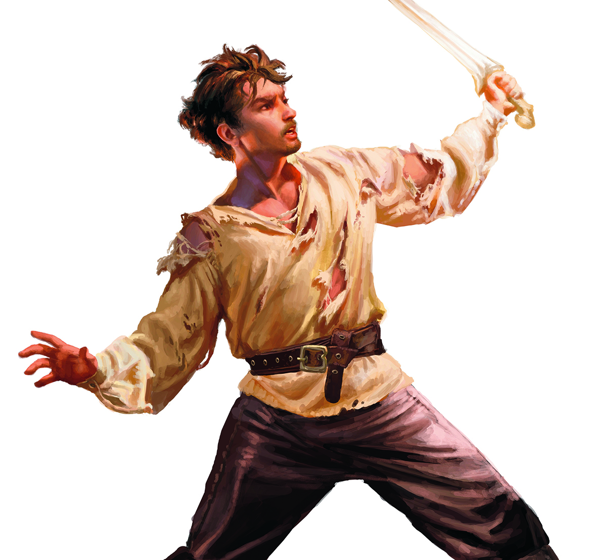
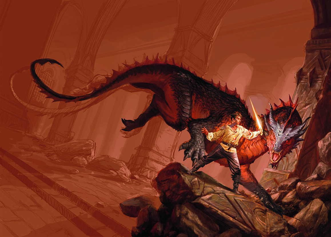
The genesis of this compelling cover art lies in a clear directive from Armenia Edizioni: to encapsulate the raw intensity of a pivotal moment within RF Obsydios’s debut fantasy novel. The brief called for a scene steeped in the archetypal conflict of man versus beast, a visual narrative that would immediately draw in potential readers. The core elements were meticulously defined: a young warrior, battle-hardened and visibly wounded, his tattered attire a testament to his recent struggles. He stands defiantly, sword in hand, poised to confront a formidable, wingless dragon, its scales a menacing mosaic of deep reds and stark blacks.
The setting itself was to be as impactful as the characters. An imposing, somber fortress, characterized by grand, vaulted columns and the lingering detritus of recent conflict, was envisioned as the backdrop. The overall atmosphere was to evoke the timeless grandeur and inherent peril of classic epic fantasy, a genre that often relies on visually rich and dramatic imagery to transport its audience.
The Artist’s Vision: Echoes of a Golden Age
For the artist, this commission was more than just a professional assignment; it was a homecoming. The aesthetic described in the brief directly mirrored the visual language that had shaped their formative years as an artist. "This aesthetic is what I grew up with," the artist shared, "meaning that it was easy for me to imagine a scene reminiscent of these types of covers, the works of the master illustrators who have always inspired me." This deep-seated connection to the genre allowed for an intuitive translation of the publisher’s vision into a tangible artwork.
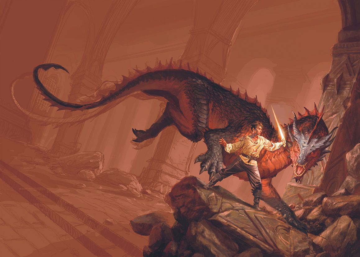
The emotional tenor of the piece was equally crucial. The directive was for a warm, yet intense, palette, with reds and oranges dominating the composition. This choice of colors is intrinsically linked to themes of passion, conflict, and the visceral energy of battle. As an illustrative example, the artist pointed to Joe Abercrombie’s novel, "The Devils," as a benchmark for the desired tone – a testament to the power of atmospheric and emotionally charged fantasy art.
To embark on such a creative endeavor, certain tools are indispensable. The artist highlighted the necessity of robust digital art software, the foundational platform for modern illustration. Complementing this, the selection of one of the best drawing tablets is paramount, offering the tactile responsiveness and precision required to translate intricate ideas from mind to screen. These tools are not merely instruments; they are extensions of the artist’s creative will, enabling the realization of complex visions.
The Creative Process: From Concept to Canvas
The creation of a complex illustration is rarely a linear progression. It is a journey of refinement, iteration, and meticulous attention to detail. The artist’s approach to this fantasy cover art can be broken down into several key stages:
H2: The Foundational Sketch: Laying the Groundwork
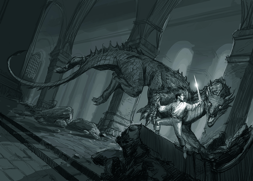
While some artists favor extensive preliminary sketches, this illustrator adopts a more streamlined approach. "I don’t usually make many sketches; at most, one or two, in black and white," they explained. This minimalist initial phase is not a shortcut but a strategic decision. The objective is to clearly articulate the core intentions of the composition – the arrangement of elements, the play of light and shadow, and the overall volumetric structure. By establishing these fundamental aspects early on, the artist ensures that the client, Armenia Edizioni, has a clear understanding of the intended direction before the more time-consuming stages of rendering begin. This clarity at the outset minimizes potential misunderstandings and allows for a more efficient progression of the artwork.
H3: Painting the Protagonist: Isolating the Warrior
The focal point of the cover is undoubtedly the young warrior. The artist’s strategy was to address this crucial element in isolation first. "I started by painting the young warrior. I painted him separately in a larger format and, once finished, I resized and positioned him." This methodical approach offers several advantages. By focusing solely on the warrior, the artist could dedicate their full attention to capturing the nuances of his portrayal: the depth of his gaze, the texture of his wounds, the tattered state of his clothing, and the determined grip on his sword. This intensive focus ensures that the central figure is rendered with the utmost care and detail. Once perfected, the warrior could then be seamlessly integrated into the broader scene, allowing for a more cohesive and impactful final composition.
H3: Constructing the Arena: Building the Scene
With the protagonist established, the next phase involved constructing the environment that would frame his epic confrontation. "For me, it’s very important to first focus on the scene," the artist emphasized. This involved an iterative process of layering and refining the key environmental elements: the imposing fortress, the dragon, and the battlefield ruins. "So the warrior, the dragon and then the ruins they’re moving through were the first steps in painting." This stage is crucial for establishing the spatial relationships between the characters and their surroundings, and for ensuring that the overall composition feels dynamic and believable. It’s during this phase that the artist assesses whether the intended narrative is being effectively conveyed and identifies areas that require adjustment or further development. "I need to see if everything works, and only then can I begin to understand what’s right and what needs fixing."
H3: The Dragon’s Form: Sculpting Dynamic Anatomy
The design of the wingless dragon presented a unique challenge, particularly its hind legs. The artist’s aim was to imbue the creature with a sense of potent, untamed energy. "Designing the anatomy of the dragon’s hind legs was no easy feat. I wanted the body to express dynamism, and for it to form a curve that would draw the viewer’s gaze toward the main scene." This deliberate shaping of the dragon’s posture serves a dual purpose: it enhances the visual drama of the encounter and guides the viewer’s eye through the composition, reinforcing the narrative’s focal point. The successful rendering of this dynamic curve is highlighted as a key achievement in the creation of the cover.
H3: Echoes of Stone: Detailing the Fortress Ruins
The imposing fortress, a silent witness to the unfolding battle, demanded careful attention to its texture and atmosphere. "I had a lot of fun adding detail to the fallen column in the foreground, with its scratches and cracks, and conveying the roughness and texture of the stone through subtle colour variations and the use of ‘dry’ brushes." The artist’s description reveals a keen understanding of how to translate the tactile qualities of stone into a digital medium. The subtle variations in color and the judicious use of "dry" brush techniques contribute to a realistic and evocative portrayal of ancient, weathered masonry. The conceptual inspiration for the fortress was drawn from the iconic ruins of Moria, a nod to the enduring legacy of fantasy architecture in popular culture. This choice of inspiration immediately conjures an image of immense scale, age, and a palpable sense of foreboding.
H3: The Power of Perspective: Employing a Tilted Angle
The choice of camera angle is a fundamental tool in visual storytelling, capable of profoundly influencing the viewer’s perception of a scene. For this cover art, the artist opted for a deliberate compositional choice: a tilted shot. "To further accentuate the scene’s sense of danger, I used a tilted shot. This angle is especially useful for emphasising the dynamism, or even, in this case, the drama, of what’s happening in the scene." This Dutch angle, as it’s often called, immediately injects a sense of unease and instability, mirroring the perilous nature of the confrontation. It enhances the perceived motion and heightens the emotional impact, drawing the viewer into the heart of the action and amplifying the dramatic tension.
H3: Authenticity Through Reference: The Value of Historical Detail
While digital art offers immense creative freedom, grounding fantastical elements in a degree of realism can significantly enhance their believability. The artist’s commitment to this principle is evident in their acquisition of historical-style clothing and fabric scraps. "Over time, I’ve had the opportunity to purchase some historical-style clothing and some fabric scraps to make costumes. This has been very useful for taking photos and creating references, in particular lighting conditions." This practice of creating physical references, even for a digital creation, allows the artist to study the interplay of light and shadow on real fabrics and forms, leading to more convincing and nuanced depictions of textures and drapery. This attention to detail, even in areas that might not be immediately obvious to the casual observer, contributes to the overall richness and authenticity of the artwork.
Supporting Data and Industry Context
The creation of fantasy book covers is a sophisticated art form that plays a critical role in the marketing and reception of a novel. Publishers invest significant resources in cover art, recognizing its power to attract readers and convey the genre and tone of a book at a glance. The market for fantasy literature continues to be robust, with readers actively seeking out visually compelling narratives.
The illustration process described is representative of contemporary digital art workflows. The use of specialized software and drawing tablets allows for a level of detail and flexibility that was previously unattainable. Furthermore, the artist’s reliance on historical references and established aesthetic touchstones demonstrates a thoughtful engagement with the visual language of the fantasy genre, ensuring that the cover art resonates with both seasoned fans and newcomers alike. The comparison to classic fantasy illustrators and the specific mention of Joe Abercrombie’s work as an example underscore the artist’s understanding of the genre’s heritage and contemporary trends.
Official Responses and Publisher’s Vision
While direct official responses from Armenia Edizioni regarding the specific nuances of this particular cover design were not explicitly detailed in the provided text, the commissioning of the artwork itself serves as a testament to their strategic vision. The publisher’s directive to create a scene steeped in classic epic fantasy, with a focus on a wounded warrior and a formidable dragon, clearly indicates their intention to position RF Obsydios’s debut novel within a familiar and beloved subgenre. The choice of a seasoned digital artist, whose own artistic sensibilities align with the requested aesthetic, further suggests a deliberate effort to ensure a high-quality and thematically appropriate visual representation. The success of a book cover often lies in its ability to telegraph the essence of the story, and Armenia Edizioni’s approach appears geared towards achieving precisely that.
Implications for the Novel’s Reception
The impact of a well-crafted book cover on a novel’s success cannot be overstated. For RF Obsydios’s debut, this cover art serves as a powerful introduction, promising an epic adventure filled with high stakes and visceral conflict. The image of a scarred warrior facing a monstrous dragon immediately signals the genre and evokes themes of bravery, resilience, and the struggle against overwhelming odds.
The warm, dominant color palette, with its emphasis on reds and oranges, suggests a narrative that is both intense and emotionally charged. This visual cue can attract readers who are drawn to action-packed fantasy stories with a strong emotional core. The detailed rendering of the fortress and the dragon’s anatomy hints at a world that is richly imagined and meticulously crafted, suggesting a depth and complexity that will appeal to dedicated fantasy readers.
Ultimately, this cover art is more than just an illustration; it is a carefully constructed promise. It is the visual embodiment of the novel’s core conflict and thematic underpinnings, designed to capture the attention of potential readers in a crowded marketplace and to ignite their imaginations, beckoning them into the world created by RF Obsydios. The success of this artistic endeavor will undoubtedly contribute significantly to the initial reception and long-term appeal of the author’s debut fantasy novel.