
Pucker Up: How Kiss Radio is Reclaiming its "Mischief" Through a Bold Visual Rebrand
The British audio landscape has long been a battleground for the ears of the youth, but in an increasingly visual and digital-first era, a radio station’s identity must transcend the airwaves. Kiss, the iconic UK audio brand, has recently unveiled a comprehensive and high-energy rebrand designed to do exactly that. Orchestrated by the London-based design agency Not Wieden+Kennedy (NotWK), the refresh marks a significant pivot for the station, blending its rebellious pirate radio heritage with a contemporary aesthetic tailored for a new generation of listeners.
The new identity is far more than a simple logo tweak; it is a conceptual overhaul that leans into the "cheeky" spirit of the brand. By utilizing a "puckered" typographic style, a vibrant "digital-first" color palette, and a motion-heavy design system, Kiss is signaling its intent to remain at the forefront of the UK’s competitive music and entertainment market.
Main Facts: A "Mischievous" Transformation
At the heart of the rebrand is a desire to return to the "soul" of the Kiss brand. Originally founded as a pirate radio station in the mid-1980s, Kiss became synonymous with underground dance music and a "mischief-making" attitude. Over the decades, as it transitioned into a mainstream powerhouse under Bauer Media, some critics felt the brand’s visual edge had softened.
The collaboration with Not Wieden+Kennedy aims to rectify this. The agency was tasked with creating a "noticeably bolder look and feel" that would resonate with Gen Z and younger Millennial audiences who interact with the brand primarily through social media, apps, and live events rather than traditional FM tuners.
Key components of the new identity include:
- The "Puckered" Wordmark: A custom typeface where the letterforms mimic the physical movement of a kiss.
- The "X" Graphic Device: Utilizing the modern text equivalent of a kiss (x) as a framing element for the brand.
- Motion Identity: A "puckering up" animation style that gives the logo a lifelike, playful behavior.
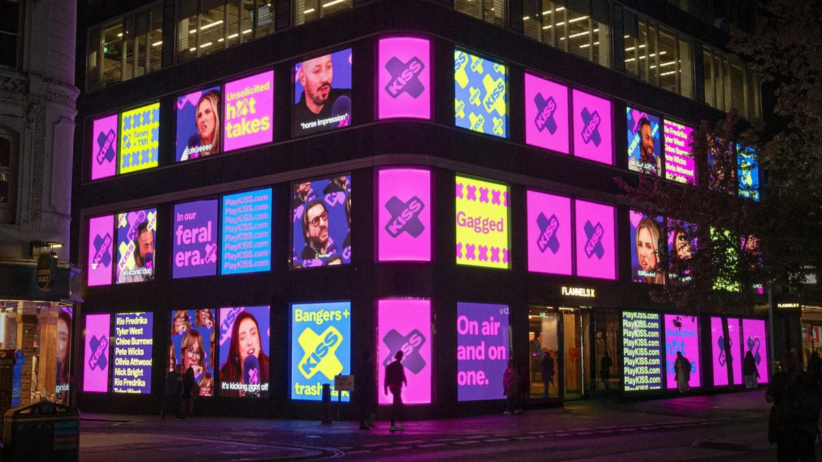
- Vibrant Color Palette: A high-contrast selection of purples, pinks, yellows, and blues designed for maximum impact on digital screens and outdoor advertising (OOH).
The rebrand was launched alongside a high-profile experiential campaign featuring Kiss Breakfast presenters Tyler West and Chloe Burrows, who broadcast live from a transparent studio mounted on a neon pink truck traversing the streets of London.
Chronology: From Pirate Roots to Digital Dominance
To understand the weight of this rebrand, one must look at the historical trajectory of Kiss. The station’s evolution is a mirror of the UK’s shifting cultural and media landscape.
1985–1990: The Pirate Era
Kiss FM began its life in October 1985 as a pirate radio station founded by Gordon Mac. It was a revolutionary force in London, providing a platform for soul, jazz-funk, and early house music that the BBC and legal commercial stations ignored. This era cemented the brand’s reputation for "mischief" and rebellion—a legacy that Not Wieden+Kennedy sought to tap into for the 2024 refresh.
1990–2000s: Going Legal and Expanding
In 1990, Kiss 100 was granted a legal license, marking a turning point where the brand had to balance its underground "cool" with the requirements of commercial viability. Throughout the late 90s and 2000s, the brand expanded nationally, eventually becoming part of the Bauer Media Group.
2010s: The Multi-Platform Shift
As digital audio broadcasting (DAB) and streaming took over, Kiss transformed from a single station into a "network," including spin-offs like Kiss Fresh and Kisstory. However, the visual identity during this period remained somewhat static, relying on a logo that felt increasingly disconnected from the fast-paced, motion-heavy world of TikTok and Instagram.
2024: The Not Wieden+Kennedy Refresh
Recognizing that the "Kiss" name was its most potent asset, Bauer Media engaged Not Wieden+Kennedy to modernize the brand. The agency spent months distilling the essence of the word "Kiss" into a visual language. The result, unveiled in mid-2024, represents the most significant aesthetic shift for the brand in over a decade.
Supporting Data: The Mechanics of the Design System
The success of the new Kiss identity lies in its technical execution. Not Wieden+Kennedy focused on "behavioral branding"—the idea that a brand should not just look a certain way, but move and react in a way that reflects its personality.
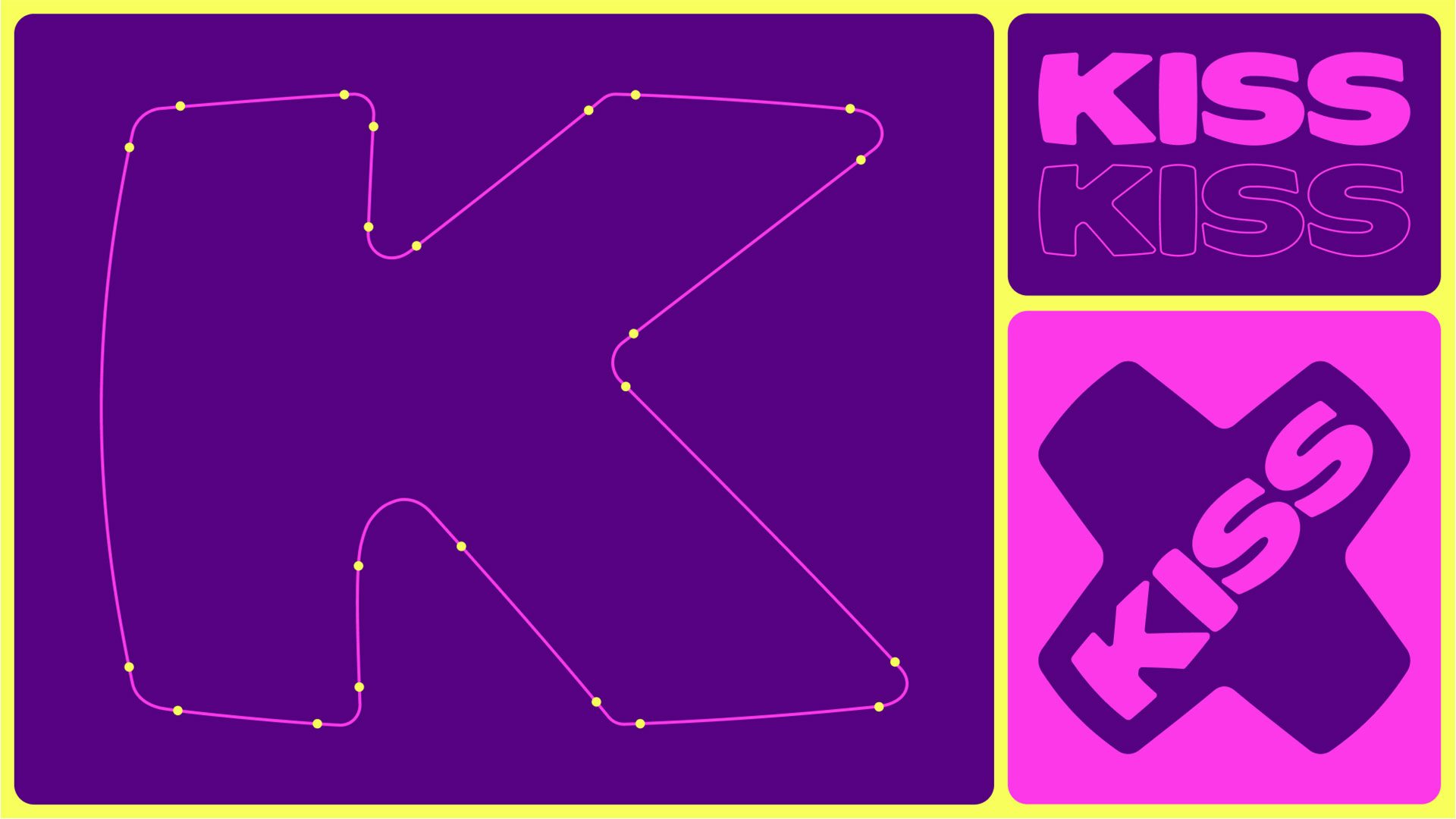
1. Typography and the "Pucker"
The most distinctive element of the rebrand is the custom wordmark. The designers described the letterforms as having a "puckered" shape. This was achieved through:
- Rounded Edges: Softening the corners of the "K," "I," and "S" to suggest the plumpness of lips.
- Variable Weight: The letters appear to squeeze and expand, creating a sense of elasticity.
- Secondary Typography: To prevent the brand from feeling too "cartoonish," the playful wordmark is balanced with a clean, high-legibility sans-serif typeface used for information-heavy assets.
2. The "X" Factor
In modern digital communication, an "x" is the universal shorthand for a kiss. The design team leveraged this by creating a large "x" graphic device that sits behind the wordmark. This serves two purposes:
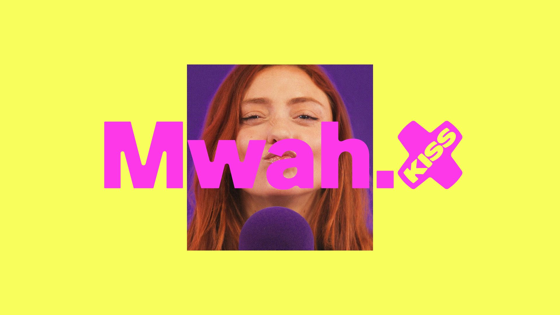
- Framing: It provides a consistent container for the logo across different aspect ratios (16:9 for YouTube, 9:16 for TikTok).
- Symbolism: It bridges the gap between the brand’s name and modern social vernacular.
3. Motion as a Primary Language
In a digital-first environment, static logos are secondary to motion graphics. NotWK developed a motion system where the logo "puckers up" toward the viewer. By using 3D-like scaling and easing, the logo mimics a quick, cheeky kiss. This motion is applied to everything from transition stings on video content to the loading screens of the Kiss Kube app.
4. High-Contrast Palette
The color selection was driven by the need for "thumb-stopping" visibility. The primary palette includes:
- Electric Purple and Neon Pink: Evoking nightlife and energy.
- Vibrant Yellow and Sky Blue: Adding a sense of daytime accessibility and optimism.
By pairing these colors with high-contrast, "gritty" photography of presenters and artists, the brand maintains its "street" heritage while looking polished.
Official Responses: "Mischief in the DNA"
The creative leadership behind the project has been vocal about the strategic intentions of the refresh. Adam Hunt, Design Director at Not Wieden+Kennedy, emphasized that the brand’s history was the primary inspiration.
"The identity, in itself, is incredibly simple," Hunt noted during the launch. "It doesn’t just look like a kiss, but behaves like one too. Kiss has always had mischief in its spirit and DNA. The opportunity for us was to take that soul and build an identity that behaves as playfully as the brand itself."
Hunt further explained that the "pirate" roots were not just a historical footnote but a guiding principle for the new look. "Kiss are, and have always been, mischief-makers. From their roots as a pirate radio station to their current crop of presenters and their on-air antics. The new identity amplifies this feeling of mischief and packages it in a modern, digital-first approach."
Representatives from Bauer Media have also signaled that this rebrand is part of a broader strategy to unify the Kiss Network. By creating a cohesive visual language, the parent company aims to make the transition between Kiss, Kisstory, and Kiss Fresh seamless for the user, regardless of which platform they are using.
Implications: The Future of Audio Branding in a Visual World
The Kiss rebrand serves as a case study for the broader audio industry. As traditional radio listenership faces competition from global giants like Spotify, Apple Music, and YouTube, local and national stations are realizing that they can no longer survive on "audio only."
1. The Rise of the "Audio-Visual" Brand
The Kiss refresh proves that for a radio station to thrive, it must be a "lifestyle brand." The use of the neon pink truck stunt in London demonstrates that physical presence and "Instagrammable" moments are now essential components of a radio station’s marketing mix. The visual identity must be strong enough to carry these physical activations.
2. Social-First Design
By prioritizing motion and high-contrast colors, Kiss is acknowledging that its primary "storefront" is the smartphone screen. The "puckering" logo is perfectly suited for the circular profile picture formats of Instagram and the fast-scrolling nature of TikTok. This "social-first" approach is likely to be mimicked by other legacy media brands looking to stay relevant.
3. Emotional Connection Through Simplification
In a crowded marketplace, Not Wieden+Kennedy chose to simplify. By focusing on the literal meaning of the word "Kiss," they have created an emotional shorthand with the audience. The "cheeky" and "playful" nature of the design lowers the barrier to entry for new listeners, making the brand feel approachable and fun rather than institutional.
4. Reclaiming Heritage
Finally, the rebrand highlights the importance of "brand archetypes." By leaning back into the "Mischief Maker" archetype, Kiss is differentiating itself from the more "corporate" feel of some competitors. In an era where authenticity is highly valued by younger demographics, reclaiming pirate radio roots—even through a polished, modern lens—is a savvy strategic move.
Conclusion
The transformation of Kiss by Not Wieden+Kennedy is a masterclass in brand rejuvenation. It successfully honors the past while aggressively courting the future. By distilling the brand down to its most basic, emotive element—the kiss—and injecting it with motion, color, and "mischief," the agency has ensured that Kiss will not just be heard, but seen and felt across the digital landscape. As the "puckered" logo begins to appear on billboards, apps, and social feeds across the UK, one thing is clear: Kiss is ready to make some noise.


Leave a Comment