The Intersection of Art and Science: Ozen Disrupts the Stagnant Oral Care Market
The global oral care industry, a sector long dominated by a handful of multi-billion-dollar conglomerates and characterized by a sea of clinical blue-and-white packaging, is witnessing its most significant disruption in decades. Ozen, a new challenger brand founded by NHS maxillofacial surgeon Dr. Niall Kent, has officially launched nationwide in the United Kingdom via Boots. Representing more than just a new product on the shelf, Ozen introduces the first patented sensitivity technology to enter the category in nearly 30 years, packaged within a visual identity that challenges the very foundations of pharmaceutical branding.
Developed in a unique partnership with Mother’s startup incubator, Broody, and featuring a brand identity crafted by Mother Design, Ozen aims to bridge the gap between rigorous medical efficacy and high-end lifestyle aesthetics. As the brand rolls out across the UK, it signals a shift in consumer expectations, where "playing it safe" is no longer a viable strategy for new entrants in the health and beauty space.
Main Facts: A New Paradigm in Dental Health
Ozen’s entry into the market is defined by three core pillars: medical innovation, strategic incubation, and disruptive design.
At the heart of the brand is AeroGraft, a proprietary technology derived from bone graft materials used in advanced surgery. This marks a historic milestone for the industry, as the sensitivity sector has relied on the same handful of active ingredients—primarily potassium nitrate and various fluorides—since the late 20th century. Ozen’s arrival terminates a 30-year drought in patented technological breakthroughs for tooth sensitivity.
The brand’s commercial infrastructure was built through Broody, the in-house startup incubator of the global communications agency Mother. Broody specializes in taking high-potential intellectual property—often from founders with deep technical expertise but little retail experience—and transforming it into a market-ready consumer brand.

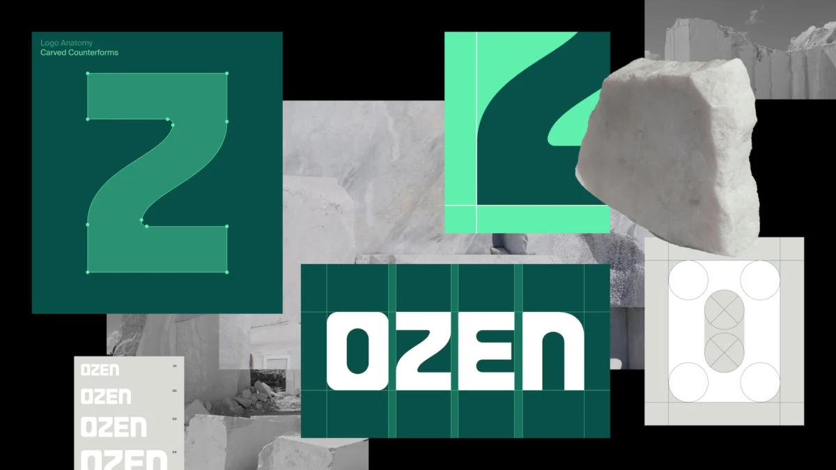
To ensure the product resonated with a modern audience, Mother Design was tasked with creating a visual language that avoided the "cold and clinical" tropes of traditional toothpaste. The result is a premium, green-hued identity that emphasizes tactile quality and human-centric design, moving away from the aggressive, laboratory-style marketing that has historically defined the sector.
Chronology: From the Operating Room to the High Street
The journey of Ozen began not in a corporate boardroom, but in the specialized environment of a hospital operating theater.
The Medical Genesis
Dr. Niall Kent, an NHS maxillofacial surgeon, spent years working with advanced biomaterials designed for bone regeneration and structural repair. During his research, he identified a parallel between the materials used to encourage bone growth and the mineral requirements of human teeth. He recognized that the porous, regenerative qualities of certain surgical materials could be adapted to treat dentin hypersensitivity—a condition where the microscopic tubules in the teeth become exposed, leading to sharp pain.
The Artistic Collaboration
In a departure from traditional R&D processes, Dr. Kent did not work solely with chemists. He collaborated with his brother, a sculptor trained at the Royal Academy. This partnership allowed them to explore the physical properties of materials from both a structural and aesthetic perspective. Together, they experimented with how bone graft materials could be manipulated into a format suitable for daily oral care. This "intersection of art and experimentation" led to the birth of AeroGraft.
The Incubation Phase
Once the technology was proven and patented, the challenge shifted to commercialization. In 2023, the project entered Broody. As Mother’s incubator, Broody provided the necessary bridge between Dr. Kent’s surgical expertise and the complexities of the UK retail landscape. Over several months, the team refined the product’s positioning, ensuring that the "science of the surgeon" was balanced with "consumer-facing appeal."

The Design and Launch
In early 2024, Mother Design was brought in to finalize the brand identity. The goal was to create a brand that felt authoritative yet accessible. Following a period of intensive design iteration, Ozen secured a nationwide listing with Boots, the UK’s leading health and beauty retailer. The brand officially debuted on shelves in mid-2024, supported by a digital and physical campaign that highlighted its unique origin story.
Supporting Data: The Stagnation of the Oral Care Sector
The oral care market is often cited by brand analysts as one of the most "stuck" categories in fast-moving consumer goods (FMCG). To understand Ozen’s significance, one must look at the data surrounding category innovation.
- Innovation Vacuum: Prior to Ozen, the last major patented technological shift in sensitivity toothpaste occurred in the 1990s. While brands have updated their packaging and flavor profiles, the underlying "mechanism of action" for desensitizing teeth has remained largely static.
- Market Share Saturation: The UK oral care market is dominated by a few major players. According to market research, nearly 70% of the category is controlled by three parent companies. This lack of competition has historically led to "category fatigue," where consumers purchase based on habit or price rather than performance.
- The Rise of the "Challenger": Data from the last five years suggests a growing consumer appetite for "doctor-led" brands. In skincare, brands like The Ordinary and Dr. Barbara Sturm have seen explosive growth by highlighting specific ingredients and medical credentials. Ozen is applying this "clinical transparency" model to oral care.
- Visual Overload: Traditional oral care relies on a color palette of 90% blue, white, and silver. Market testing by Mother Design suggested that consumers often find it difficult to distinguish between brands on the shelf. Ozen’s use of deep and "punchy" greens is a data-driven move to exploit "shelf-shout" and brand recall.
Official Responses: The Creative Philosophy
The leadership team behind Ozen’s identity emphasizes that the brand’s look is a direct reflection of its surgical roots.
Jo Tulej, Creative Director at Mother Design, notes that the industry’s tendency toward safety has become its biggest weakness. "Oral care is one of those sectors where playing it safe has become the riskiest move of all," Tulej stated. She argues that because consumers are so used to ignoring toothpaste advertising, a brand must be visually "refreshing" to even be noticed.
Cecilia Serafini, Design Director at Mother Design, expanded on the "art-meets-science" narrative. "What made Ozen so compelling was the story behind the science," Serafini explained. "The technology itself emerged from the intersection of art and experimentation, so we wanted the identity to reflect that tension."

According to the design team, every element was "carefully calibrated." The logo features carved counterforms—a nod to the sculptural work of Dr. Kent’s brother—while the typography remains restrained and geometric to maintain "clinical credibility." The choice of green was intentional, designed to retain the "freshness cues" consumers expect while adding a "premium presence" that justifies its position as a challenger brand.
Implications: The Future of Health-Tech Branding
The launch of Ozen carries several long-term implications for the pharmaceutical and consumer goods industries.
The "Lifestyle-ization" of Medicine
Ozen represents a broader trend where medical-grade products are being rebranded as lifestyle essentials. Consumers are increasingly willing to pay a premium for products that offer both high-level efficacy and an elevated user experience. This "Med-Design" hybrid model is likely to expand into other mundane categories, such as pharmacy-only skincare, supplements, and even first aid.
The Role of Agency-Led Incubators
The success of the Broody-Mother-Ozen partnership demonstrates a shift in how new products reach the market. Traditionally, a scientist like Dr. Kent would have sold his patent to a major conglomerate. By working with an agency-led incubator, the founder retains more control over the brand’s soul, and the product enters the market with a more distinct personality than a corporate-developed line might allow.
A Wake-Up Call for Legacy Brands
Ozen’s nationwide presence in Boots puts immediate pressure on legacy brands to justify their lack of innovation. If a small startup can introduce a new patented technology after 30 years of industry silence, it raises questions about the R&D priorities of the market leaders. We may see an increase in "defensive innovation" from major players as they attempt to protect their market share from science-backed challengers.

Sustainability and Trust
While the current focus is on technology and design, the "human" element of Ozen’s branding—highlighting the surgeon and the sculptor—builds a level of trust that faceless corporations struggle to replicate. In an era of misinformation, "founder-led" science provides a narrative that resonates with consumers looking for transparency and genuine expertise.
As Ozen continues its rollout, the industry will be watching closely. If it succeeds in capturing significant market share, it will serve as the definitive case study for how to rejuvenate a "boring" category through the powerful combination of surgical-grade science and world-class design. For now, Ozen stands as a testament to the idea that even the most clinical of products can—and perhaps should—be a work of art.