
Reshaping the Auditory Image: London Sinfonietta Unveils a Dynamic Rebrand for the Modern Era

In an era where the visual and auditory realms are increasingly inseparable, the London Sinfonietta—one of the world’s leading contemporary chamber orchestras—has announced a comprehensive brand transformation. Developed in partnership with the acclaimed London-based creative agency NB Studio and brand strategist Cecilia Martin, the new identity marks a significant departure from traditional orchestral branding. By prioritizing motion, responsiveness, and a "living" design language, the rebrand seeks to encapsulate the orchestra’s 56-year legacy of radical experimentation while positioning it at the vanguard of the future of music.
Main Facts: A Synthesis of Legacy and Innovation
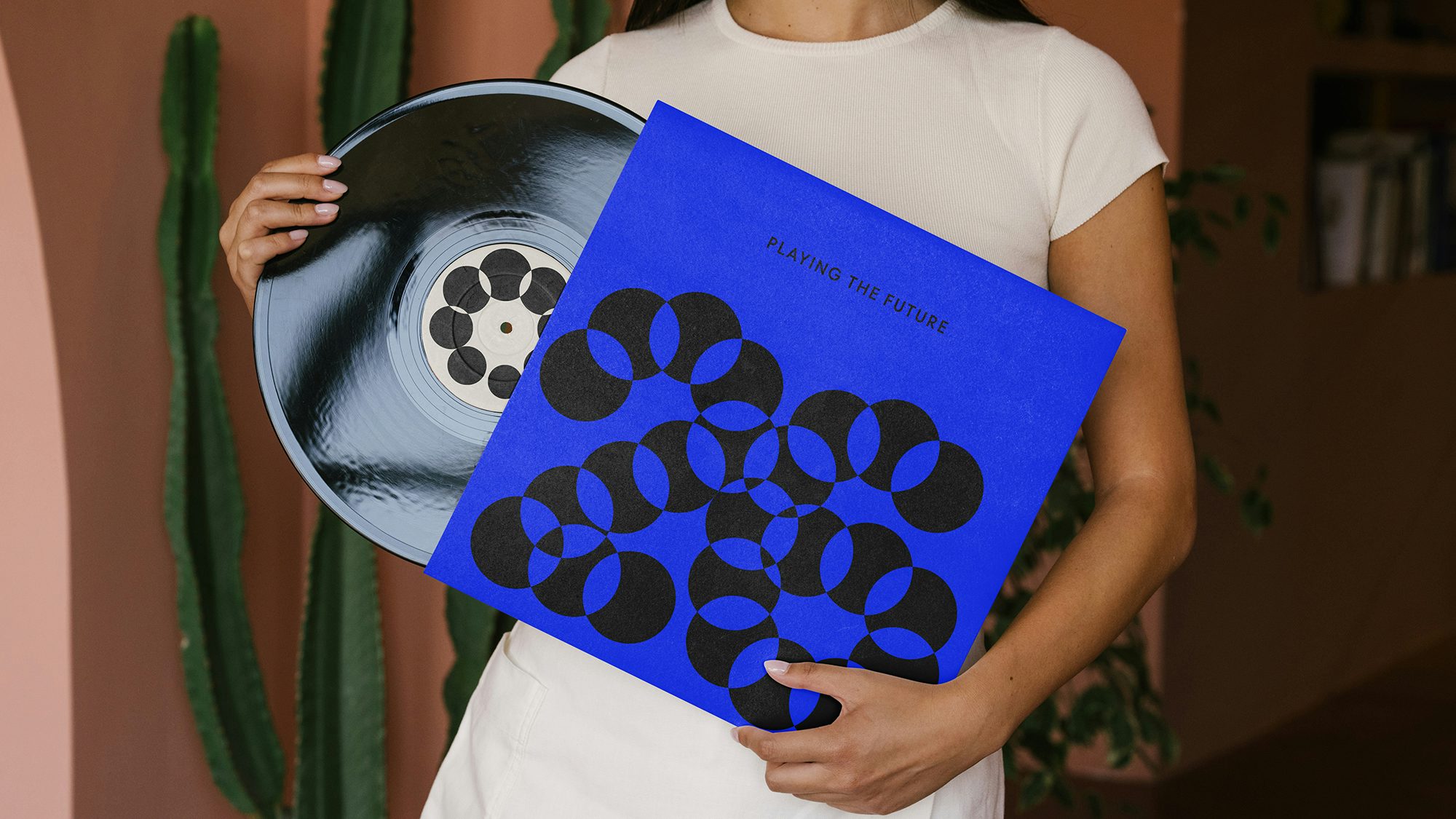
The centerpiece of the new identity is a responsive wordmark that serves as a visual metaphor for the orchestra’s dual nature. The word "London" remains static, set in a grounded, authoritative typeface that honors the ensemble’s deep roots in the UK capital and its established reputation as a global cultural institution. In stark contrast, "Sinfonietta" is rendered as a fluid, ever-changing constellation of dots. These dots are programmed to shift in shape, size, and density, reacting in real-time to the rhythm, pitch, and texture of the music being performed or promoted.
This "living" logo is not merely an aesthetic choice but a strategic tool designed to turn "passive listeners into active creators and adventurers." By utilizing a palette of shifting colors and generative motion, the branding reflects the diverse genres the orchestra explores—ranging from high-modernism and minimalism to cross-genre collaborations with electronic and jazz artists. The rebrand extends across all touchpoints, including digital platforms, social media, environmental graphics, and physical merchandise such as tote bags, lanyards, and concert posters.
Chronology: From Radical Roots to a Digital Renaissance
To understand the necessity of this rebrand, one must look back at the London Sinfonietta’s inception and its trajectory through the decades.
1968: The Birth of a Radical Collective
Founded in 1968 by David Atherton and Nicholas Snowman, the London Sinfonietta was born out of a desire to provide a dedicated platform for the music of the living. At a time when mainstream orchestras were largely focused on the classical and romantic canons, the Sinfonietta committed itself to the avant-garde. Its early years were defined by landmark performances of works by Schoenberg, Berio, and Stockhausen, establishing a "radical" reputation that became its hallmark.
1970s–1990s: Institutionalization and Influence
As the orchestra matured, it became a resident at the Southbank Centre and a regular fixture at the BBC Proms. It commissioned hundreds of new works, effectively shaping the landscape of 20th-century music. However, as the digital age approached, the visual identity of the orchestra—like many of its peers—remained somewhat tethered to the formal, static aesthetics of the 20th-century concert hall.
2020–2023: The Catalyst for Change
The COVID-19 pandemic and the subsequent shift toward digital consumption of the arts forced many cultural institutions to re-evaluate their communication strategies. The London Sinfonietta recognized that its existing visual language did not fully communicate its "pioneering" spirit to a younger, digitally native audience. The orchestra’s leadership identified a disconnect between their boundary-pushing musical output and their conventional visual presentation.
2024: The NB Studio Collaboration
In early 2024, the orchestra engaged NB Studio and Cecilia Martin to begin a process of deep institutional soul-searching. This collaborative journey lasted several months, involving workshops and strategic audits to define the orchestra’s "Unique Selling Proposition" (USP). The culmination of this process is the "dynamic" identity unveiled today, which officially transitions the orchestra into its next chapter.
Supporting Data: The Mechanics of a Responsive Identity
The rebrand is built upon several technical and psychological pillars that distinguish it from standard graphic design projects in the arts sector.
Generative Design and Synesthesia
The design team at NB Studio utilized generative design principles to ensure that the "Sinfonietta" portion of the logo is never truly identical twice. This approach taps into the concept of synesthesia—the blending of senses—allowing the audience to "see" the music. In data-driven tests, motion-based logos have been shown to increase digital engagement by up to 40% compared to static counterparts, a crucial metric for an orchestra looking to expand its streaming presence.
Typographic Contrast
The choice of typography reflects a calculated balance. The "London" typeface is a bespoke serif that suggests stability and historical weight. The "Sinfonietta" dots, meanwhile, represent the "collective" nature of the orchestra—an ensemble made up of individual virtuosos who come together to create a complex whole. This modularity allows the brand to scale from a small smartphone screen to a massive banner on the side of the Royal Festival Hall without losing its impact.
Color Theory and Genre Mapping
Rather than adhering to a single corporate color, the rebrand employs a "spectrum" strategy. High-energy, vibrant hues are used for contemporary commissions and electronic collaborations, while more muted, sophisticated tones are applied to historical retrospectives. This flexibility allows the orchestra to market diverse programming under a unified visual umbrella while signaling the "mood" of the music to the audience before a single note is played.
Official Responses: A Journey of Self-Discovery
The leadership at both the London Sinfonietta and NB Studio have emphasized that this project was as much about internal philosophy as it was about external aesthetics.
Andrew Burke, Chief Executive and Artistic Director of the London Sinfonietta, reflected on the transformative nature of the project:

"We knew we needed a cleaner and more contemporary brand image and story. But to get there, we had to re-confirm for ourselves what we stood for. That journey was brilliantly curated for us by NB Studio. It wasn’t just about a logo; it was about reclaiming our identity as a pioneering collective that shapes the future of music."
The Creative Team at NB Studio noted the importance of capturing the "radical" essence of the group:
"The London Sinfonietta isn’t a museum piece; it’s a living, breathing laboratory for sound. We wanted to create an identity that felt as alive as the music they play. By splitting the wordmark into a static ‘legacy’ element and a moving ‘future’ element, we’ve created a system that respects the past while obsessively looking forward."
Cecilia Martin, Brand Strategist, added:
"Our goal was to define the unique space the Sinfonietta occupies. They are adventurers. The brand needed to reflect that spirit of discovery, moving away from the ‘passive’ experience of the traditional concert-goer and toward an ‘active’ engagement with new sounds."
Implications: Setting a New Standard for Arts Branding
The London Sinfonietta’s rebrand carries significant implications for the wider classical music and performing arts industry.
1. The Death of the Static Arts Logo
As cultural consumption moves further into the realms of AR, VR, and social media, static logos are becoming increasingly obsolete. The Sinfonietta’s move toward a responsive, motion-first identity sets a precedent for other orchestras and galleries. It suggests that in the future, an organization’s "visual" will be just as rhythmic and temporal as its "auditory" output.

2. Bridging the Generational Gap
Classical music has long struggled with an aging demographic. By adopting a design language that mirrors the aesthetics of modern technology and electronic music culture, the London Sinfonietta is making a clear bid for the attention of Gen Z and Millennial audiences. This rebrand positions contemporary classical music not as a "difficult" or "academic" pursuit, but as an immersive, sensory experience akin to a high-end digital art installation.
3. Identity as a Performance
The most radical implication of this rebrand is the idea that branding itself can be a form of performance. When the logo reacts to the music during a live stream or a concert hall projection, the brand becomes part of the art. This blurs the line between marketing and creative expression, suggesting a future where an orchestra’s visual identity is as much a part of the "commission" as the musical score itself.
4. Reaffirming the "Collective" Model
By emphasizing the "dots" in "Sinfonietta," the branding reinforces the ensemble’s identity as a collective of individuals rather than a monolithic, hierarchical entity. This aligns with modern social movements that value collaboration and transparency over traditional "top-down" institutional structures.
In conclusion, the London Sinfonietta’s new identity is more than a facelift; it is a declaration of intent. By embracing motion, color, and responsiveness, the orchestra has successfully translated its radical musical philosophy into a visual language that is fit for the 21st century. As they continue to commission the "future of music," they now have a brand that is capable of moving at the same speed as the sounds they create.


Leave a Comment