Design Blunder Goes Viral: Indie Horror Game "In Us" Sparks Laughter and Caution with Unfortunate Title Typo
In the fast-paced world of game development, where polished aesthetics and compelling narratives are paramount, even the most experienced studios can fall victim to a glaring oversight. The recent case of Engawa Games’ upcoming co-op horror title, "In Us," serves as a stark and often humorous reminder of this reality. What was intended to be a spine-chilling experience has, due to an unfortunate typographical error in its key art, become a viral sensation for entirely the wrong reasons. The game’s title, when viewed in its stylized, tightly kerned font, bears an uncanny and unavoidable resemblance to a common vulgarity, sparking widespread amusement and a cautionary tale for designers everywhere.
The Genesis of a Viral Mishap
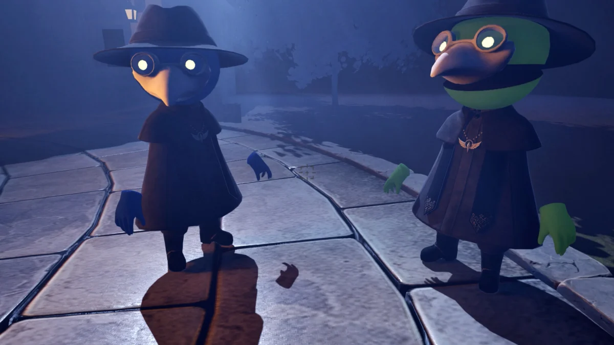
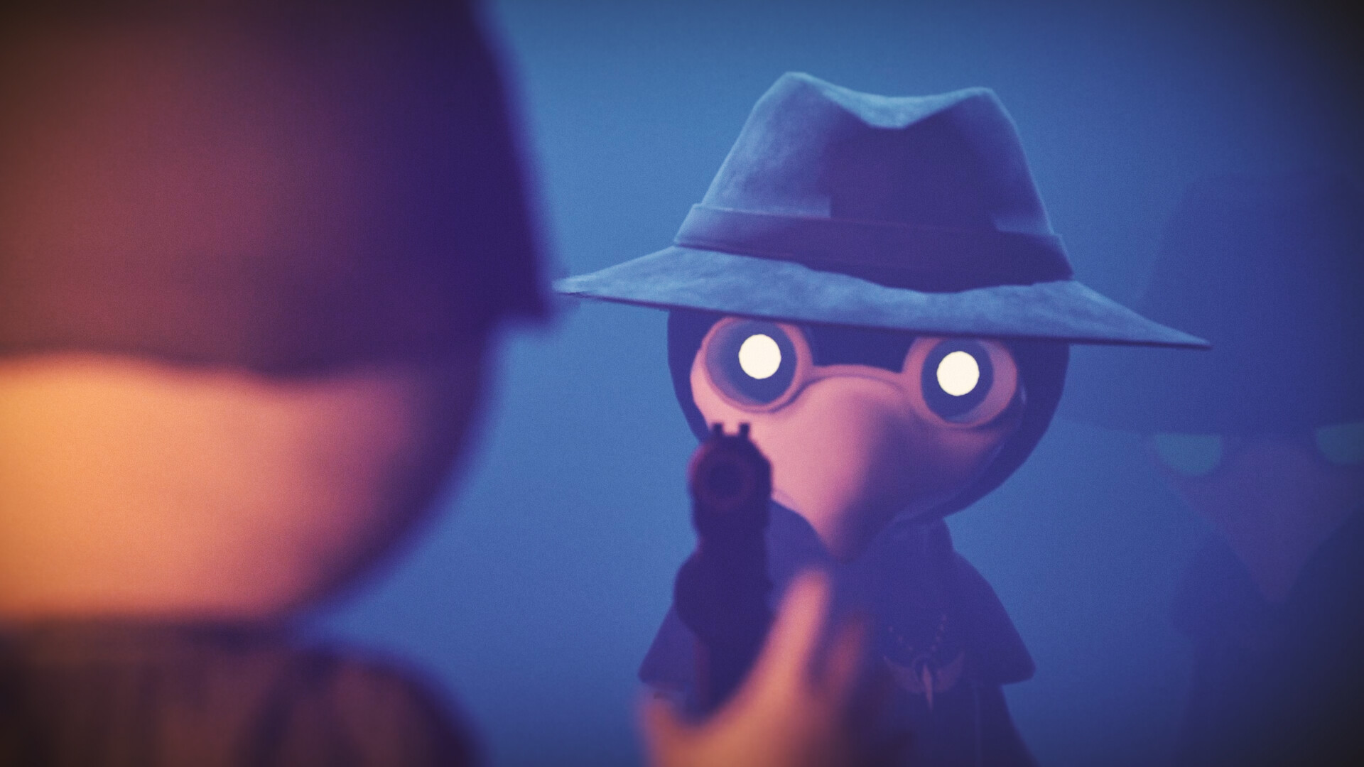
Engawa Games, an independent Japanese studio previously known for its chaotic co-op title "Parking Together!," is gearing up for the release of "In Us," a multiplayer survival horror game. The premise is intriguing: players step into the shoes of exorcists tasked with ridding a demon-corrupted village of its monstrous inhabitants. The gameplay promises a blend of social deduction and tense atmospheric horror, designed for cooperative play with friends. On paper, it sounds like a recipe for success.
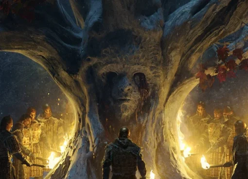
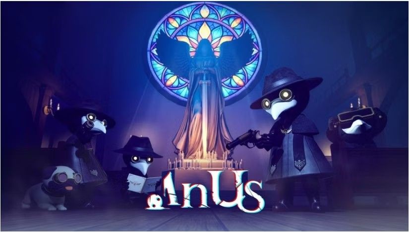
The game’s initial promotional materials, particularly its key art, aimed to capture this eerie, atmospheric tone. Featuring hooded figures with bird-like masks standing before a glowing stained-glass window, the artwork evokes a sense of mystery and dread. However, it was the game’s title, "In Us," rendered in a distinctive and heavily stylized font beneath the ominous imagery, that inadvertently stole the show – and not in the way the developers intended.
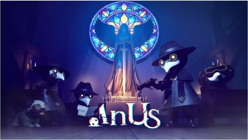
The closely spaced letters, particularly the "n" and "U" in "In Us," merge to create a visual illusion that is, for many, immediately recognizable as "Anus." This accidental visual pun, once spotted, proved impossible to unsee, and the internet, in its inimitable fashion, quickly seized upon it. The image, and the ensuing commentary, began to spread like wildfire across social media platforms and gaming news outlets.
A Typographic Nightmare: The Anatomy of the Error
The issue lies in the precise kerning – the adjustment of space between individual characters in a typeface – and the chosen font’s inherent design. When letters are placed in close proximity, especially those with rounded or curved elements, the negative space between them can coalesce into new, unintended shapes. In the case of "In Us," the specific design of the font, combined with the tight spacing, caused the "n" and the "U" to form a shape that strongly suggests the word "Anus."
This phenomenon is not entirely new in the realm of graphic design. Designers, immersed in the minutiae of their creations, can sometimes develop a form of selective attention. Spending hours staring at a logo or title at high resolution on a large screen can lead to a disconnect from how it will be perceived by the general public, especially at smaller sizes, on different devices, or when viewed fleetingly. The brain, focused on balancing shapes and aesthetics, can overlook the literal interpretation of the word.
This is remarkably similar to the principles demonstrated in the famous "Invisible Gorilla" experiment by psychologists Christopher Chabris and Daniel Simons. In that experiment, participants were asked to count basketball passes in a video, becoming so engrossed in the task that they failed to notice a person in a gorilla suit walking through the scene. The "In Us" logo, in essence, is a real-world, and rather embarrassing, manifestation of this perceptual blindness. Designers, in their pursuit of visual impact, can become so focused on the "how" of the design that they miss the "what" of the message.
The Ripple Effect: From Laughter to Caution
The immediate reaction to the "In Us" logo was a wave of amusement and incredulity. Memes, jokes, and commentary flooded the internet, with many expressing disbelief that such an oversight could occur in the current era of design scrutiny. Some even speculated if it was an intentional marketing stunt, a bold and risqué move to generate buzz. However, the developers at Engawa Games have not publicly confirmed this, and the prevailing sentiment points towards a genuine, albeit highly unfortunate, accident.
The incident has also sparked a broader conversation about the importance of thorough review processes in design. While the stylized nature of display typography can lend itself to creative expression, it also introduces potential pitfalls. The lesson learned from "In Us" is that even the most avant-garde design choices require rigorous testing and feedback from a diverse range of perspectives. What appears visually striking to the creator might be inadvertently offensive or absurd to the intended audience.
Supporting Data: A History of Typographic Fails
The "In Us" incident, while particularly egregious, is far from an isolated event. The history of branding and marketing is replete with examples of unfortunate typographic choices that have led to public embarrassment and, in some cases, costly rebranding efforts.
- J. Crew’s "Orgasm" Sweater: In 2011, the retail giant J. Crew released a sweater with the word "Orgasm" emblazoned on it, intended as a playful nod to the French term for "climax." However, due to the font choice and spacing, it was widely perceived as a crude and unintentional display of the word.
- The "Kmart" Logo: In 2004, Kmart underwent a rebranding with a new logo featuring a stylized "K." The design, however, was criticized for its resemblance to the word "mart," leading to a less-than-ideal visual association.
- The "Chock Full o’Nuts" Logo: This classic coffee brand’s name, while seemingly innocuous, has long been a subject of debate due to its spacing, which some interpret as suggestive.
These examples, alongside "In Us," highlight a recurring theme: the critical importance of scrutinizing the unintended visual interpretations of text, especially when employed in stylized or unconventional ways. The digital age, with its instant global reach, amplifies the impact of such errors, turning a localized design blunder into a worldwide spectacle.
Official Responses and Developer Actions
As of the time of this report, Engawa Games has not issued a formal public statement addressing the controversy surrounding the "In Us" title art. However, it is worth noting that the Steam page for "In Us" remains accessible, and the artwork, as initially presented, can still be viewed. This suggests that the developers are either in the process of deciding on a course of action or are choosing to let the situation unfold without immediate intervention.
In the absence of an official statement, the gaming community and design critics have been left to speculate. Some suggest that Engawa Games might opt to revise the title art before the game’s full release, a move that would likely appease a significant portion of the online discourse. Others argue that the sheer virality of the current artwork might prompt the developers to embrace it, potentially even weaving it into the game’s narrative or marketing as a form of meta-commentary.
The decision Engawa Games makes will be closely watched. It could set a precedent for how independent developers handle such unexpected and widespread branding mishaps.
Implications and Lessons Learned
The "In Us" logo incident serves as a potent case study with far-reaching implications for the design industry and beyond.
- The Perils of Stylized Typography: While creative font choices and tight kerning can enhance a brand’s visual identity, they necessitate extreme caution. Designers must be acutely aware of how letterforms interact and the potential for unintended interpretations.
- The Power of External Review: Relying solely on the internal design team’s perspective is a risky strategy. Implementing a robust external review process, involving individuals from diverse backgrounds and with fresh eyes, is crucial for identifying blind spots.
- The "Invisible Gorilla" Effect in Practice: The incident underscores the psychological principle that intense focus on one aspect of a task can lead to the overlooking of other important elements. Designers need to consciously step back and evaluate their work from a broader, more objective standpoint.
- The Double-Edged Sword of Virality: While virality can bring immense exposure, it can also be detrimental if the catalyst is negative. Engawa Games is experiencing this double-edged sword firsthand, gaining widespread recognition but for an attribute that overshadows their intended product.
- The Importance of Adaptability: The gaming industry is dynamic. Developers must be prepared to adapt to unforeseen circumstances, including public perception and potential design revisions.
Ultimately, the story of "In Us" is a testament to the unpredictable nature of creativity and public reception. While the developers at Engawa Games may be facing an unexpected hurdle, the incident provides a valuable, albeit embarrassing, lesson for all involved in the visual communication of ideas. It’s a reminder that in the pursuit of artistic expression, clarity and careful consideration of audience perception are just as vital as aesthetic appeal. And as the author of the original article aptly concluded, "watch out for that gorilla!" – and perhaps, a rogue typo or two.